Make Great Facebook T-Shirt Ads & Skyrocket Sales
In this short guide, I will show you why you should be using Facebook Advertising to promote your online t-shirt business, how to decrease Facebook Ads cost and increase its effectiveness, and also show you a step-by-step guide on how to get your very first Facebook ad up and running. Also, if what you are looking for is more of a keyword strategy for your Ads you visit our Best SEO Keyword Tips for Your T-Shirt Brand.
How to Sell T-Shirts on Facebook
- Facebook for Businesses: How It Works
- Selling T-Shirts on Facebook: Is It a Good Idea?
- Decrease Facebook Ads Cost and Increase Effectiveness
- Promote T-shirts With Facebook Ads: Step by Step Guide
- To Wrap It Up
A Word About How Facebook Works For Businesses
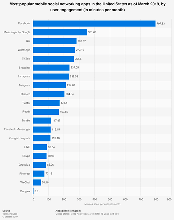
First things first, Facebook reigns. Is this clear? If not, here’s a graph that demonstrates it. The average of daily active users is 1.59 billion for June 2019. This is the main reason why advertising on Facebook makes a lot of sense and if you are still not advertising on Facebook you are definitely missing out.
You might also know that Facebook’s algorithm has changed for Business Pages. By the end of 2014, Business Page’s organic reach decreased dramatically. This happened because by then, there were too many Pages and too many Page posts that were competing against many other several posts, causing posts to be rarely seen by users.
To fix this, Facebook decided to change its algorithm and stop bombarding the end-user with businesses’ content and started showing on the News Feed only what Facebook thought was more relevant: friends’ updates.
So today, in order to get your Facebook Page posts seen 5 things need to happen:
1. A user goes directly to their Facebook Pages Feed and sees your non-boosted post.
What is the probability of this actually happening? Almost none. Very few people bother on going to their Pages Feed, do you remember the last time you checked your Pages Feed? Probably not.
You can check your Pages Feed by clicking on the Pages Feed link on the left sidebar of your News Feed. You might want to bookmark the Pages Feed to stay in the know of what your liked pages are sharing.
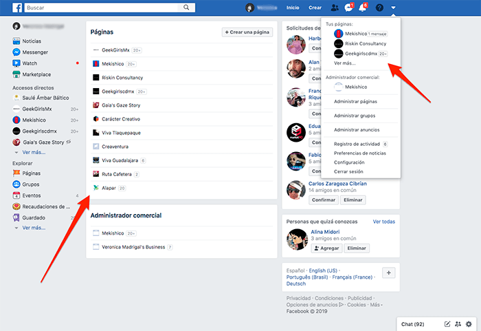
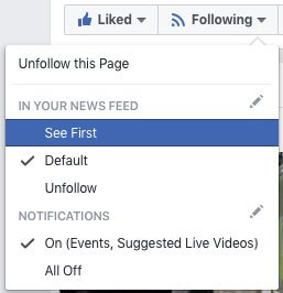
2. Another way a user can organically see your shared content is if they choose to “See First” your Page’s posts. What a user has to do is go to your Facebook Business Page, then click on “Following” and choose “See First”.
What is the probability of this actually happening? People follow these steps when a Page owner kindly asks users to do this or a user deliberately goes and does this when really interested in the content that is shared on the page. So while we are at it, why not going to Placeit’s Facebook Page now and choose to see our awesome updates first? 😉 👉
3. Someone decides to reshare a Page’s post on their own wall. After a piece of content has been shared on the Page, a user can share it on their wall or a friend’s wall and get Friends and Followers to see it.
What is the probability of this happening? Brand owners usually reshare content they share on their Facebook Pages to increase organic reach. Also, if the content is interesting it can get reshared and reshared, think viral posts.

4. A Facebook Page Owner boosts a post to get the post to reach its followers and an audience beyond their follower base.
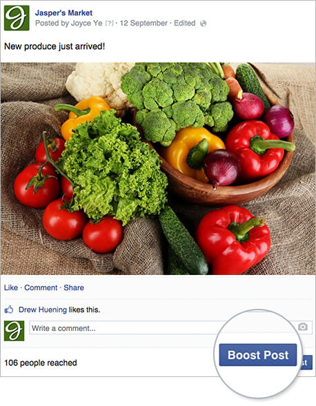
5. A Facebook Page Owner goes to Facebook Ads Manager and creates an ad. Ads created through the Ads Manager perform better than a boosted post because the targeting capabilities are way higher.
Now that we know all about Facebook Page Posts, let’s focus on points 4 and 5 since the objective of this blog post is to help you create low-cost and high-converting Facebook Ads to sell more t-shirts.
So Why Are Facebook Ads Good For Selling T-Shirts?
Facebook Ads are sponsored content that people see while they are on Facebook. And as previously stated, non-boosted Facebook Page posts have minimum visibility. On the contrary, when you invest in Ads, these can be seen on a user’s mobile or desktop News Feed, in the right column on laptops or desktop computers, or even beyond Facebook on Facebook’s Audience Network.
People see sponsored content because a Page owner or Social Media Manager has decided to target them and spend money on that ad content to appear right before their eyes.
Facebook Ads work because people spend on average 20 minutes per Facebook visit and what they do is they scroll through their News Feed, stop to watch, like, or comment, and continue scrolling, sometimes endlessly. Here, in the News Feed, is exactly where Facebook has strategically decided to show Ads, making Ads practically unmissable.
Ad content may or may not go paired with social actions that your friends have taken, like liking a page.

It makes sense then to think that when an ad has this extra information on it, the chances of actually doing what the ad wants you to do increase since people you know have already engaged with the page. As an example, in this Corona’s sponsored ad, I can see that 50 of my friends like Corona’s Page already so this kind of pushes me to think that Corona might be giving away interesting stuff and I should go and like this page.
“Well Mister, Then Why Are Users Not Engaging With My T-Shirt Facebook Ads? What’s Going On?”
To begin with, Facebook page owners have started to realize that Facebook Ads is the way to go so it has also become a competitive and crowded environment. This means that your Ads are competing against many other Facebook Page owners’ Ads who might be creating better Ads than yours, be it on the creative side, doing a better job targeting their audience more effectively, who knows.
Facebook Advertising interface is so user-friendly that few actually realize that when you Advertise on Facebook you are joining a massive auction. It makes sense then to think that Facebook wants to maximize its profits and the way they will achieve this is by only displaying high-quality (relevant) Ads to users so that these Ads get high user engagement (money for Facebook). To be on top of the game, users use a website grader to evaluate their facebook presence to improve their ad campaigns.
Alright, enough history, let’s learn the best tips and tricks about how effective Facebook Ads that sell t-shirts look like.
How to Decrease Facebook Ads Cost and Increase Effectiveness
T-shirt business owners fail and end up wasting their hard-earned money when they fail to define what it is that they want to achieve when investing in a Facebook Ad campaign or by boosting a post.
The cost and effectiveness of Facebook Ads can be optimized by making a few smart tweaks to your Ads. Amongst the most important aspects to take care of are:
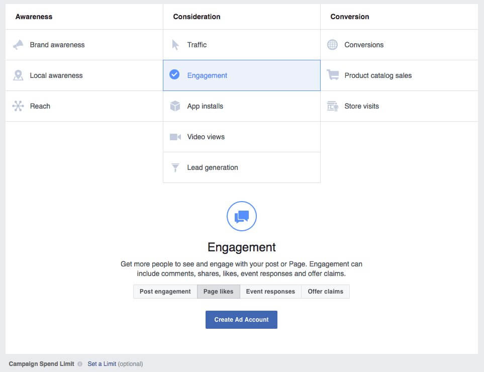
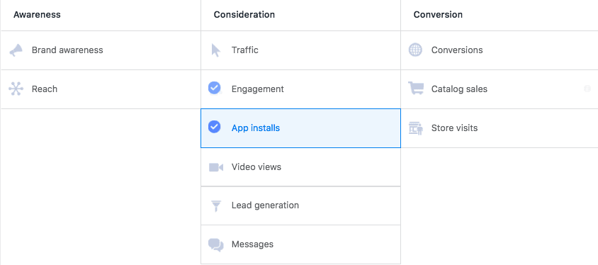
Choosing the Right Facebook Ads Objective
✓ You need to know what kind of Facebook Ads to run based on what your objectives are. Besides achieving your campaign objectives another benefit is that you will spend less on Ads since Facebook will be able to understand what your goals are and will optimize ad delivery accordingly. In this sense, what outcome would you consider a success – exposure and sales, simply sales, likes?
Choosing Facebook Ad Placements the Right Way. Where Do You Want Your Facebook Ads to Appear?
✓ Choose to appear on the desktop news feed or the mobile news feed only. Ads displayed on the right side column rarely get noticed. Personally, I ignore these Ads, I even find them misleading, but then I’ve heard of people that purchase products that appear there, so if you feel like it, please experiment.
✓ Facebook Ads work best on a CPC (Cost per Click) basis, which means that you will only pay for clicks that your ad receives. Choose to get charged per Post Engagement. You can cap the amount of money you want to spend per day, so if you want to test Ads at $7 per day, you can do it.
✓ Bidding on conversions is recommended because Facebook will do its best to deliver your ads to people who are interested in your offer also known as, most likely to convert.
Perfecting Your Facebook Ad Targeting Strategy
✓ Make sure you target a very narrowed down niche if you want to have really inexpensive clicks. You need to know who your target market is, the things they like, watch, read, listen to, and buy. Creating consumer personas will make you an expert on psychographic and demographic targeting and will make your Ads way more compelling.
✓ Build several custom audiences and improve them over time. There are advertisers that create audiences with +100 interests, wow.
✓ Go for intersections of interests. When choosing your audience interests go for “people who enjoy outdoors” AND “people who enjoy drinking beer” this is much more exact than if you were using OR instead of AND. Get the most benefit from Facebook Ads and start applying this technique now.
✓ You need to know about how Facebook considers how relevant an ad is when determining which Ads to show a person. The more relevant the images and the copy on your Ads are for the targeted audience, the less expensive your ads will get. Once a campaign has ended, go to your Facebook Ads Manager then select an Ad set and under Relevance Score, you will see your ad’s score.
Remember to use buyer personas to improve your Facebook Ad Relevance Score. To get the full juice on Ad Relevance Score check read this great blog post.
✓ Your Facebook t-shirt Ads need to speak to your target audience’s identity. Use images that match their lifestyle and view of themselves. While interacting with your Ads, you want them to think “This is SO me.”
✓ Improve your targeting by checking Audience Insights, detect who is not engaging with your t-shirt Ads and focus on the ones that are.
Promoting Your High-Quality Content with Facebook Ads
✓ Using High-Quality HD images, especially when in the “lifestyle” clothing business.
✓ Invest in professional product/studio photography that talks to your audience for your Ads. Placeit’s t-shirt mockups are highly recommended and super effective.
✓ Usually, people want a t-shirt that gets a reaction from their peers. So if I am passionate about X, I want to wear a shirt that someone might come up to me and say, that is cool, where did you get it. Transmit this on your ad and see how sales go up.
✓ Promote the products that you are selling on your print on demand shop through social media by engaging Facebook Ads. (Not selling on a POD site yet? What are you waiting for? Head to this post on where to sell t-shirts online to find the perfect marketplace for your brand).
✓ Ask yourself, the image or video you are using will capture the viewer’s eye amongst all of the other Facebook page clutter?
✓ Carousel Ads provide a flexible way to advertise your t-shirts without having to create multiple Ads. The carousel format allows you to showcase more than one image for a given ad unit so that you can show several images displaying different models wearing your t-shirt and thus making your business trustworthy.

✓ Test advertising one specific product per ad instead of your entire shop – e.g. someone that would buy a t-shirt wouldn’t necessarily buy a tote bag or even interested in seeing tote bag Ads. Tailor your target audience specific to the product in the ad! The Facebook Ad Manager makes it easy for everyone to create several Ads fast.
✓ It is recommended as well to use videos to promote your t-shirts. It is not difficult to create videos, I repeat, it is not difficult! Placeit has t-shirt video mockups and t-shirt cinemagraph mockups that you can use on Facebook Ads. To create a t-shirt video mockup you just have to drag and drop your t-shirt design, that’s it. Facebook has been prioritizing video content for a while now because video tends to generate more engagement. So why not give it a go?
✓ Don’t always sell, sell, sell. Share and boost inspiring content that your target audience will find interesting, attractive, or entertaining and build awareness. If you sell cat shirts, share cat content. By doing this you will get your target audience more familiarized with your brand’s values and will find more value in your page. After a few of these posts, users will be more ready to engage with your selling Ads. A great way to make your audience identify with your brand effectively is by creating a custom logo for your apparel brand.
Craft Effective Ad Copy & Imagery for Facebook Ads
✓ Make your ad highly clickable by adding urgency wording. Entice customers with words like “limited time, hurry, last chance” that help create excitement about an offer and push users to make the purchase in that exact moment or at the most on that day. Also, use active verbs in your copy and make sure that your customers’ “pain points” are central to your message while appealing to emotions.
✓ Don’t assume, test! Create different ad sets that have small changes. Test a different copy, a different image (real person vs. an illustration), different demographics, different objectives, etc. By testing different content and variables, you will learn which kind of ad your audience feels like engaging the most with, and your costs will go down.

✓ Include strong, recognizable trust signals. Fast shipping and returns, t-shirt’s real price, amount of t-shirts already sold, etc. Once your Ads start to be effective, the cost per engagement goes down, so work on perfecting your Ads!
Step-by-Step Guide: How to Promote T-Shirts With Facebook Ads
I’m going to show you now a step-by-step guide to follow and create Facebook T-shirt Ads and skyrocket sales.
What you will need:
✓ A Facebook Page.
✓ A Facebook Ads Manager account.
✓ A credit card.
✓ A clear objective.
✓ Attractive imagery.
✓ Your ideal customer’s buyer persona.
✓ The URL where you want to send your audience once they engage with your ad.
Ready? Let’s do this!
Head to the Facebook Ads Manager screen and start a new ad.
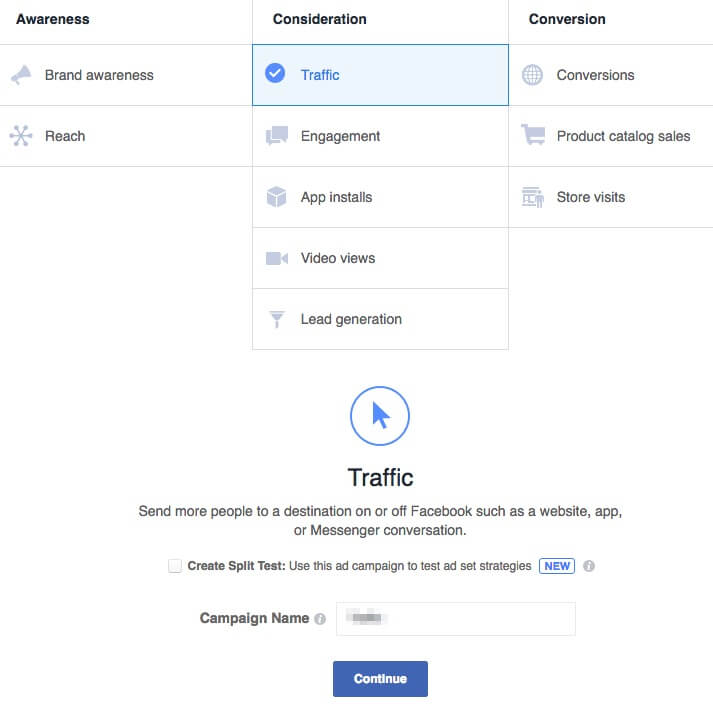
Step 1: Choose your Marketing Objective.
Choose traffic as your marketing objective. By choosing this option, you will be able to send people directly to your shop or product page, which is what we want.
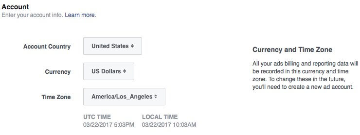
Step 2: Creating an Ad Account.
In this step, you will enter your account and billing information. Choose the country where you are located, currency, and time zone.
Step 3: Creating a New Ad Set
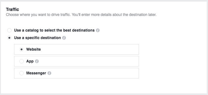
Part 1: Traffic
Once you give your Ad Set a name, you will be asked where you want to drive traffic to. Choose Website or Messenger.
Part 2: Offer
This option allows you to create an offer people can save and get reminders about, but it will not work for us at the moment, so let’s ignore it.

Part 3: Audience
Here is where your customer buyer persona will come in handy. By defining an audience for your Ads, you will let Facebook know who you want to see your Ads and sell your t-shirts to.
By knowing the characteristics of the person that is more likely to engage with our ad, you will benefit in two ways; first, Facebook will reduce your Ads’ cost because the more accurately targeted your Ads are, the more the user will be pleased, or not bothered at least, and a positive experience will be delivered which is what Facebook wants. Second, the people who click your Ads will be more likely to convert (make the purchase), and you will see a real monetary benefit from advertising t-shirts on Facebook.
Since this is probably your first time using Facebook Ads, you won’t be able to create a Custom Audience, so leave it blank. But just so you know, Custom Audiences are groups you create based upon your email lists, phone numbers, app users, or website retargeting.
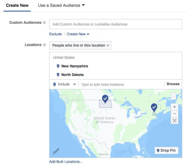
Now on location, select “People who live in this location.” This option allows you to enter one or more global regions, countries, states/regions, cities, postal codes, addresses to show or exclude your ad to people in those locations.
For illustration purposes, I chose to target the states of North Dakota and New Hampshire because, according to this report, these two states are where people consume the most beer in the United States, and the t-shirts that I will be selling this time are meant to appeal people from 25 to 54 years old, which is the core beer-drinking demographics.
Now. Choose the age range and gender of the people who will most likely wear your t-shirts.
Then on Languages, choose the language your ad is displayed in. In this guide’s case, English (ALL) will do the job.

Now comes my favorite part, the Detailed Targeting section. In this section, you are able to define your audience by including or excluding demographics, interests, and behaviors.
- Demographics: education, relationship status, income, job title, employer name, language, financial, homeownership, parental status, etc.
- Interests: everything from Facebook brand pages to celebrities and every topic you can think of.
- Behaviors: shopping habits, spending, mobile, device ownership, travel habits, etc.
My ideal customer is most likely to have liked the Budweiser page on Facebook AND enjoy Baseball, so that’s what I typed in.
Going for intersections like I just did, helps to narrow down the audience and laser targeting your audience. Because a person that liked Budweiser might not be necessarily interested in Baseball, targeting an audience who likes Budweiser OR enjoys Baseball might end up displaying my ads to the wrong people. Don’t forget, these are variables in the advertising equation that can always be optimized in the future.
Under the Connections section, you can choose to “Exclude people who like your Page” to deliver your Ads only to new users. This is an optional step; you might choose to leave this blank or to target only your current Page followers; just don’t forget to tailor your ad’s image accordingly.

Part 4: Ad Placements
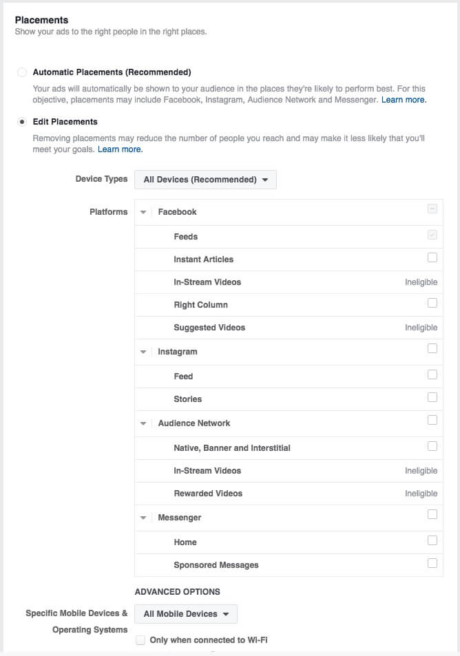
Here you will be able to define where people will see your t-shirt Ads.
Choose to edit placements, deselect everything and select only to show your Ads on user’s News Feeds (both mobile and desktop) and on the Right column on the desktop. These are my recommended settings, but you are encouraged to prove me wrong.
Personally, I believe that the audience I’m targeting will rarely be on Instagram nor would engage with an ad featured on Facebook’s Audience Network nor on an Instant Article, the reason why I deselected them.
Part 5: Budget & Schedule
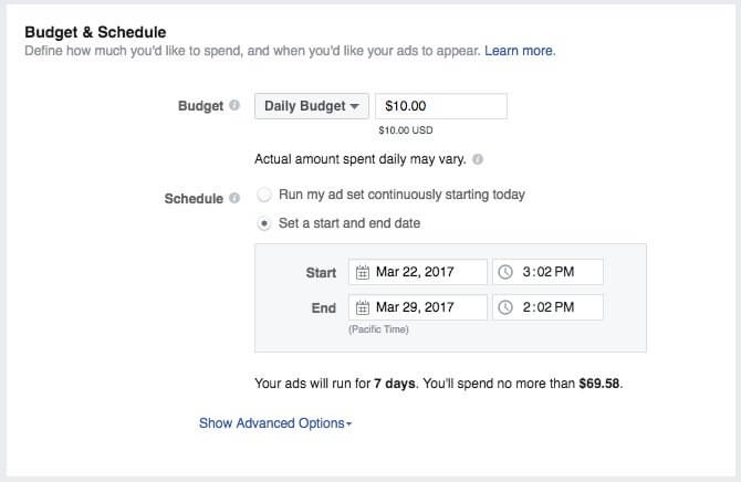
Here you will define how much you’d like to spend and when you’d like your ads to appear. Start with low quantities first; the minimum is $10.00 USD to test the effectiveness of your Ads.
You don’t want to go and invest $500.00 USD when you haven’t tested your Ads yet, right? Remember that running tests is super important when advertising shirts on Facebook.
By setting the daily budget to $10 USD and the ad to run for 7 days, you will be able to learn, gather data, and most likely, see how t-shirts sales go up during these 7 days.
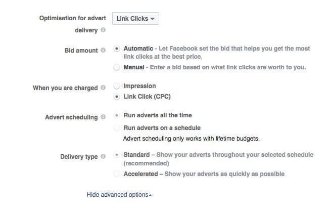
Now click on Show Advanced Options, and let’s tell Facebook that we only want to get charged when a user actually clicks on our ad. This is super important; choosing to be charged by impressions just works if your goal is to boost brand awareness, but this is not our case; on this occasion, we want CLICKS & SALES!
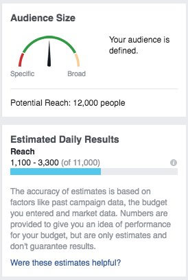
Once you are done, you will see a summarized version of your ad on the right side. Your audience definition “meter” should fall as much as possible towards the left side. Don’t forget, the more specific your selected audience is, the more effective your t-shirt Facebook Ads will be. In my case, the potential reach of my Ads is 12,000 people, as can be seen on the next screenshot. Remember that having a very well-defined audience will allow you to spend less on t-shirts Ads and sell way more t-shirts.
Step 4: Ad Creation
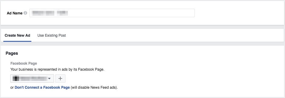
In this Ad Creation section, you will be able to add text and media to your t-shirt Facebook ad. Select the Facebook page that your Ads are related to.
Part 1: Ad Format
Facebook has moved to a “video first” strategy. We all love video, and Facebook knows it; besides, video content is able to keep users engaged in the platform for a long time which is beneficial for Facebook as well. Knowing this, promoting your t-shirt with a video is a must, so go ahead and choose the “Single Video” format.

How to Get a Professional T-Shirt Video Mockup for Less?
In case you don’t already have a video to promote your t-shirt, the easiest way to get a professional t-shirt video mockup done is with Placeit. On Placeit’s site, choose a t-shirt video template. I used this one for my ad, then simply upload your t-shirt design! Download your high-definition MP4 t-shirt video and upload it.
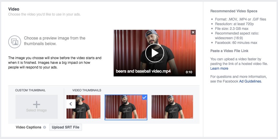
See how cool this t-shirt video mockup looks!
Now select your Facebook Page and copy and paste the URL where you want to send people to.
It is time now to get creative with compelling copy that will talk to your audience and will help convince users to click or tapping on your ad.
- Use wording that creates urgency and drives sales
- Appeal to emotions
- Use active verbs that will push users to make the purchase immediately
Since I’m selling a t-shirt, the call to action should say “Shop Now” because I want users to go to Sunfrog in this case and purchase my t-shirt.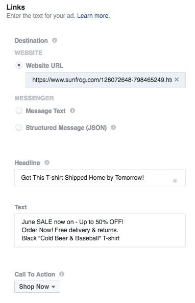
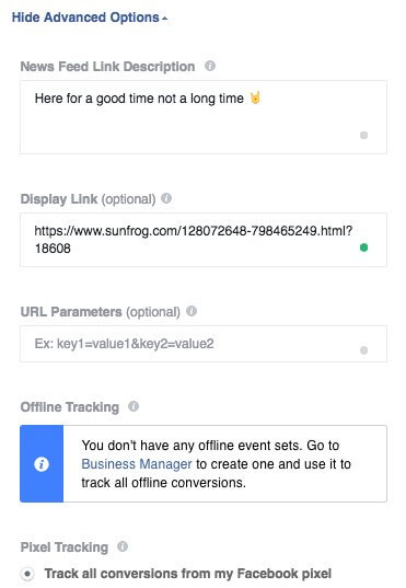
Now under Advanced Options, add supporting copy and a short display link that will tell your audience where they will be taken to, in this case, Sunfrog.
Your T-Shirt Facebook Ad is Now Ready!
Hit the “Place Order” green button at the bottom right corner, and you will be good to go.
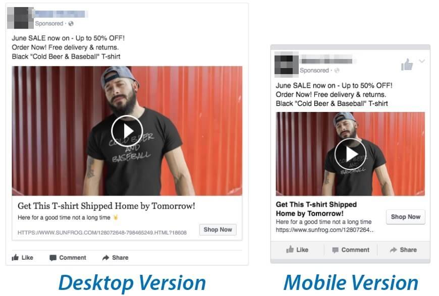
This is the final result of my ad, and it is a great-looking one. Too easy, wasn’t it?
Your ad now shows a t-shirt video featuring your design being worn by your target audience, and it looks awesome wearing this t-shirt proudly!
What If I Want to Advertise my T-Shirts with Images Rather than with a Video?
If you use want to use an image to create a T-shirt Facebook Ad, I recommend you as well to use Placeit for the best results. I’ll show you why.
First, go and select the “Single Image” ad format.

As I was saying, Placeit will help you to create an eye-catching Facebook T-shirt ad. So once in Placeit’s site, choose a Facebook Ad Image Template, customize it your own way and download your high definition image file so that you can upload it to the Facebook Ads Manager.
How to Create a T-Shirt Facebook Ad Image in 6 Easy Steps
1. Choose a Facebook Ad Template.
2. Upload your T-shirt design in PNG or JPEG format.
3. Choose the T-shirt color that matches the actual T-shirt that you are selling.
4. Fill in the blanks with your promotion’s details.
5. Hit download and upload your new ad image to the Facebook Ads Manager.
Your ad now shows a t-shirt being worn by your target audience!
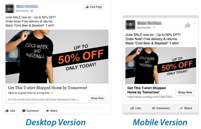
See how cool this Facebook T-shirt Ad Image looks!

What About This Facebook Ad Format Called “Carousel” Should I Use It?
Yes! The Carousel ad format seems complicated at first glance, but it really isn’t. The Carousel ad format combined with the Canvas feature allows users to browse and purchase your offerings in a beautiful visual way. It will help you acquire more new customers, drive awareness and generate sales since you are able to include both a video and photos to your ad to make it irresistible!
I’ll quickly show you how to make the best out of the already available full-screen templates that prospects will be happy to click through.
Go ahead and choose the Carousel ad format to promote your tees.

Now click on the Add a fullscreen Canvas option so that the following screen appears. You will now select the Sell Products options.
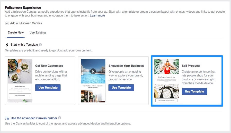
The following image can explain what you can do with the Canvas feature enabled. It’s a super creative method to tell your t-shirt business story!
But to start with, let’s use the ready-to-edit template from Facebook. Here you will be able to add a t-shirt video mockup and from four to 50 items so people can browse and shop. Upload an image and add a headline for each image, a description, and a destination URL for each item. At the very bottom, you will want to add a strong call-to-action to make users pull out their credit cards and purchase your awesome t-shirts!
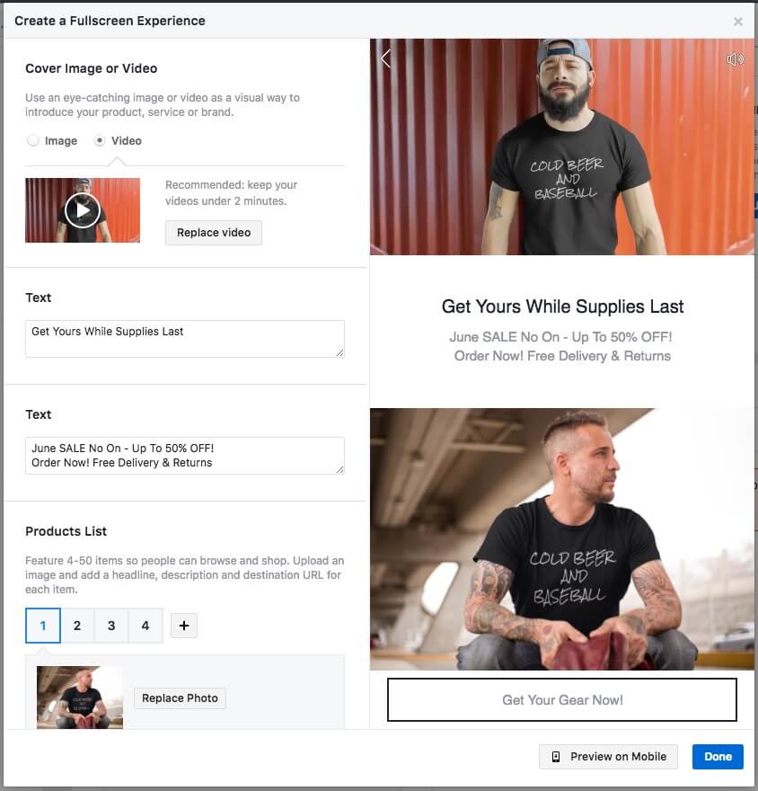
Benefits of Canvas:
✓ Simple to create with templates or advanced Canvas builder for custom Canvases that will help you to tell the story about your brand in a short and powerful way.
✓ Loads instantly and allows you to amaze customers thanks to the fullscreen experience.
✓ Expands to fullscreen experience that highlights content
Since the Canvas interface is thought to improve the mobile experience, you will also need to create t-shirt Ads with the same information for the rest of the devices, as seen on the following screen.
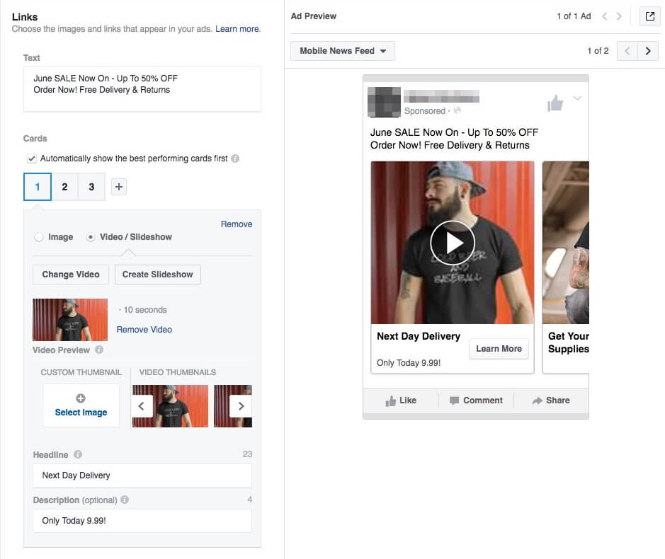
Now have a sneak preview of what your users will be experiencing once they stop scrolling down and stop and click on your ad!
Video Tutorial
If you prefer to watch someone make a Facebook ad, here’s a step-by-step tutorial we prepared for you, or you can always follow our video marketing guide to read more on the subject!
Over To You
Effectively configuring Facebook Ads is not as difficult as it seemed in the beginning, after all. Continue experimenting and see what works best for you and your audience. In the end, Facebook Ads is where the best business owners advertise. Want to take it all one step further? Consider creating your own business cards to boost your image or other graphic design that can help you promote your brand like all text ads, for example. You can make this in a second using design templates.
By following these practical steps and using t-shirt mockups, you can transmit much more than simply showing a t-shirt with a white background. Placeit has thousands of mockups with the right Facebook Ad Image dimensions ready to be used by you. Dozens of mockups are added every single day, so be sure to visit often. It’s also worth mentioning that Placeit has some great ad templates that you can use to design eye-catching advertisements not only for Facebook but also for other social media websites, your online shop, or even to include in your newsletter. You can find all sorts of ad templates for seasonal sales, like Black Friday Ads or Christmas Ads. But don’t stop there. Placeit also has hundreds of amazing templates for your Instagram Posts and your Instagram Stories.
Pro tip – Placeit has a subscription that gives you access to every last t-shirt mockup and Facebook ad template. This way, you can feel free to experiment with all types of different mockups and figure out which ones work best with your niche without breaking the bank, so be sure to sign up!
What’s best is that you don’t need any photo or video editing experience at all. All the editing is done for you so that you can simply upload your artwork and forget about the rest. In case you need a t-shirt design inspiration, you should check this free 2018 T-shirt Calendar we just released.
What are your thoughts? Any insight you’d like to share on what has and hasn’t worked for you? Leave a comment, and let’s start a conversation!
Ready to Create T-Shirt Mockups to Better Promote Your Brand?
Feeling Christmassy yet? You can also get the word out about your brand with beautiful Christmas online banners!
“Great stuff! I just sold my first t-shirt from the Facebook ad I made with Placeit!”
James Hunter 5/5
Make Great Facebook Ads to Promote and Sell Your T-Shirts
Follow our Facebook ads guide to reach thousands of potential customers with your fantastic t-shirt designs. Facebook ads aren't as complicated as they might first seem, in this quick guide we show you the ins and outs of creating an ad campaign that will help your brand grow and potentially make quite a bit of money! Placeit has loads of amazing t-shirt mockups, you can use to give you the edge over the competition and in this guide we show you how to use them.
Make a T-Shirt Facebook Ad Now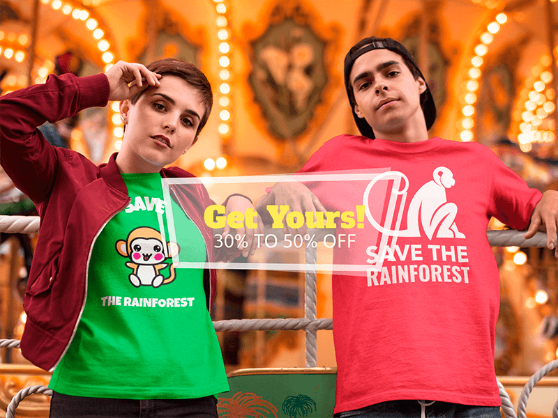

17 Comments
Everette
I couldn’t refrain from commenting. Very well written!
Darren
Wonderful article! We are linking to this great content on our site.
Keep up the great writing.
Charis
Hurrah, that’s whaat I was seeking for, what a data! present here at this blog,
thanks admin of this site.
Bertie
I seriously love your blog.. Very nice colors
& theme. Did you create this amazing site yourself?
Please reply back as I’m attempting to create my own personal site and want to know where
you got this from or just what the theme is called.
Many thanks!
Cedric
Hi, I read your blogs on a regular basis.
Your story-telling style is witty, keep up the good work!
Christine
Quality content is the crucial to attract the viewers to pay a visit the
site, that’s what this web site is providing.
Elana
Nicely done & written my friend!
I’ve just started writing a blog myself just recently and hafe seen lot of blogs merely
rework old ideas bbut add very little of value. It’s great too see an insightful post of some actual vaoue to myself and your other followers.
It’s going down on my liszt off things I need to emulate being
a new blogger. Audience engagemenbt and material value aare king.
Many terrific thoughts; you have certainly got on myy
list of blogs to watch!
Continue the fantastic work!
Congratulations,
Davie
Susan
Howdy! Do you use Twitter? I’d like to follow you if that would be
ok. I’m undoubtedly enjoying your blog and look forward to new posts.
Maik
It’s really a great and helpful piece of info.
I am satisfied that you shared this helpful information with us.
Please keep us up to date like this. Thanks for sharing.
Layne
If some one desires to be updated with latest technologies afterward he must be pay
a visit this site and be up to date everyday.
Moises
Informative article, totally what I was looking for.
Clay
I couldn’t resist commenting. Very well written!
Kendra
Wow, marvelous blog layout! How long have you been blogging for?
you make blogging look easy. The overall look of your
web site is great, as well as the content!
Ignacio
I really like what you guys tend to be up too. This kind of clever work and coverage!
Keep up the amazing works guys I’ve added you guys to our blogroll.
Susannah
This website was… how do you say it? Relevant!! Finally I’ve found something which helped me.
Thanks!
Paulo Lorenzo
Hey amigo, descobri esta postagem a partir de um blog de um
conhecido. Curti do que li, tu parece entender bem do tema.
Muito obrigado!
Kitty
Love it, all the best Eddie