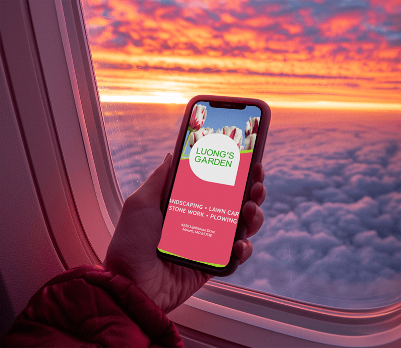
Creating Impactful Visual Marketing Messages
Imagine scrolling through your phone, surrounded by a sea of messages. What grabs your attention? Often, it’s the visuals—vibrant, captivating, and instantly engaging. In marketing messages, where every character matters, visual elements are key to designing for SMS. They not only draw the eye but also convey messages effectively.
Let’s dive into how to craft visually stunning messages for SMS campaigns as well as explore why visuals are essential in SMS and share strategies to create images that not only grab attention but also connect deeply with your audience.
Back to School Rush is coming fast!
Get unlimited access to mockups that convert when it matters most
Start creating now!
What is the Role of Visuals in SMS Marketing
Visual elements are very important in SMS; they elevate your messages from ordinary to extraordinary. They’re not just pretty pictures; they’re powerful tools that can enhance your message in several ways, conveying messages more quickly and effectively than text alone. Here’s how:
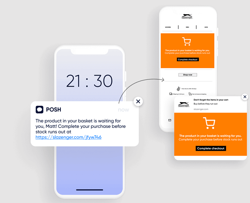
- Engagement: Visuals capture attention and can convey messages more quickly and effectively than text alone. Studies have shown that messages with visuals tend to have higher engagement rates.
- Simplifying Complex Information: Sometimes, a picture really is worth a thousand words. Visuals can help simplify complex information and make it easier for your audience to understand.
- Eliciting Emotions: Visuals have a unique ability to evoke emotions in ways that text alone cannot. Whether it’s a heartwarming image or a funny meme, visuals can help create a connection with your audience.
- Boosting Brand Recall: Visuals are more memorable than text, which means using visuals in your SMS can help increase brand recall among your audience.
5 Key Elements to Incorporate Visuals Into Your SMS Marketing Strategy:
1. Design Principles for Effective Visual Messaging
-
Utilize White Space, Typography, & Colors
White space, or negative space, is the empty space around elements in a design. It helps create a sense of balance and allows the important elements to stand out. In marketing messages, where space is limited, using white space effectively can make your message more readable and visually appealing.
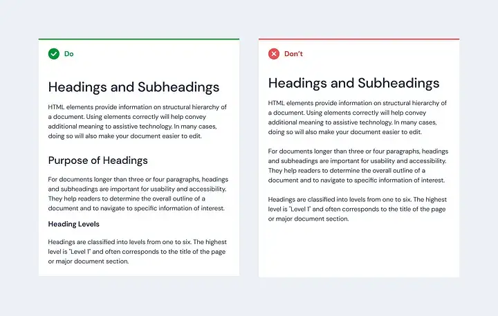
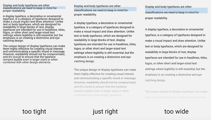
Typography is another critical aspect of visual messaging. Choose fonts that are easy to read on small screens and align with your brand’s identity. Consider factors like font size, style, and color to ensure your message is clear and visually engaging.
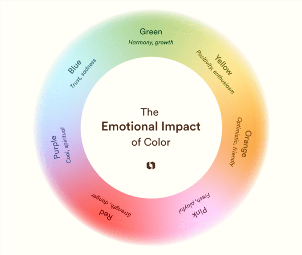
Colors play a vital role in evoking emotions and creating visual interest. Use your brand’s color palette to maintain consistency and reinforce brand recognition. Consider the psychological effects of colors when choosing them for your SMS visuals. For example, blue is often associated with trust and reliability, while red can create a sense of urgency.
✨ Check out these corporate videos!
-
Consistency with Brand Identity & Message Tone
Consistency is key to building a strong brand identity. Your visual messaging should align with your brand’s identity, including its colors, fonts, and overall style. This consistency helps build brand recognition and trust with your audience.
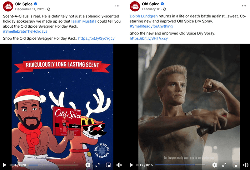
Consider the tone of your message when designing visuals for SMS campaigns. The tone should be consistent with your brand’s voice and the message you want to convey. For example, if your brand is known for its humor, incorporate playful elements into your visuals. If your brand is more serious, stick to a more professional and straightforward approach.
-
Simplicity & Clarity for Small Screens
With the limited space available on mobile screens, simplicity is key to effective visual messaging. Avoid cluttered layouts and overly complex graphics that can overwhelm your audience. Instead, focus on conveying your message clearly and concisely.
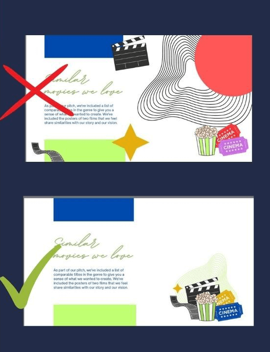
Use simple and easy-to-understand visuals that can be quickly processed by your audience. Consider using logos or icons to convey messages instead of relying solely on text. This approach not only saves space but also makes your message more visually appealing and memorable.
2. Creating Visual Assets for SMS
When designing images and GIFs for SMS campaigns, it’s essential to keep them simple, clear, and engaging. Consider the following guidelines:
- Use images that are relevant to your message and resonate with your audience.
- Keep text to a minimum and ensure it is easily readable on small screens.
- Use high-quality images to maintain clarity and professionalism.
- Incorporate your brand’s colors and logo to reinforce brand identity.
- Consider the use of animations or GIFs to add visual interest and grab attention.
Optimizing visual content for fast loading times is essential in SMS, where space is limited, and attention spans are short. To optimize your visuals, use compressed image formats like JPEG or PNG to reduce file size without sacrificing quality. Avoid using large or high-resolution images that can slow down loading times. Test your visuals on different devices and networks to ensure they load quickly for all users.

There are several tools and resources available to help you create visually appealing images and GIFs for your SMS campaigns. Adobe Spark, and Giphy are popular tools that offer templates and design elements for creating graphics and animations.
Moreover, websites like Unsplash and Pexels provide free high-quality images that you can use in your designs. By following these guidelines and utilizing the right tools, you can create visually compelling assets that enhance your SMS marketing campaigns and effectively engage your audience.
3. Incorporating Visuals Into Text Messages
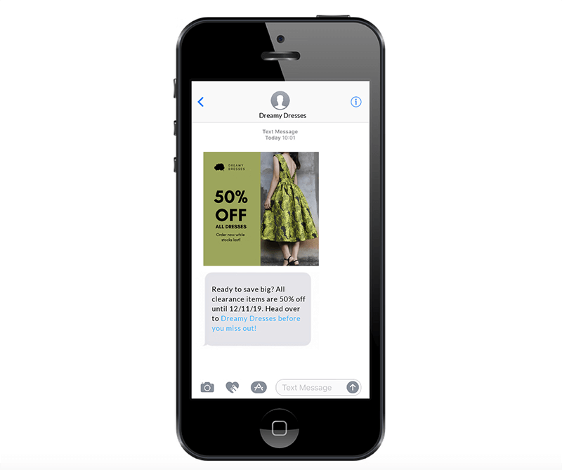
Incorporating visuals into text messages can significantly enhance the effectiveness of your SMS campaigns. Images and GIFs can complement text messages in several ways, such as providing visual context, emphasizing key points, or simply adding a touch of creativity. For example, a retail store could send a text message announcing a sale along with an image of the featured products to entice customers.
To enhance storytelling and evoke emotions, consider using visuals that resonate with your audience’s emotions and help tell a story. For instance, a charity organization could use a heartfelt image or GIF to convey the impact of donations, evoking empathy and encouraging support.
When balancing text and visuals, it’s essential to ensure that both elements work together harmoniously to convey your message effectively. Avoid overcrowding your message with text or using visuals that distract from the main message. Instead, use visuals to complement and enhance your text, creating a cohesive and engaging message for your audience.
4. Ensuring Compliance & Accessibility
Ensuring compliance and accessibility is crucial when incorporating visual content into SMS campaigns. SMS regulations vary by region, but in general, it’s important to follow guidelines set by regulatory bodies such as the TCPA in the United States or the GDPR in the European Union. These regulations often require transparency in advertising, respect for user privacy, and compliance with anti-spam laws.
To ensure that visual messages are accessible to all recipients, including those with disabilities, consider the following tips:
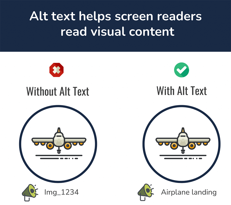
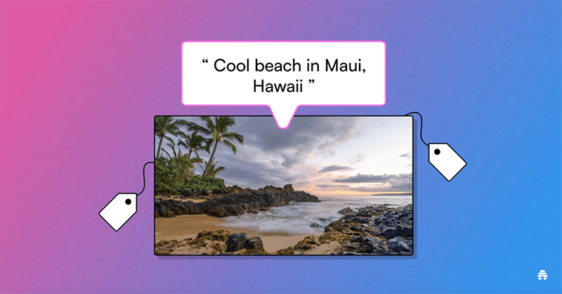
- Use descriptive alt text: For images, provide alternative text (alt text) that describes the content of the image. This helps visually impaired users understand the message conveyed by the image.
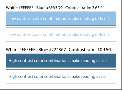
- Maintain high contrast: Ensure that text and visual elements have sufficient contrast to make them readable for users with visual impairments.
- Provide text-based alternatives: For important information conveyed through visuals, provide a text-based alternative to ensure that all recipients can access the information.
- Use accessible design practices: Follow best practices for accessible design, such as using clear and simple language, providing captions for videos, and ensuring that interactive elements are accessible via keyboard navigation.
5. Testing and Optimizing Visual Campaigns
Testing and optimizing visual campaigns is essential for ensuring their effectiveness and maximizing their impact. A/B testing, also known as split testing, involves creating two or more versions of a visual element and testing them against each other to see which performs better. This can help you understand what resonates with your audience and refine your visual strategy accordingly. To conduct A/B testing for visual elements, consider testing different images, colors, fonts, or layouts to see which combination drives the desired outcome, such as clicks or conversions. It’s important to test one element at a time to isolate the impact of each change and gather meaningful data.
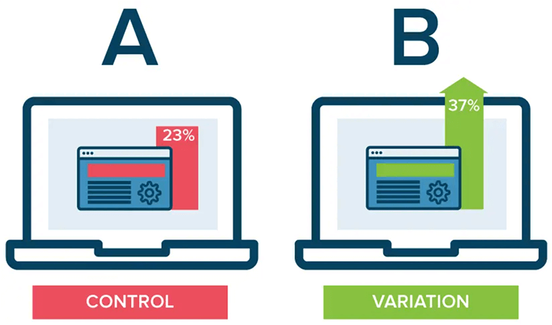
Once you have collected data from your A/B tests, analyze the results to identify trends and patterns. Look for insights such as which visuals perform best, what messaging resonates with your audience, and how different design elements impact engagement. Use these insights to optimize your visual campaigns by refining your visuals, messaging, and targeting strategies. In addition to A/B testing, consider using performance data from your visual campaigns to optimize future campaigns. Track key metrics such as click-through rates, conversion rates, and engagement rates to understand how your visual campaigns are performing and make informed decisions about future campaigns.
Conclusion
In summary, visual content plays a crucial role in SMS marketing campaigns, and by implementing best practices and staying ahead of trends, marketers can create visually compelling campaigns that drive engagement and deliver results.
