9 Tips to Help You Create Your Own Flyer

Designing a flyer if you don’t have design experience can seem like such a challenge. Even if you’re not a designer, you can definitely learn to do it yourself. To learn how to design a flyer, all it takes is a little bit of research and some creativity. If you’re feeling a little bit lost, use these tips to guide your design work.

1. Communicate a Clear Message

Before starting to design a flyer, you’ll already have some information to guide you. Gather this information and turn it into key points that communicate exactly what you want. The most important pieces of information will be what the flyer is advertising and a date to go along with it. For example, you may be advertising an event, so having a date for this event on the flyer is a must. If you’re advertising the launch of a new product, let people know when it’s launching.

Think about what other information is crucial for your audience to know. You may want to tell them every detail about your event or product, but a flyer isn’t the best way to get it all out there. In these cases, stick to the basics but be sure to include your social media handles and your website where more information will be available.

2. Highlight Your Keywords

As you get to work on your flyer, it’s important that you recognize that certain parts of your text will be more important. To highlight these keywords or key phrases, use different methods to get them to stand out in your text. To make these keywords jump out, use a bold text, make these words larger, or use a different font. It’s also important to pay attention to where you place these important details, keeping in mind that people read flyers from top to bottom.

Think about the lineup announcements you’ve seen for music festivals where the headliners’ names are larger, at the top of the flyer, and have more space. Eventually, you’ll stop reading even if you haven’t gotten to the end of the text, but you at least got the most important information.

3. Consider the Size of Your Flyer

A flyer isn’t huge, they’re usually the size of a sheet of paper or half that size, so you really don’t have a ton of space to work with. On top of that, a flyer will be more effective if it’s visually appealing, meaning not too much text. The text that is included should be readable, so it’s important that your font size is large enough to read without a struggle. Whether you’re handing out your flyers, posting them on a bulletin board, or posting them around town, your text should be easy to read for onlookers.
 
While it’s true that a person stopping to read flyers on a bulletin board at a cafe will put in the effort to read multiple flyers, you still want your flyer design to stand out. Too much text will be overwhelming and can cause a person to lose interest quickly, making them move on to another flyer before getting any real information from yours.

4. Include a Call to Action

A call to action is a must even when you aren’t working on a digital flyer. This is a basic marketing technique to get your audience to act. To make this happen, include action words in your carefully selected text that encourage some sort of action. This, of course, will depend on the type of flyer you’re making.

If your flyer is advertising a class, encourage your audience to register or sign up. Let’s say you’re designing a banner for an event, then your CTA might say something like, “Attend This Event,” or “Buy Your Tickets Now!” Other action words you can use include, call now, visit our website, join or team, etc. As you choose your CTA, be sure you’re speaking directly to your audience, be friendly, and encourage them to do something.

5. Think About How Flyers Get Read

As we mentioned earlier, people tend to read flyers from top to bottom, so it makes sense to include the most important information at the top. It’s also important to focus on making the top of your flyer attention-grabbing. This will ensure you grab the attention of your audience and keep it long enough for them to get excited about your announcement.

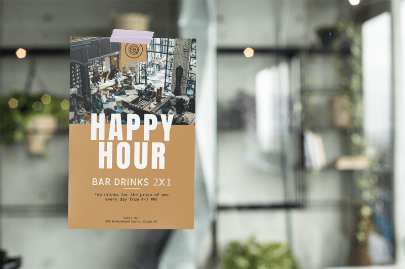
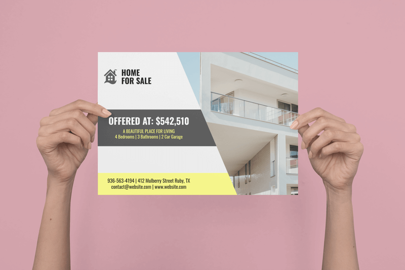
Use an appealing image at the top and start with bold text that gives your flyer personality. After this initial introduction, help your reader move their way down your flyer by creating a visual hierarchy with your text. Headings, text sizes, white space, contrasts, justification, and bright colors can all be used to lead the eye down and maintain the attention of your audience. If you’re worried about how you can create your own flyer that works, you can always use a flyer design template to make this even easier. The base structure will be provided and all you have to do is enter your information in the professionally designed template.

💡 Pro Tip: Boost your brand’s visibility with polished and professional flyer mockups that leave a lasting impression.

6. Choose Your Images Wisely

Since you’re trying to make your flyer visually appealing, it only makes sense to use bold colors and attractive images. As you browse potential images, only consider those that are of the best quality. This means great resolution, sharp, good contrast, and are relevant to what your flyer is for.

The orientation of the image also matters. Let’s say you want to use an image for the background of your flyer and it’s horizontal but your flyer is vertical. Your image will get cut off and won’t look how you expected. Make sure your images work for you and make your flyer look as professional as possible.

PRO TIP: Keep in mind that the ideal resolution of your image will depend on whether your flyer is meant for print or if it’s strictly digital. If you’re planning on doing both, go with the highest resolution needed for the best results.

7. Create Branded Flyers

Are you making a flyer for your business or personal brand? Either way, make sure your flyer design makes it obvious that it is coming from you or your brand. To create a great branded flyer, include your logo design on the flyer, use your brand’s color palette, and stick to fonts your brand typically uses on other assets. If your brand is already trusted and well-regarded, then knowing that this flyer is coming from you will make your event or announcement more appealing to your audience.

8. Consider Your Color Palette

Yes, we just mentioned sticking to your brand’s color palette, but this doesn’t mean you have to limit your use of color to this in all aspects of your flyer. It’s more than ok to incorporate other colors into your design. Of course, stick to colors that make sense for your flyer’s purpose and that evoke the feelings you want to inspire.

If you’re hosting a summer music festival, using bright colors that are reminiscent of summer is a great idea. In the same sense, if you’re creating a flyer for a holiday toy drive, using the colors of the season is recommended. Use your judgment to decide what colors make the most sense so that your flyer attracts the right audience.

9. Keep Your Audience in Mind

Finally, don’t lose sight of your audience. Your flyer is meant to attract their attention and lead to some type of action. It may sound pretty basic to tell you to design with them in mind, but it can be easy to forget about them halfway through the process. While you work, think about what will appeal to them but keep your design relevant to what you’re advertising. There will be clear differences when designing a flyer for a children’s event compared to a business flyer. Look for inspiration online to help you stay focused and use elements that will help you attract the right audience.

Flyer Design Made Easy

With this information, you’re now more than ready to design an effective flyer. Keep in mind that flyer templates are always an option because they have the basic design down and you just have to worry about adding in your elements and information.

“I was able to make a cool flyer design in no time with Placeit’s flyer templates!”
Elsa Lund 5/5

Creating a Flyer Design Is As Easy As Can Be

Not matter what type of event you’re trying to promote, creating an effective flyer design is essential. From using the right amount of text to choosing a layout that works for your announcement, learn all about how to design an impressive flyer. Don’t forget that you can simplify this process by using a flyer template that will ensure you’ll get it right every time.

Make a Flyer Design!
Hundreds of Freebies for Your Project!
Get Freebies
0 CommentsClose Comments

Leave a comment

Scroll Up