Everything You Need To Know to Succeed in Mobile Apps & ASO Marketing
The essential free guide to optimizing your mobile app marketing strategy! Best practices, tips, ASO marketing, and research… all in one place.
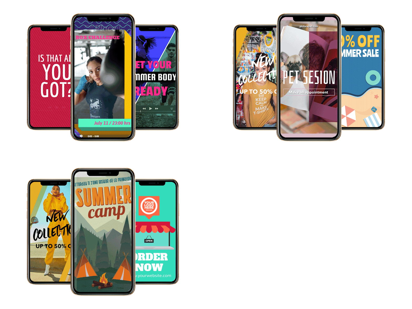
🔥 Check out Placeit’s app!
Continue reading, or skip to another section of the guide:
Mobile App Pre-Launch Checklist
App Store Submission And Optimization
Mobile App User Acquisition Strategies
Mobile App User Retention Strategies
Improving Your App Performance
Mobile App Pre-Launch Checklist
What you will learn in this section:
- Valid reasons to build an app
- App Design and User Experience
- Usability Tests
- Setting Up Your Digital Properties
- App-Specific Keyword Research
Valid Reasons To Build An App
Hold your horses, does your business really need a mobile app? Developing an app demands a lot of effort, time, and resources which your business could probably make better use of somewhere else. So prior to getting knee-deep into the App Marketing ecosystem, let’s go through a few valid reasons for developing an app:
- Your app awesomely solves a problem
- Your app’s features are unique and outperform the competition
- Your app makes life simpler
- Your app empowers its users
- Your app has features not available in a mobile browser
Have you ticked them all or at least the majority of them? If so, congratulations your app is on the path to success. If not, sad as it is, your app might be doomed to failure straight from the start and your valuable resources might go to waste.
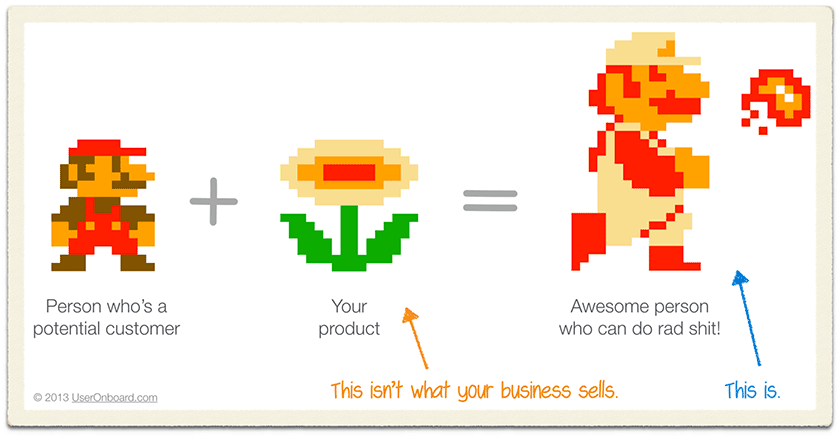
Users get apps and products to enhance themselves. They want to save resources, become more efficient, save time, etc. Your app needs to have clear benefits for its users and it should empower them to do awesome stuff. Want to read more on the subject? Check the blog post from the guys from Buffer about selling benefits vs selling features, super recommended.
About App Design & UX
Your app needs an excellent design to be successful. A well-thought, well-designed, and well-tested user interface will consequently provide a satisfying user experience (UX). Yes, you don’t only need a great idea and expert app developers but you also need a talented UX Designer to develop the app your business needs. An app needs to be fast, needs to have a beautiful design, and needs to be intuitive because, on the contrary, complicated-cheap-looking apps perform poorly on both the smartphone and the app store.
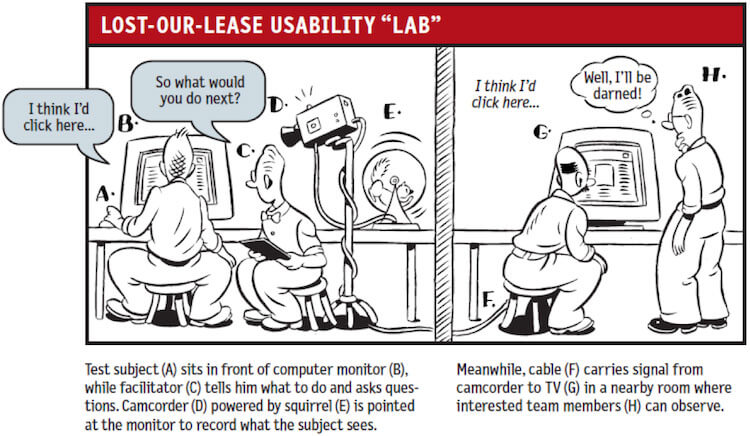
The best approach to sort an app’s possible usability and design issues is to beta test early. My suggestion is to set a DIY usability “lab”, ask close friends, relatives, or volunteers for permission to record them, and then ask them to do stuff in your app. An app feature that could seem obvious and visible to you could be hard to find for the average user, but since you developed the app and you’ve been using it now for probably a long time, you might have become familiar with it. One of the goals of this test is to confirm that users will use the app the way your team designed the app to be used.
If you want to learn more about accessibility and usability please check Steve Krug’s awesome book “Don’t Make Me Think, Revisited”. This practical book gives the best advice on user experience and web usability and can be perfectly applied to app development. It’s a must-have for every tech company.
Ingredients of a DIY Usability test:
- A brave volunteer
- An intelligent facilitator
- A walk-through script with “missions” for the test subject
- One or two cameras to record the session
- A nice reward for the volunteer’s time and effort
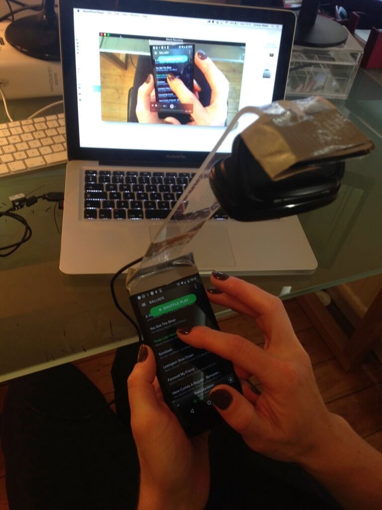
When testing, be open to criticism and suggestions and pay attention to the testers’ reactions. This early feedback will boost your app’s chances of success. Remember, test early, test constantly, and keep improving. If necessary include an in-app walkthrough to quickly demonstrate how to use an app’s main features.
Further Reading on Usability and Design:
– UI Design Do’s and Dont’s for iOS as suggested by Apple Developer’s website
– Usability-Accessibility tips for Android apps as suggested by Google
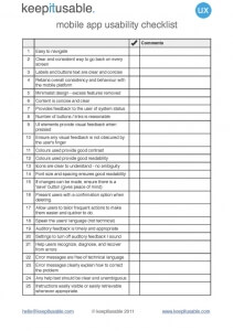
– The guys from Keep It Usable created a Mobile App Usability Checklist, download it, print it, and use it!
Building an Online Presence / Establishing a Following
According to Google’s so-called Zero Moment of Truth (ZMOT), mobile has changed the way we live and what we expect of brands. We now take immediate action whenever we want to learn, find or buy something. Moreover, our expectations are high and our patience is low, therefore, the brands that do the best job of addressing our needs in each moment will win.
So let’s say Tom is into rap music and wants to figure out the lyrics of a song by Jay-Z. The user searches for “lyrics app” in both the App Store and Google and a so-called Musixmatch app shows first. The user decides to dig deeper about Musixmatch and visits their website and Facebook page. The user stumbles with a friendly website and a Facebook page liked by thousands of users which provide enough validation for the user to take action and download the app.
This is just one scenario portraying the importance of building an online presence before or at the time of releasing an app. The average user now needs different touchpoints to connect with a brand, your brand. Be proactive and reduce uncertainty by communicating quality, authority, and reliability on your different digital properties.
Before Launching Your App You Should:
- Build a Website / Landing Page
- Secure Social Media Handles: Facebook Page, Twitter, Google+, Instagram
- Build and establish a following for your recently acquired Social Media accounts
How to Get Started With a Modern Landing Page:
A landing page is where a user lands after clicking a link. It MUST show what the link promised in order to keep the visitor interested and avoiding high bounce rates. An effective landing page leads to conversion (app download) so make sure you display the information your future app users need in an appealing and informative fashion.
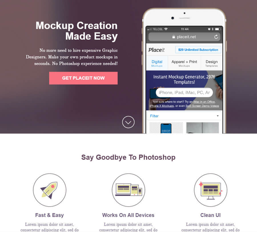
Here are a few cool template ideas to get you started with:
- https://unbounce.com/landing-page-template/premia/
- http://www.scoopthemes.com/templates/SevenApp/
- https://themewagon.com/themes/polo-responsive-app-landing-page-template/
- https://designsmaz.com/best-responsive-app-landing-page-templates/
Keyword Research for Your Mobile App
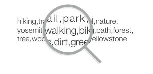
If you were wondering how to make an app rank better, the answer is with the correct use of keywords. With smart use of keywords, potential users will be able to find your app. Performing keyword research prior to releasing your mobile app is nowadays a must-do.
Here’s a quick guide on how to find the right keywords for your app:
- Besides searching in Google, use keyword tools. I recommend using keyword tools like SEMRush, Answer The Public, or Keyword Tool to discover the search queries and keywords that people are typing in. Start a new spreadsheet and type your findings in.
- Next step, keyword spying. Look at the keywords that your competitors are using. Tools like Search Man, App Trace, and Sensor Tower allow you to look at your competitor’s keywords. Transfer your research to your keyword spreadsheet.
- Now it’s time for good old review mining a.k.a. searching for keywords on app reviews (yours and the competitors’). On iTunes, filter reviews by “Most Useful” or “Most Favorable” and check the vocabulary that the users are using to refer to the app’s functionalities, most likely, these will be positive keywords. This research provides helpful insight into how are users actually talking about the app.
- And last but not least, go outside and ask people about how they would search for your app if they wanted to find it in the app store. Best results are achieved if you ask specifically to the persona you are targeting. This research will provide long-tail keywords which are also very useful. Sometimes we rely too much on technology and forget about the value of real human interaction and the helpful insight that it provides.
Continue reading, or skip to another section of the guide:
Mobile App Pre-Launch Checklist
App Store Submission And Optimization
Mobile App User Acquisition Strategies
Mobile App User Retention Strategies
Improving Your App Performance
App Store Submission & Optimization
What you will learn in this section:
- App Store Optimisation (ASO Marketing)
- App Store Submission Guidelines
- Mobile App Marketing
- Mobile App On-Page Optimisation
- Mobile App Off-Page Optimisation
App Store Optimization (ASO)
Prior to submitting your app to the app stores, it is important to get yourself familiar with mobile app marketing and ASO. The App Store Optimization (ASO) process will make your app rank higher in an app store’s search results. Are you doubting of the power of ASO Marketing? Research by both Nielsen and Forrester shows that inbound and organic channels in the app store (search and top charts) are the biggest drivers for downloads. Search is critical for mobile app discovery followed by personal recommendations (word of mouth), blogs, and the app store’s top charts.
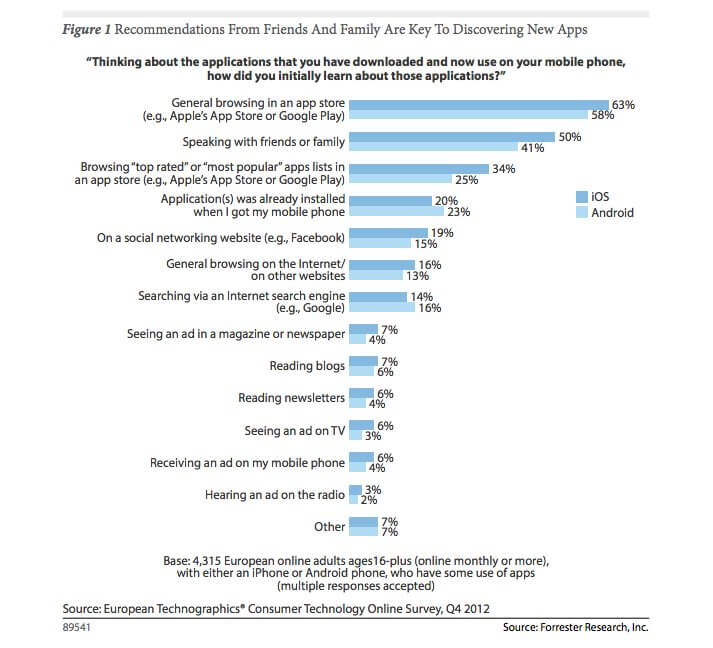
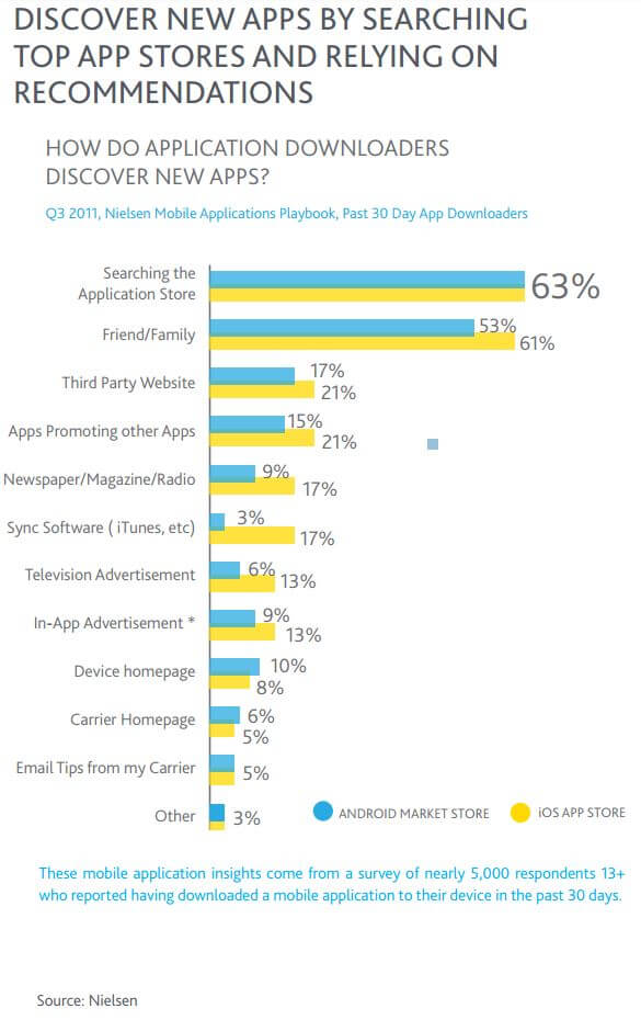
The study also looked at how important organic app acquisition was. Retention rates after 30 days were 156% greater for organic app installs than for paid app installs. Therefore, it is fundamental to engage in App Store Optimisation best practices to make an app succeed.
Both Apple and Google strive to return the best available results for a determined search query, so the core purpose of optimizing an app for the app store is to let the app store search algorithm know that your app is most likely what the user is searching for. It might sound easy but keep in mind the massive amount of apps that populate the mobile app stores. Android users are able to choose between more than 2.2 million apps and Apple users are able to choose between more than 2 million apps according to this recent study.
You need to know exactly what is your app’s value proposition and you also need to understand your target customer persona and the keywords they might be typing in the app store’s search bar to find what they are looking for.
In order to improve an app’s discoverability, you need to do both On-Page and Off-Page optimization (accurate metadata) which means you need to become a master in the art of keywords.
App Store Submission Guidelines
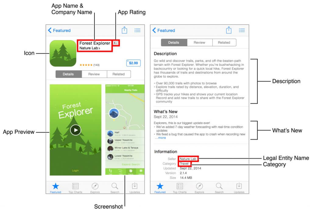
App On-Page Optimization
As in website SEO, your mobile app’s metadata should reflect the app’s core experience and should be updated as changes are made to the app.
- App Title: It is the most important for the app store search algorithm. Keep it as short as possible, make sure it is descriptive, and don’t forget to include your top keyword.
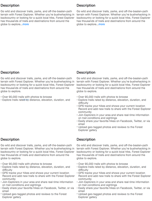
- App Description: You have 4000 characters to effectively describe your app’s features and benefits. Use keywords and long-tail keywords wisely. Search for terms you want to rank for and see how it is that the competition is ranking for those terms and improve upon. The first lines are the most important ones from both user and SEO perspectives.
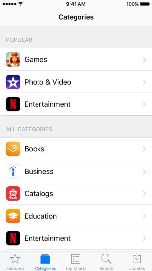
- App Category and Subcategory: This is an opportunity to properly define your product by a specific category.
- App Screenshots: This is your chance to show the app in use and reduce uncertainty by displaying striking screenshots of your app’s benefits. The first screenshot you upload will appear as a search result if no app preview video is available, so place your best screenshot first. To do so, take screenshots of your app on the target device and then add minimal graphic overlays if needed, or as we recommend, follow this guide to get more app downloads with better App Store Screenshots Accomplish a striking screenshot by using Placeit’s iOS Screenshot Templates, check below the difference of using and not using a tool like Placeit’s iPhone Mockups.
For further details on screenshot requirements for the App Store, read the iPhone Screenshot Size and iPad Screenshot Size guides.
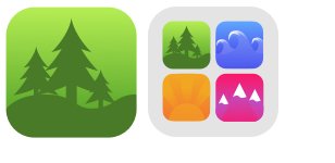
- App Icon: Avoid the use of text on your icon. The icon might be the most important piece of your branding strategy. Make a great first impression transmitting quality by design.
- App Video Preview: App Previews are the first thing users see in a search result. Show how intuitive your app is by uploading a short video of your app in use. It is not mandatory but a video transmits much more than simple images. An app preview demonstrates the features, functionality, and user interface of your app in a short video that users can watch right on the App Store.
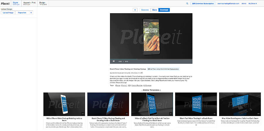
You might like checking our app video mockups to stand out from the crowd.
- Apple recommends using iMovie and Final Cut Pro X to create and edit short videos but, as seen in the preview above, Placeit Video works just as well. You can preview your landing page o special screenshots of the app. For further App Preview specifications, head to App Preview Properties.
Follow these easy steps to deliver your screenshots and app preview:
- Prepare up to five screenshots and one optional app preview for each device type you support, using the highest-resolution device size (5.5-inch display for iPhone devices and iPad Pro for iPad devices). This set can be used across device sizes and localizations. Go to the Version section under App Store on your app’s page:
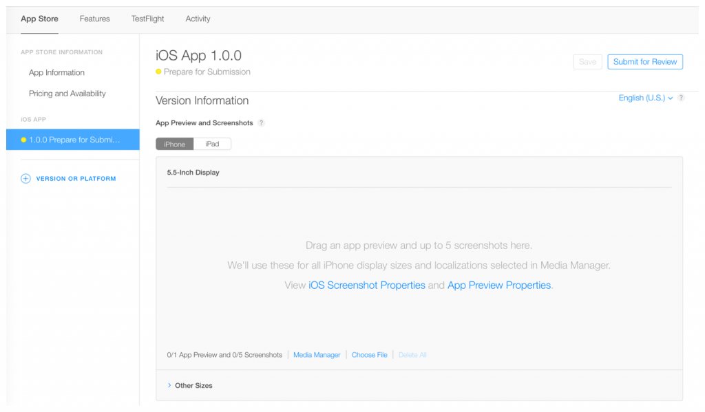
- Drag your highest-resolution display screenshots and app preview into the well:
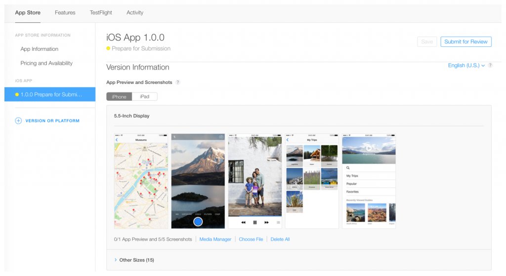
- Click on “Other Sizes” to see which display sizes have been scaled from your delivery. For example, it may read “Using 5.5-inch Display” for iPhone.
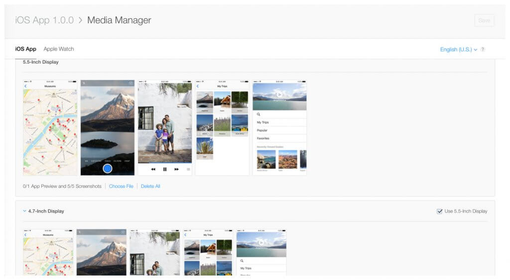
- Customize display sizes or localizations, using Media Manager, if your app doesn’t display the same across localizations or device sizes:
App Off-Page Optimization
In an effort to display the most relevant results for the user, the app store search algorithm also ranks apps by popularity (amount of downloads) and quality (based on review ratings).
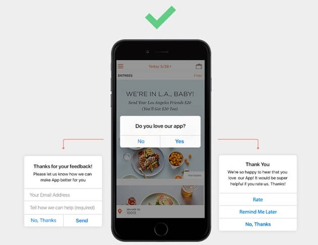
- App Ratings: It is important to politely ask users to rate your app because it influences your app’s visibility on the app store. Users are affected by others’ favorable evaluations of apps. If users see that an app has hundreds or thousands of positive 4 or 5-star reviews, then new users can infer that the app does the job that it advertises and will consequently download your app. And yes, lower star ratings hurt search rankings.
- App Reviews: Same as ratings, (positive) reviews are a critical piece of the ASO puzzle and represent an important social psychological factor. It’s hard to get users to write a review for your app but with enough creativity and the right incentives it is possible to accomplish.
- App Downloads: Another important determiner is how many times an app has been downloaded. Get your app marketing right and early in order to get the most amount of downloads in the least amount of time. Plus, if your mobile app makes it to the top charts you can be sure that a lot of users will start downloading the app just because it is featured there.
Further reading on Mobile App’s Metadata:
- iTunes Connect Developer Guide on iTunes Connect Properties and Metadata
- Apple’s Guide on Optimizing for App Store Search
- Google Support Guide on Graphics Assets, Screenshots & Video
Continue reading, or skip to another section of the guide:
Mobile App Pre-Launch Checklist
App Store Submission And Optimization
Mobile App User Acquisition Strategies
Mobile App User Retention Strategies
Improving Your App Performance
Mobile App User Acquisition Strategies
What you will learn in this section:
- App Marketing Strategies and Promotion
- App Launch Video
- Paid App Advertising Marketing and Promotion Strategies
Mobile App Launch Video
Video remains the best option to pitch or sell an idea. As proved on crowdfunding platforms such as AppsFunder, Kickstarter, or Indiegogo, and as suggested on entrepreneurial best-seller books as The Lean Startup, a compelling video of your product will help to convince the masses. Effectively show in a video how your mobile app features make life simpler and how the user will be benefited from the use of it and you will be on the road to success. Remember to connect with your audience on an emotional level and to portray positive feelings.
What to include in your app launch video:
-
- A character with a goal
- A character with a conflict
- Your app awesomely solving the character’s conflict and enabling him/her to accomplish his/her goal
- A joyful resolution
Creating And Seeding Content
To get customers today, and to keep them tomorrow, you must develop a content marketing strategy to deliver indispensable information in addition to the products and services you provide. – Joe Pulizzi & Newt Barrett
One of the cheapest and most effective methods of driving traffic to your mobile app site is by constantly creating original content that appeals to your audience. Content is king, hence its inclusion in this mobile app marketing guide. Driving organic inbound traffic to your website with content allows search algorithms to know that you have something useful worth displaying on the top results. Deliver content that is vital and relevant to your target market and you will take on an important role in their lives.
Apply the B.E.S.T. formula so that your content marketing strategy is:
-
-
- Behavioral: Everything you communicate with your customers has a purpose. What do you want them to do?
- Essential: Deliver information that your best prospects need to succeed at work or in life.
- Strategic: Your content marketing efforts must be an integral part of your overall business strategy.
- Targeted: You must identify targeted buyers precisely so that you can create truly relevant content.
-
If you want to get the best on Content Marketing, take a look at Get Content Get Customers book by Pulizzi and Barrett.
Once you have created content, the next step is to promote your content online. This process is known as content seeding. Share your freshly created content on your digital properties such as Facebook Page, Blog, and Twitter account and also join relevant conversations on Quora, Reddit, and forums of your industry where users could benefit from a link to your content. Get creative, track which medium results are the most effective for your business, good luck seeding your content!
One thing that makes content great is the use of great imagery. Placeit is a website where you can create high-definition iPhone and Android mockups without needing any graphic design skills, for instance have a look at these brand new iPhone X Mockups you can use to promote your newest app version. Usually, Photoshop is needed to accomplish this but with Placeit you just need to drag and drop a JPG file, a PNG file, an MP4 file, or even a URL to create an original image or video to promote your app in Social Media in seconds. Bookmark this resource!

App Search Ads by Apple
Apple’s Search Ads allow your app to be featured at the top of relevant search results on the Apple App Store. One of the benefits of this paid approach is that you pay only when a user taps on your ad which means that you also benefit from “free” brand exposure. As previously said, the App Store is the primary place where people search for apps so this new App Store feature just makes sense. Watch Search Ads promo video below.
AdWords APP Promotion (Universal App Campaigns)
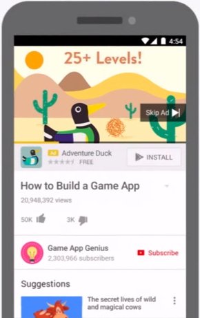
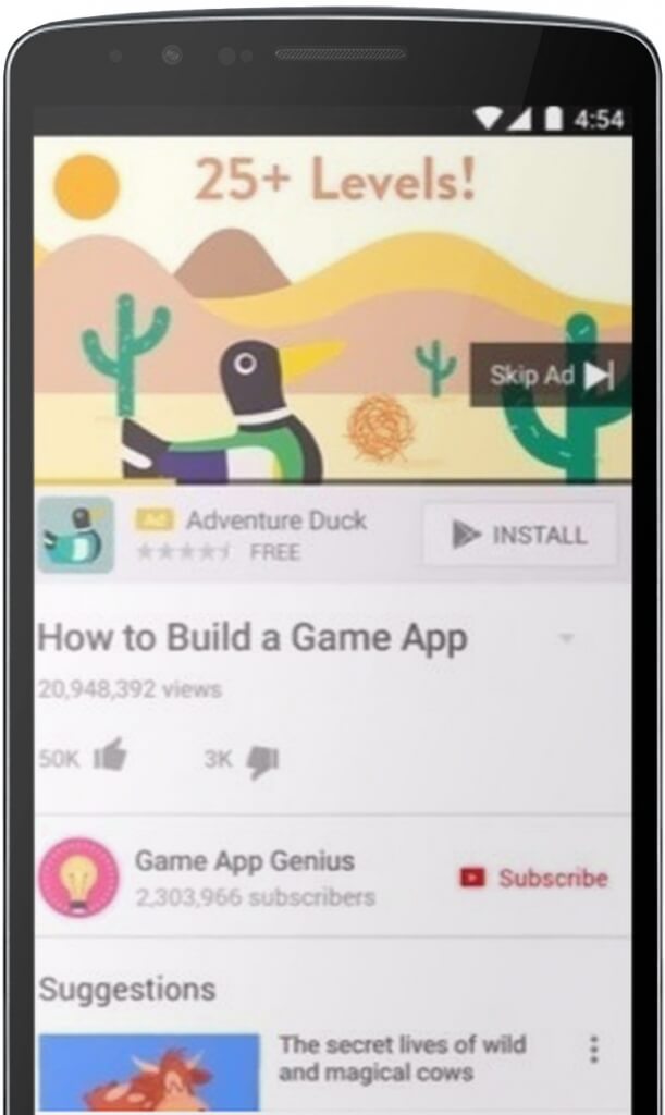
Google’s Universal App Campaigns is the advertising tool to use to get your app to the users who will love it. You are able to promote your app to users across Google Search, Google Play, the Google Display Network, AdMob, and Youtube with just a few clicks. When you set your bids, you tell AdWords the amount you’d like to spend each time someone installs your app. So, if you set your daily budget for $30, and your targeting cost-per-install is $3, you’re aiming for about 10 installs per day from your ads. Watch Universal App Campaigns promo video below.
Facebook Ads for Apps
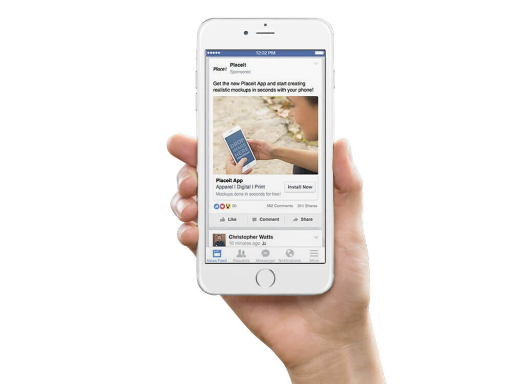
Facebook Ads for Apps allows you to grow your app user-base by paying to reach a larger audience and increasing your installs. You can promote your mobile app in the Facebook News Feed. People can like, comment, share, and most important, install your app with a simple tap. With more than 1 billion daily active users, Facebook proves to be a great place to advertise. Its powerful targeting features allow you to target people by platform, interests, age, and more demographics or connection to Pages and apps which allow app owners to highly refine advertising efforts.
Continue reading or skip to another section of the guide:
Mobile App Pre-Launch Checklist
App Store Submission And Optimization
Mobile App User Acquisition Strategies
Mobile App User Retention Strategies
What you will learn in this section:
- Mobile Apps Churn Rates
- How-to Mobile App Push Notifications
Mobile App Retention Strategies
Love at first sight exists. Providing a superb first-time user experience is key to retain users and prevent app uninstalls (consider a quick in-app walkthrough if needed). According to Localytics research, the first 30 days after a new user downloads your app is the most crucial time frame for influencing long-term engagement and retention. You need to get users to regularly use the app as early as possible to retain them for a long time.
Unfortunately, an awesome first-time experience might not be enough to keep a user coming back to your app.
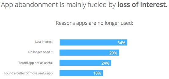
Google found out that the average app user has around 36 apps installed on their smartphone and only 9 of those are used daily. Talk about a saturated environment. The same research shows that 1 in 4 installed smartphone apps are installed and never used. Actually, consumers often abandon apps immediately after a download. But the main reason for app abandonment is actually caused by loss of interest, as shown in the graph below.
Design a consistent and recurring use of your app to keep your users coming back to your app.
Mobile App Push Notifications
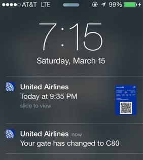
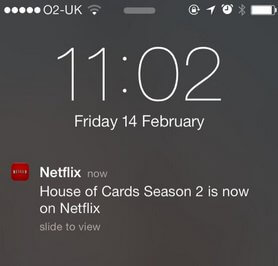
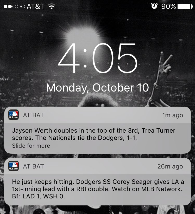
Alerts represent a great opportunity for retaining users and avoiding getting lost in the app fog. Nevertheless, notifications should be implemented wisely. And by wisely I mean at the right time and only when necessary.
It’s true that notifications can be annoying, really annoying maybe. But this happens because certain app developers use app notifications imprudently. Don’t be one of those instead.
A lot of apps ask for notification permissions too early. An intelligent app dev tackles the notifications subject as a personal relationship. You usually can’t start asking for much right at the beginning of a relationship. A user knows little about your app when he first downloads it and installs it, so the probability of the user accepting push notifications is little. In the image below you can see how users are more likely to accept push notifications once they have completed several sessions and less likely when they have just recently downloaded the app.
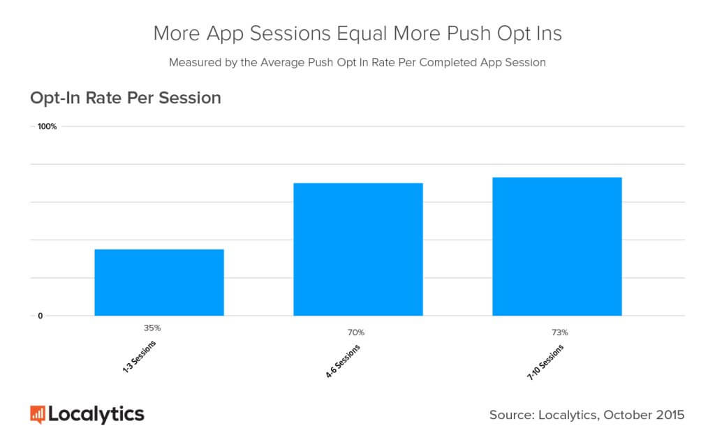
“Because push notifications are used to bring that relevant content to the forefront, negating the need for users to go searching for it, the resulting impact on engagement is substantial.” –Localytics
Keep your users informed and engaged with your app with push notifications that are personalized, relevant, and well-timed.
Continue reading, or skip to another section of the guide:
Mobile App Pre-Launch Checklist
App Store Submission And Optimization
Mobile App User Acquisition Strategies
Improving Your App Performance
What you will learn in this section:
- App Store Mobile App Reviews
- Tools And Services To Power-Up Your App
App Store Mobile App Reviews
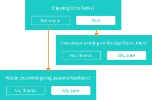
As previously said, encouraging happy customers to leave reviews is important for ASO. App reviews provide insight and feedback that the R&D department can’t possibly provide plus it helps convincing new customers. Keeping an eye on user reviews and comments provides the information needed to improve and develop new features. Also, app reviews help to uncover performance bugs that most likely require a prompt response from your side.
Please read Circa’s The Right Way To Ask Users To Review Your App post on Medium to learn a great trick they used to get the positive app reviews they need.
Tools & Services To Power-Up Your App
The app journey doesn’t end when the user gets your app. It’s important to analyze in-app user behavior in order to continuously improve the app and provide a better experience. Although this subject is out of the scope of this post, here are a few companies that promise to give you valuable analytics and behavioral insight. If you give any of them a shot, let us know your results by commenting on this blog post.
- Apptentive is software that enables companies to start conversations with their customers, listen to them, respond, and use insights gained to build better apps.
- AppAnnie produces business intelligence tools, app analytics, and market reports empowering app developers to focus on what they do best—creating apps—while leaving the complex data analysis and reporting to the experts in business intelligence.
- Appbot helps app developers, product managers, and support teams build, market, and support mobile apps thanks to intelligent app review analysis reports.
- AppAnalytics provide real/time mobile app analytics for the entire customer lifecycle with event-based analytics, crash analytics, heat map analytics, and gesture recognition.
- Appsee‘s mobile analytics platform provides an in-depth analysis of your user’s behavior, allowing you to deliver the ultimate app experience. Its services include heatmaps, recorded user sessions, analysis of user’s behavior, and more.
“If people are not using your app as much as you think they should, it is time to figure out why. The first step is examine your analytics and find out where in your app your users are dropping out, and what could be causing it.” –Apptamin
- Mobile App Pre-Launch Checklist
- App Store Submission And Optimization
- Mobile App User Acquisition Strategies
- Mobile App User Retention Strategies
- Improving Your App Performance
If you have more tips on Mobile App Marketing Optimization please share them with us and join the discussion! Don’t forget to Bookmark this guide for future reference.
Visit Placeit Digital for hundreds of free mockups of iOS and Android devices!
💡 Check out these 10 app store optimization (ASO) mistakes you should avoid.
