Font Pairing Made Easy

A Guide for Non Designers

Have you ever come across a stunning font pairing and wished you could replicate it? It’s possible that, until now, your attempts at combining fonts haven’t quite hit the mark. But that’s about to change! You’re about to become a font guru with this font pairing guide. 🧙🏼

It’s time to unlock the best tips designers use when creating their designs so you can also try them. Say goodbye to dull and conventional font pairings; instead, create your own and transform your work from drab to fab. Let the magic start with this easy guide packed with useful tips and examples.

What Is Font Pairing?

Introduction to Font Pairing

In simple words, font pairing is the art of combining two or more fonts to create a harmonious, stylish, and well-balanced design. Whether it’s a logo, a poster, a flyer, an invitation, a social media post, a website, a presentation, a document, or any other design that contains text.

Why Is Font Pairing Relevant in Any Design?

At first glance, it may appear evident why font pairing is relevant. However, it not only creates a visually appealing look but also serves to:

💡Tone and Messaging:

Font pairing can determine or change the tone of your message, conveying different emotions or messages.

😉 Coherence in Branding:

It provides a cohesive and coherent appearance, which is vital for branding.

⭐ Professionalism:

When done correctly, it demonstrates professionalism and elevates the overall appearance.

✨Sophistication and Unity:

Applying these concepts ensures your design looks sophisticated and unified, leaving a positive impression that will last.

✏ Enhanced Readability:

Font pairing enhances readability, helping readers quickly and easily find relevant information.

@placeitapp Whether you're designing for print or web, these tricks will help you create harmonious and eye-catching text combinations. Check out more info in our link in bio! ⬆️ ‌ #fontpairing #fontcombinations #madewithplaceit #tshirtdesign #graphicdesign #fontpair #fontstyle #designtips ♬ Puff - Hany Beats

Types of Font Families

This is our first stop on our font pairing journey. Learn about the most popular font categories to gain context and better understand the fonts we’ll explore today. Let’s explore these font families, their meanings, and how to distinguish them.

Serif Fonts

⭐ Top 3 favorite fonts: Playfair Display, Yeseva One, and Gilmer Sans.

Sans Serif Fonts

Unlike serif fonts, sans-serif fonts lack the decorative strokes or lines found in serif fonts and feature clean lines or semi-rounded details instead.

They are often associated with a clean, minimalistic, and modern aesthetic.

Sans-serif fonts are especially well-suited for screens and are easily read at smaller sizes, making them suitable for print and digital materials. They are commonly used in websites, blogs, apps, social media, and flat design. Additionally, they work well for body paragraphs.

🚀 Top 3 favorite fonts: Poppins, Raleway and Proxima Nova. 

Script Fonts

🌈 Top 3 favorite fonts: Barcelony, Rampsey and Blowing.

Monospace Fonts

You can quickly identify monospace fonts as they occupy the same amount of horizontal space. In other words, you can distinguish them because they have space between each letter. They resemble old typewriters and are mainly used in coding and tech.

👾 This gaming template uses the ‘6809 chargen’ font, which is a monospaced font, alongside a display font called Starblaster.

Slab Serif Fonts

They’re also referred to as Egyptian or Clarendon fonts. These are easily identifiable because they’re thick, prominent, and blocky or rectangular. The serif strokes are typically either blunt and angular or soft and rounded.

✨ In this template, you can witness a harmonious fusion of Dela Gothic One, a beautiful slab serif font, with the clean elegance of a Sans serif font: Brulia.

Display Fonts

Also known as decorative or ornamental fonts, they are highly recognizable due to their cursive and artistic letterforms. These fonts are ideal for branding, packaging, wanted posters, and other creative applications, as their primary focus is aesthetics rather than readability. Therefore, Display fonts are perfect for short texts like headlines, subheadlines, logos, posters, or Instagram stories.

😊In this image, Cormorant and Delmera are both display fonts.

😉✏ Before diving into our golden tips, you might want to read our 12 Graphic Design Principles to Swear By

Six Tips for Easy Font Pairing

✨ 1. Ensure Contrast

When we talk about contrast, we’re referring to using two or more fonts that differ from each other. This helps readers better understand our text at a visual level and assign specific roles to each font, allowing them to stand out and differentiate themselves as distinct pieces of information. For example, all of your headlines, subheadings, and body paragraphs should be different somehow.

To achieve contrast, we can:

By applying some of these actions, you’ll be ensuring contrast and a coherent design.

🤩 2. Find Balance

Design is no exception when it comes to balance. To ensure a green tick regarding font pairing, you need to aim for visual harmony.

👉 For example, a design won’t look good if it’s overloaded with bold and thick typefaces. Instead, if your headline is already imposing, the rest of your text should be softer and less weighty, and vice versa.

It’s important that in this creative process, you trust your gut and, even when in doubt, find some references online.

Placeit, for instance, is such a great and easy example to find a wide range of curated font combinations that professional graphic designers made. Later, we’ll dive more into this topic. 😉

⭐ 3. Give Each Element the Weight It Deserves

Once again, one of the key principles of font pairing is to follow a fundamental design concept: hierarchy. In every design, you likely know that there are different sizes to ensure visual harmony.


For example, elements like size, weight, and style are potent allies in creating a cohesive look. Whether it’s for a design or a document that includes text. Let’s learn more about them:

📏 Size

It’s no secret that we use various text sizes to clarify information or highlight specific aspects.

When creating your font pairings, you can decide which part of your canvas you want your viewers to see first and which element you want to give more importance to, such as a title, a benefit, or a keyword. Typically, though not strictly a rule, the largest and boldest words carry the most significance, with the rest of the content being smaller.

💣 Weight

Today, most fonts offer different weights, ranging from thin to black. Choosing a specific thickness or boldness adds contrast and dynamism to your texts and empowers a word or text to convey more information.

For example, using bold text can emphasize or highlight relevant information or draw attention to specific points.

🚀 Styles

Such as italics, bold, or underlines are valuable for achieving visual hierarchy and adding emphasis. They enhance the overall appeal of your design, preventing it from appearing flat.

💡 4. Learn About the Personality of Each Font

Just like colors, fonts can convey different perceptions and feelings. Therefore, before picking your fonts, you need clarity about your design goals to choose the proper font and efficiently achieve your desired look. For example, if you aim to communicate a playful look, Times New Roman is definitely not the choice. But Gaegu might be the ideal font for this jolly style. 

🌈Check out our color palette tool to make the most informed decision on color branding! 

Also, when font pairing, consider the essence of each font. Some typefaces have a stronger personality, so they need to be complemented with one with a softer or neutral look for a balanced design. This example uses the fonts Manrope, Black Rose, and Sough. 

So, How Can You Check the Personality of Each Font? Here Are Some Criteria to Consider:

At first glance, it may appear evident why font pairing is relevant. However, it not only creates a visually appealing look but also serves to:

🔤 Composition

Here, you’ll need to closely examine the visual details, such as the shape of the letters – whether they appear rounded or flat. Overall, rounded tips suggest a friendly, approachable, and informal feel. While straight lines typically convey a sense of order, precision, professionalism, and cleanliness.

✨ Style

At first glance, ask yourself, what is the first thing that comes to mind when you see this font? Does it convey a sense of solidity and formality, perhaps suitable for a newspaper? Or does it feature more diverse and rounded shapes, giving off a playful and accessible appearance?

✏ Legibility

Another factor to consider is how easy it is to read. As we’ve seen, serif and sans-serif typefaces are usually great for readers. In contrast, display typefaces may be more beneficial for artistic and creative designs where legibility isn’t the primary concern. This also reflects their personality, indicating whether they are approachable or not.

💪 Weight and Density

Once again, you’ll need to rely on your sense of sight to classify typefaces and uncover their personality. As mentioned earlier, some typefaces are naturally heavy and thick, while others are light and fluid. In this case, the heavier ones convey a sense of solidity, strength, and stability, while the lighter ones give off a smooth and delicate look.

📏 Line Spacing

When we encounter text with tightly spaced letters, it usually conveys a sense of rigidity. On the other hand, typefaces with, for example, monospace style, communicate a feeling of openness and relaxation.

🔠 Going Back to Basics

Remember our lesson on serif, sans-serif, and scripts? Well, serif fonts are typically used in contexts where formality and tradition prevail. Alternatively, Sans-serif fonts provide a more modern and clean look. At the same time, script fonts convey creativity and warmth.

🚀 Take Your Research Further

This point is optional but certainly valuable to provide more context on why that font was created and where it is most commonly used. You can use Google Fonts, specifically the ‘About & License’ section, which provides more details about its origin and occasionally suggests the types of text it works best for. For example, Bebas Neue is fantastic for headings, captions, and packaging. Furthermore, due to its simplicity and cleanliness, it conveys a minimalist and aesthetic look.

🌈 Play Around With It

Once you’ve completed the previous steps, it’s time to contextualize it. You can do this by trying out different online editors or using Placeit. Our font library is vast, and you can quickly see how your font combination works in context. Here, trust your intuition or seek feedback from others.

🌈 5. Use From 2 to 3 Different Fonts

A thumbs-up practice in font pairing is to choose between 2 to 3 fonts. However, the design field offers great versatility, allowing you to experiment with incorporating additional fonts. Nevertheless, starting with the fundamentals is an excellent way to begin your design journey.

The main goal is maintaining harmony in your design without cluttering it with various fonts. By limiting the number of fonts, you achieve a clean and easily readable text and assign appropriate significance to each font in your composition. This balance enhances the overall aesthetic and effectiveness of your design.

✏ 6. Check Legibility and Readability

A typeface’s legibility refers to how easy it is to distinguish between different letters. On the other hand, readability refers to a reader’s ability to decipher, process, and comprehend what they are reading.

Having cleared these two concepts, let’s jump into what you need to know when font pairing. 

📌 Consider the Context and the Goal of Your Design

Before choosing your fonts, have clarity about the objective of your texts. Are you looking to convey a clear message? Or do you intend to experiment in a creative way in which readability might not be the ultimate goal?

🤓 Where Is Your Text Going to Appear?

To choose the right font combination, ask yourself what these texts will appear on. Is this font pairing for a book or a t-shirt design?

This is essential to ensure it’s readable and legible in your selected format. However, sometimes, for branding purposes, we need to pick the right fonts to ensure they’re clear and easy to read. Whether online on your website, email, or social media or printed on a poster, an advertising banner, or a sticker.

🤩 🌟 Want to know more? Learn how to make and sell stickers in a breeze with this easy-peasy guide! 

💡 Take Into Consideration Your Target Audience

To ensure the success of legibility and readability in font pairing, don’t forget to consider your final readers. Using small font sizes for a mature audience or highly decorative fonts for people with visual impairments might not be the best option. Instead, opt for legible fonts like serif or sans serif and help yourself with bigger sizes. 

To sum up, legibility and readability in font pairing go beyond aesthetics; they ensure your texts are easy to read and deliver your message clearly.

🤩🪄 Looking for more insightful tips? Then read our ‘What do graphic designers do‘ post to uncover our designers’ top secrets.”

Fail-Proof Font Combinations

As we always say, you can have space to experiment and play with various fonts. However, here are the main recommendations for font pairing that always work and are sure to get you out of a jam. 😉👇

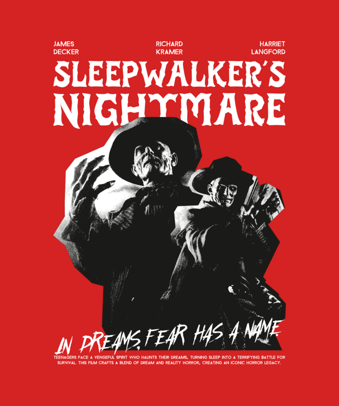
⭐ 1. Use Serif and Sans Serif Together

✨Serif + Sans Serif

🚀 Display + Sans Serif

⚡ Serif + Sans Serif

This is an infallible method that never goes wrong. When in doubt, you can always choose both a serif and a sans-serif font to avoid complications.

The reason why this powerful combination ensures harmony is because of their differences. Their contrast creates an appealing design, establishes a clear visual hierarchy, and helps readers quickly distinguish all the information.

✏ Pro tip: Use Serif fonts for headlines and reserve Sans Serif fonts for your body paragraphs.

✨ Check out these other font pairings that go well together:

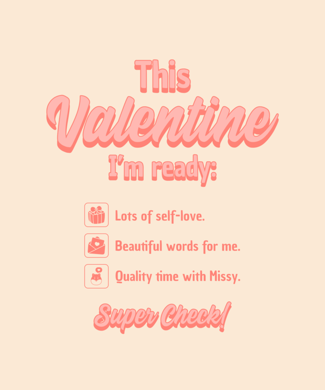
😉 2. Keep It Simple With Fonts of the Same Family

Another great method for font pairing is to select fonts belonging to the same family or designer. Montserrat and Lato, for instance, belong to the Sans Serif font family and together create a harmonious look. 

By doing this, you’ll ensure that your text maintains a consistent aesthetic, making it easier to find balance and achieve a smooth and cohesive look. However, we recommend incorporating contrast by varying the sizes, weights (including extra thin, for example), and styles (such as italics) to ensure that your text remains easy to read.

💡 For example, here, we use two fonts from the Sans Serif family—Barlow Condensed for the top and Bebas Neue for the bottom part.

✨ Heads Up: Our new AI Vector Converter tool is on its way to you! Get ready to transform any graphic from our templates into stunning, editable vectors with no loss in quality. Get a sneak peek! 🚀✨

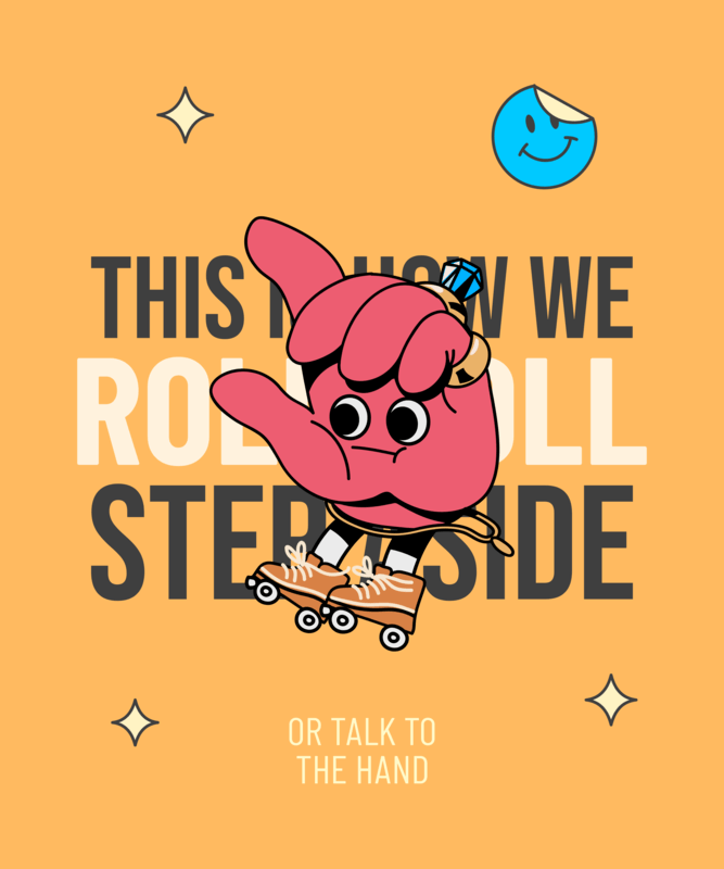
🙌 3. Use the Same Font

This might be the easiest method, but it’s important to add contrast to help ourselves with font sizes and weights to create the appearance of using different typefaces.

For example, take a look at this image; at first glance, you might think it incorporates various fonts, but the truth is, it’s all the same font (Blood Splash). To achieve this professional and varied look, assign the appropriate weight to titles or important words and make use of bold and italics.

This practice can be suitable for any design, including lengthy documents, and it’s perfect for saving time. Furthermore, it maintains visual consistency and creates a unified, clean, and harmonious design.

Proven Font Pairings With Placeit’s Examples

To create various looks, we’ve gathered some common examples based on Placeit by Envato templates developed by our professional graphic designers. Here are our font recommendations for any style you can think of!

Artisanal

Typically, an artisanal font pairing resembles beautiful handwriting with cursive and delicate traces, making it seem like a soft and fluid text.

Aesthetic

As its name implies, this font pairing offers a clean, easy-to-read look. The top choices include Sans Serif, Serif, and Display fonts.

Elegant

This font pairing is known for its simplicity and cleanliness. Occasionally, it introduces an element of style by incorporating script fonts to emphasize specific words while preserving an uncluttered overall aesthetic.

Horror

These horror font combinations are swiftly written with faint, blade-like traces or simulated liquid drips descending from the edges. The overall aesthetic is bold, powerful, and thick, leaving a strong impact.

🌟 Looking for more spooktacular fonts for this season? Browse our Day of the Dead templates for more inspo. 

Playful

Playful font pairings typically involve prominent, rounded typefaces paired with smaller, cleaner fonts to achieve balance and harmony.

Retro

A font pairing with a retro style often includes large fonts, whether straight or rounded, with a slight inclination. At other times, it simulates a handwritten style with a wider appearance.

Romantic

This font pairing style often uses delicate, soft, and fluid typefaces to evoke a charming and affectionate aesthetic that inspires feelings of love.

✨😊💍 You might like reading 25+ Wedding Color Schemes You’ll Fall in Love With

Sporty

Sporty font pairings usually feature large, weighty, sleek, and thick typefaces. Some sports teams, however, opt for cursive lettering to evoke tradition and connect with the enduring styles that define their legacy.

Traditional

This combination of fonts with a traditional style includes prominent and classic elements, such as those of the Serif style. Likewise, it gives a refined and approachable impression.

😊🌟🛠️ Heads Up: Enhance your images like magic with our Placeit by Envato Tools suite! Find from AI design tools to cool editing gadgets to elevate your graphics effortlessly! Discover everything you’ve been wishing for! 💫

Font Pairing Tools Worth Trying

To make things easy, here are some of our favorite font pairing generators. These tools can help you explore typefaces and discover potential combinations.

⭐ Typ.io

This website is a valuable source of inspiration, featuring various categories that offer insights into font choices, including recommendations for the best serif font fonts for headers. Additionally, Typ.io provides essential information about each typeface, including its font family, origin, ideal applications, and illustrative examples.

💡 Monotype

Monotype and Fontjoy work very similarly. They allow you to obtain different font pairings with just one click. Additionally, you can adjust the contrast and size. Best of all, you can edit the headline and body text to insert your own titles and text, allowing you to see how your font pairing would look in real-time.

✏ Fontpair.co

It’s by far our favorite free tool, as it provides relevant information about font families and pairings. Fontpair.co allows you to explore a wide selection of curated font pairings that complement each other. Like other editors, you can also edit the headline and body text to get a more realistic preview. Additionally, when you click on a typeface, the website provides more details about the font, such as its weight (from light to bold), and a direct download link from Google.

Last Words

We’ve reached the end of this font pairing guide! We hope it has been educational and has helped clarify your doubts. 

Remember, in design, you can always experiment and engage in trial and error until you master this art. If you’re not feeling very confident yet, you can seek external resources like the ones we mentioned or even use Placeit as inspiration to observe how our professional graphic designers combine fonts. For beginners, saving this font pairing guide as a reference or source of inspiration is a good idea.

Also, keep in mind the design principles we talked about to make your texts type-rrific and outstanding! Now it’s your time to have fun and make incredible font pairings. 

See you on the next blog. Let us know what you would like us to talk about. 😊✏

Hundreds of Freebies for Your Project!
Get Freebies
Scroll Up