
(& How to Fix it)

How Do You Create a Good Logo?
Most businesses strive for logo perfection. After all, your logo is a fundamental part of your brand’s story. It serves as a visual representation of your brand’s identity and values, setting you apart from your competitors and familiarizing consumers with your brand.
That being said, the pursuit of a “perfect logo” is laborious and unattainable, mostly because art is so subjective. It might come as no surprise then, that one of the easiest, hassle-free ways to create a good logo is to simply avoid creating a bad logo design.
There are some glaringly distinctive characteristics of bad logo designs that you should steer clear of at all costs. By avoiding these mistakes from the get-go, you stand a much better chance of creating a good logo.
And don’t worry if you spot any of these mistakes in your current logo design—they’re easily fixable.
1. Outdated Visuals
An outdated logo can harm your credibility, especially if you’re in an industry that values innovation and creativity.
If a consumer were to type a tech-related subject into Google—like “VoIP services” or “what is a trunk call?”–they would expect to land on a contemporary website with a sleek, modern logo signaling their authority. Similarly, if someone was searching for a custom t-shirt designer, they would expect to arrive on a website with a unique, contemporary logo.
If they came across an outdated design (like this 2008 Airbnb logo), they might not trust your brand’s authenticity.
![]()
You can fix an outdated logo by performing a revamp, steering clear of outdated visuals like clip art, skeuomorphism, and 3D gradients. If you do opt for a retro-style logo, only use in-trend vintage design elements and ensure that the aesthetic is authentic to your brand’s identity.
😊💡✨ Looking for design inspiration? Check out our logo ideas guide! It’s packed with design tips regarding graphic style, colors, and fonts and over 30 ideas sorted into 9 styles to perfectly match your vision.
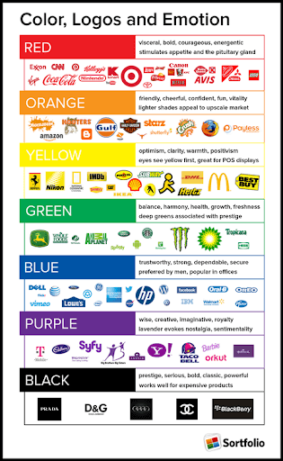
2. Mismatched Colors
Done right, your logo colors should be intrinsically connected to your brand’s image. Think Cadbury’s purple wrapping paper or McDonald’s red and yellow boxes—these colors are almost synonymous with the brands.
Done wrong, however, and your logo colors might drive potential customers away. As one of the most distinctive signs of a poor logo design, mismatched colors can result in a logo that is too bright, tacky, or just plain unappealing.
Try designing your logo in black and white before adding color to ensure a versatile, timeless finish. From there, try consulting a color wheel. Colors on opposite ends of the wheel tend to complement each other, while adjacent colors don’t.
Pay close attention to saturation, tone, and hue, as these play a significant role in the compatibility of colors. And always remember that less is more. According to Adobe, 95% of the world’s top 100 brands only use one or two colors. Any more than three colors and you run the risk of appearing unpolished and inconsistent. So, if you want to feel inspired, check this guide about logo color schemes to find a wide variety of combinations.
3. Irrelevant Colors
Color psychology proposes that different colors evoke different emotional responses and associations. For example, green is generally symbolic of growth and freedom, while black symbolizes prestige and power. 33% of the world’s leading brands use blue in their logo to relate to personalization, communication, and security.
The emotions that colors evoke for consumers are influenced by factors including gender, culture, and past experiences. By defining your target audience in alignment with your brand’s identity, you can manipulate colors to evoke desired responses.
4. It’s Over-Complicated
Of course, you want your design to express everything that your brand has to offer, but when it comes to logos, less is usually more. A design with too much detail might be over-stimulating and lacking in clarity, prompting your audience to swiftly move on.
It might also be unadaptable—your detailed logo might look wonderful on a billboard, but be completely illegible on the side of a pen.
You might choose to simplify your logo by getting rid of some of the text, images, or visual effects. Alternatively, you could create different versions of your logo for simplification and scalability purposes (more on that later!).
5. It’s Too Simple / Generic
There’s a very thin line between an effectively simple logo and an overly-simple logo. For startups, an overly-simple logo might be considered generic or forgettable, which is undesirable when your logo is meant to help you stand out.
If your logo consists of a singular letter, geometric shape, or, quite likely, a combination of the two, it might be time to go back to the drawing board. Remember that brands usually start off with a detailed design and simplify it as they become more established.
Try playing with different images, shapes, lines, and colors. Dig deeper into your brand’s identity and try to encapsulate it with a particular style, font, or vector. Inject some uniqueness into your logo while still keeping it simple. Headspace’s imperfect circle logo is a great example.
![]()
6. Lack of Responsiveness
Don’t fall into the common trap of failing to check that your design remains intelligible and effective on different mediums. A colorful, detailed gaming logo might look great on a hoodie, but when business takes off and you decide to expand to beanies, pins, or keycaps, does your logo hold up?
Counteract this problem by designing a responsive logo. Start by creating a primary logo for large mediums and a secondary logo for small mediums—this could be one logo with an image and text, and one with just an image. As your business grows, you can expand to suit a range of mediums.
7. Poor Typography Choices
Your font, style, size, and text placements are focal points of your logo, which is why typography mistakes are some of the most obvious signs of a poor logo design.
Along with using generic, outdated, and unreadable fonts, here are some common typography mistakes along with some tips on how to fix them.
Inappropriate fonts – Using an inappropriate font can give people the wrong idea about your brand. Always consider your brand’s identity and the image that you want to project.
For example, if you’re a gaming or tech company you might avoid fancy, cursive fonts in favor of bold, modern fonts to symbolize your innovative products. A jeweler, however, might be able to pull off a cursive font to encapsulate their luxurious products.
Too many fonts – Using three or more fonts on your logo design is distracting and messy. Instead, stick to two fonts—one dominant “brand” font, and a secondary font for your tagline.
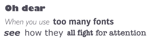
Also, resist the urge to use a pair of fancy or elaborate fonts—incompatible font pairings are another indicator of poor logo design.
Lack of kerning – Whatever you do, don’t overlook the importance of kerning. Kerning refers to the spacing between letters, and should always be handled manually rather than left to the equal spacing tool on your computer. Kerning mistakes can easily result in embarrassing (but hilarious) faux pas that isn’t the most PG-friendly.
8. Relies Too Heavily on Trends
While it’s always a good idea to follow the latest design trends, keep in mind that today’s trend might just be tomorrow’s cliche.
Take the tree figure, for example, which has become somewhat of a template for health-based logos. Or the arc; a strong design used to represent progress or forward-thinking that quickly lost its charm because of its aggressive over-use.
And yes, while Amazon managed to cleverly innovate the arc by placing it in a way that signifies they have everything from A-Z, it was certainly a high-risk, high-reward move. Unless your design is particularly creative, it’s best to think twice before using the latest trend in your design.
![]()
9. Doesn’t Appeal to Target Audiences
Consider your target audience when you’re designing your logo. Different target markets resonate with different designs, images, and color schemes, meaning that a lack of prior market research is likely to result in a poor logo design that your audience doesn’t gel with.
The target audience of a business supplying VoIP call center software is unlikely to resonate with vibrant colors or in-your-face graphics, preferring modern, sleek, or minimal designs.
Similarly, a POD business would cater to their audience and create a logo that expresses their creativity and uniqueness, rather than something erring on the side of overly simple.
10. Lacks Visual Unity
Each element of your logo needs to come together in harmony to create an aesthetically-pleasing, unified image. A logo that lacks alignment or isn’t properly weighted can appear unprofessional and even ignite a sense of unease.
Visual unity can also send subliminal messages regarding your brand’s identity and values. There’s a reason why some of the most popular logos in the world are symmetrical, from McDonald’s famous golden arches to Starbucks’ mirror-imaged mermaid. Not only is symmetry aesthetically soothing, but it suggests brand constancy and stability.

So, if you’re struggling to create unity, injecting symmetry and balance into your design might just help.
Conclusion
Logo revamps are inevitable for any business. However, by avoiding these common characteristics of poor logo designs, you can increase the longevity of your logo so that redesigns don’t become a recurrent, costly endeavor.
Not only that, but your logo will do a much better job of attracting customers and staying memorable.
Fortunately, you don’t have to be a seasoned designer to create an effective logo. With Placeit’s logo maker tool, you can utilize customizable templates created by professional designers to produce eye-catching logos in minutes. No matter if it’s an industrial logo, we’ve got you covered!
🔥 Before you leave, learn how to design in the best way by following the 12 graphic design principles.
About the Author
Richard Conn – Senior Director, Demand Generation, 8×8
Richard Conn is the Senior Director for Demand Generation at 8×8, a leading UCaaS Magic Quadrant recognized cloud communication platform with integrated contact center, voice, video, and chat functionality. Richard is an analytical & results-driven digital marketing leader with a track record of achieving major ROI improvements in fast-paced, competitive B2B environments. Here is his LinkedIn.

1 Comment
GENERAL
nice