
Does an App Need Good Reviews to Be Successful?
We’re constantly told that to become one of the most popular apps, you had better have some good reviews. That reviews will make or break an app. Conventional ASO theory holds that reviews are critical to an app being ranked well in the App Store, and some companies will go as far to pay people to give their app high positive reviews. Convention wisdom says that without good reviews, we’ve got nothing.
But maybe convention’s wrong.
This post is going to explore three apps that do NOT have good reviews but are enormously successful anyway. We’re going to look at Yo, Yik Yak, and Snapchat and try and uncover the secret to their unpopular success.
🔥 Check out Placeit’s app!
Yo App
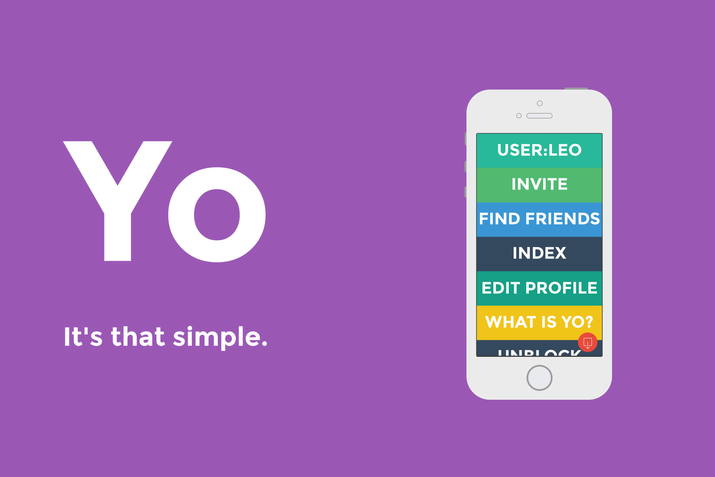
Yo is the ridiculous app that gets all the attention. Available across all platforms and free to download, it’s emphasized distribution over, well, actually doing anything.
The whole idea is that you can send a push notification to your friend that says yo.
Then – wait for it – they can send you a yo back. That is all the app does.
Naturally, their reviews in the App Store… aren’t great. They’re not terrible (I thought we’d ease into this whole terrible review post), but they’re not great.
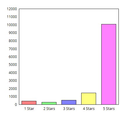
For a little bit of perspective, let’s look at what positive reviews in the app store look like. Clash of Clans is as of writing the top grossing app in the App Store. They have an average rating of 4.5 stars, in a system where 5 stars are pretty much impossible. They have 12,790 ratings across all versions (all the numbers in this post are for all versions).
Of those 12,790, 10,049 are 5-star ratings, or 78.6%.
On the other side of things, 449 people gave it a 1-star rating or 3.5%
What this means is that 78.6% of people felt that Clash of Clans couldn’t be a better app, and 3.5% of people felt that it couldn’t possibly be any worse.
So that’s what some good review stats look like.
Yo’s stats… not so much. They have an average rating across all versions of 3.5 stars – not so bad really.
But they’ve had 185 reviews in the app store, 62 of which were rated 1 star. That means that 33.5% of users felt that Yo couldn’t be any worse. And while they have a lot of positive stars as well, it still means that a huge chunk of their audience is downloading their app and responding with a firm ‘no’

Image via Flickr
Why We Love Yo Anyway
Here’s the crazy thing ‘yo’ (oh puns. How I’ve missed you). Yo has done nothing by gain traction over time, and in fact, they’ve expanded their business beyond just saying Yo. They now offer a whole bunch of things you can subscribe to by simply sending them a Yo. The best example was Yo WORLDCUP, where people who had subscribed would get a Yo every time a goal was scored.
This is actually a really big deal.
The challenge of push notifications is that they’re intrinsically tied to one particular app. So I get Facebook push notifications from Facebook, and Twitter notifications from Twitter, and so on. What Yo is going is taking the push notification and the fantastic micro-interaction that yoes along with it and expanding its functionality. The whole idea of Yo is that they can sell push notifications to companies, and the people can subscribe to them.
- You could get a notification when your table is ready at a restaurant
- You could get a notification when your flight is leaving, or when a taxi’s at your door
- You could get a notification when there’s breaking news, or even more specifically when there’s breaking news about a particular issue, like an election
The possibilities to broker a push notification market are endless for Yo, which is what enticed venture capitalists in the first place.
Yo is successful not for what it is currently – an annoying way to bug your friends, perhaps pushing them to message you on a different network – but rather because it has huge potential for completely changing how we interact with our phones.
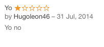
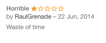
Favorite Worst Reviews
Yik Yak

Image via Flickr
Yik Yak is an app that gives you “a live feed about what everyone’s saying around you.”
Basically, it’s a social media platform that only works within a 1.5-mile radius, but that you can post to (and read from) completely anonymously. It’s found most of its success not so much on the “local bulletin board” vibe that it advocates, but around university campuses instead, where the anonymity and proximity settings lead to lots of in-jokes and (predictably) a lot of gossip and abuse.
Number Crunching
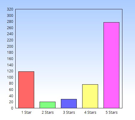
Yik Yak has been rated 521 times, with 118 1-star ratings and 277 5-star ratings. So 22.6% of people think that it’s the worst app ever created and a little over half (53%) think that it’s the best.
Again, those aren’t terrible numbers, but in the world of ASO, when ratings and reviews are (in theory) the lifeblood of your app ranking position, then a 22% hate rate is far too high for conventional success.
And yet it seems to work regardless.
Why we love Yik Yak anyways
First, something like the product that Yik Yaks became is always going to cause problems and controversy, but at the same time always garner a fair few followers. Think about other apps and trends that have been if not nefarious probably not the best thing in the world, like Chat Roulette or even Whisper. Neither of those is showing any signs of quitting.
Yik Yak has the draw of the spectacle.
The other reason why people still use the Yak is the demographic it has hit so squarely on the head. In a world where personal privacy mashes violently with the desire to engage wholeheartedly with social media, Yik Yak’s unique social media solution solves the privacy problem.
Finally, if there’s something like this that’s putting out (in addition to acting as a local bulletin board) a large volume of gossip and heresy, there’s going to be some backlash that’s reflected in its ratings.
So while the Yak’s ratings aren’t great, it’s not really an app that you’d expect great ratings from. It’s always going to rub someone the wrong way, but in doing that it’s going to become more appealing to 10 other people.
Favorite Worst Reviews
Snapchat
![]()
Snapchat is one of the new social media sites sweeping the nation. It’s just a messaging app that lets you send pictures to your friends – but the pictures disappear after 10 seconds. It’s pretty genius.
However, it’s not so genius according to their App Store ratings
Number Crunching
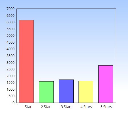
Snapchat has been rated in the App Store 13,861 times, with a whopping 6,162 1 star votes and 2,779 5 star votes. The middle 3 stars are pretty evenly spread at about 1,600 votes apiece. This means that for every 5-star rating, Snapchat is giving up two 1 star ratings.
That’s not a great 1: 5-star ratio.
And yet Snapchat remains one of the hottest new social networks out there. In October 2014 they had 100 million active users and 40% of American 18-year-olds use it multiple times per day.
These are numbers that Snapchat can be proud of. So what’s their secret?
Why we still love Snapchat
Honestly, it’s hard to say. At this point, part of the appeal of Snapchat, irrespective of the user interface or how well it solves user’s needs is the appeal of the network itself. If all your friends are on Snapchat, then even if you don’t like it very much it’s likely that you’ll get on the bandwagon too.
But that doesn’t explain the entire discrepancy.
From reading some of the reviews there seem to be some serious disgruntlement over the way that Snapchat handles its updates:
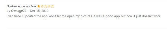
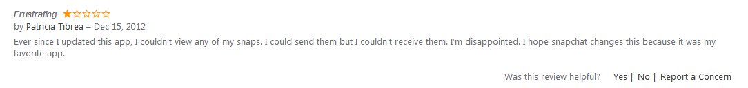
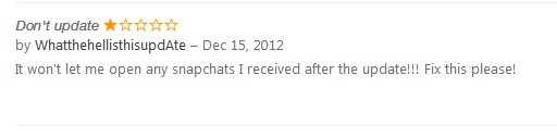
So that’s always going to be a problem. But it doesn’t necessarily explain why the entire problem of why their review is so bad.
Personally, I think that it’s mostly negative bias. When you’re running a network the size and influence of Snapchat, people are unlikely to write reviews when things are going right – Snapchat doesn’t rely on ratings and reviews the way smaller apps or budding social networks might, so there are not CTAs like ‘go review me now!’ What’s more, once a certain size is reached I feel like people except your app to just work, irrespective of whatever else is going on. So the pressure to perform increases.
These factors combined mean that you don’t see nearly as many positive reviews, but if something goes wrong or even simple changes you’ll likely see a whole lot of negative reviews. My money says that the majority of the negative reviews (which are now a huge percentage) for Snapchat emerged later after the network was already established, and the early reviews are where the positive reviews are concentrated. (When it was a new network, and the needed the reviews to succeed, and there was more early adopter enthusiasm and support for the network before it became ‘mainstream’.)
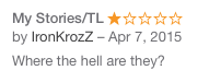
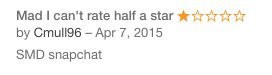
Favorite Worst Reviews
Wrap up
The adage that review equals success isn’t the be-all to end all of ASO. From these examples, it’s clear that tremendous success can actually come from ratings. But that doesn’t mean that you shouldn’t strive for great reviews and a user base who love you. Each of these networks had a particular offering that worked, regardless of negative feedback in the App Store. In the case of Yik Yak, the more negative feedback they got, both in the App Store and in the press, the more users they likely garnered. SO there are exceptions to the ASO rule. Remember: the top-grossing game in the App Store has some of the most positive reviews in the App Store. I’d aim for the correlation. Click here to get a software box mockup to promote your app!
“Can’t mention this enough: For web/UI designers, Placeit is a great online tool”
Six Revisions 5/5

1 Comment
Gita
Hello, I enjoy reading through your article.
I like to write a little comment to support you.