Back to School Rush is coming fast!
Get unlimited access to mockups that convert when it matters most
Start creating now!
If you are a designer or at least hoping to make a few designs for your brand, you should know about the Golden Ratio in design! What do the greatest artworks of all time have in common? They are all balanced, aesthetically pleasing, and beautiful. Why? Because they all were created from the Golden Ratio. Looking for a balance in your designs can make a lot for your brand.
- What is the Golden Ratio?
- How Is the Golden Ratio Used in Design?
- How Is the Golden Ratio Used in Logos?
- Golden Ratio Tools for You
- FAQ
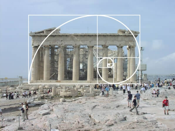
The Golden Ratio exists in nature since the beginning of times. The pyramids in Egypt, the Parthenon in Greece, the Mona Lisa, and so much more. The reason for their popularity is their naturally pleasing effect on their viewers. Interested yet? Great Let’s understand first what is the Golden Ratio.
What is the Golden Ratio?
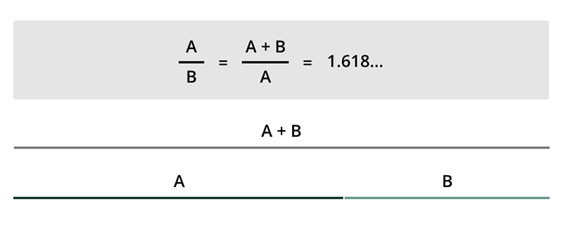
Also known as The Golden Section, Golden Mean, or the Greek letter ‘phi, the Golden Ratio is a mathematical ratio found in nature’s designs: 1.618. It describes a perfect symmetric proportion between two elements.
This ratio makes designs look organically beautiful, a natural composition, aesthetically pleasing. Our brains are wired to prefer images that are built using the Golden Ratio.
How to Draw the Golden Ratio?
Similar to the Fibonacci Sequence, the formula for the Golden Ratio is 1, 1, 2, however, this may mean nothing to you. So like many artists and designers, we have to look at it visually. It’s actually simpler than it looks.
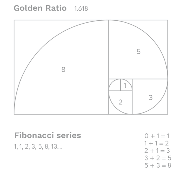
1. First, you draw a square
2. Then, divide the square with a line right in the middle
3. Perfect, now divide one of the squares with a diagonal line right in the middle
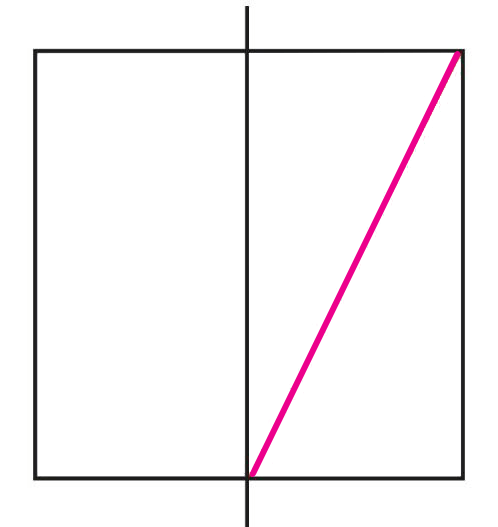
4. Rotate that line to create a new rectangle
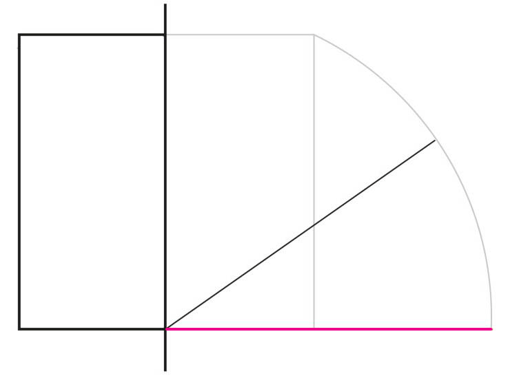
And there you go! If you keep applying the Golden Ratio formula to the new rectangle on the far right, you will end up with an image made up of increasingly smaller squares.
We will go over this so you can use it as a tool to make your designs.
How Is the Golden Ratio Used in Design?
To use the Golden Ratio to leverage your designs you need to think about the rule of thirds in photography. Diving an area into equal thirds can make your artwork very pleasing.
Most web designers use the Golden Ratio to balance out sidebars, navigation menus, on-site logos, and more. Providing a pleasing view between columns.
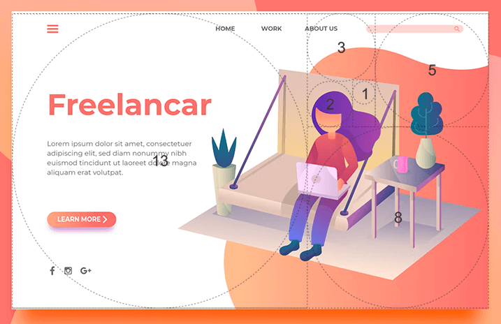
Remember this number: 1.618
You can apply the Golden Ratio to your designs on your layout, font spacing, content size, images, forms, and more. Using the Golden Ratio on your UX/UI design is a great way to ensure people find your designs appealing.
🔥 Create an amazing logo by following the 12 graphic design principles
How Is the Golden Ratio Used in Logos?
Logo design is the most essential element of any brand. This is why we will go over a few tips to keep your logo goldenated! Or is it goldenized?
1. Keep in Mind Typography Hierarchy
After you choose your texts A, B, and C according to hierarchy, you then multiply whatever the size of your font is by, yes you guessed it, 1.618. Keeping this proportion on your fonts will help you get a balanced logo.
You should do exactly the same with your inline font spaces.
2. Consider Golden Ratio Spiral & Focal Point
Setting your logo design over a Golden Ratio sketch will help you place your elements on the right focal points.
3. Set Your Dimensions to 1:1.618
Whichever your elements’ sizes are in px, you should simply multiply by the ratio to get the best proportion.
4. Height & Width of Your Logo Proportion

The golden rectangle will help you position your elements. Keep this in mind to whenever you need to resize your logo design, the same rule applies.
By trusting the Golden Ratio on the previous designing practices, you will ensure the results will be simple, clean, and beautiful. There’s a reason why so many of the world’s most famous logo designs use this design principle.
Using the Golden Ratio is also great practice for print designs and artistic designs since it gives your work a pleasing composition. Everything from a book, to a magazine, a flyer, and much more.
😊💡✨ Looking for design inspiration? Check out our logo ideas guide! It’s packed with design tips regarding graphic style, colors, and fonts and over 30 ideas sorted into 9 styles to perfectly match your vision.
Golden Ratio Tools for You
There are a few tools out there that you can use to include the Golden Ratio in your designs:
Use this grid to help you place your elements easily in proportion.
The Golden Ratio calculator will calculate the shorter side, longer side, and combined length of the two sides to compute the Golden Ratio.
This one is very useful for your fonts, this calculator provides:
-
- a typographic scale based on your primary font size,
- associated line heights, and
- spacing units derived from the primary line-height
This is simply a sket you can layer on your designs to help you guide elements.
⭐ Now that you’ve learned some theory let’s find out together what are the best logo makers in 2023 to create your next big brand asset.
FAQ
Last Words
Keeping the Golden Ratio in mind is a great way to ensure your designs will have the proper compositions that make them visually pleasing to everyone. You can apply the Golden Ratio to your designs, logo, artwork, art prints, and basically anything, even your photography!
If you want to get your designs skills to a new level you should also try out our How to choose the best fonts for your logo post, How to trademark a logo post, or simply try our 10 distinctive characteristics of a bad logo list to avoid them!
What do you think? Have any comments for us? Let us know!
