A Complete Guide on Logo Color Schemes
Are you close to launching your own brand? If that's the case, let's start with one of the essential steps in branding: defining your logo color scheme. This mini-guide will show you how to create a combination that you love, and that aligns with your goals. Shall we get started?


Table of contents
Why Are Brand Colors Important?101: The Color Wheel Is Your Ally Types of Color SchemesThe Meaning of ColorsHow to Choose the Right ColorsWinning Logo Color SchemesRed LogosOrange LogosYellow LogosGreen LogosBlue LogosPurple LogosPink LogosBrown LogosWhite LogosBlack LogosRainbow LogosWhat Logo Color Schemes Will You Choose?
Step 2. Browse our colossal video collection
Your logo will be how you present yourself to others; therefore, you must choose the right colors to transmit the message you want. By now, you probably already have some colors in mind, but before creating a wild combination, you have to take baby steps.
So, to choose the best color matches for your logo, let's learn more about the principles of color.
💡 Do you want to know what types of logos work best for your business? Then, find it out by taking this quick quiz!
Why Are Brand Colors Important?
Color is one of the main ingredients when it comes to logo design. These elements help us reflect and highlight the essence and strengths of our brand, differentiate us from our competitors, and establish meaningful relationships with our customers. In other words, colors provoke certain emotions, perceptions, and even behaviors. That's why it's so essential to choose the right ones.


Lorem ipsum dolor sit amet, consectetur adipiscing elit, sed do eiusmod tempor incididunt ut labore et dolore magna aliqua. Nunc eget lorem dolor sed viverra ipsum nunc. Tortor at risus viverra adipiscing at in tellus integer feugiat. Arcu cursus vitae congue mauris rhoncus. A scelerisque purus semper eget duis at. Eget nunc scelerisque viverra mauris in aliquam sem fringilla ut. Diam maecenas sed enim ut. Dolor sit amet consectetur adipiscing elit ut. Id volutpat lacus laoreet non curabitur gravida arcu. Vitae turpis massa sed elementum tempus egestas. Sagittis orci a scelerisque purus semper eget duis at. Porta nibh venenatis cras sed.


Lorem ipsum dolor sit amet, consectetur adipiscing elit, sed do eiusmod tempor incididunt ut labore et dolore magna aliqua. Augue ut lectus arcu bibendum at varius. Nam libero justo laoreet sit amet cursus sit amet. A diam sollicitudin tempor id eu nisl nunc mi ipsum. Et malesuada fames ac turpis egestas maecenas pharetra convallis posuere. Maecenas ultricies mi eget mauris pharetra et ultrices neque. Dictumst vestibulum rhoncus est pellentesque elit ullamcorper dignissim cras tincidunt. Purus ut faucibus pulvinar elementum integer enim neque volutpat. Ipsum a arcu cursus vitae congue mauris. Sagittis purus sit amet volutpat consequat mauris. Fames ac turpis egestas sed. In tellus integer feugiat scelerisque varius. A lacus vestibulum sed arcu. Egestas congue quisque egestas diam in. Est placerat in egestas erat imperdiet sed euismod nisi. Quam quisque id diam vel quam. Dolor sit amet consectetur adipiscing elit pellentesque habitant. Morbi quis commodo odio aenean sed adipiscing diam donec. Diam quam nulla porttitor massa id.
101: The Color Wheel Is Your Ally
In case you didn’t know, there’s a great science behind this well-known color wheel. The combinations aren’t made randomly; they follow specific guidelines to please the human eye and make design easy.
Lorem ipsum dolor sit amet, consectetur adipiscing elit, sed do eiusmod tempor incididunt ut labore et dolore magna aliqua. Nunc eget lorem dolor sed viverra ipsum nunc. Tortor at risus viverra adipiscing at in tellus integer feugiat. Arcu cursus vitae congue mauris rhoncus. A scelerisque purus semper eget duis at. Eget nunc scelerisque viverra mauris in aliquam sem fringilla ut. Diam maecenas sed enim ut. Dolor sit amet consectetur adipiscing elit ut. Id volutpat lacus laoreet non curabitur gravida arcu. Vitae turpis massa sed elementum tempus egestas. Sagittis orci a scelerisque purus semper eget duis at. Porta nibh venenatis cras sed.


Lorem ipsum dolor sit amet, consectetur adipiscing elit, sed do eiusmod tempor incididunt ut labore et dolore magna aliqua. Augue ut lectus arcu bibendum at varius. Nam libero justo laoreet sit amet cursus sit amet. A diam sollicitudin tempor id eu nisl nunc mi ipsum. Et malesuada fames ac turpis egestas maecenas pharetra convallis posuere. Maecenas ultricies mi eget mauris pharetra et ultrices neque. Dictumst vestibulum rhoncus est pellentesque elit ullamcorper dignissim cras tincidunt. Purus ut faucibus pulvinar elementum integer enim neque volutpat. Ipsum a arcu cursus vitae congue mauris. Sagittis purus sit amet volutpat consequat mauris. Fames ac turpis egestas sed. In tellus integer feugiat scelerisque varius. A lacus vestibulum sed arcu. Egestas congue quisque egestas diam in. Est placerat in egestas erat imperdiet sed euismod nisi. Quam quisque id diam vel quam. Dolor sit amet consectetur adipiscing elit pellentesque habitant. Morbi quis commodo odio aenean sed adipiscing diam donec. Diam quam nulla porttitor massa id.
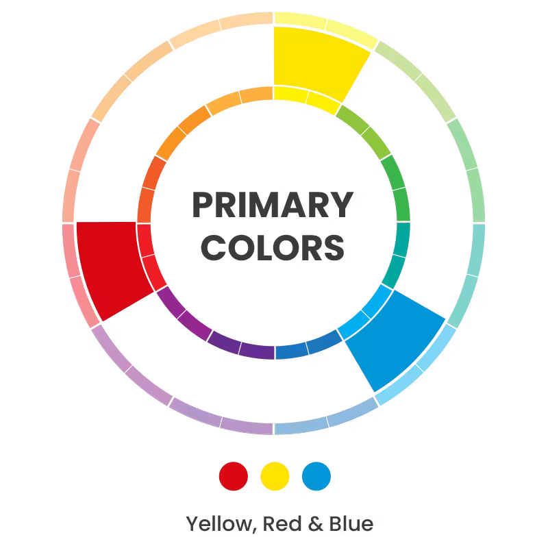
But What’s the Color Wheel
It’s a pie chart that shows the relationship between colors, which are integrated into three categories. First are the primary colors, then the secondary colors, and finally, the tertiary colors. As a result, we obtain a circular and colorful fan that integrates all these tones.

Primary Colors
Red, blue, and yellow are the basis of everything. These colors can't be created by mixing other colors, but they're the ones in charge of giving life to new shades.
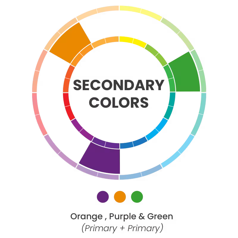
Secondary Colors
By mixing the primary colors, we obtain the secondary colors: orange (red + yellow), green (blue + yellow), and violet (red + blue).
Tertiary Colors
These color combination exist because the primary colors are mixed with the secondary colors adjacent. That is, green with blue gives a green-blue tone.


Image Cropper
Resize your JPG or PNG images for free
A quick intro to Hex codes
⚡ Once we understand how colors are made, we can jump into the different combinations to create our brand's perfect logo color scheme. Learn how to use color combinations in your designs!
Lorem ipsum dolor sit amet, consectetur adipiscing elit, sed do eiusmod tempor incididunt ut labore et dolore magna aliqua. Nunc eget lorem dolor sed viverra ipsum nunc. Tortor at risus viverra adipiscing at in tellus integer feugiat. Arcu cursus vitae congue mauris rhoncus. A scelerisque purus semper eget duis at. Eget nunc scelerisque viverra mauris in aliquam sem fringilla ut. Diam maecenas sed enim ut. Dolor sit amet consectetur adipiscing elit ut. Id volutpat lacus laoreet non curabitur gravida arcu. Vitae turpis massa sed elementum tempus egestas. Sagittis orci a scelerisque purus semper eget duis at. Porta nibh venenatis cras sed.
Lorem ipsum dolor sit amet, consectetur adipiscing elit, sed do eiusmod tempor incididunt ut labore et dolore magna aliqua. Augue ut lectus arcu bibendum at varius. Nam libero justo laoreet sit amet cursus sit amet. A diam sollicitudin tempor id eu nisl nunc mi ipsum. Et malesuada fames ac turpis egestas maecenas pharetra convallis posuere. Maecenas ultricies mi eget mauris pharetra et ultrices neque. Dictumst vestibulum rhoncus est pellentesque elit ullamcorper dignissim cras tincidunt. Purus ut faucibus pulvinar elementum integer enim neque volutpat. Ipsum a arcu cursus vitae congue mauris. Sagittis purus sit amet volutpat consequat mauris. Fames ac turpis egestas sed. In tellus integer feugiat scelerisque varius. A lacus vestibulum sed arcu. Egestas congue quisque egestas diam in. Est placerat in egestas erat imperdiet sed euismod nisi. Quam quisque id diam vel quam. Dolor sit amet consectetur adipiscing elit pellentesque habitant. Morbi quis commodo odio aenean sed adipiscing diam donec. Diam quam nulla porttitor massa id.
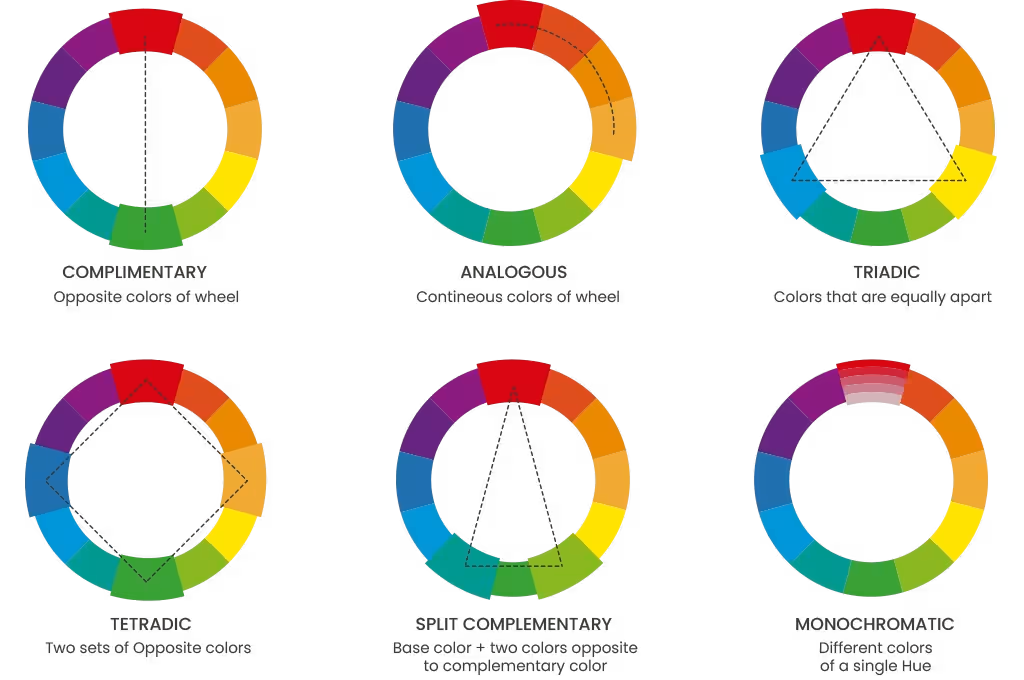
Types of Color Schemes
Now that you know how the color wheel is integrated, it's time to start thinking about the main color of your logo. This step will assist you in finding the colors that best match the shade you have pre-established as the one that distinguishes your brand. In this way, soon, you'll have the perfect logo color scheme.
Monochromatic. Is a palette with only one color possible? Indeed it is. That's why there are monochromatic combinations, in which a color is selected and accompanied by white, black, and gray to build that color, making it lighter or darker. This style is most suitable for brands that want to keep a simple logo color scheme.
Complementary. People say that opposites attract, and yes, it's true! Such is the case with this combination, which only requires two colors that are on opposite sides of the color wheel. They're perfect for creating a high contrast in any logo.
Analogous. Choose the analogous palette to create a logo color scheme with 2 or 3 colors that go well together. The selected colors are always placed next to each other on the color wheel. This means the colors are closely related, although there isn't much contrast since they're consecutive colors. However, it's perfect for those logos that want a more subtle and in-tune look.
Triadic trios. Follow this style if you've always wanted your next logo to contain 3 colors. It's perfect for those logos that want to be colorful and varied. You have to take your color wheel and visualize a triangle inside it; this way, you'll create a perfect harmony, usually characterized by vibrant and high-contrast colors.
Tetradic. Color lovers, this is the best combination for you. We're talking about the Tetradic style, which generates a perfect harmony with 4 colors, which is represented in the form of a rectangle in the chromatic wheel. They're usually distinguished by two sets of complementary colors.

Lorem ipsum dolor sit amet, consectetur adipiscing elit, sed do eiusmod tempor incididunt ut labore et dolore magna aliqua. Nunc eget lorem dolor sed viverra ipsum nunc. Tortor at risus viverra adipiscing at in tellus integer feugiat. Arcu cursus vitae congue mauris rhoncus. A scelerisque purus semper eget duis at. Eget nunc scelerisque viverra mauris in aliquam sem fringilla ut. Diam maecenas sed enim ut. Dolor sit amet consectetur adipiscing elit ut. Id volutpat lacus laoreet non curabitur gravida arcu. Vitae turpis massa sed elementum tempus egestas. Sagittis orci a scelerisque purus semper eget duis at. Porta nibh venenatis cras sed.
Lorem ipsum dolor sit amet, consectetur adipiscing elit, sed do eiusmod tempor incididunt ut labore et dolore magna aliqua. Augue ut lectus arcu bibendum at varius. Nam libero justo laoreet sit amet cursus sit amet. A diam sollicitudin tempor id eu nisl nunc mi ipsum. Et malesuada fames ac turpis egestas maecenas pharetra convallis posuere. Maecenas ultricies mi eget mauris pharetra et ultrices neque. Dictumst vestibulum rhoncus est pellentesque elit ullamcorper dignissim cras tincidunt. Purus ut faucibus pulvinar elementum integer enim neque volutpat. Ipsum a arcu cursus vitae congue mauris. Sagittis purus sit amet volutpat consequat mauris. Fames ac turpis egestas sed. In tellus integer feugiat scelerisque varius. A lacus vestibulum sed arcu. Egestas congue quisque egestas diam in. Est placerat in egestas erat imperdiet sed euismod nisi. Quam quisque id diam vel quam. Dolor sit amet consectetur adipiscing elit pellentesque habitant. Morbi quis commodo odio aenean sed adipiscing diam donec. Diam quam nulla porttitor massa id.
Step 2. Browse our colossal video collection
Looking for the perfect template for you next video? Here are a few tricks to help you get started:
First, we recommend using the search bar to filter by keyword will appear. Don't forget to add formats to make you search more complete: "Summer Videos".
🔥 Design a logo from scratch with The Ultimate Guide to Logo Design
The Meaning of Colors
We've already understood the basics of how the famous color wheel and its combinations are formed. Now it's time to delve into the meaning of colors and how each one of them impacts our logo.
🌈 Check out this year's color of the year!
Lorem ipsum dolor sit amet, consectetur adipiscing elit, sed do eiusmod tempor incididunt ut labore et dolore magna aliqua. Nunc eget lorem dolor sed viverra ipsum nunc. Tortor at risus viverra adipiscing at in tellus integer feugiat. Arcu cursus vitae congue mauris rhoncus. A scelerisque purus semper eget duis at. Eget nunc scelerisque viverra mauris in aliquam sem fringilla ut. Diam maecenas sed enim ut. Dolor sit amet consectetur adipiscing elit ut. Id volutpat lacus laoreet non curabitur gravida arcu. Vitae turpis massa sed elementum tempus egestas. Sagittis orci a scelerisque purus semper eget duis at. Porta nibh venenatis cras sed.
Lorem ipsum dolor sit amet, consectetur adipiscing elit, sed do eiusmod tempor incididunt ut labore et dolore magna aliqua. Augue ut lectus arcu bibendum at varius. Nam libero justo laoreet sit amet cursus sit amet. A diam sollicitudin tempor id eu nisl nunc mi ipsum. Et malesuada fames ac turpis egestas maecenas pharetra convallis posuere. Maecenas ultricies mi eget mauris pharetra et ultrices neque. Dictumst vestibulum rhoncus est pellentesque elit ullamcorper dignissim cras tincidunt. Purus ut faucibus pulvinar elementum integer enim neque volutpat. Ipsum a arcu cursus vitae congue mauris. Sagittis purus sit amet volutpat consequat mauris. Fames ac turpis egestas sed. In tellus integer feugiat scelerisque varius. A lacus vestibulum sed arcu. Egestas congue quisque egestas diam in. Est placerat in egestas erat imperdiet sed euismod nisi. Quam quisque id diam vel quam. Dolor sit amet consectetur adipiscing elit pellentesque habitant. Morbi quis commodo odio aenean sed adipiscing diam donec. Diam quam nulla porttitor massa id.
Warm Colors
Red
- Attributes: Power, energy, passion, desire, determination, speed, strength, anger, danger, motivation, excitement and emotion.
- Negative side: Excess, aggressiveness, bad temper, danger, anger, forbidden, stress, and rebellion.
Lorem ipsum dolor sit amet, consectetur adipiscing elit, sed do eiusmod tempor incididunt ut labore et dolore magna aliqua. Nunc eget lorem dolor sed viverra ipsum nunc. Tortor at risus viverra adipiscing at in tellus integer feugiat. Arcu cursus vitae congue mauris rhoncus. A scelerisque purus semper eget duis at. Eget nunc scelerisque viverra mauris in aliquam sem fringilla ut. Diam maecenas sed enim ut. Dolor sit amet consectetur adipiscing elit ut. Id volutpat lacus laoreet non curabitur gravida arcu. Vitae turpis massa sed elementum tempus egestas. Sagittis orci a scelerisque purus semper eget duis at. Porta nibh venenatis cras sed.
Lorem ipsum dolor sit amet, consectetur adipiscing elit, sed do eiusmod tempor incididunt ut labore et dolore magna aliqua. Augue ut lectus arcu bibendum at varius. Nam libero justo laoreet sit amet cursus sit amet. A diam sollicitudin tempor id eu nisl nunc mi ipsum. Et malesuada fames ac turpis egestas maecenas pharetra convallis posuere. Maecenas ultricies mi eget mauris pharetra et ultrices neque. Dictumst vestibulum rhoncus est pellentesque elit ullamcorper dignissim cras tincidunt. Purus ut faucibus pulvinar elementum integer enim neque volutpat. Ipsum a arcu cursus vitae congue mauris. Sagittis purus sit amet volutpat consequat mauris. Fames ac turpis egestas sed. In tellus integer feugiat scelerisque varius. A lacus vestibulum sed arcu. Egestas congue quisque egestas diam in. Est placerat in egestas erat imperdiet sed euismod nisi. Quam quisque id diam vel quam. Dolor sit amet consectetur adipiscing elit pellentesque habitant. Morbi quis commodo odio aenean sed adipiscing diam donec. Diam quam nulla porttitor massa id.
Cool Colors
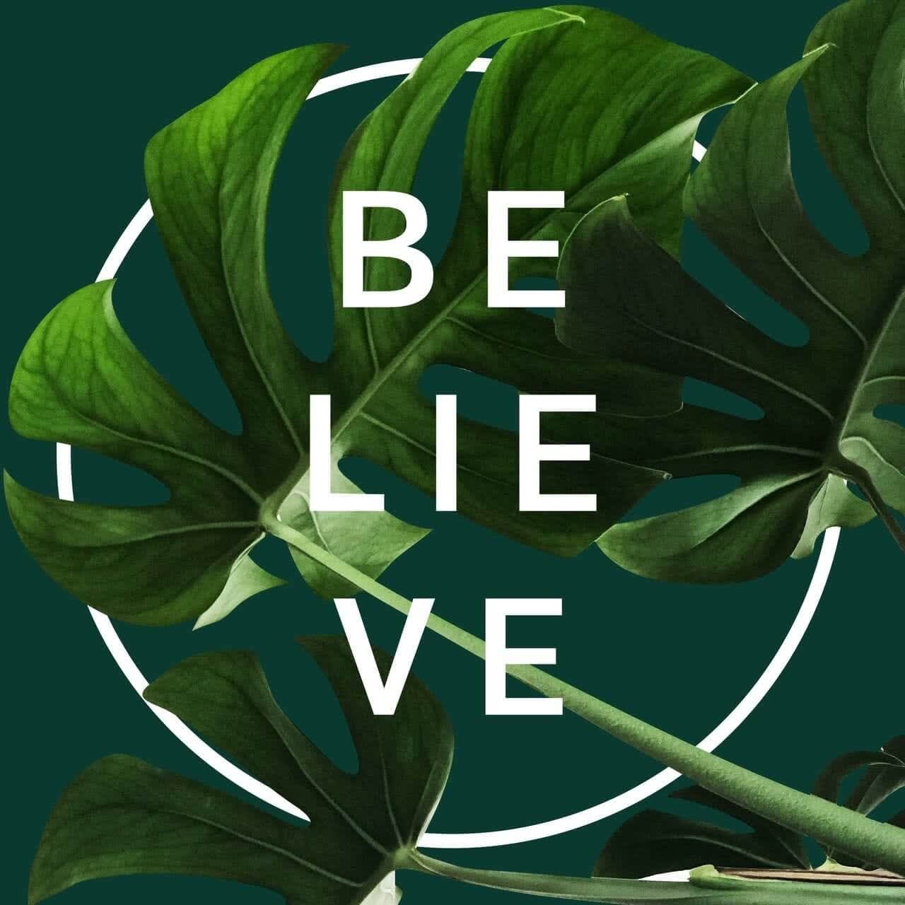
Green
- Symbolizes: nature, growth, harmony, freshness, fertility, money, safety, healing, life, health, environment, and renewal.
- Some negative effects of green include: immaturity, repulsion, poison and boredom.
Lorem ipsum dolor sit amet, consectetur adipiscing elit, sed do eiusmod tempor incididunt ut labore et dolore magna aliqua. Nunc eget lorem dolor sed viverra ipsum nunc. Tortor at risus viverra adipiscing at in tellus integer feugiat. Arcu cursus vitae congue mauris rhoncus. A scelerisque purus semper eget duis at. Eget nunc scelerisque viverra mauris in aliquam sem fringilla ut. Diam maecenas sed enim ut. Dolor sit amet consectetur adipiscing elit ut. Id volutpat lacus laoreet non curabitur gravida arcu. Vitae turpis massa sed elementum tempus egestas. Sagittis orci a scelerisque purus semper eget duis at. Porta nibh venenatis cras sed.
Lorem ipsum dolor sit amet, consectetur adipiscing elit, sed do eiusmod tempor incididunt ut labore et dolore magna aliqua. Augue ut lectus arcu bibendum at varius. Nam libero justo laoreet sit amet cursus sit amet. A diam sollicitudin tempor id eu nisl nunc mi ipsum. Et malesuada fames ac turpis egestas maecenas pharetra convallis posuere. Maecenas ultricies mi eget mauris pharetra et ultrices neque. Dictumst vestibulum rhoncus est pellentesque elit ullamcorper dignissim cras tincidunt. Purus ut faucibus pulvinar elementum integer enim neque volutpat. Ipsum a arcu cursus vitae congue mauris. Sagittis purus sit amet volutpat consequat mauris. Fames ac turpis egestas sed. In tellus integer feugiat scelerisque varius. A lacus vestibulum sed arcu. Egestas congue quisque egestas diam in. Est placerat in egestas erat imperdiet sed euismod nisi. Quam quisque id diam vel quam. Dolor sit amet consectetur adipiscing elit pellentesque habitant. Morbi quis commodo odio aenean sed adipiscing diam donec. Diam quam nulla porttitor massa id.
Non-color Colors
White
- White usually represents: health, cleanliness, innocence, purity, goodness, safety, peace, trust, simplicity, openness, light, freshness, and minimalism.
- Yet, for some, it also has negative meanings, such as: elitism, unfriendliness, and solitude.
Lorem ipsum dolor sit amet, consectetur adipiscing elit, sed do eiusmod tempor incididunt ut labore et dolore magna aliqua. Nunc eget lorem dolor sed viverra ipsum nunc. Tortor at risus viverra adipiscing at in tellus integer feugiat. Arcu cursus vitae congue mauris rhoncus. A scelerisque purus semper eget duis at. Eget nunc scelerisque viverra mauris in aliquam sem fringilla ut. Diam maecenas sed enim ut. Dolor sit amet consectetur adipiscing elit ut. Id volutpat lacus laoreet non curabitur gravida arcu. Vitae turpis massa sed elementum tempus egestas. Sagittis orci a scelerisque purus semper eget duis at. Porta nibh venenatis cras sed.
Lorem ipsum dolor sit amet, consectetur adipiscing elit, sed do eiusmod tempor incididunt ut labore et dolore magna aliqua. Augue ut lectus arcu bibendum at varius. Nam libero justo laoreet sit amet cursus sit amet. A diam sollicitudin tempor id eu nisl nunc mi ipsum. Et malesuada fames ac turpis egestas maecenas pharetra convallis posuere. Maecenas ultricies mi eget mauris pharetra et ultrices neque. Dictumst vestibulum rhoncus est pellentesque elit ullamcorper dignissim cras tincidunt. Purus ut faucibus pulvinar elementum integer enim neque volutpat. Ipsum a arcu cursus vitae congue mauris. Sagittis purus sit amet volutpat consequat mauris. Fames ac turpis egestas sed. In tellus integer feugiat scelerisque varius. A lacus vestibulum sed arcu. Egestas congue quisque egestas diam in. Est placerat in egestas erat imperdiet sed euismod nisi. Quam quisque id diam vel quam. Dolor sit amet consectetur adipiscing elit pellentesque habitant. Morbi quis commodo odio aenean sed adipiscing diam donec. Diam quam nulla porttitor massa id.
How to Choose the Right Colors for Your Logo Scheme
Identify your brand personality. Before choosing colors, think about how you want your brand to be identified. Generally and unconsciously, as consumers, we're attracted to brands that share the same values as us, so reflect on the personality you want to convey and choose the colors that go best with these adjectives.
Choose your main color. Now it's time to choose your dominant color, which will be the one by which many people recognize your brand.
Select complementary colors to create your logo color scheme. Once you've chosen your primary color, it's time to decide how many colors you want your brand to have. Generally, it's from 2 to 3. However, regarding creativity, there are single-color logos and those with larger palettes, including more than 4 colors.Once you already have something in mind, it's time to review the color schemes so they can serve as a guide and help you find your next logo color scheme.
Lorem ipsum dolor sit amet, consectetur adipiscing elit, sed do eiusmod tempor incididunt ut labore et dolore magna aliqua. Nunc eget lorem dolor sed viverra ipsum nunc. Tortor at risus viverra adipiscing at in tellus integer feugiat. Arcu cursus vitae congue mauris rhoncus. A scelerisque purus semper eget duis at. Eget nunc scelerisque viverra mauris in aliquam sem fringilla ut. Diam maecenas sed enim ut. Dolor sit amet consectetur adipiscing elit ut. Id volutpat lacus laoreet non curabitur gravida arcu. Vitae turpis massa sed elementum tempus egestas. Sagittis orci a scelerisque purus semper eget duis at. Porta nibh venenatis cras sed.
Lorem ipsum dolor sit amet, consectetur adipiscing elit, sed do eiusmod tempor incididunt ut labore et dolore magna aliqua. Augue ut lectus arcu bibendum at varius. Nam libero justo laoreet sit amet cursus sit amet. A diam sollicitudin tempor id eu nisl nunc mi ipsum. Et malesuada fames ac turpis egestas maecenas pharetra convallis posuere. Maecenas ultricies mi eget mauris pharetra et ultrices neque. Dictumst vestibulum rhoncus est pellentesque elit ullamcorper dignissim cras tincidunt. Purus ut faucibus pulvinar elementum integer enim neque volutpat. Ipsum a arcu cursus vitae congue mauris. Sagittis purus sit amet volutpat consequat mauris. Fames ac turpis egestas sed. In tellus integer feugiat scelerisque varius. A lacus vestibulum sed arcu. Egestas congue quisque egestas diam in. Est placerat in egestas erat imperdiet sed euismod nisi. Quam quisque id diam vel quam. Dolor sit amet consectetur adipiscing elit pellentesque habitant. Morbi quis commodo odio aenean sed adipiscing diam donec. Diam quam nulla porttitor massa id.
Winning Logo Color Schemes
To empower your brand, you'll need to choose the right colors to connect with your audience. Below, are some logo color schemes to inspire your next masterpiece.You can also look to some of world's most famous logos to get more inspo when it comes time to choose a color scheme for your logo!
Lorem ipsum dolor sit amet, consectetur adipiscing elit, sed do eiusmod tempor incididunt ut labore et dolore magna aliqua. Nunc eget lorem dolor sed viverra ipsum nunc. Tortor at risus viverra adipiscing at in tellus integer feugiat. Arcu cursus vitae congue mauris rhoncus. A scelerisque purus semper eget duis at. Eget nunc scelerisque viverra mauris in aliquam sem fringilla ut. Diam maecenas sed enim ut. Dolor sit amet consectetur adipiscing elit ut. Id volutpat lacus laoreet non curabitur gravida arcu. Vitae turpis massa sed elementum tempus egestas. Sagittis orci a scelerisque purus semper eget duis at. Porta nibh venenatis cras sed.
Lorem ipsum dolor sit amet, consectetur adipiscing elit, sed do eiusmod tempor incididunt ut labore et dolore magna aliqua. Augue ut lectus arcu bibendum at varius. Nam libero justo laoreet sit amet cursus sit amet. A diam sollicitudin tempor id eu nisl nunc mi ipsum. Et malesuada fames ac turpis egestas maecenas pharetra convallis posuere. Maecenas ultricies mi eget mauris pharetra et ultrices neque. Dictumst vestibulum rhoncus est pellentesque elit ullamcorper dignissim cras tincidunt. Purus ut faucibus pulvinar elementum integer enim neque volutpat. Ipsum a arcu cursus vitae congue mauris. Sagittis purus sit amet volutpat consequat mauris. Fames ac turpis egestas sed. In tellus integer feugiat scelerisque varius. A lacus vestibulum sed arcu. Egestas congue quisque egestas diam in. Est placerat in egestas erat imperdiet sed euismod nisi. Quam quisque id diam vel quam. Dolor sit amet consectetur adipiscing elit pellentesque habitant. Morbi quis commodo odio aenean sed adipiscing diam donec. Diam quam nulla porttitor massa id.
Red Logo Color Schemes
Get all the designs you need to turn your brand into a success
For brands that want to stand out and not be one of the crowd, red is the color of choice, as this vibrant color is usually a great conductor of energy, passion, and dynamism. So many big brands worldwide, usually in the entertainment and food industries, have chosen red as their selected color. 


For brands that want to stand out and not be one of the crowd, red is the color of choice, as this vibrant color is usually a great conductor of energy, passion, and dynamism. So many big brands worldwide, usually in the entertainment and food industries, have chosen red as their selected color.
Lorem ipsum dolor sit amet, consectetur adipiscing elit, sed do eiusmod tempor incididunt ut labore et dolore magna aliqua. Nunc eget lorem dolor sed viverra ipsum nunc. Tortor at risus viverra adipiscing at in tellus integer feugiat. Arcu cursus vitae congue mauris rhoncus. A scelerisque purus semper eget duis at. Eget nunc scelerisque viverra mauris in aliquam sem fringilla ut. Diam maecenas sed enim ut. Dolor sit amet consectetur adipiscing elit ut. Id volutpat lacus laoreet non curabitur gravida arcu. Vitae turpis massa sed elementum tempus egestas. Sagittis orci a scelerisque purus semper eget duis at. Porta nibh venenatis cras sed.
Lorem ipsum dolor sit amet, consectetur adipiscing elit, sed do eiusmod tempor incididunt ut labore et dolore magna aliqua. Augue ut lectus arcu bibendum at varius. Nam libero justo laoreet sit amet cursus sit amet. A diam sollicitudin tempor id eu nisl nunc mi ipsum. Et malesuada fames ac turpis egestas maecenas pharetra convallis posuere. Maecenas ultricies mi eget mauris pharetra et ultrices neque. Dictumst vestibulum rhoncus est pellentesque elit ullamcorper dignissim cras tincidunt. Purus ut faucibus pulvinar elementum integer enim neque volutpat. Ipsum a arcu cursus vitae congue mauris. Sagittis purus sit amet volutpat consequat mauris. Fames ac turpis egestas sed. In tellus integer feugiat scelerisque varius. A lacus vestibulum sed arcu. Egestas congue quisque egestas diam in. Est placerat in egestas erat imperdiet sed euismod nisi. Quam quisque id diam vel quam. Dolor sit amet consectetur adipiscing elit pellentesque habitant. Morbi quis commodo odio aenean sed adipiscing diam donec. Diam quam nulla porttitor massa id.
Orange Logo Color Schemes


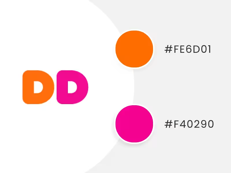
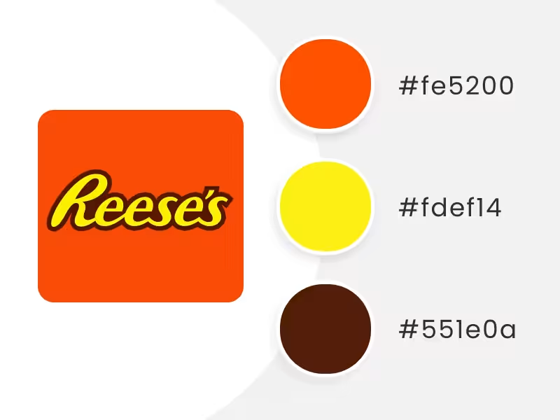

Get all the designs you need to turn your brand into a success
A warm color that has a similar effect to red, yet isn't used as often, is orange. This beautiful and cheerful shade expresses fun, joy, creativity, and vitality. So it's no surprise that some beverages use this whimsical color. Of course, the message takes on a whole new meaning with the right color combination, like Mastercard, which wanted to express passion, energy, and progressiveness by adding yellow to the logo.


For brands that want to stand out and not be one of the crowd, red is the color of choice, as this vibrant color is usually a great conductor of energy, passion, and dynamism. So many big brands worldwide, usually in the entertainment and food industries, have chosen red as their selected color.
Lorem ipsum dolor sit amet, consectetur adipiscing elit, sed do eiusmod tempor incididunt ut labore et dolore magna aliqua. Nunc eget lorem dolor sed viverra ipsum nunc. Tortor at risus viverra adipiscing at in tellus integer feugiat. Arcu cursus vitae congue mauris rhoncus. A scelerisque purus semper eget duis at. Eget nunc scelerisque viverra mauris in aliquam sem fringilla ut. Diam maecenas sed enim ut. Dolor sit amet consectetur adipiscing elit ut. Id volutpat lacus laoreet non curabitur gravida arcu. Vitae turpis massa sed elementum tempus egestas. Sagittis orci a scelerisque purus semper eget duis at. Porta nibh venenatis cras sed.
Lorem ipsum dolor sit amet, consectetur adipiscing elit, sed do eiusmod tempor incididunt ut labore et dolore magna aliqua. Augue ut lectus arcu bibendum at varius. Nam libero justo laoreet sit amet cursus sit amet. A diam sollicitudin tempor id eu nisl nunc mi ipsum. Et malesuada fames ac turpis egestas maecenas pharetra convallis posuere. Maecenas ultricies mi eget mauris pharetra et ultrices neque. Dictumst vestibulum rhoncus est pellentesque elit ullamcorper dignissim cras tincidunt. Purus ut faucibus pulvinar elementum integer enim neque volutpat. Ipsum a arcu cursus vitae congue mauris. Sagittis purus sit amet volutpat consequat mauris. Fames ac turpis egestas sed. In tellus integer feugiat scelerisque varius. A lacus vestibulum sed arcu. Egestas congue quisque egestas diam in. Est placerat in egestas erat imperdiet sed euismod nisi. Quam quisque id diam vel quam. Dolor sit amet consectetur adipiscing elit pellentesque habitant. Morbi quis commodo odio aenean sed adipiscing diam donec. Diam quam nulla porttitor massa id.
Yellow Logo Color Schemes


Get all the designs you need to turn your brand into a success
One of the rainbow colors that will undoubtedly make your brand shine, as it's associated with light, sun, positivity, kindness, and youth. Although on the other hand, it also denotes affordability and mass consumption, so if you want your brand to be exclusive or convey that message, this is definitely not the color.

For brands that want to stand out and not be one of the crowd, red is the color of choice, as this vibrant color is usually a great conductor of energy, passion, and dynamism. So many big brands worldwide, usually in the entertainment and food industries, have chosen red as their selected color.
Lorem ipsum dolor sit amet, consectetur adipiscing elit, sed do eiusmod tempor incididunt ut labore et dolore magna aliqua. Nunc eget lorem dolor sed viverra ipsum nunc. Tortor at risus viverra adipiscing at in tellus integer feugiat. Arcu cursus vitae congue mauris rhoncus. A scelerisque purus semper eget duis at. Eget nunc scelerisque viverra mauris in aliquam sem fringilla ut. Diam maecenas sed enim ut. Dolor sit amet consectetur adipiscing elit ut. Id volutpat lacus laoreet non curabitur gravida arcu. Vitae turpis massa sed elementum tempus egestas. Sagittis orci a scelerisque purus semper eget duis at. Porta nibh venenatis cras sed.
Lorem ipsum dolor sit amet, consectetur adipiscing elit, sed do eiusmod tempor incididunt ut labore et dolore magna aliqua. Augue ut lectus arcu bibendum at varius. Nam libero justo laoreet sit amet cursus sit amet. A diam sollicitudin tempor id eu nisl nunc mi ipsum. Et malesuada fames ac turpis egestas maecenas pharetra convallis posuere. Maecenas ultricies mi eget mauris pharetra et ultrices neque. Dictumst vestibulum rhoncus est pellentesque elit ullamcorper dignissim cras tincidunt. Purus ut faucibus pulvinar elementum integer enim neque volutpat. Ipsum a arcu cursus vitae congue mauris. Sagittis purus sit amet volutpat consequat mauris. Fames ac turpis egestas sed. In tellus integer feugiat scelerisque varius. A lacus vestibulum sed arcu. Egestas congue quisque egestas diam in. Est placerat in egestas erat imperdiet sed euismod nisi. Quam quisque id diam vel quam. Dolor sit amet consectetur adipiscing elit pellentesque habitant. Morbi quis commodo odio aenean sed adipiscing diam donec. Diam quam nulla porttitor massa id.
Green Logo Color Schemes

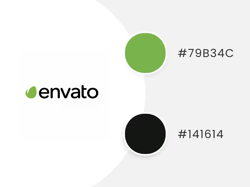


Get all the designs you need to turn your brand into a success
When we think of this color, we usually think of life, health, freshness, and even care for the environment. However, this striking color goes beyond that, thanks to its versatility. For example, it represents money, wealth, security, harmony, and newness. But also peace of mind and relaxation.
So, to sum up, if you want this color to be in your logo color scheme, try to combine it with white, yellow, and even red.
For brands that want to stand out and not be one of the crowd, red is the color of choice, as this vibrant color is usually a great conductor of energy, passion, and dynamism. So many big brands worldwide, usually in the entertainment and food industries, have chosen red as their selected color.
Lorem ipsum dolor sit amet, consectetur adipiscing elit, sed do eiusmod tempor incididunt ut labore et dolore magna aliqua. Nunc eget lorem dolor sed viverra ipsum nunc. Tortor at risus viverra adipiscing at in tellus integer feugiat. Arcu cursus vitae congue mauris rhoncus. A scelerisque purus semper eget duis at. Eget nunc scelerisque viverra mauris in aliquam sem fringilla ut. Diam maecenas sed enim ut. Dolor sit amet consectetur adipiscing elit ut. Id volutpat lacus laoreet non curabitur gravida arcu. Vitae turpis massa sed elementum tempus egestas. Sagittis orci a scelerisque purus semper eget duis at. Porta nibh venenatis cras sed.
Lorem ipsum dolor sit amet, consectetur adipiscing elit, sed do eiusmod tempor incididunt ut labore et dolore magna aliqua. Augue ut lectus arcu bibendum at varius. Nam libero justo laoreet sit amet cursus sit amet. A diam sollicitudin tempor id eu nisl nunc mi ipsum. Et malesuada fames ac turpis egestas maecenas pharetra convallis posuere. Maecenas ultricies mi eget mauris pharetra et ultrices neque. Dictumst vestibulum rhoncus est pellentesque elit ullamcorper dignissim cras tincidunt. Purus ut faucibus pulvinar elementum integer enim neque volutpat. Ipsum a arcu cursus vitae congue mauris. Sagittis purus sit amet volutpat consequat mauris. Fames ac turpis egestas sed. In tellus integer feugiat scelerisque varius. A lacus vestibulum sed arcu. Egestas congue quisque egestas diam in. Est placerat in egestas erat imperdiet sed euismod nisi. Quam quisque id diam vel quam. Dolor sit amet consectetur adipiscing elit pellentesque habitant. Morbi quis commodo odio aenean sed adipiscing diam donec. Diam quam nulla porttitor massa id.
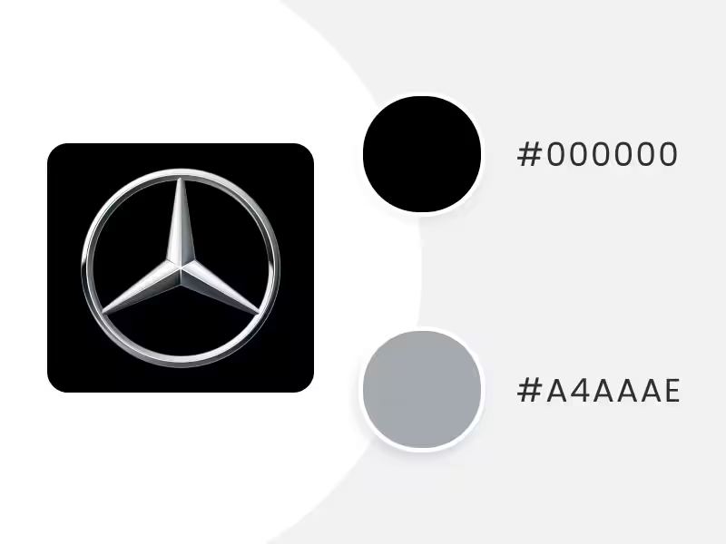
Blue Logo Color Schemes

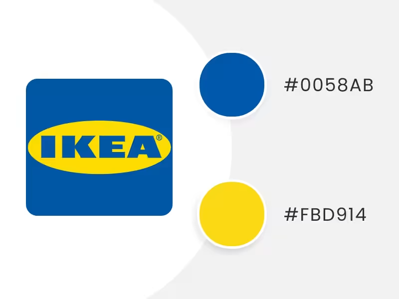

Get all the designs you need to turn your brand into a success
This popular primary color is a favorite of many brands because it's usually associated with confidence, security, maturity, stability, and intelligence. So it's not surprising that the logo color schemes of many technology and financial companies carry this shade as their dominant color. 


For brands that want to stand out and not be one of the crowd, red is the color of choice, as this vibrant color is usually a great conductor of energy, passion, and dynamism. So many big brands worldwide, usually in the entertainment and food industries, have chosen red as their selected color.
Lorem ipsum dolor sit amet, consectetur adipiscing elit, sed do eiusmod tempor incididunt ut labore et dolore magna aliqua. Nunc eget lorem dolor sed viverra ipsum nunc. Tortor at risus viverra adipiscing at in tellus integer feugiat. Arcu cursus vitae congue mauris rhoncus. A scelerisque purus semper eget duis at. Eget nunc scelerisque viverra mauris in aliquam sem fringilla ut. Diam maecenas sed enim ut. Dolor sit amet consectetur adipiscing elit ut. Id volutpat lacus laoreet non curabitur gravida arcu. Vitae turpis massa sed elementum tempus egestas. Sagittis orci a scelerisque purus semper eget duis at. Porta nibh venenatis cras sed.
Lorem ipsum dolor sit amet, consectetur adipiscing elit, sed do eiusmod tempor incididunt ut labore et dolore magna aliqua. Augue ut lectus arcu bibendum at varius. Nam libero justo laoreet sit amet cursus sit amet. A diam sollicitudin tempor id eu nisl nunc mi ipsum. Et malesuada fames ac turpis egestas maecenas pharetra convallis posuere. Maecenas ultricies mi eget mauris pharetra et ultrices neque. Dictumst vestibulum rhoncus est pellentesque elit ullamcorper dignissim cras tincidunt. Purus ut faucibus pulvinar elementum integer enim neque volutpat. Ipsum a arcu cursus vitae congue mauris. Sagittis purus sit amet volutpat consequat mauris. Fames ac turpis egestas sed. In tellus integer feugiat scelerisque varius. A lacus vestibulum sed arcu. Egestas congue quisque egestas diam in. Est placerat in egestas erat imperdiet sed euismod nisi. Quam quisque id diam vel quam. Dolor sit amet consectetur adipiscing elit pellentesque habitant. Morbi quis commodo odio aenean sed adipiscing diam donec. Diam quam nulla porttitor massa id.
Purple Logo Color Schemes


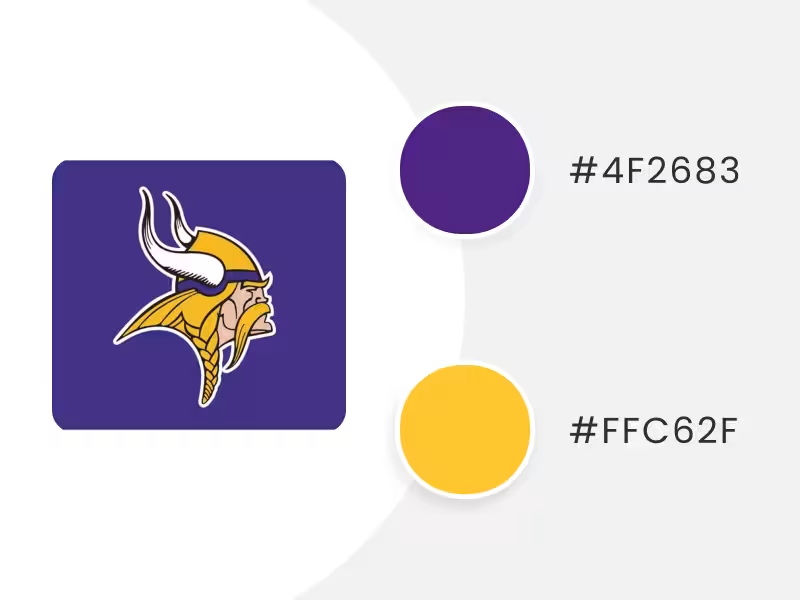
Get all the designs you need to turn your brand into a success
This color used to be one that only wealthy people used, and perhaps that's why it's associated with luxury to this day. The exciting thing about this rainbow color is that it represents fun, creativity, and extravagance. So it's a good match for a brand that wants to project these characteristics into a logo color scheme.

For brands that want to stand out and not be one of the crowd, red is the color of choice, as this vibrant color is usually a great conductor of energy, passion, and dynamism. So many big brands worldwide, usually in the entertainment and food industries, have chosen red as their selected color.
Lorem ipsum dolor sit amet, consectetur adipiscing elit, sed do eiusmod tempor incididunt ut labore et dolore magna aliqua. Nunc eget lorem dolor sed viverra ipsum nunc. Tortor at risus viverra adipiscing at in tellus integer feugiat. Arcu cursus vitae congue mauris rhoncus. A scelerisque purus semper eget duis at. Eget nunc scelerisque viverra mauris in aliquam sem fringilla ut. Diam maecenas sed enim ut. Dolor sit amet consectetur adipiscing elit ut. Id volutpat lacus laoreet non curabitur gravida arcu. Vitae turpis massa sed elementum tempus egestas. Sagittis orci a scelerisque purus semper eget duis at. Porta nibh venenatis cras sed.
Lorem ipsum dolor sit amet, consectetur adipiscing elit, sed do eiusmod tempor incididunt ut labore et dolore magna aliqua. Augue ut lectus arcu bibendum at varius. Nam libero justo laoreet sit amet cursus sit amet. A diam sollicitudin tempor id eu nisl nunc mi ipsum. Et malesuada fames ac turpis egestas maecenas pharetra convallis posuere. Maecenas ultricies mi eget mauris pharetra et ultrices neque. Dictumst vestibulum rhoncus est pellentesque elit ullamcorper dignissim cras tincidunt. Purus ut faucibus pulvinar elementum integer enim neque volutpat. Ipsum a arcu cursus vitae congue mauris. Sagittis purus sit amet volutpat consequat mauris. Fames ac turpis egestas sed. In tellus integer feugiat scelerisque varius. A lacus vestibulum sed arcu. Egestas congue quisque egestas diam in. Est placerat in egestas erat imperdiet sed euismod nisi. Quam quisque id diam vel quam. Dolor sit amet consectetur adipiscing elit pellentesque habitant. Morbi quis commodo odio aenean sed adipiscing diam donec. Diam quam nulla porttitor massa id.
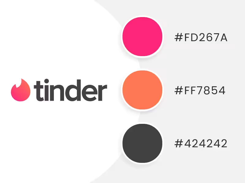
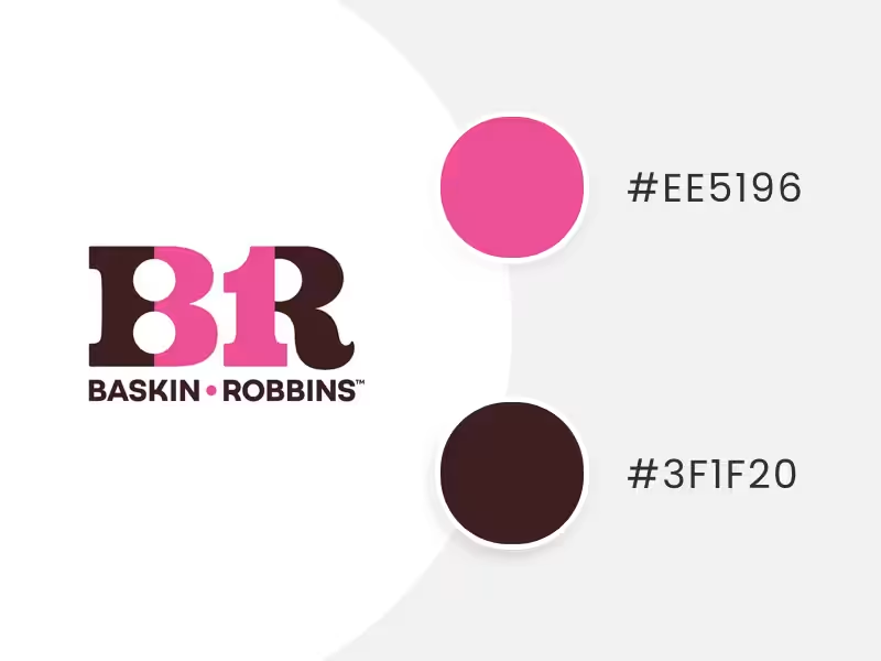
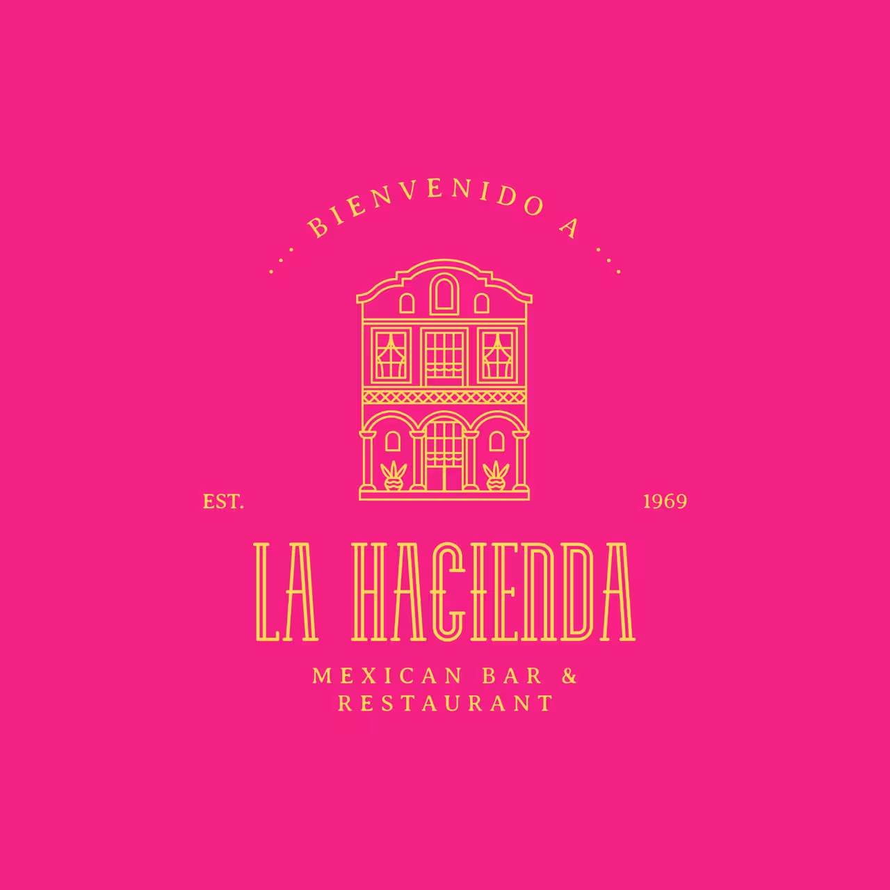
Pink Logo Color Schemes


Get all the designs you need to turn your brand into a success
It's a color associated with a feminine, emotional and dreamy side. Moreover, its different shades make it very commercial for feminine products, childhood, and even now, to link it with the fight against breast cancer. Undoubtedly it's a color that some brands have decided to bet on because it irradiates sensuality, love, sweetness, calm, and sophistication. 
For brands that want to stand out and not be one of the crowd, red is the color of choice, as this vibrant color is usually a great conductor of energy, passion, and dynamism. So many big brands worldwide, usually in the entertainment and food industries, have chosen red as their selected color.
Lorem ipsum dolor sit amet, consectetur adipiscing elit, sed do eiusmod tempor incididunt ut labore et dolore magna aliqua. Nunc eget lorem dolor sed viverra ipsum nunc. Tortor at risus viverra adipiscing at in tellus integer feugiat. Arcu cursus vitae congue mauris rhoncus. A scelerisque purus semper eget duis at. Eget nunc scelerisque viverra mauris in aliquam sem fringilla ut. Diam maecenas sed enim ut. Dolor sit amet consectetur adipiscing elit ut. Id volutpat lacus laoreet non curabitur gravida arcu. Vitae turpis massa sed elementum tempus egestas. Sagittis orci a scelerisque purus semper eget duis at. Porta nibh venenatis cras sed.
Lorem ipsum dolor sit amet, consectetur adipiscing elit, sed do eiusmod tempor incididunt ut labore et dolore magna aliqua. Augue ut lectus arcu bibendum at varius. Nam libero justo laoreet sit amet cursus sit amet. A diam sollicitudin tempor id eu nisl nunc mi ipsum. Et malesuada fames ac turpis egestas maecenas pharetra convallis posuere. Maecenas ultricies mi eget mauris pharetra et ultrices neque. Dictumst vestibulum rhoncus est pellentesque elit ullamcorper dignissim cras tincidunt. Purus ut faucibus pulvinar elementum integer enim neque volutpat. Ipsum a arcu cursus vitae congue mauris. Sagittis purus sit amet volutpat consequat mauris. Fames ac turpis egestas sed. In tellus integer feugiat scelerisque varius. A lacus vestibulum sed arcu. Egestas congue quisque egestas diam in. Est placerat in egestas erat imperdiet sed euismod nisi. Quam quisque id diam vel quam. Dolor sit amet consectetur adipiscing elit pellentesque habitant. Morbi quis commodo odio aenean sed adipiscing diam donec. Diam quam nulla porttitor massa id.
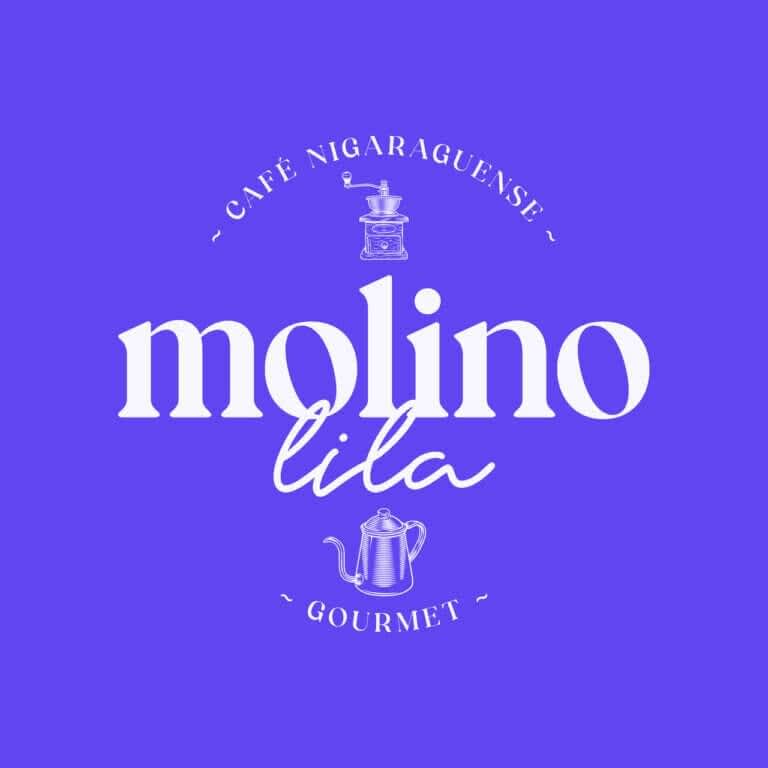
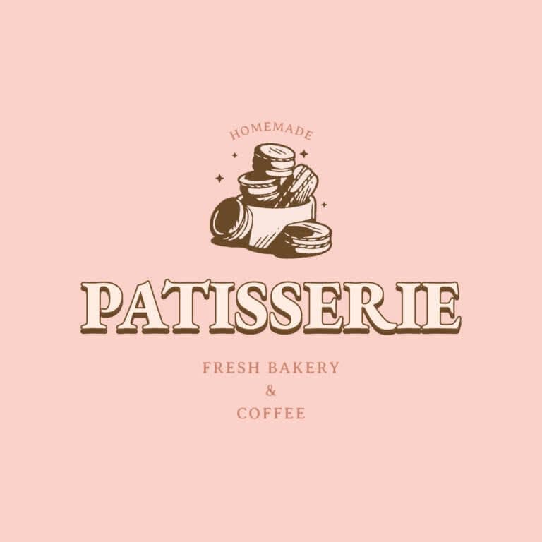
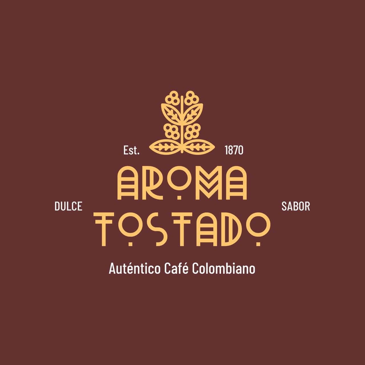
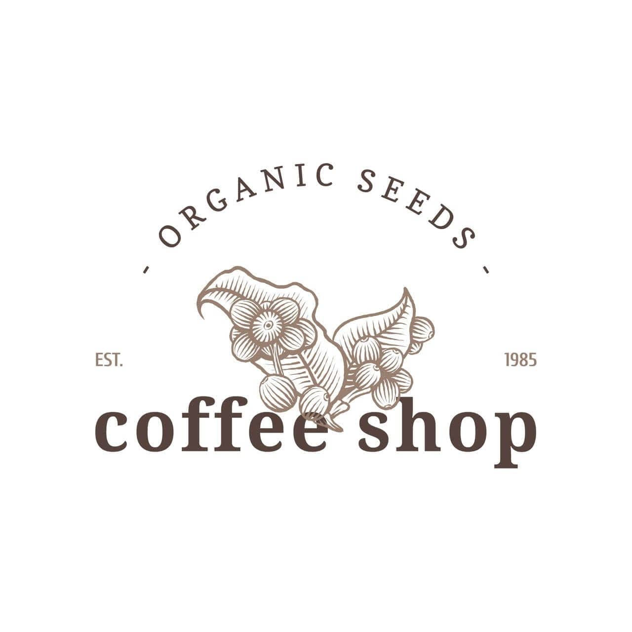
Brown Logo Color Schemes

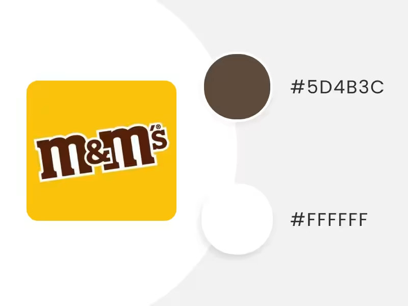
Get all the designs you need to turn your brand into a success
The so-called earth color is a great choice to integrate into the logo color scheme of brands in contact with nature and the outdoors, chocolate and coffee, and fall. As well as the brands that wish to communicate warmth, stability, and solidity. 

For brands that want to stand out and not be one of the crowd, red is the color of choice, as this vibrant color is usually a great conductor of energy, passion, and dynamism. So many big brands worldwide, usually in the entertainment and food industries, have chosen red as their selected color.
Lorem ipsum dolor sit amet, consectetur adipiscing elit, sed do eiusmod tempor incididunt ut labore et dolore magna aliqua. Nunc eget lorem dolor sed viverra ipsum nunc. Tortor at risus viverra adipiscing at in tellus integer feugiat. Arcu cursus vitae congue mauris rhoncus. A scelerisque purus semper eget duis at. Eget nunc scelerisque viverra mauris in aliquam sem fringilla ut. Diam maecenas sed enim ut. Dolor sit amet consectetur adipiscing elit ut. Id volutpat lacus laoreet non curabitur gravida arcu. Vitae turpis massa sed elementum tempus egestas. Sagittis orci a scelerisque purus semper eget duis at. Porta nibh venenatis cras sed.
Lorem ipsum dolor sit amet, consectetur adipiscing elit, sed do eiusmod tempor incididunt ut labore et dolore magna aliqua. Augue ut lectus arcu bibendum at varius. Nam libero justo laoreet sit amet cursus sit amet. A diam sollicitudin tempor id eu nisl nunc mi ipsum. Et malesuada fames ac turpis egestas maecenas pharetra convallis posuere. Maecenas ultricies mi eget mauris pharetra et ultrices neque. Dictumst vestibulum rhoncus est pellentesque elit ullamcorper dignissim cras tincidunt. Purus ut faucibus pulvinar elementum integer enim neque volutpat. Ipsum a arcu cursus vitae congue mauris. Sagittis purus sit amet volutpat consequat mauris. Fames ac turpis egestas sed. In tellus integer feugiat scelerisque varius. A lacus vestibulum sed arcu. Egestas congue quisque egestas diam in. Est placerat in egestas erat imperdiet sed euismod nisi. Quam quisque id diam vel quam. Dolor sit amet consectetur adipiscing elit pellentesque habitant. Morbi quis commodo odio aenean sed adipiscing diam donec. Diam quam nulla porttitor massa id.
White Logo Color Schemes

Get all the designs you need to turn your brand into a success
It's the opposite color of black but combines incredibly well with it – and almost all other colors! It tends to be ideal for brands that want to represent purity, confidence, minimalism, and even perfection. 
For brands that want to stand out and not be one of the crowd, red is the color of choice, as this vibrant color is usually a great conductor of energy, passion, and dynamism. So many big brands worldwide, usually in the entertainment and food industries, have chosen red as their selected color.
Lorem ipsum dolor sit amet, consectetur adipiscing elit, sed do eiusmod tempor incididunt ut labore et dolore magna aliqua. Nunc eget lorem dolor sed viverra ipsum nunc. Tortor at risus viverra adipiscing at in tellus integer feugiat. Arcu cursus vitae congue mauris rhoncus. A scelerisque purus semper eget duis at. Eget nunc scelerisque viverra mauris in aliquam sem fringilla ut. Diam maecenas sed enim ut. Dolor sit amet consectetur adipiscing elit ut. Id volutpat lacus laoreet non curabitur gravida arcu. Vitae turpis massa sed elementum tempus egestas. Sagittis orci a scelerisque purus semper eget duis at. Porta nibh venenatis cras sed.
Lorem ipsum dolor sit amet, consectetur adipiscing elit, sed do eiusmod tempor incididunt ut labore et dolore magna aliqua. Augue ut lectus arcu bibendum at varius. Nam libero justo laoreet sit amet cursus sit amet. A diam sollicitudin tempor id eu nisl nunc mi ipsum. Et malesuada fames ac turpis egestas maecenas pharetra convallis posuere. Maecenas ultricies mi eget mauris pharetra et ultrices neque. Dictumst vestibulum rhoncus est pellentesque elit ullamcorper dignissim cras tincidunt. Purus ut faucibus pulvinar elementum integer enim neque volutpat. Ipsum a arcu cursus vitae congue mauris. Sagittis purus sit amet volutpat consequat mauris. Fames ac turpis egestas sed. In tellus integer feugiat scelerisque varius. A lacus vestibulum sed arcu. Egestas congue quisque egestas diam in. Est placerat in egestas erat imperdiet sed euismod nisi. Quam quisque id diam vel quam. Dolor sit amet consectetur adipiscing elit pellentesque habitant. Morbi quis commodo odio aenean sed adipiscing diam donec. Diam quam nulla porttitor massa id.
Black Logo Color Schemes


Get all the designs you need to turn your brand into a success
Theoretically, black isn't considered a color, but in everyday life, it is. And in fact, it has positioned itself as a favorite and revolutionary color that evokes elegance, mystery, and exclusivity.
And although it has negative aspects that are often culturally related to death, that hasn't been an impediment for great luxury, fashion, and technology brands to succeed thanks to this powerful color.


For brands that want to stand out and not be one of the crowd, red is the color of choice, as this vibrant color is usually a great conductor of energy, passion, and dynamism. So many big brands worldwide, usually in the entertainment and food industries, have chosen red as their selected color.
Lorem ipsum dolor sit amet, consectetur adipiscing elit, sed do eiusmod tempor incididunt ut labore et dolore magna aliqua. Nunc eget lorem dolor sed viverra ipsum nunc. Tortor at risus viverra adipiscing at in tellus integer feugiat. Arcu cursus vitae congue mauris rhoncus. A scelerisque purus semper eget duis at. Eget nunc scelerisque viverra mauris in aliquam sem fringilla ut. Diam maecenas sed enim ut. Dolor sit amet consectetur adipiscing elit ut. Id volutpat lacus laoreet non curabitur gravida arcu. Vitae turpis massa sed elementum tempus egestas. Sagittis orci a scelerisque purus semper eget duis at. Porta nibh venenatis cras sed.
Lorem ipsum dolor sit amet, consectetur adipiscing elit, sed do eiusmod tempor incididunt ut labore et dolore magna aliqua. Augue ut lectus arcu bibendum at varius. Nam libero justo laoreet sit amet cursus sit amet. A diam sollicitudin tempor id eu nisl nunc mi ipsum. Et malesuada fames ac turpis egestas maecenas pharetra convallis posuere. Maecenas ultricies mi eget mauris pharetra et ultrices neque. Dictumst vestibulum rhoncus est pellentesque elit ullamcorper dignissim cras tincidunt. Purus ut faucibus pulvinar elementum integer enim neque volutpat. Ipsum a arcu cursus vitae congue mauris. Sagittis purus sit amet volutpat consequat mauris. Fames ac turpis egestas sed. In tellus integer feugiat scelerisque varius. A lacus vestibulum sed arcu. Egestas congue quisque egestas diam in. Est placerat in egestas erat imperdiet sed euismod nisi. Quam quisque id diam vel quam. Dolor sit amet consectetur adipiscing elit pellentesque habitant. Morbi quis commodo odio aenean sed adipiscing diam donec. Diam quam nulla porttitor massa id.
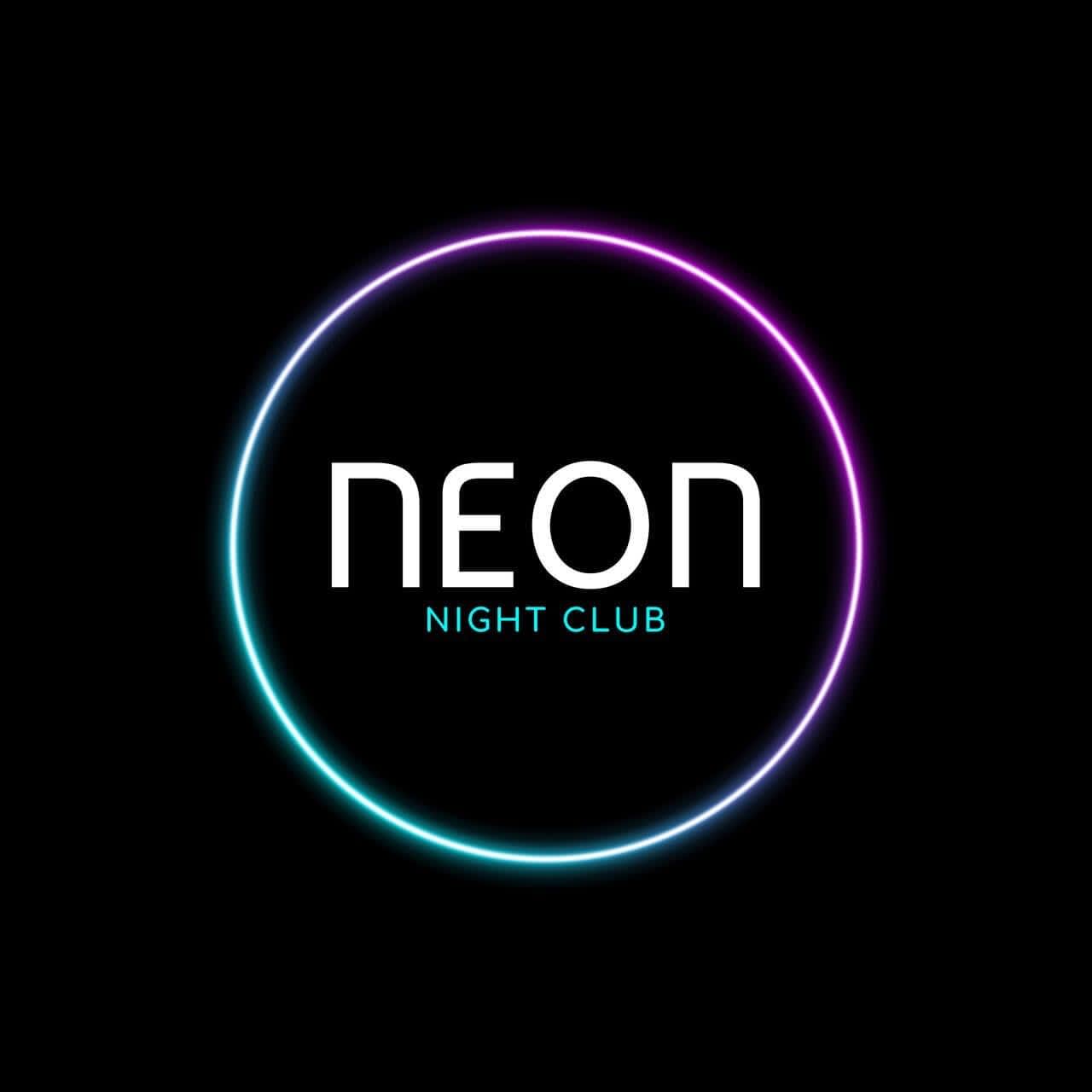
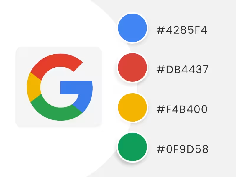
Rainbow Logo Color Schemes


Get all the designs you need to turn your brand into a success
Here, we'll quickly look at some color combinations used by famous brands. We've called them rainbow, not necessarily because they have all 7 colors, but because they occupy 4 or more colors! Maybe it can serve as inspiration for your next logo color scheme. After all, the limit is your creativity!


For brands that want to stand out and not be one of the crowd, red is the color of choice, as this vibrant color is usually a great conductor of energy, passion, and dynamism. So many big brands worldwide, usually in the entertainment and food industries, have chosen red as their selected color.
Lorem ipsum dolor sit amet, consectetur adipiscing elit, sed do eiusmod tempor incididunt ut labore et dolore magna aliqua. Nunc eget lorem dolor sed viverra ipsum nunc. Tortor at risus viverra adipiscing at in tellus integer feugiat. Arcu cursus vitae congue mauris rhoncus. A scelerisque purus semper eget duis at. Eget nunc scelerisque viverra mauris in aliquam sem fringilla ut. Diam maecenas sed enim ut. Dolor sit amet consectetur adipiscing elit ut. Id volutpat lacus laoreet non curabitur gravida arcu. Vitae turpis massa sed elementum tempus egestas. Sagittis orci a scelerisque purus semper eget duis at. Porta nibh venenatis cras sed.
Lorem ipsum dolor sit amet, consectetur adipiscing elit, sed do eiusmod tempor incididunt ut labore et dolore magna aliqua. Augue ut lectus arcu bibendum at varius. Nam libero justo laoreet sit amet cursus sit amet. A diam sollicitudin tempor id eu nisl nunc mi ipsum. Et malesuada fames ac turpis egestas maecenas pharetra convallis posuere. Maecenas ultricies mi eget mauris pharetra et ultrices neque. Dictumst vestibulum rhoncus est pellentesque elit ullamcorper dignissim cras tincidunt. Purus ut faucibus pulvinar elementum integer enim neque volutpat. Ipsum a arcu cursus vitae congue mauris. Sagittis purus sit amet volutpat consequat mauris. Fames ac turpis egestas sed. In tellus integer feugiat scelerisque varius. A lacus vestibulum sed arcu. Egestas congue quisque egestas diam in. Est placerat in egestas erat imperdiet sed euismod nisi. Quam quisque id diam vel quam. Dolor sit amet consectetur adipiscing elit pellentesque habitant. Morbi quis commodo odio aenean sed adipiscing diam donec. Diam quam nulla porttitor massa id.
What Logo Color Schemes Will You Choose?
So far, we've learned from the basics of colors to the palettes you can take as inspiration for your logo. But keep in mind that colors, more than a visual appeal, are a business decision that shouldn't be taken lightly, as they can affect everything, from perception to sales. Remember to check out How to Choose the Best Fonts Logos for Your Design.We hope this mini-guide has helped you, and remember that you can start designing your own logo here. Once you have it ready, you can apply your logo color schemes to different branding materials. For example, on business cards, flyers, t-shirts, stationery, social media, and anywhere you can imagine. Last but not least, check out how to design a logo with the logo maker, and please avoid the 10 Distinctive Characteristics of a Bad Logo Design. 😉
Lorem ipsum dolor sit amet, consectetur adipiscing elit, sed do eiusmod tempor incididunt ut labore et dolore magna aliqua. Nunc eget lorem dolor sed viverra ipsum nunc. Tortor at risus viverra adipiscing at in tellus integer feugiat. Arcu cursus vitae congue mauris rhoncus. A scelerisque purus semper eget duis at. Eget nunc scelerisque viverra mauris in aliquam sem fringilla ut. Diam maecenas sed enim ut. Dolor sit amet consectetur adipiscing elit ut. Id volutpat lacus laoreet non curabitur gravida arcu. Vitae turpis massa sed elementum tempus egestas. Sagittis orci a scelerisque purus semper eget duis at. Porta nibh venenatis cras sed.
Lorem ipsum dolor sit amet, consectetur adipiscing elit, sed do eiusmod tempor incididunt ut labore et dolore magna aliqua. Augue ut lectus arcu bibendum at varius. Nam libero justo laoreet sit amet cursus sit amet. A diam sollicitudin tempor id eu nisl nunc mi ipsum. Et malesuada fames ac turpis egestas maecenas pharetra convallis posuere. Maecenas ultricies mi eget mauris pharetra et ultrices neque. Dictumst vestibulum rhoncus est pellentesque elit ullamcorper dignissim cras tincidunt. Purus ut faucibus pulvinar elementum integer enim neque volutpat. Ipsum a arcu cursus vitae congue mauris. Sagittis purus sit amet volutpat consequat mauris. Fames ac turpis egestas sed. In tellus integer feugiat scelerisque varius. A lacus vestibulum sed arcu. Egestas congue quisque egestas diam in. Est placerat in egestas erat imperdiet sed euismod nisi. Quam quisque id diam vel quam. Dolor sit amet consectetur adipiscing elit pellentesque habitant. Morbi quis commodo odio aenean sed adipiscing diam donec. Diam quam nulla porttitor massa id.
Resources
FAQ
What They Say About us


Very easy to design a beautiful logo and with a lot of options.
David Zukerman


Make Unlimited Mockups, Designs, Logos and Videos


Unlimited Subscription
From:
/mo*
Unlimited Downloads
*Cancel anytime. Unlimited subscription billed yearly in USD. 1 month minimum commitment if subscribers have downloaded any templates.