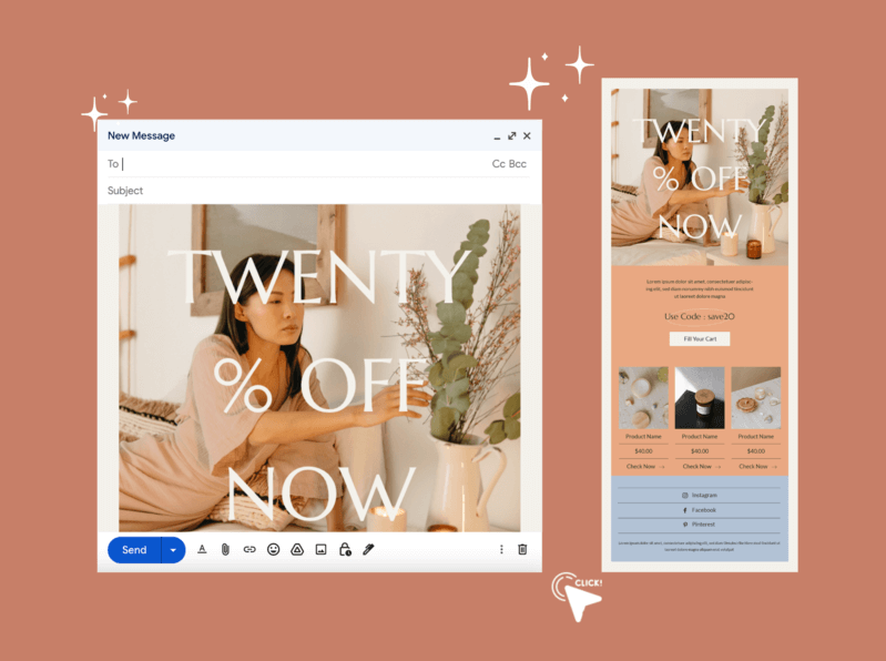
More than 300 billion emails were sent in 2021 alone. Imagine standing out from that crowd. Email marketing will always be integral to any brand’s marketing strategy. But simply sending emails doesn’t guarantee success; you need to design your emails impeccably to convert leads. That said, good email design is more than just for visual appeal. It’s supposed to help you sell more of your products, build stronger relationships with your target audience, and improve your overall return on investment (ROI) in email marketing. Simply put, if you want your email marketing campaigns to succeed, you’ll need well-designed emails. With that in mind, here are eight email design best practices to follow when preparing your email templates.
Back to School Rush is coming fast!
Get unlimited access to mockups that convert when it matters most
Start creating now!
8 Tips for Email Design
- 1. Grab Your Subscribers’ Attention With Engaging Subject Lines
- 2. Use a Customized Email Template
- 3. Add User-Generated Content to Your Email Design
- 4. Ensure Your Email Templates Match Your Brand Identity
- 5. Use Images That Add Value
- 6. Personalize Your Emails With Dynamic Content
- 7. Use Your Sender Name To Enhance Credibility
- 8. Make the Email Design Responsive on All Devices
- Convert Your Leads Into Loyal Customers With Impeccable Email Designs
1. Grab Your Subscribers’ Attention With Engaging Subject Lines
Your subject line needs to be engaging, interesting, or entertaining and give enough information to convince your recipients to open your email. Since email inboxes are usually very full, it’s crucial to come up with an outstanding subject line.
People read subject lines to filter out irrelevant emails. So, writing an engaging subject line is a foolproof way to get your customers’ attention.
Here are some elements you can include in your subject lines to make them stand out in an inbox:
- Personalization (for example, your customer’s Name);
- Emojis;
- Numbers;
- Terms related to your brand;
- Questions;
- Power words such as simplify your marketing attribution, automate your email marketing in under 5 minutes, effortless lead generation strategies, etc.;
- Idioms such as keep you in the loop, up in the air, etc.;
- Puns.
Your subject line also shouldn’t have too many characters since some email mailbox providers may truncate it. As a result, your message may lose its impact and meaning or look funny and awkward. Keep the subject line relatively short (below 60 characters) to ensure your message comes across as intended.
Here are more things to avoid when crafting email subject lines:
- Writing in all caps;
- Deceiving or tricking customers into opening your emails;
- Using excessive punctuation;
- Using spam-related phrases.
2. Use a Customized Email Template
Using an email newsletter template is an excellent way to create beautiful emails. It can give your content a professional look while speeding up the design process.
To achieve this, use an email marketing software like Sender, which has a drag-and-drop editor. It’ll allow you to create content without HTML or coding knowledge. Then, after you’ve chosen a template, all you have to do is rearrange the design elements and add the email copy. Sender also provides responsive email templates that automatically convert the content layout to be viewed on desktop, mobile devices, and tablets.
Templates are an excellent starting point for effective email design. But, more importantly, they provide an opportunity for your brand image to shine through. However, it’s not a must to use the design features of a template. You can change anything that’s inconsistent with your brand image, such as the background color or fonts.
Ensure your email campaign designs are consistent to build trust and reliability with your audience. That means sticking to a color scheme, heading structure, font, and a consistent email footer.
3. Add User-Generated Content to Your Email Design
User-generated content (UGC) refers to any content created by the end-user. This includes product reviews, photos, customer feedback, and social media posts.
Incorporating UGC into your email is an effective way to leverage social proof and reinforce the credibility of your brand. So, highlight real people to create a two-way dialogue in your emails and humanize your brand.
You can streamline the UGC experience by delivering personalized content such as Instagram posts or positive reviews based on email subscriber behavior and interests. You can also include relevant buyer endorsements across your emails to drive conversions.
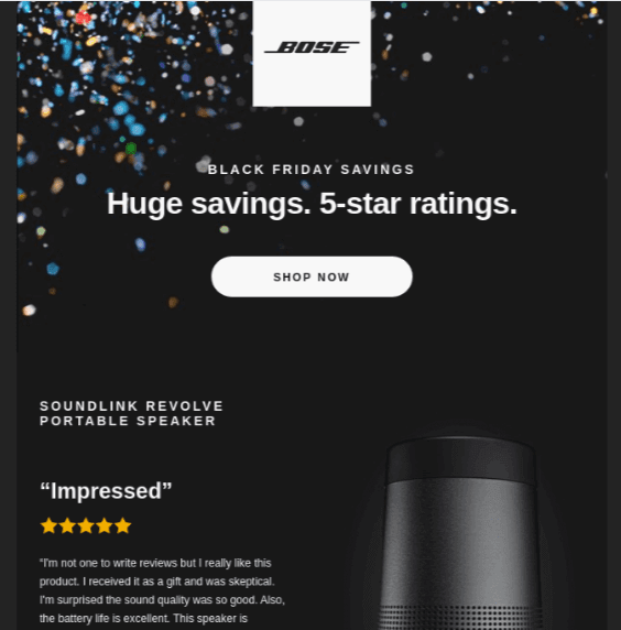
Here’s an email example from Bose that has incorporated a customer review:

4. Ensure Your Email Templates Match Your Brand Identity
Your email templates should match your brand identity to help your recipients form a stronger relationship with your business.
That means your emails’ colors, logo, call-to-action (CTA) buttons, typography, and imagery must be consistent with what’s on your website and other marketing channels. Reboot shares that you can increase brand recognition by 80% if your brand uses a signature color.
Consider the suggestions below if you’re still developing your brand’s visual identity:
- Develop a color scheme from attractive, complementary colors. Have a color set for individual elements like headers, copy, and CTAs.
- Choose two fonts that complement each other and use them throughout your emails — one for the main text and CTAs and one for the headlines.
- Don’t make your email templates too complicated. Ensure they’re simple, recognizable, and aesthetically pleasing.
Also, add your company logo to emails to distinguish your business from other brands your recipients will see in their inboxes.
In the template, place the logo at the top of your email in the middle or left corner. Some email marketers like to include their logo in the footer, just above the disclaimer and unsubscribe link.
When your emails are consistent with your brand’s visual identity, your recipients will develop more brand awareness.
5. Use Images That Add Value
While photos are a superb way to break up your email message and make your content more digestible, you shouldn’t overuse them.
Sending emails with too many photos, illustrations, or infographics can result in problems such as:
- Issues in displaying the content;
- Emails taking a long time to load;
- A vague and unfocused message to your subscribers.
To avoid these pitfalls when it comes to email design, ask yourself what value an image adds to your content. Some great ways to add pictures to your email campaigns include:
- Adding a few high-quality photos of your products;
- Spotlighting a team member;
- Using an explanatory infographic.
Avoid using stock images since they don’t add value to your emails and large files because they can cause loading issues and frustrate your readers. Instead, use Placeit by Envato; our library is huge, whether it’s designs or mockups! It contains thousands of professional and designer-created graphics to choose from.
Remember to consider people who don’t have automatic image downloading turned on. Even without pictures, your emails must persuade them that your marketing materials are worth reading.
Ensure your email newsletters have properly styled text and images with the ALT text attribute. If some recipients use a screen reader to discover your emails, the ALT attribute will enable them to understand the content of your email.
6. Personalize Your Emails With Dynamic Content
One of the most significant trends in email design is a shift from generic one-to-many approaches to personalized one-to-one emails based on customer behavior.
Thanks to features like email automation, segmentation, and lead scoring, you can tailor content creation to individuals like never before. This results in the most dynamic, relevant, and innovative email designs.
Email personalization goes beyond using contacts’ first names in the greeting. It involves using dynamic content to take personalization to the next level. That’s where you change entire sections of your email content to make email campaigns more relatable and appealing to subscribers.
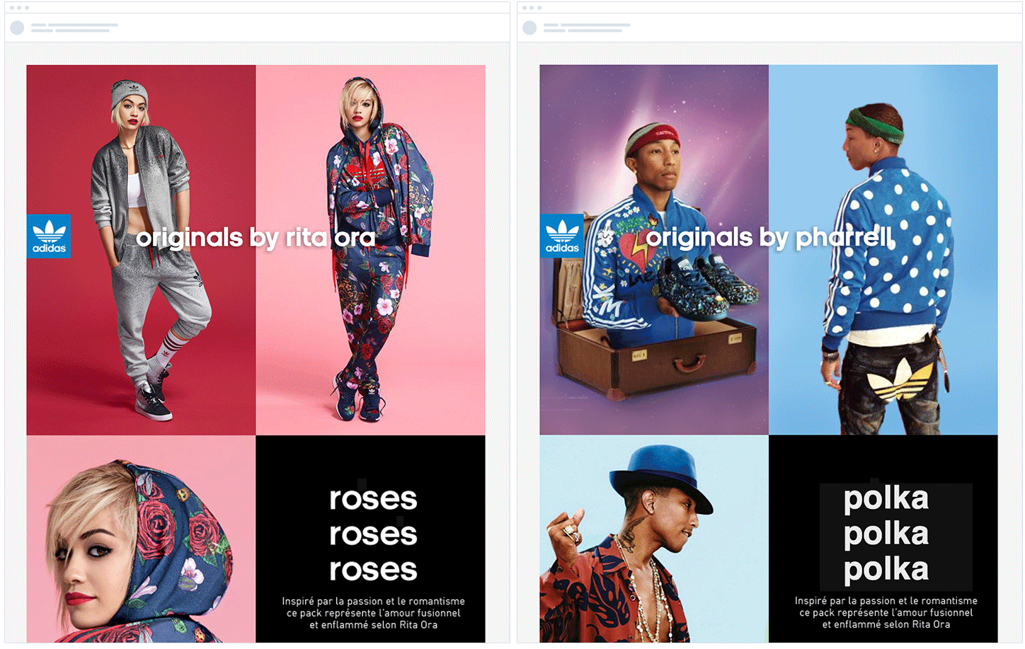
The more you know your customers; the more targeted, customized, and relevant your emails can be. For example, Adidas shows their women’s products to female subscribers and men’s products to male subscribers in the email campaign below:

7. Use Your Sender Name To Enhance Credibility
The Sender’s Name is a crucial element of any email design. It adds credibility to the email and makes the recipient curious enough to open it.
The main purpose of the Sender’s Name is to inform your readers who sent the message. The sender name can also reinforce your subject line and preheader and increase your email open rates.
There’s no one-size-fits-all approach for choosing the right sender name. But make it personal, short, and relevant. Here are some popular patterns (with examples) you can follow when selecting your sender name.
- [Company name] — Sender;
- [Department name] at [Company name] — Content at Sender;
- [Person’s Name] from [Company name] — Camilla from Sender;
- [Company name] Team/Community/Crew — Sender Team;
- [Company name] [Name of the topic or message] — Sender Newsletter;
- [Employee name] — John Doe.
Your sender name needs to be trustworthy and recognizable. If your subscribers have had a positive experience with your brand, they’ll be more likely to open emails with the Sender’s Name next to them.
8. Make the Email Design Responsive on All Devices
Most people check emails on their mobile devices when not using a desktop or laptop. For that reason, you must create responsive emails regardless of the device. To make your email design responsive, keep the copy short and legible so people can read it on the go.
You can also design it so that the links and CTAs are easily accessible with your thumb. Repeat the primary call-to-action at the end of the email if you have a lengthy message to save your reader from having to scroll.
💡Keep reading: How to Create an Email Campaign for Your Online Shop
Convert Your Leads Into Loyal Customers With Impeccable Email Designs
Different brands are always flooding your email clients’ inboxes, fighting to win their attention. That’s why good email layout design is critical.
Getting your audience’s attention is the first step toward effectively nurturing your relationship with leads, upselling customers, getting referrals, and increasing revenue. Use the email design best practices discussed above to awaken their curiosity and stand out in their inboxes.
If you’re looking for an email marketing tool that makes crafting email templates simple and rewarding, sign up for Sender’s FREE FOREVER plan.
Author’s Bio:

Skirmantas Venckus is a writer by day and reader by night. He hates talking about himself in the third person. He is also the growth hacker at Sender.net – the email marketing provider that is focused on user-friendliness, affordability, and utility. Linkedin
