Content and UX marketing are both tricky strategies to pin down. Once you could post a short, 500-word article and watch your rankings go up, that just won’t do the trick in the current climate.
So what can you do to cut through the noise and take your content strategy to the next level?
Whether you’re a T-shirt designer, an app developer, or a small business, a good place to start is aligning your content marketing with your UX design strategy. In other words, making sure your content enhances the user experience on your website. If you can suss this out, you’re on to a real winner.
In this article, we’ve outlined four key things to focus on when aligning your content marketing with your UX design strategy. By the end, you should have a good idea of what you need to do to make sure your content feeds into the UX design of your website and how your UX design can make your content easier to navigate.
Let’s get right to it.
1. Get to Know Your Audience
First things first. In order to provide content that’s tailored for your audience, you need to know who they are. This might seem like an obvious place to start, but it’s an important point to cover. Especially as you’ll need to have a thorough understanding of who they are if you want to improve their experience on your website.
You probably already have a good idea of who your customer base is, but it’s always worth revisiting this every now and then to make sure things haven’t changed (as they often do). Spend some time figuring out who your audience is and researching their demographic to fully understand who you’re targeting.
Once you have this information, you can start to think about how to tailor your content for your audience. Whether that’s creating new landing pages to appeal to a certain audience or targeting the right keywords with SEO, the more you know about your audience, the more your content can be tailored to them.
And ultimately, when your content is tailored to your audience, their experience on your site will improve.
2. Keep it Simple and Minimize Distractions
You might feel like you’re doing people a favor by giving them so many options to choose from on your website. Well, we’re here to tell you that this isn’t always the case. In fact, it can be distracting for those trying to navigate your website.
For this reason, we’d always recommend keeping your website design nice and simple. The easier it is to navigate, the better experience your users will have –and the same rule applies when it comes to content. If you start to waffle and use overly-complicated language, you might lose their interest, so choose your words carefully and keep it simple.
When you’re trying to align content with UX design, you’ll also want to think about your blog page’s layout. First impressions are important, and a simple structure will help users navigate your blog efficiently. Here are a few best practices to ensure your blog is as user friendly as possible:
- Limit the number of times you post at once. You don’t want to overwhelm users with 20 articles all in one go, so make sure you schedule your uploads to go live on different dates.
- Adding a search bar will help users filter through the content and find what they’re looking for as quickly as possible.
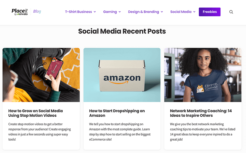
- Categorizing your blogs by topic will also help users navigate through the sea of content. You can take a look at our blog as an example:

3. Integrate a Chatbot to Your Website
Chatbots allow businesses to engage with customers 24/7. That’s right, all day, every day. Using pre-made conversations, chatbots respond to customers to improve their browsing experience. They answer any questions your customers might have while browsing your site and direct them to other articles or landing pages to provide the user with more information.
If you do decide to use a chatbot as part of your UX strategy, you’ll also need to think about how your content (both new and existing) feeds into this. The chatbot will direct people to existing content on your website, so you need to be sure that this content provides users with the answers they’re looking for.
But how can you be sure that your content is providing people with what they’re looking for?
Well, to find out if your content is giving people what they want, you can review the data you have from the chatbot. An article from WebsiteSetup says that using data from your chatbot allows you to:
“focus on resolving more complex issues and [have] more meaningful interactions with leads and customers.”
We have to agree with this. By reviewing the data, you can determine what questions people are asking and whether your content is providing those answers. Once you’ve reviewed your content, you can tweak anything you need to create new content to improve their overall experience for your customers.
4. Use Internal Linking
Internal linking is a great way to encourage users to stay on your website. When done right, you can keep users on your site for a few clicks before they land on the page that will take them from being a potential customer to a solid lead or conversion.
But what exactly do we mean when we talk about internal links? Let’s use writing a blog as an example.
Imagine you’re writing an article about how to develop an app. Throughout the article, there will be opportunities for you to link to other pages, including resources from your website, tutorials, product pages, similar articles – and these are just to name a few.
By linking internally, you’re encouraging users to stay on your site for as long as possible and helping them navigate your site more efficiently.
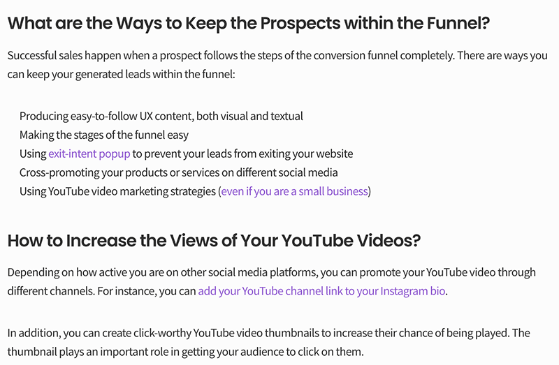
Here’s an example of internal linking from one of our very own articles:

As you can see, the text in purple is linked to other pages on the website, allowing people to easily click the link for more information.
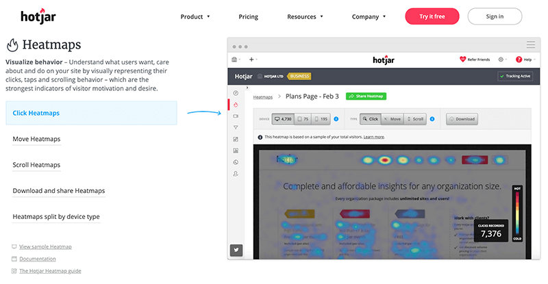
There are also tools out there that can help you identify any missing internal links on your website. Platforms such as Hotjar or Lucky Orange create heat maps to show you where people are clicking on your website. And if they’re clicking somewhere that isn’t linked, you need to add a link there as soon as possible.

So you see, linking internally is a great way to align your content marketing with your UX design strategy. By giving users access to additional information within the content itself, you’re also improving their experience on your website. It’s a win-win.
What’s Next?
So there you have it. Our top 4 tips for aligning your content marketing and UX design strategy. These tips will undoubtedly help you get the ball rolling, but we understand that every business is different and that there will be other ways to align content with the UX design of your website.
It’s down to you to figure out what these are, but using these 4 top tips will give you a solid base to start. And remember: make sure you have a thorough understanding of who your customers are. Without this, it’ll be pretty tricky to tailor your content and improve your UX design.
Good luck out there!
About the Author

Reid Burns has his roots in supply chain, handling global teams for private label companies. He has since transitioned to freelance work, providing thought leadership in the e-Commerce domain.
