The Easiest Mockup Generator In the Market!
Placeit is the perfect mockup generator. It’s as easy as choosing a mockup, dropping your screenshot, and downloading it. You can choose from hundreds of mockups to create your own in seconds. And by hundreds, we really mean over 800+ mockups for iOS, Android, and Windows Mobile apps. We have all the latest devices mixed between different types of environments, from work to casual, from home and families to fun and bars.
Placeit acts as a mockup generator because it will create a photorealistic mockup as soon as you drop your screenshot, including realistic glares and shadows. No need for any Photoshop work. Our professionally shot images really allow you to make the best use of our mockup generator.
Here are some examples:
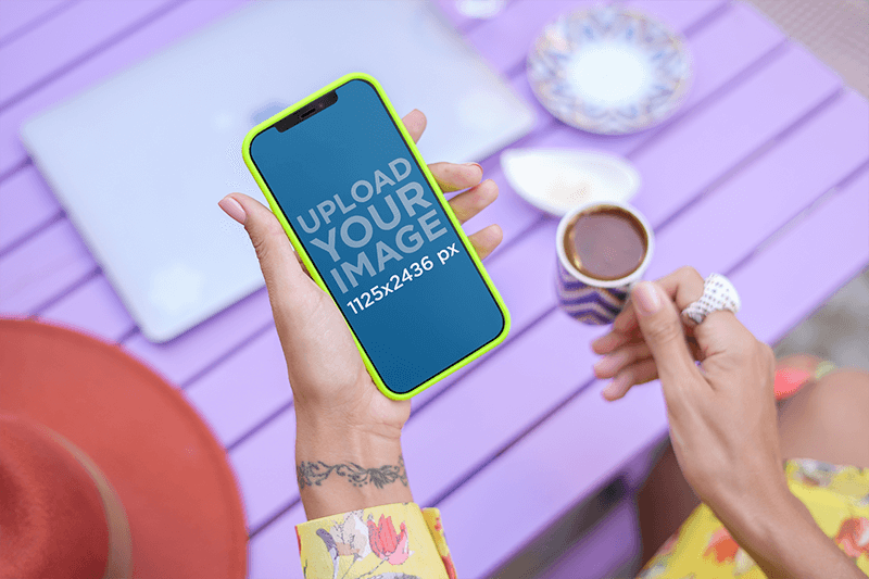
Digital Mockup of a Woman Holding an iPhone 12 Pro
Check out this mockup of a woman holding an iPhone 12 Pro in a portrait position. She has a wrist tattoo and is holding a hot chocolate mug in the other hand. Start now!
Ipad Mockups of Businessman
This is an amazing iPad Mini mockup, it features a young businessman who is holding the white iPad Mini in landscape position, and the image is a top view shot, which provides an excellent view of the iPad’s screen. This mockup creates a business atmosphere as it looks like this young man is showing important business data to a coworker with his iPad; he may even be using a productivity or business app to share statistics or other important data; it could even be your app that he is showcasing. All you need to do is drag a screenshot of your own app into the iPad’s screen, and you’ll get an amazing mockup you will be able to share with partners or potential users; mockups are a great tool to enhance your app marketing strategy, give it a try with this iPad Mini mockup.
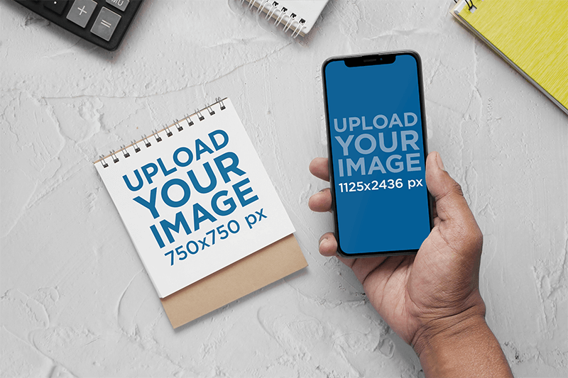
Mockup of a Person Holding an iPhone13 ft a Notebook
This mockup features a notebook and a person’s hand holding an iPhone 13 in an office setting. Try it now and display your planner and calendar designs!
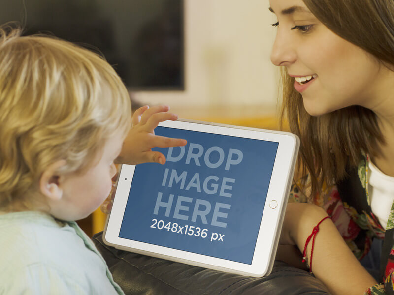
White Ipad Mini Mokcup of Mom & Son
In this iPad mockup, we can see a young mom enjoying some quality time with her son; he is barely a toddler and is already familiar with high-end technology, as we can see him tapping on the screen of a white iPad in landscape position; she smiles with amusement of her child’s abilities with the device. This is the perfect scenario in which you can display your new iOS kids app and show it to the world as a part of your app marketing strategy. All you need to do is drag a screenshot of your app directly into the screen of this iPad or simply type your mobile responsive site’s URL above, and it will automatically generate a screenshot that fits; your end result will be an amazing image that will carry your app in a wonderful context that will provide a clear idea of what your app does and who your market is. Placeit is definitely a great app marketing tool, go ahead and try it out right away.
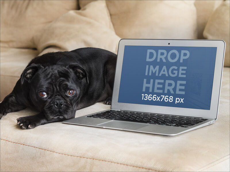
Macbook Mockup of a Dog & Laptop
It doesn’t get any cuter than this. This beautiful black pug puppy just came home from a walk outside and is exhausted, so he lays on the couch next to a MacBook Air, the perfect place for you to display your new pet care website or web app. Actually, any website would look stunning next to this cute puppy. The photograph has great lighting, and the arrangement works fantastically, as it allows you to display a full screenshot on the MacBook, which steals the spotlight and provides a great context for you to present your new site. Use MacBook mockups as a part of your online marketing strategy to provide your potential users and clients a clear insight into your website’s design and features while being used. Besides, this mockup generator makes it super easy for you to create an amazing image within seconds! Just drag and drop your screenshot over the MacBook screen.
Mockup ft a Female Gamer Pointing at Her iPhone
This iPhone mockup features a happy woman pointing at her phone. She’s wearing a headset and is sitting on a gamer chair.
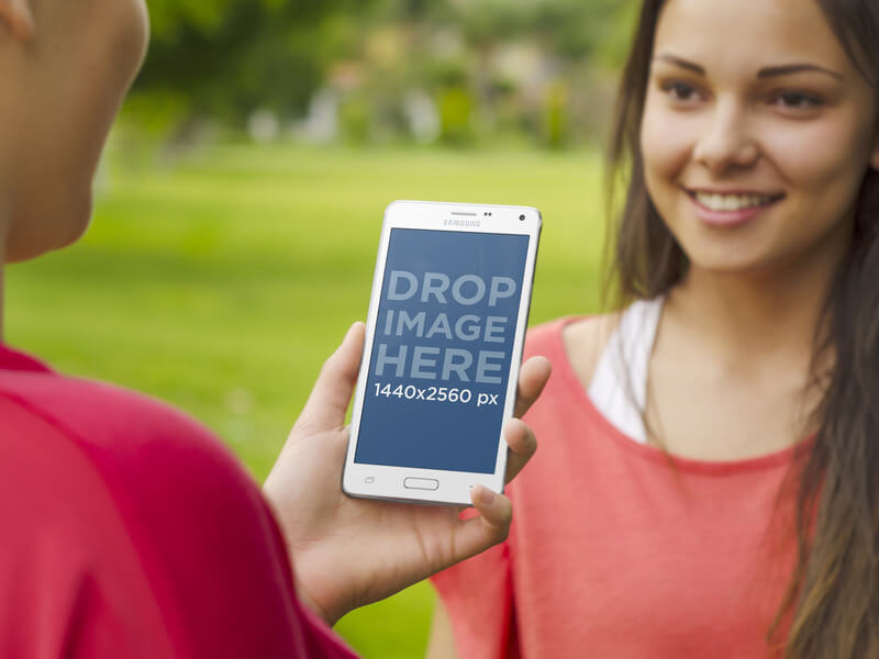
Samsung Galaxy Note Mockup of Friends at Park
A beautiful, professional Samsung Galaxy Note mockup showing two friends hanging out at the park. One of them holds the phone while the other smiles. Buff up your app marketing strategy with this device mockup. It’s always better to show your design in context, so we created Placeit to help you. All small sizes are free. You can just drop an image, and Placeit will generate your personalized mockup in seconds. If you designed an Android app and need to showcase it, try out this Samsung Galaxy Note mockup. You can also input a URL, and it will show on the device screen.
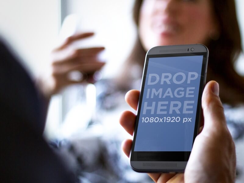
Black HTC Mockup ft a Young Couple Having Drinks
Try this HTC Mockup here! Have a leisure or event app to promote? Then this mockup is ideal for you. This scenario features a young couple relaxing over drinks. Perhaps they’re on a date, and the man is looking up movie times? Or the couple is having dinner, and he is checking a social media account? Or maybe he is making reservations for a spontaneous trip they just decided to take? There are a lot of marketing options here. The close-up shot of the HTC’s portrait screen means that you can easily upload a detailed screenshot from your app. Making this Placeit mockup the perfect marketing tool for you.
Mockup of a Delivery Man Holding an iPhone13
Check out this digital mockup featuring a man holding an iPhone 13. Try it now and showcase your latest app projects creatively!
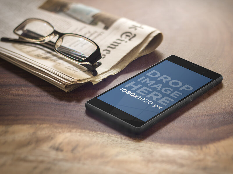
Android Mockup of Sony Xperia with Glasses & Newspaper
Try this Android mockup here. There are thousands of Android apps at the Google Play store; in order to make yours stand out, you must think outside the box; using device mockups as a part of your app marketing strategy is a great idea since they will allow you to share an insight of your app’s design and features while being used in a real-life scenario. Take a look at this particular mockup; the image has great lightning which generates a warm environment that perfectly complements the items on the table; we can see a newspaper with a pair of reading glasses on top of it, and next to these, the beautiful Sony Xperia, isn’t it a great mockup? Try it out now by simply dragging your image onto the Sony Xperia’s screen, or just type your URL above.
How to Use Mockups for Your Designs
Making a t-shirt mockup is the next step after giving the finishing touches to your clothing line’s designs. Promote your designs and how your t-shirt designs look like while being worn by real people in a real-life scenario. The best thing about Placeit is that you don’t need Photoshop to add your designs to these fantastic templates, you just drop your image, and it will be automatically adjusted. So take a look at this video to get started!
Placeit can create a beautiful app demo video for you. Give it a try!
