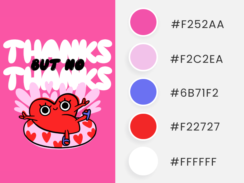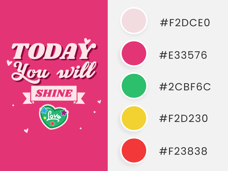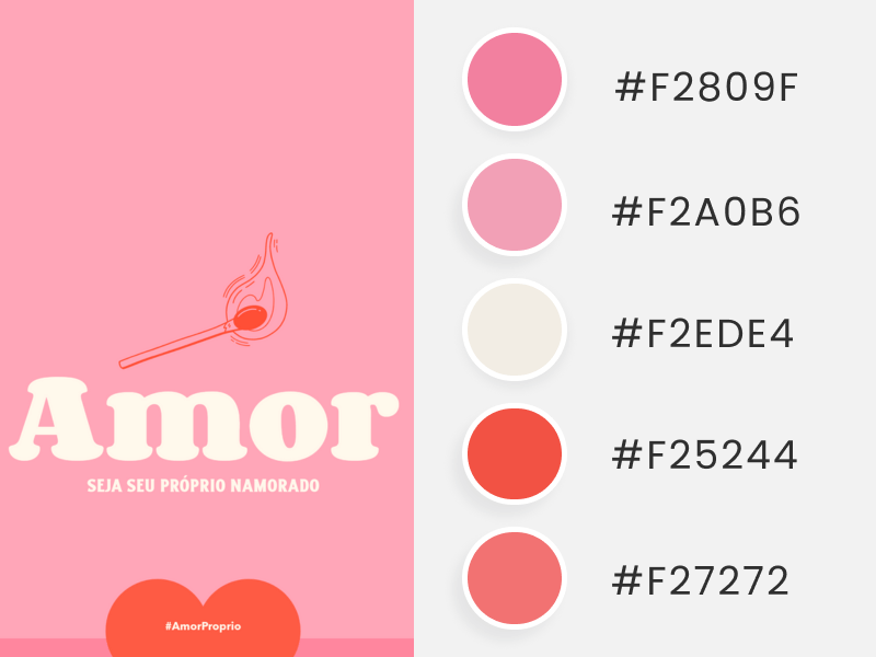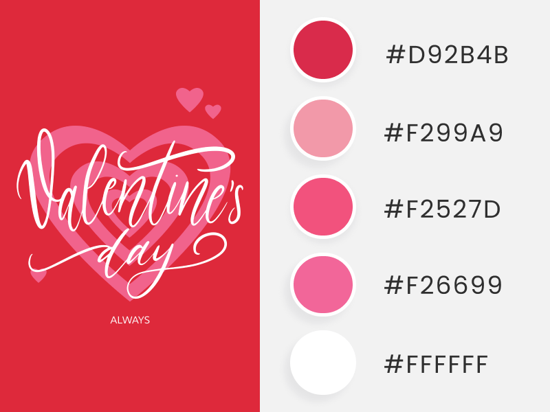
As January wraps up, it’s time to get ready for the month of love. To get your brand’s aesthetics just right or to infuse love into your Valentine’s Day marketing campaign, product line, or design, we’ve rounded up +30 Valentine’s color palettes personally approved by Cupid himself! 👼🏹💖
Below, you’ll discover a wide variety of color palettes to find your perfect match! Expect classic Valentine’s colors, soft pastel tones, and dark, eye-catching combinations, allowing your brand to become a heart-stealing sensation!
❤️🔥 Jump Ahead to What You Need:
Mark Your Calendar: Save These Dates
Apart from Valentine’s Day on February 14, there are two more love-themed events in our February t-shirt ideas calendar that you might want to check out or consider:
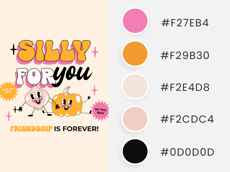
💛 Galentine’s Day. Tuesday, February 13th! It’s the day when besties come together to celebrate the beauty of friendship, making it a unique and fun day.
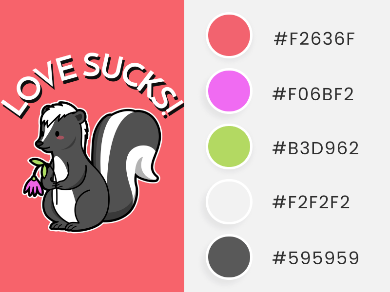
🖤 Anti-Valentine’s. From Thursday, February 15th, to Wednesday, February 21st, we have an entire week dedicated to those who stand against the forces of love. The color for this anti-love celebration is, of course, black! (And we included some color palettes with this color, too 😉).
Why Use Valentine’s Day Color Palettes?
Colors are one of the first things we notice when strolling down the street or entering our favorite local shop or website.
And guess what steals the spotlight during special dates and seasonal events like Valentine’s Day? You got it – colors! 🌈💖During special dates and seasonal events like this one, colors take center stage to communicate what’s new in-store and spread the love.
But there are more reasons to incorporate Valentine’s colors for this beloved date. Let’s look at them:
🌱 1. Freshness
By continually adapting your brand to seasonal events, you send your customers a powerful message. It’s a declaration that you’re not just up-to-date – you’re interested in keeping your brand fresh and relevant, always with something new in store to surprise your customers.
Think of Placeit by Envato – our stunning marketing team ensures our digital platforms always look amazing by promoting relevant, trendy, seasonal templates and content, for special dates.
🗓️✨Visit our website, YouTube channel, and blog on January 25th to witness the transformation into a gorgeous Valentine’s Day theme. This dynamic approach keeps our existing customers engaged and attracts new ones with the promise of something fresh and exciting!
✨ 2. Spotlight on Your Campaign
Imagine this scenario – you’re running an incredible Valentine’s Day campaign. However, if your website remains unchanged, it might go unnoticed until customers stumble upon your marketing deals or products. To ensure your promotions and communications stand out, dress and add color to your site to put it in the spotlight.
Adapting your brand’s marketing materials or products to these vibrant hues signals to your users or visitors that something new or extra is on offer. While elements like fonts, texts, and imagery play a crucial role, the colors grab attention at first glance and make all the difference. 🙌
✨💘🥰 Don’t miss our Valentine’s Day Etsy guide packed with easy tips to help you turn hearts into sales.
💓 3. Emotional Connection
Colors evoke moods and emotions that can alter how we perceive a product or a brand. When using seasonal color palettes like Valentine’s, people can quickly associate the colors with this special date, positively impacting their mood. Additionally, it creates a sense of anticipation, excitement, and interest! 😉
Real-Life Examples of Valentine’s Day Color Palettes
Now, let’s take a look at two brands that have already incorporated Valentine’s Day color palettes into their websites:
🛒✨ Target Valentine’s Day
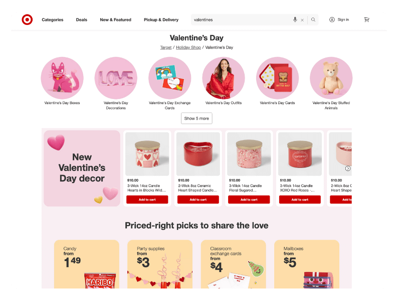
Our first example is Target! The retail shop has already included a Valentine’s Day section on its home page. To make it stand out, Target added soft and contrasting tones of pink with touches of white and black. Also, they added a couple of heartwarming products, primarily with red and pink packaging.
But that’s not all! The company created a remarkable landing page for this profitable celebration. This page shows some bubbles with light pinks and gradients composed of white and pink, along with soft yellow boxes to highlight some products.
🍫💘 M&M's Valentine’s Day
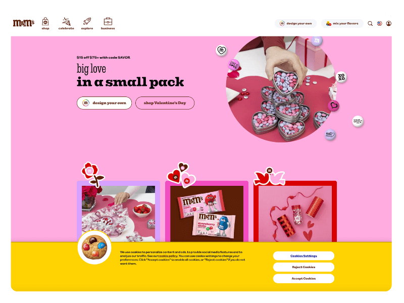
On the other side, we have the official M&M’s site, where the brand also dressed their website with a Valentine’s Day theme but with a slightly different vibe. M&M’s opted for a more vibrant color palette, including vivid pink, red, purple, and yellow, with touches of black and brown (representing chocolate).
Additionally, the famous chocolate brand incorporated its logo into some of the love graphics, providing a customized branding touch. M&M’s shows us that adapting seasonal campaigns doesn’t mean sacrificing the essence of your brand – it’s all about infusing the festive spirit while staying true to your unique identity!
+30 Valentine’s Day Color Palettes to Fall For!
While red and pink are universally associated with Valentine’s Day, symbolizing love, passion, romance, and tenderness, a whole universe of subtones and colors can be used to give a unique twist to this day.
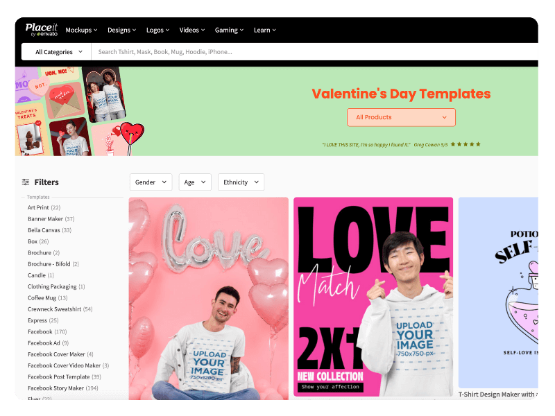
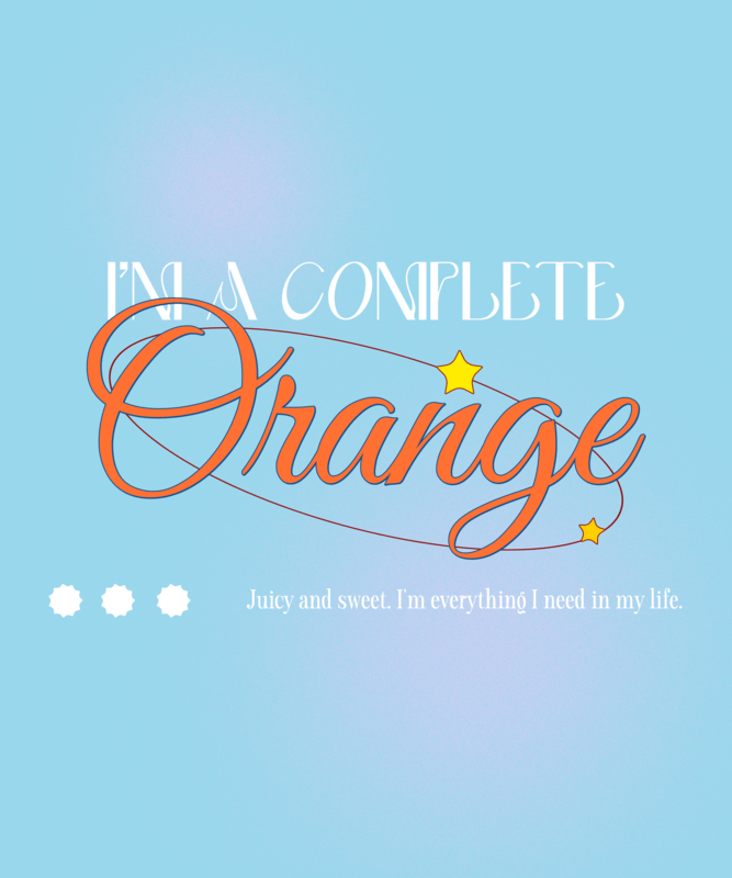
Our Valentine’s Day templates page is living proof of this statement – we’ve dared to use soft pastel green and medium orange, stepping out of the traditional color comfort zone. 😉
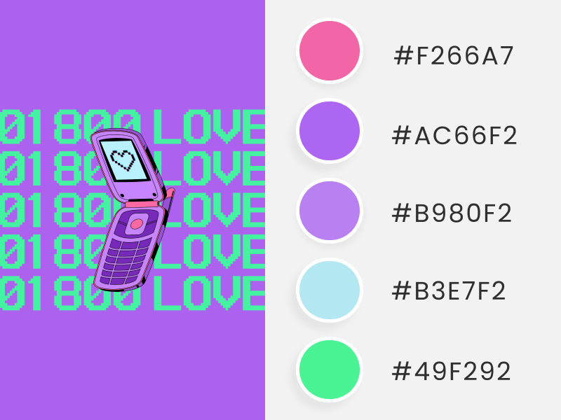
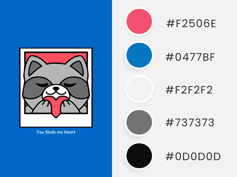
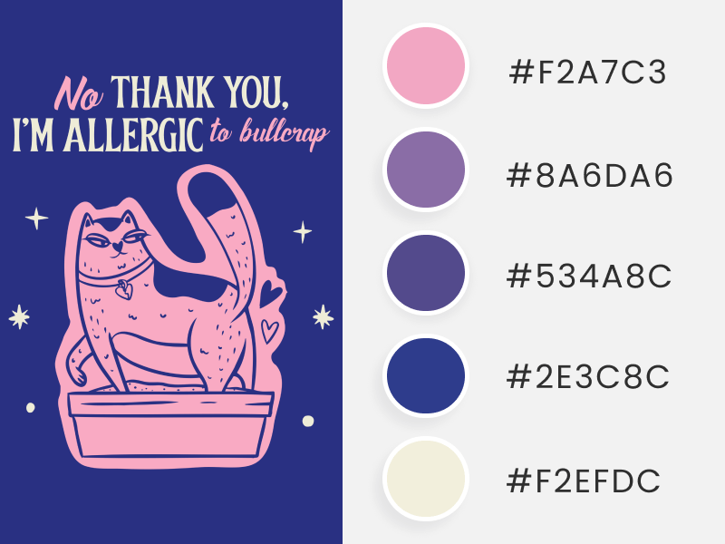
We know it might not sound easy, as some of us aren’t designers, but we’re here to help! That’s why we’ve curated +30 Valentine’s Day color palettes to choose from! Whether you’re looking for a soft and dreamy Valentine’s Day color palette, an unconventional dark combination, or something sophisticated but classy, we’ve got it all! This way, you can pick your favorite color palette or create your own to adapt any t-shirt design, social media post, or website for this Valentine’s.
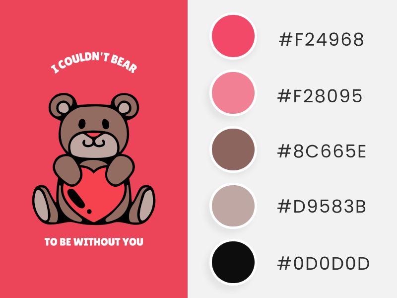
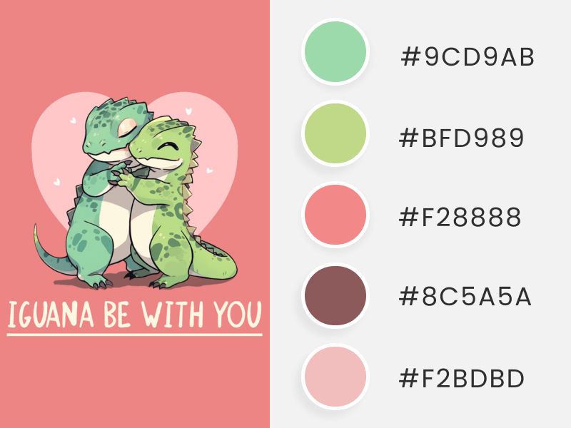
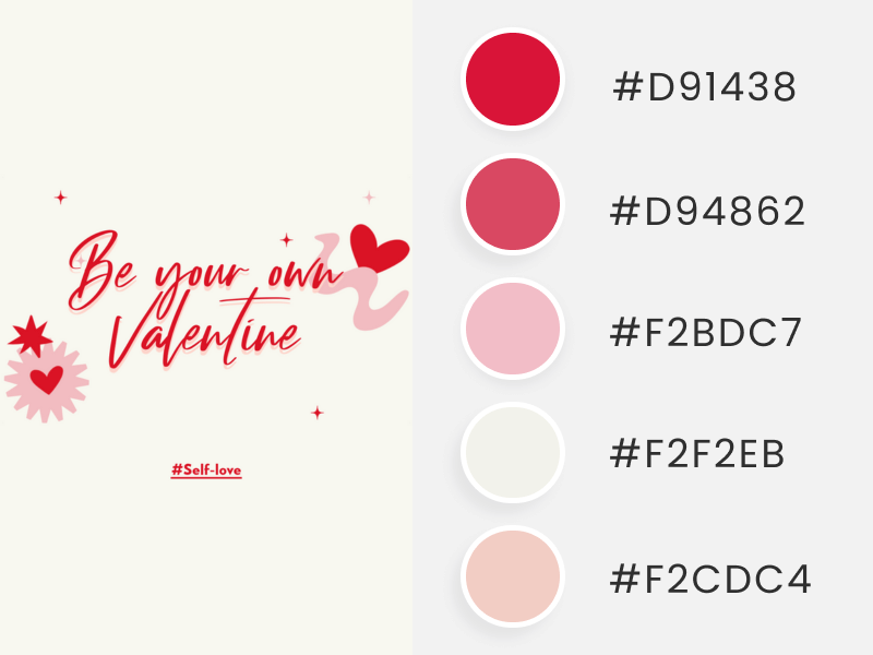
And the best part? All colors come with hex codes, so you can effortlessly copy and paste them into Placeit, your favorite editor, or an e-commerce website. 🫶✨
🌈 But, What Is a Hex Code?
🚀 A hex code is used to identify a specific color. It’s made up of a “#” followed by six numbers and/or letters.
This coding method is especially useful in the design field, simplifying the task of identifying and applying a precise color rather than using a broad hue.
For example, instead of saying just red, which has numerous variations, you could use a hex code. Let’s say #D2042D, which is a dark red, to accurately find and use that specific shade in all your design materials. This guarantees a uniform and harmonious look across your digital and offline platforms.
Regarding the Valentine’s Day color palettes we’re about to explore, you can easily choose a hex code that appeals to you and integrate that precise shade into any design. This avoids guesswork or approximations – just the exact color you desire to customize your designs to your liking. 💘😉
Classic Valentine’s Day Color Palettes
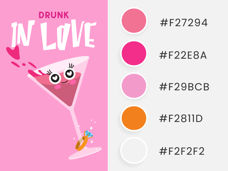
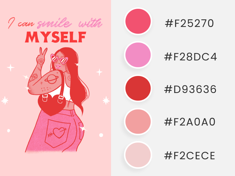
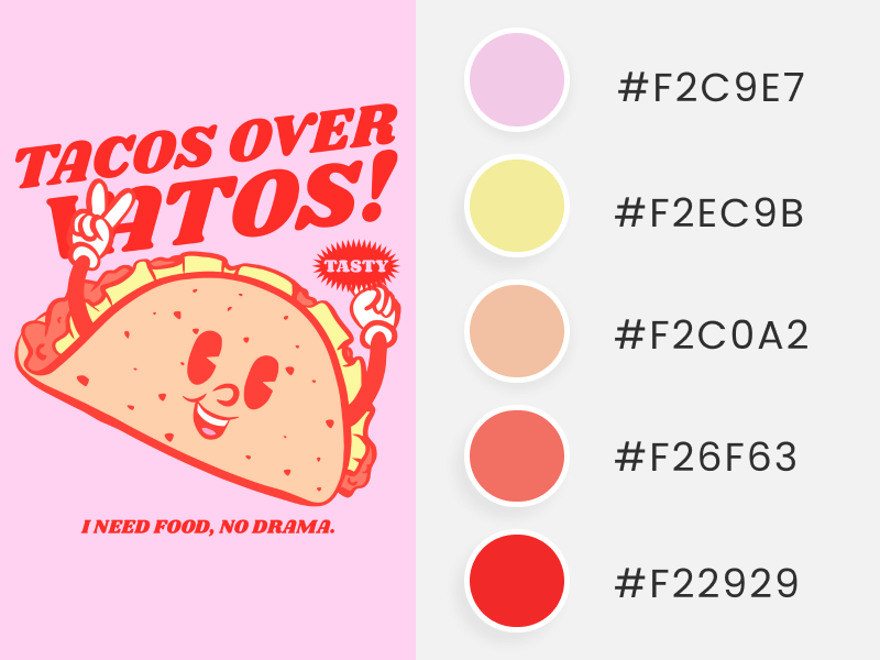
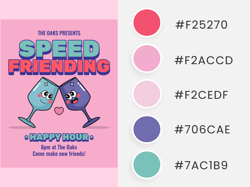
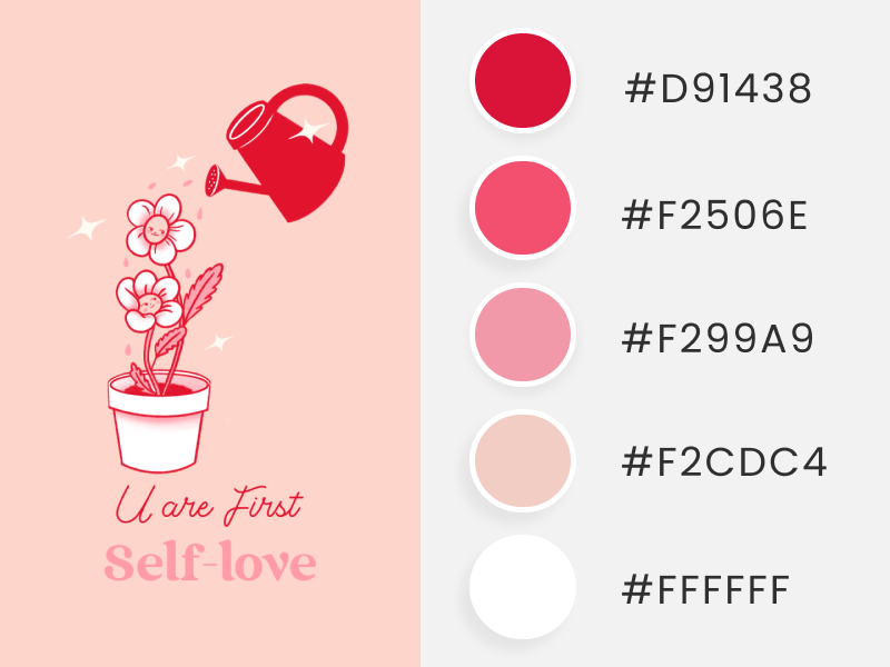
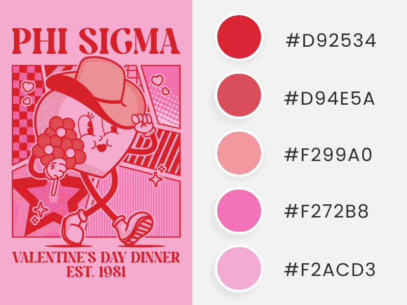
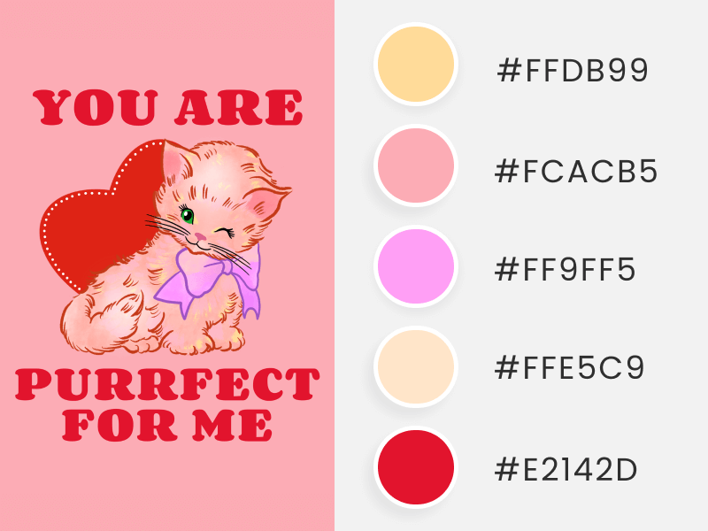
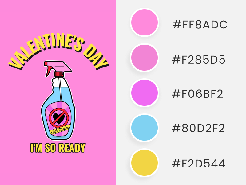
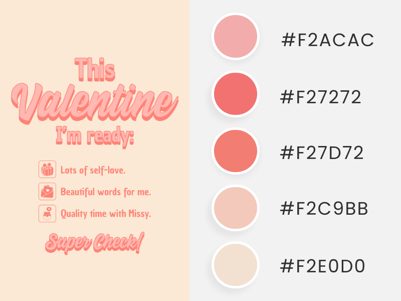
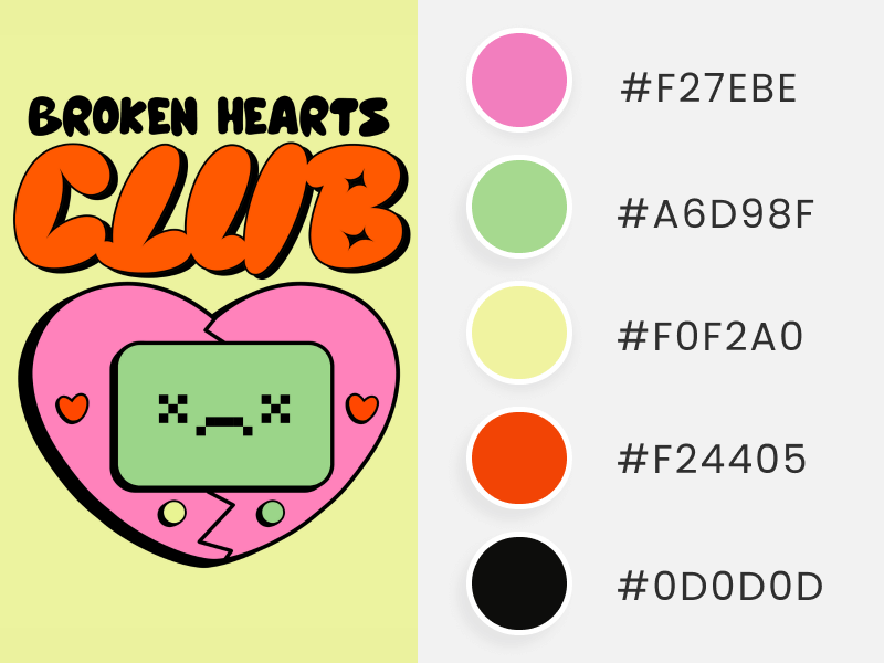
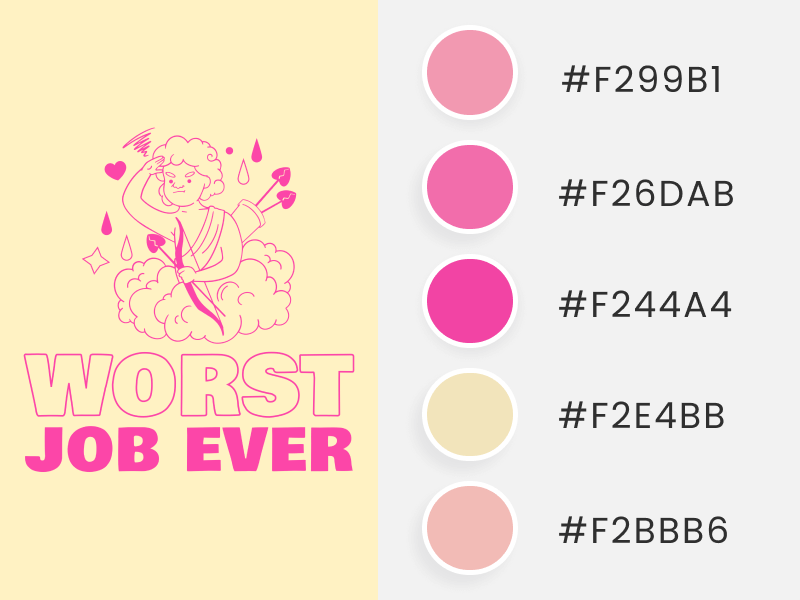
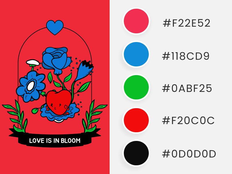
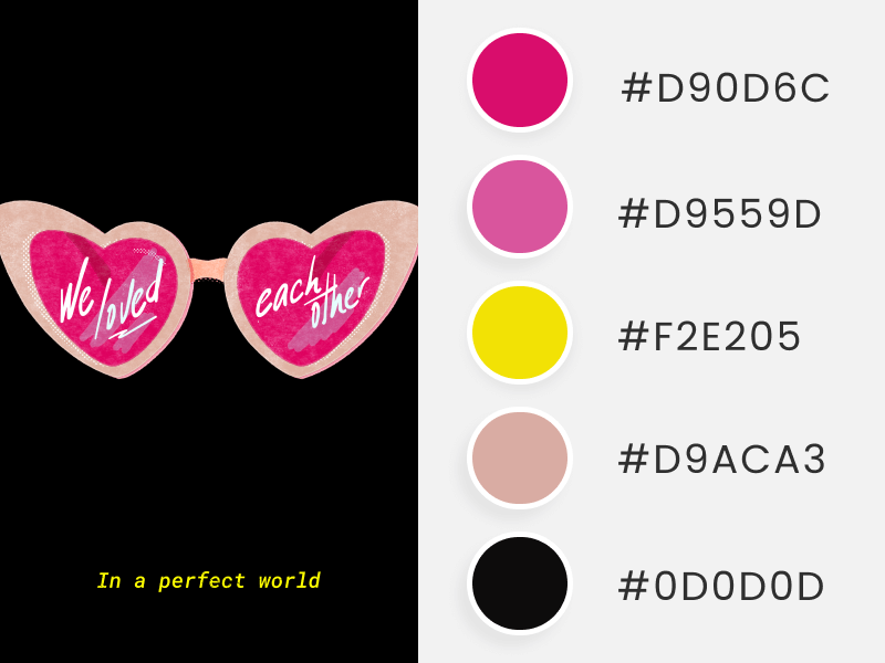
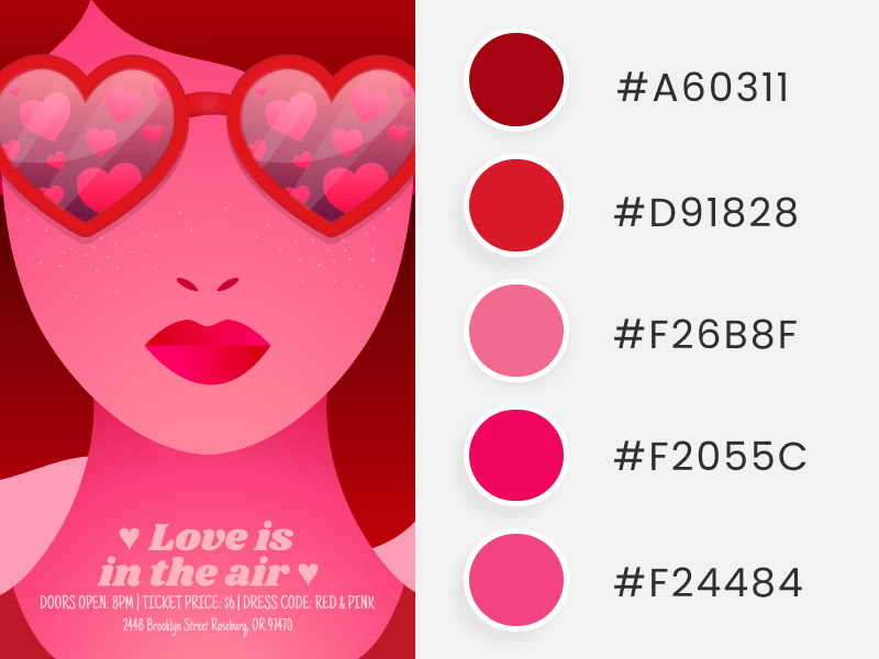
These are just a timeless classic that mainly includes all shades of red and pink, the colors of love! ✨🥰💖
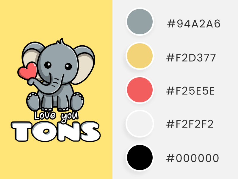
However, you can find more! Find from vivid red, porcelain, midnight black, coral, cotton candy, wild strawberry, sunshine yellow, and apple green, among others, to give that characteristic and recognizable lovey-dovey look.
By applying these stunning Valentine’s Day color palettes, all eyes will be on your communications and promotions, as people will immediately associate them with this day of celebrating love! 🥂
🌷 Pro tip: If you like any image (in which we extracted the color palette), click on it, and the link will take you to Placeit. There, you can download or personalize it to match your unique brand style and message!
🌈🐰Need more color inspo? Hop into these curated Easter color palettes — perfect for any design!
Soft Valentine’s Day Color Palettes
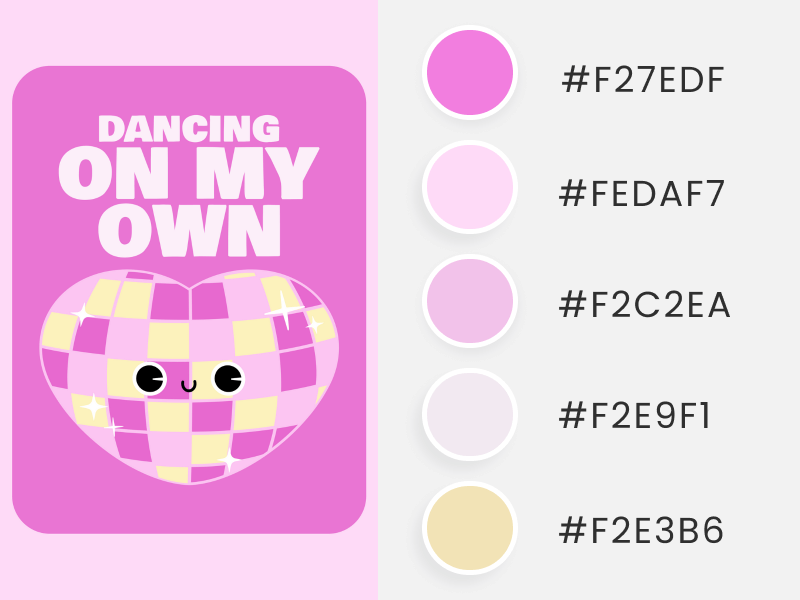
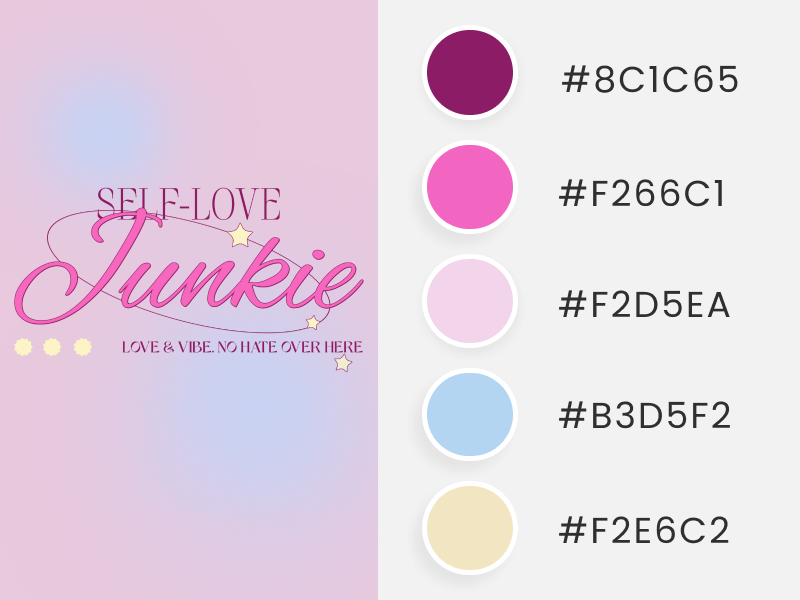
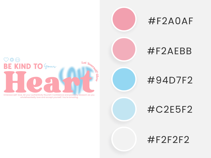
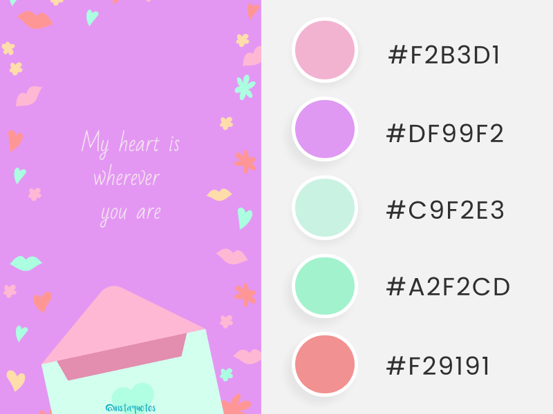
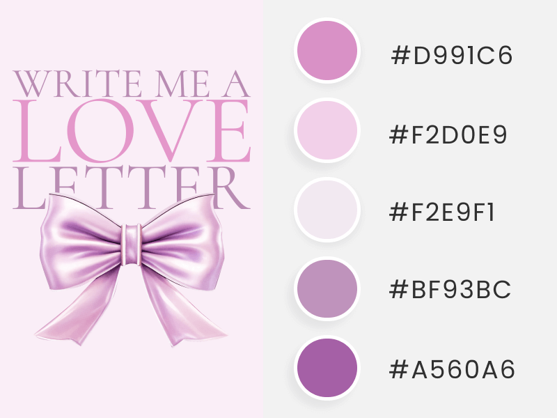
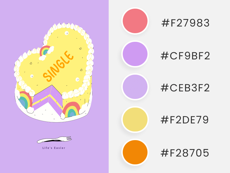
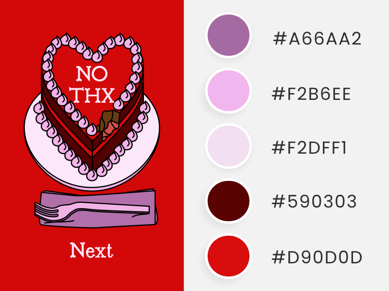
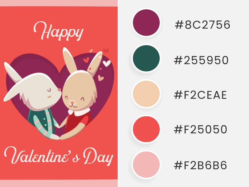
We’ve crafted a pure, sweet love section inspired by Valentine’s Day’s delicate, soft side! 🌙💕 So, get ready to be enchanted by gorgeous graphics, charming fonts, and, of course, the most important ingredient – soft, pastel, and dreamy tones that are tailor-made for those aiming to convey an adorable look! 🌸✨
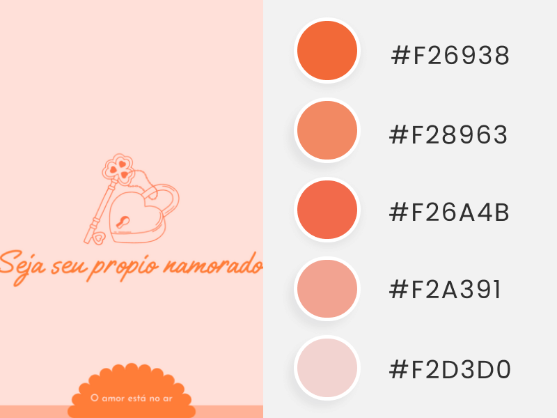
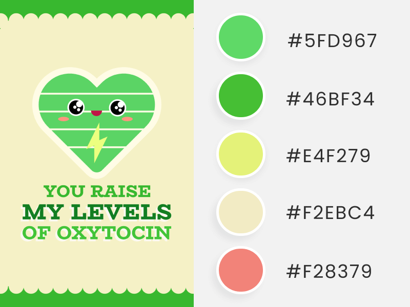
Discover pastel and canary yellows, beiges, peaches, light pinks, lime greens, and pale purples in these delicate Valentine’s Day color palettes. Together, these shades create harmonious and balanced color palettes to incorporate into any design you have in mind.
🚀✨ Tool Alert: Need to remove the background of any image? Then, head over to our incredible AI Background Remover tool to do the magic for you!
Dark Valentine’s Day Color Palettes
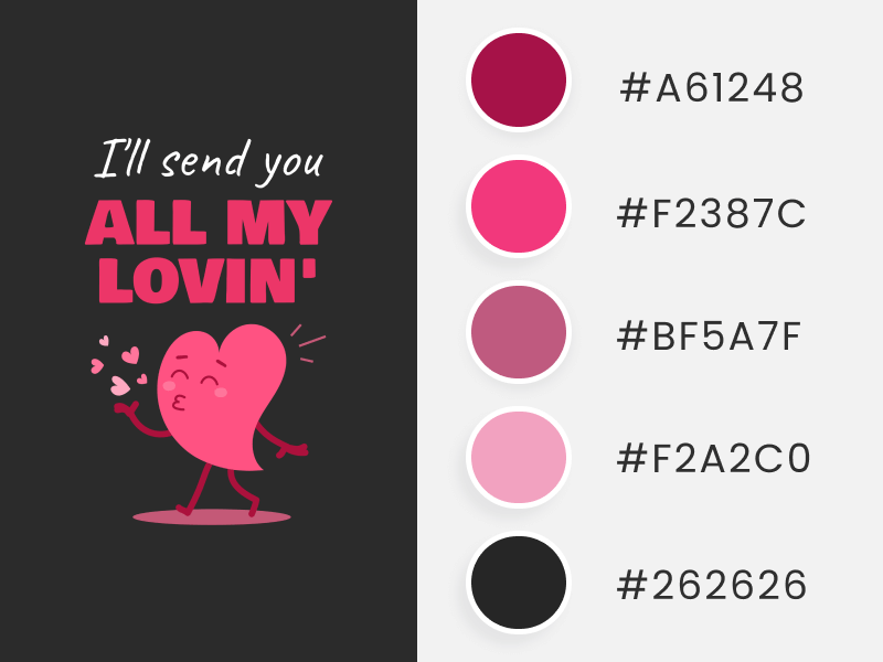
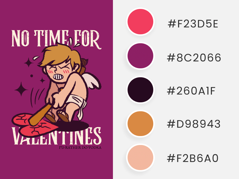
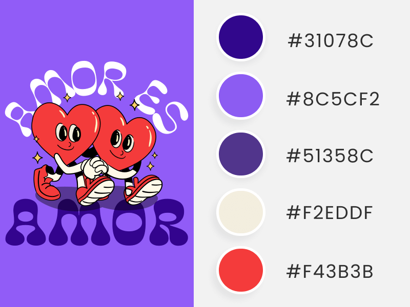
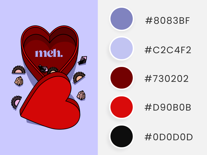
For those looking for a bold and dark side while keeping the essence of love alive, or if you’re proudly waving the Anti-Valentine’s flag, look no further – these palettes are for you! 😎🖤
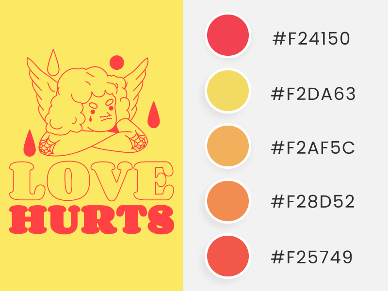
✨ Below, expect dark colors such as black, burgundy, crimson, cobalt, denim blue, violet, and brown tones. So, rest assured, these Dark Valentine’s Day color palettes are the right match to give a sophisticated and distinctive look to your Valentine’s Day materials – whether it’s a t-shirt, an invitation, or an Instagram post!
So, let’s unlock them!
Complement Your Color Palettes With Romantic Fonts
Get ready to give your designs a Valentine’s Day makeover with these font combinations! All these fonts are available on Placeit, so if you love a specific combination, grab it and customize it on any Valentine’s Day template you like.
- Kibul + Digistick
- Manrope + KeepSmile
- Elmoder + Bestters Supply
- Classical Diary + Youther Script
- Fredoka One + Bestters Supply
- Hideaki + Live in Portland
- Delmera + Great Vibes + Hideaki
- VisbyCF + Pintgram + BagelFatOne + Source Sans Pro
- Standie + Coventry
- Source Sans Pro + Sunwish Maverick + Breeder Regular
💕✏️ You might like reading our Font Pairing blog, which includes more aesthetic, elegant, romantic, and playful combinations for your designs!
How to Apply These Valentine’s Day Color Palettes?
It’s easy peasy! Simply copy and paste the hex code you like into your preferred editor or directly onto Placeit’s editor.
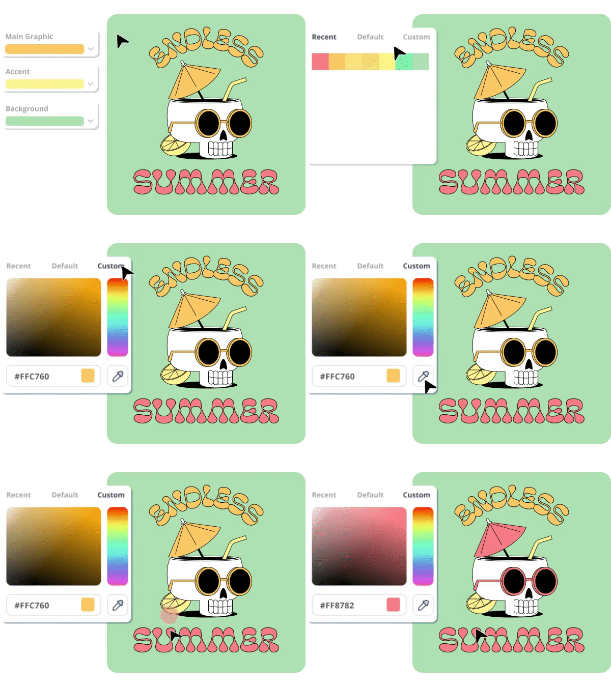
To customize any Placeit template with one of these Valentine’s color palettes, follow these simple steps:
- Go to Placeit and select the template you want to customize.
- Once inside the template, click the little square with the color you wish to change (background, text, graphic, or even the color of a t-shirt on mockups).
- You’ll see four color options. Go to the last tab: “Custom” to see the current hex code being used.
- Replace the existing color by pasting the hex code you want to use from this list (copy it from this blog).
- Hit enter to see the change. And that’s it!
Last Words
Valentine’s Day marks the perfect opportunity to start the year by daring yourself to play with colors, and guess what? You don’t need to have attended design school – we’ve got your back! 🚀💖✨
By now, you’ve discovered a whole world beyond the classic red and pink hues. There are so many more colors waiting for you to incorporate into your Valentine’s Day campaigns and give them a fresh, new twist!
At Placeit, we’re happy and committed to helping you shine. Whether you’re starting with this Valentine’s Day color palette guide, experimenting in our user-friendly editor with your own color combinations, or unlocking our gorgeous and informative Colors guide to become a design expert, you’ll always find the right resources to nourish your creative mind and apply this knowledge to your business.
Remember, everybody is creative, Placeit makes you a creator! 🌈💪 Let February be the month you start on your creative journey to becoming a design guru.
