As a brand owner, having a logo you love is great! Of course, you’ll be tempted to use it everywhere, and why not? You want your brand to stand out and be top of mind, so it makes sense to use it on everything from packing to social media and even on promotional materials. This, however, means that you’ll need the correct logo size for each use case. This will ensure your logo stays sharp and looks its best no matter where it’s being used.
To get the low down on the best logo sizes for all your brand’s needs, keep reading!
What you’ll find in this post:
- Logo Basics Every Business Owner Should Know
- Ideal Logo Sizes for Web
- Best Logo Sizes for Your Social Media Profiles
- Preferred Logo Sizes for Print Items
- Why You Need Logo Variations for Your Brand
- Final Thoughts
Logo Basics Every Business Owner Should Know
A logo may seem like a pretty basic design, but there are some rules you or your designer should follow when creating yours. From the best file type to the ideal color scheme, have these things in mind when designing your logo:
Your Logo Should Be Legible in All Sizes
As a business owner, you may have plans to use your logo on something as small as a business card and as big as a billboard. With that in mind, you want to design a logo that will be readable in both of those sizes and everywhere in between. Take some pointers from the most famous logos in the world so that you get your design just right.
This can mean keeping text to a minimum, choosing logo-friendly fonts, and sticking to details that won’t get lost when your logo is sized down. One workaround for this is to have multiple logo variations for different applications, but more on this later.

💡 Psssst, do you want to know what types of logos work best for your business? Then, find it out by taking this quick quiz!
Pick the Right Color Palette
Colors that complement each other will make your logo more appealing and can contribute to its legibility. Your color story should also make sense with the product or services you offer. Keep in mind that you may also need variations of your logo in black and white for certain applications, so make sure it translates well in these tones.
Know Your Logo’s Dimensions
Logos are measured in pixels (px) so you’ll often see size requirements mention dimensions in pixels and/or file size. Usually, the higher the pixel count, the better the resolution, but also the bigger the file size. If your file size is too large, you won’t be able to upload your logo. This isn’t a huge issue since you can always reduce the file size.
Use the Right File Type
When creating your logo, be sure you have a vector logo file. This file type basically lets you rescale your logo to any size without your logo losing any quality. This means you can resize a logo and print it as big as a billboard without worrying that it will be pixelated. Your printing service will expect this file type, so if you’re purchasing your logo from a designer, be sure they provide you with this type of file.
👉 Learn more about how to design a brand logo and collaborate with a designer.
For web, you can turn your vector file into a PNG or JPG. These are the types of files social media platforms and websites will ask for. Using a PNG is ideal since this type of image file will retain quality without increasing the file size too much. A PNG will also allow your image to have transparent areas if your logo includes any.
With a vector, you’ll be ready to print your logo on everything, no matter how big or small!
Establish Brand Guidelines
Since there is no standard logo size that should be used across the board, it’s important to have logo variations and guidelines as to when each variation should be used. This will make it easier to maintain a solid brand image since there will be no confusion as to what logo variation to use where.
⚡️ Don’t miss our ultimate guide to logo design! You’ll find everything from choosing a color palette to creating an animated logo!
Ideal Logo Sizes for Web
Again, there is no standard logo size for something as vague as “web.” The ideal size will depend on the exact location and use of your logo. What you can be sure of is that a PNG image file will be your best bet when using your logo online.
There are two common areas where you will find a logo displayed on a website, so let’s get more specific:
Logo Size for Website
Most brands have a website regardless of whether they offer a product or a service. Having a website makes your brand easier to find and it can work as a hub where browsers can get all the information they need about your business. Because of this, you want whoever lands on your website to know that it belongs to you. This is where your logo comes in.
Most websites include the brand’s logo on the top left-hand side of every page. This means that your homepage and every other page (product pages, FAQ, contact us, etc.) will have your brand’s logo in the same spot. Usually, this will be accomplished by including it in the navigation or menu area of your website because these areas stay consistent across your whole website.
In most cases, 250 x 150px will be a safe size to stick with. With that said, even the ideal logo size for website applications will vary depending on some factors, like your website design. If you’re using a template for your website, your template will usually let you know what the ideal file size and dimensions will be for your logo to display properly.
It’s best to first determine what your website will look like and where your logo will be located so that you can adapt your logo to fit it properly.

Recommended Favicon Dimensions
If you’re not familiar with the term favicon, just take a look at the tabs you have open on your browser. You’ll notice a little icon on the lefthand side of each tab – that is a favicon. These help you keep track of what each tab is, making it easier to navigate between them.
Since the area a favicon covers is so tiny, it’s usually a variation of a brand’s logo reduced to a simple icon. For it to be effective, users should still be able to recognize what brand that icon belongs to.
For the ideal favicon dimensions stick to an icon that is 16 x 16px and avoid using text.
![]()
Email Signature Logo Size
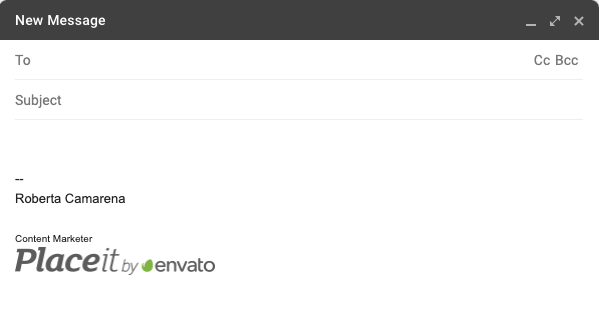
Including your brand’s logo in your email signature is a great option, and a must if you are emailing people outside of your org. It gives your communication more authority and legitimacy while also promoting your brand.
For your email signature to display properly it should be max 320px in width and max 100px in height. You may be tempted to go wider than 320px, but keeping your logo at this size will ensure it displays properly on desktop and mobile screens.
Most email service providers will have an easy way to add your logo to your signature. Check your profile settings to get more specific information about your email signature from your email service provider.
Best Logo Sizes for Your Social Media Profiles
For business owners, there’s no escaping social media. While you may not need to have a profile on every social media platform under the sun, it does make sense to create business accounts on those your target audience frequents.
Using your logo for your profile pic is a great idea because it will make it easier for people to identify what content is coming from you.
Most social media platforms allow you to upload square-shaped profile pictures but will display them as circular images. Because of this, it’s best to keep graphics centered, or else you risk losing important information.
Banners or cover photos are generally rectangular, but “safe areas” can vary depending on the device used to view your profile (desktop vs mobile) so keep this in mind when designing your assets. It’s also recommended that you use PNG files on social media for the best quality images, especially when text is included in an image.
Your profile pic and cover photo are the two main spaces where you’ll want to display your logo or feature it as a part of a larger design, but you can always include your logo in image and video posts as well. When using it in posts, the size of your logo will depend much more on your design and what you’re communicating.
With that said, here are the recommended logo sizes for your brand’s social media profiles:
Logo Size for Instagram
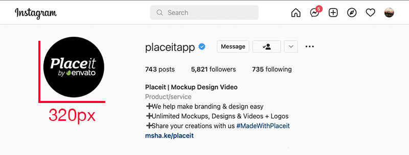
Profile Picture
Display Shape: Circular
Size: 320 x 320px
Logo Sizes for Facebook
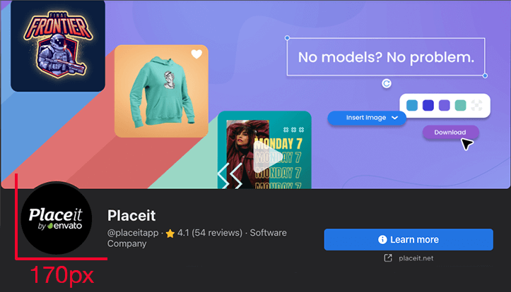
Profile Picture
Display Shape: Circular
Size: 170 х 170px
Cover Photo
Size: 851 x 315px, max 100KB
*Your cover photo will display at 820px by 312px on desktop and at 640px by 360px on mobile, so keep this in mind when finalizing your design.
YouTube Logo Sizes
Profile Picture
Display Shape: Circular
Size: 800 x 800px, max 4MB
Banner
Size: 2048 x 1152px (16:9 aspect ratio), max 6MB
*Keep in mind that the safe area for text and logos at this size would be 1235 x 338 px.

Logo Sizes for Pinterest
Profile Picture
Display Shape: Circular
Size: 165 x 165px
Cover Photo
Size: 800 x 450px
Twitter Logo Dimensions
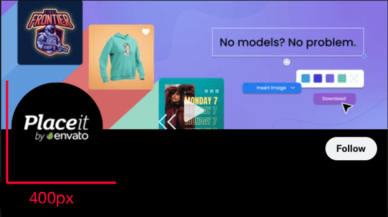
Profile Picture
Display Shape: Circular
Size: 400 x 400px, max 2MB
Cover/Header Photo
Size: 1500 х 500px
Twitch Logo Sizes
Profile Picture
Display Shape: Circular
Size: 800 x 800px, max 10MB
Banner
Size: 1200×480, max 10MB
LinkedIn Company Page Logo Dimensions
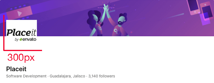
Profile Picture
Display Shape: Square
Size: 300 х 300px, max 8MB
Cover Photo
Size: 1128 x 191px
Logo Size for TikTok
Profile Picture
Display Shape: Circular
Size: 200 x 200 pixels, min 20 x 20px
Use this handy chart to prepare your social media assets:
| Social Network | Profile Picture | Shape | Cover Photo/Banner |
|---|---|---|---|
| 320 x 320px | Circular | ||
| 170 х 170px | Circular | 851 x 315px, max 100KB | |
| YouTube | 800 x 800px, max 4MB | Circular | 2048 x 1152px max 6MB |
| 165 x 165px | Circular | 800 x 450px | |
| 400 x 400px, max 2MB | Circular | 1500 х 500px | |
| Twitch | 800 x 800px, max 10MB | Circular | 1200×480, max 10MB |
| LinkedIn (company page) | 300 х 300px, max 8MB | Square | 1128 x 191px |
| TikTok | 200 x 200 pixels | Circular |
✨ Create everything you need for your social profiles, from cover images to posts and stories using Placeit’s customizable social media templates!
Preferred Logo Sizes for Print Items
Whether you sell goods or services, you’ll likely need to have your logo printed on physical items. This can be anything from a t-shirt to a storefront, so how do you make sure your logo looks good in any size and application?
As mentioned above, a vector will be your best friend. This will allow your printer to achieve the best logo size for all your printing needs. Not only will they be able to resize your logo as needed without losing quality, but a vector will also be in CMYK color mode, which is what is needed for printing.
A quick note: When you plan to get your logo printed onto anything, it’s best to work with your designer and print service to determine the best size. The final look of the item in question will benefit from trying out different sizes and listening to feedback from your designer and print service. Take note of what size worked the first time around so you can use this in the future to make this process easier.
Branding Assets
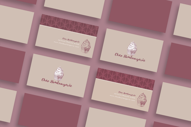
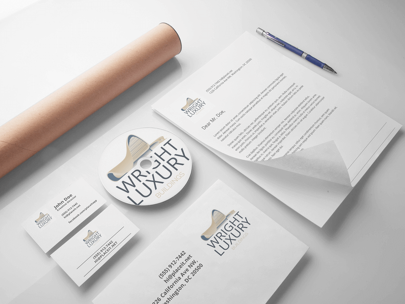
Business Card Size: In the United States, standard business cards are usually 3.5 x 2 inches. In the UK and most of Europe, you’ll find that business cards are generally 3.3 x 2.1 inches (85 x 55 millimeters). This is the size of the entire business card, so your logo will have to be smaller and its exact size will depend on the layout of your business card design.
Letterhead Size: When creating your official letterhead, the printing area will vary depending on the sheet size you plan to use. A4 size will be 8.27 x 11.69 inches, but leave enough room for margins on each side. It’s best to leave a 10 mm margin on the top and sides and a 7mm margin on the bottom.
In the United States, the standard letter size is 8.5 x 11 inches. Again, leave wide enough margins on all sides when designing your letterhead so that nothing gets cut off or comes too close to the edge.
⚡️ Find even more print sizes in our ultimate guide to print sizes!
Promotional Items
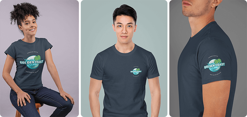
T-Shirts: Whether you’re giving away t-shirts at an event or want to make some uniform shirts for your staff, you have a number of printing options. Usually, the maximum print area on a standard t-shirt is 14 x 15 inches, but that may be too large for a single logo. You can also opt to print your logo on a sleeve, the center of the chest, or the chest pocket area.
- Maximum print area: 14 x 15 inches
- Center chest: 6 x 5 inches – 10 x 8 inches
- Chest pocket (doesn’t have to be on an actual pocket): 2.5 x 2.5 inches – 5 x 5 inches
- Sleeve: 1 x 1 inch – 4 x 4 inches
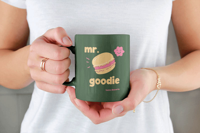
Mugs: For standard 11 oz. mugs, the whole print area is 8.5 x 3 inches. You can always choose to go with a smaller area depending on your design and preference.
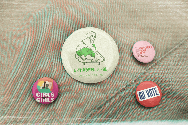
Round buttons: Buttons are great promotional items and you have quite a few sizes to choose from. The smallest buttons are 1 inch in diameter and are usually what bands use. Buttons in the 1.25-inch or 1.5-inch variety are usually what artists sell. Campaign buttons are generally larger, so a 2.25-inch button is usually what you’ll get here.
Why You Need Logo Variations for Your Brand
Since your logo will need to be displayed as tiny as a favicon and even as large as a billboard, it’s important that you have logo variations that make sense for each space. In fact, most brands have an arsenal of logo variations that include a wordmark, a letterform, a symbol/brandmark, combination marks, and more.
If your logo is made up of your brand’s name in text and a symbol, you can use these together, use the text alone (wordmark), use the first letter of the text (letterform), or the symbol on its own (brandmark).
On top of this, you’ll need your logo in a color version and in a black and white version. It’s important that your logo translates well in both of these versions because you might just need to use a black and white version for certain printed items.
It’s also important that you have your logo in different orientations. Have a horizontal version, a vertical one, and a square option. This will give you enough flexibility to have a logo ready for any occasion.

If you’re working with a designer to create your logo, be sure all the variations you need are included in their final work.
💡 If you need to resize a logo Placeit’s image cropper can get the job done and it’s free!
Final Thoughts
Getting your logo size just right will often depend on a number of factors, so feel free to experiment with sizing as your brand grows. Do take note of what logo sizes, orientations, and color schemes look best in each scenario so that you can start building your brand guidelines.
The same is true when posting your logo on social media. It may take a couple of tries to get your cover images just right, but it’s worth the effort for that satisfying finish.
Remember that your logo, whether on social media or on printed materials, shouldn’t be an afterthought because it’s a reflection of your brand, so really put the time in to get it just right. Not sure which logo maker tool is best for creating your logo? Then keep reading10 Best Logo Makers Compared in 2023
Let us know what other questions you may have about your logo in the comments below ⤵️
