K.I.S.S. The US Navy had it right. Keep It Simple Stupid. While probably not the most polite design tenant out there (hereafter known as the Simplicity Principle), it is one of the most pertinent.
Every piece of design and every interaction between the under and the interface needs to be as simple as possible. This means lots of things, like a clear and uncluttered aesthetic, concise and relevant copy, sound information architecture. But can a usability-driven redesign actually translate into a high ROI?
You could be losing $300 million from one click.
We looked at what an interaction is and why it matters, some examples of simplification success, and what you can gain by streamlining your user experience.
What are Clicks and Why Do They Matter?
 ‘Clicks’ are pretty much just a way of measuring how many steps it takes a user to get from point A to their goal. Back in the day, clicks were especially precious because of slow internet speeds – each new click probably meant a load time of 10+ seconds. Given what we now know about load times, this was a major concern.
The result was the 3-click rule, which pretty much said that the user should be able to access everything in 3 clicks or less. That’s been pretty solidly debunked (UX Myths provides a nice summary).
Current thought tends to be that each click (regardless of how many) should take the user closer to their goal. The idea is to leave a trail of information so that the user understands:
- Where they are
- How they got there
- What to do next
Both these theories attack the same problem: bring the user closer to their goal, faster. Reducing clicks is one way to do it, creating a trail of breadcrumbs in another.
The real question is: what’s the return on investment?
Here are a few examples of how real ROI was achieved with these simplification techniques.
The $300 Million Button
An e-commerce site was redesigning their checkout flow. The problem? one form. A sign-up form. Pretty standard, email and password fields, with login and register as the buttons, plus a link for forgot password. Pretty basic.
The form came after the shopping cart had been loaded with items and the user has clicked checkout. The idea was that:
- The form would streamline shopping for repeat customers
- New customers (who would come back anyway) could sign up, quick and easy
That’s not how the users saw it.
First-timers, rather than being thankful for how easy it was to sign up, resented having to sign up at all. Lots of users assumed they had, at some point, signed up already, and tried all their common username/password combos. Some were frustrated about the company asking for personal information (though the same information was needed to process the purchase anyways).
Further analysis found that 45 percent of people had multiple registrations, which is inefficient for both the consumer and the e-commerce site.
All in all, it was a poor user experience.
The fix was simple though. All they did was take away the register button and replace it with a continue button.
Now, there was a clear breadcrumb trail of information indicating:
- What had been done already
- What needed to happen next
- How to do it
Purchasing customers went up 45 percent to the tune of $15 million in the first month. Password requests dropped by 80 percent.
And the amount of merch that was no longer being dropped at the form? $300 million. (this example came from UIE and Jared Spool).
Dapulse Sign Up Form
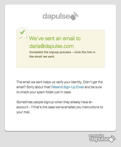
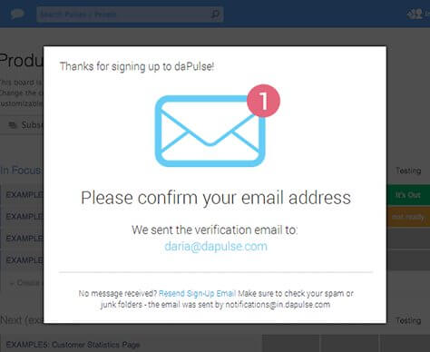
Dapulse is a piece of management software that “unites high-level goals with to-do’s and tasks.” And like all SaaS companies, their sign up form is crucial to new business. Unfortunately, they were experiencing a 30 percent drop from signup to email confirmation. That means people were keen enough to sign up, filled out their info, and then bailed on Dapulse. That’s like customers getting to the counter with their groceries and deciding that they’re not actually hungry.
Their problem was that their form didn’t present the information users needed. The sign-up form didn’t really indicate what it was for and what it wanted the user to do, nor did it provide an incentive for the user to do anything. Users were left without any idea of why they were there, what they were doing, what they were supposed to be doing, and without any incentive to do whatever it was they were supposed to be doing, presuming they could figure it out in the first place.

So Dapulse redesigned their sign up form so that it included the crucial who, what, when, where, and why. With copy and design, they simplified their form so that it was super clear to the user where they were, what they were doing, what they needed to do, and why they would want to do it.

While the clicks that the users had to go through to be confirmed stayed the same, the process was easier to understand, and there was a clear trail of information:
- Signed up
- Now need to confirm the email
- Email confirmed
They went from losing 30 percent of their signups to losing only 10 percent within one month.
Optimal Energy Conversion Rate
Usability Tools looked at the Polish energy comparison site OptimalEnergy to achieve the business goal of increasing conversion.
OptimalEnergy was a huge energy comparison site, that let people go on and compare various energy plans to see which one was cheapest. Unfortunately, their website was experiencing an 81 percent drop-off rate. Which is insane.
To solve the problem, Usability Tools stripped the site back to its bare bones. They removed fields that were causing problems and whole forms that customers were getting stuck on.

They built a slider system that indicated progress (breadcrumbs) as well as made it so that people could submit orders without actually signing up to anything (reducing complexities and clicks). The result was a 122 percent increase in conversion rate.
The New Coke of UX
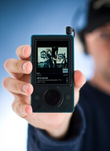
 There’s a flipside to these scenarios. Take, for example, the Microsoft Zune. In 2006, the Zune and the iPod were more or less the same product. But the Zune withered on the vine due to their poor user experience and frankly bamboozling software, far removed from the sleek performance of the iPod/iTunes combo.
The cost of a failed product is enormous. R&D, manufacturing, marketing, software development – the cost list is huge. Sure, the Zune had a lot of functionality, but by failing to apply the Simplicity Principle, Microsoft sacrificed their product, not to mention huge market share in the portable music player industry.
Image courtesy of Flickr
So What Do I Get?
From these examples, it’s obviously hard to say with certainty that UX will lead to X dollars saved, or increase revenue by X amount. The problem is that UX is about half science and half art and art is really really hard to quantify.
Fortunately, Nielsen Norman is here to save the day. In 2008, they produced a report that said that redesigns increase KPIs by 83 percent. Granted, that was down from 135 percent in 2002, but frankly, any usability improvement in 2002 was bound to have amazing results.
Fast forward to 2014, and Forrester released a report saying that customers were more loyal to companies with a positive customer experience (CX) versus a poor one:
- 5.8 percent more customers are reluctant to switch brands
- 16.6 percent more customers are likely to recommend your product
So clearly the role of UX in ROI is relevant. In fact, the Harvard Business Review conducted a study with a huge conclusion:
Organizations that invest heavily in design actually do 228 percent better on the stock market over a 10 year period.
At the end of the day, there is no surefire ROI. But if you look closely at your own metrics, and see where the holes are, you’ll probably stumble across a specific problem or two that UX just might be able to solve.
Simplicity Principle: UX Design Basics
What is the Simplicity Principle and why does it matter when it comes to UX design? We looked at this and why it matters to help you through the design process.
