We’ve listed 7 app marketing ideas that actually worked! There are about a million listicles out there about how to promote your app (I know because I’ve written several). And they’re great – they have lots of good ideas for getting the word out. But they all go pretty much like this:
- Tell a lot of people about your app (social media, funny videos, email, competitions, free toasters, websites, blogs).
- Spend a little money telling people about your app.
- Do 1 and 2 so wonderfully well, that the people you tell to go and tell all their friends how wonderful you are.
But for some apps out there, the standard 1-2-3 marketing approach just wasn’t cutting it. They had to go outside the box. Way outside the box.

Here are our favorite 7 stories about zany app marketing to help inspire your next big push (plus some takeaways into why they worked).
What You’ll Find:
1- Tinder
To think something so brilliant and so simple needed marketing. But as it turns out, it needed a little heat to really catch fire (pun courtesy of Bloomberg). Much like Facebook back in the day, Tinder started by going to where its core demographic was – university campuses. But where Facebook targeted high-profile schools like Stanford, Tinder worked on the country’s top party schools according to Playboy.
To get their crucial target audience to sign up – attractive women – they went in and pitched to sororities. They would sign up the girls on the spot afterward. Then, they would go straight over to the corresponding fraternity and show all the guys on Tinder. When the frat guys all saw the women they normally party with on Saturday night already there, they were only too enthusiastic to sign up.
Since then, Tinder’s gone from strength to strength. Most importantly, it’s stayed mainstream and doesn’t have the grotty reputation of Chatroulette, something that it’s worked hard to achieve with creative marketing.

Last year, Tinder partnered with an animal rescue organization in NYC called Social Tees to connect stray dogs to people looking for love. To do this, they created profiles for each dog, and when you swiped right, you were connected to a Social Tees worker who could talk about adoption and volunteer opportunities. It gave Tinder amazing press, plus it helped them keep their clean green mainstream image.
Every single story that ran about it included adorable screenshots of dogs with Tinder profiles. What’s not to love?
The Takeaway
Know what your audience wants, and know how your offering differs from the competition. For Tinder in the early days, it meant having attractive women, plus guys that they knew (at least at first). Later on, for Tinder, it meant continuing to be a mainstream social media app. For most app companies, it’s about knowing and solving a precise problem, not a general one.
2- RunKeeper
RunKeeper is a fitness app that lets you track your exercise. It’s hardly the only one out there. But they really ran the distance to set themselves apart.

What was unique about RunKeeper is that it has obvious appeal to runners (hence the name) and they’re from Boston. So in 2009, when they were just getting off the ground, the founder, Jason Jacobs, ran the Boston Marathon – in an iPhone suit. Aside from looking completely absurd (turns out iPhones don’t make great running outfits) it generated a lot of buzzes and the video that went along with it garnered a lot of attention.
The Takeaway
There are two takeaways actually. First, you need to be in the same space that your app is. If it’s a running app, run a marathon. If it’s a cooking app, host a how-to 3-minute cooking show on YouTube.
Whatever space you’re in, own it.
Second, when Jacobs ran the marathon, he did an absolutely brilliant job of putting his app in context. It made it really clear what his app did, in a visible and easy-to-understand way. That’s the best thing you can do for your app and you should be doing it wherever you can, from crazy marketing to pictures on your website with Placeit.
3- Angry Birds
We couldn’t possibly talk about apps without at least mentioning Angry Birds. The darling of app gaming, Angry Birds has some crazy promotional tactics in its history. The best one though is undeniably their efforts in May 2011.
They decided to bridge the digital gap and bring the fun of a smartphone into the real world. They set up an actual angry birds level in the middle of Barcelona.
The stunt was wildly successful. Not only was it fun to play and pretty much awesome, but five months after this they reached 500 million downloads.
The Takeaway
Go big or go home. Granted, T-Mobile (who paid for the stunt) probably has a lot more money to throw around. But still, if you want to stand out, then stand out.
4- Fixed
Fixed is an app that helps people get out of parking tickets (or in their words, “the easiest way to fix a parking ticket”). Unfortunately, their service as an app isn’t one that is instantly graspable. So to get their name out there (and to teach people what they do) they got a team of ticket heroes to leave advice on how to get out of a ticket on ticketed cars’ windshields.

Image Courtesy of Fixed via Facebook
People would come back, see a ticket, and immediately see what they were going to do about it. From a content marketing perspective, where to goal is to be useful to your users, you couldn’t hope for a better campaign.
The Takeaway
Always be useful. Even if it’s costly (Fixed actually uses volunteers) and even if you feel like you’re giving away the store, in an environment like the mobile app industry, usefulness is king.
5- Spotify + Mailbox
A big part of any app marketing is building hype. Both Mailbox and Spotify went about this in a slightly round-about way. Instead of shouting to the world to come and sign up, both created waitlists (even if they didn’t actually need them). Combined with marketing 1 2 3, it made both services revered before they’d even come out. Fix does the same thing in cities that it isn’t in yet. This tactic might not be as exciting as others on this list, but by getting people to sign up weeks or months before it’s available, you build an awful lot of suspense. For Mailbox in particular this was effective, because their service was just so good. People genuinely wanted to be the select few on the service.
It’s like how everyone goes to the brunch place to the longest line, even if your eggs taste exactly the same right next door.
A word of warning though – if you set expectations so astronomically high you’re only going to disappoint your users, no matter how good your product is.
The Takeaway
Make sure that when they’re using your product (especially early on) that they’re in a positive frame of mind. People tend to like things more if they’ve had to wait a bit, so waitlisting is one way to do it. Think of a way that works for your product.
6- Uber
Oh, Uber. Constantly in legal strife somewhere in the world, over something. So how do they continue to get people to sign up for their service? By constantly working to put their product in a great light.
And what do people like more than cats? Pretty much nothing.
So to celebrate National Cat Day in 2013, Uber set up a special cat delivery service. If you lived in NYC, Seattle, or San Francisco, for twenty bucks you could get a kitten and some cupcakes delivered to your door for a 15-minute cuddle date with cuteness incarnate.
The campaign was off-the-charts successful, and demand for cats massively outstripped supply. In a broader context, Uber kept its patrons happy by showering fluffiness on them, and at a tiny cost to the company.
The Takeaway
Shareable content will get you a lot further. If you’re going to do a stunt like one of these, do something that will generate a lot of content and goodwill among your users. Sure, the Angry Birds gig was cool, but cat photos and the internet and sharing go together like salt lime and tequila.
7- Taxi

Image courtesy of TNW
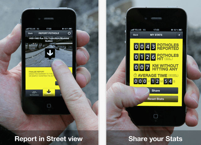
Taxi is a Canadian-based app that lets people report and document potholes whenever they hit them. The problem is that winter in the Great White North is extremely hard on roads, so spring is the season of bumpy rides and groaning suspension.
The idea is that by reporting potholes, road workers can get to them quicker, and people will know how to avoid terrible ones. The challenge that Taxi has is that when people hit potholes, they’re usually not in a frame of mind to be helpful to others, given that they’re pretty cranky themselves.
So Taxi put potholes into context but putting this installation in the middle of Montreal.

Image courtesy of PaperPlane
The Takeaway
Tell your users how you’re going to fix their problems. Whatever it is that your product does, phrase it in terms of your users. Through your marketing, through your pitch, through your product – you need to clearly answer the question ‘what’s in it for me?’
Those are our favorite 7 app marketing stunts, and some nuggets that you can apply (albeit on a smaller scale) to your own marketing efforts.
Did we miss your favorite? Let us know in the comments!
Check out the new software box mockups available at Placeit!
“Can’t mention this enough: For web/UI designers, Placeit is a great online tool”
Six Revisions 5/5

4 Comments
John Carter
I really like your blog. Its nice and has really good information on app marketing. I really thankful to this blog, as it helps me to know about various new things on mobile apps marketing. So I very much appreciate this article.
Jay Jay Burmer
One new creative way to market yourself if you’re an attorney, is to sign up with Legalclick. You can list your services for a fixed fee, and provide all transactions seamlessly via the app. It’s an ingenious way to reach a tech savvy audience and appeal to younger clientele who don’t want to be bothered with a lot of red tape.
Fixed
Hey Spencer, This is Colton at Fixed. I wanted to let you know that Fixed has been acquired and the new website is at: https://www.fixedlaw.com/
If you could update this article with the correct URL, I would appreciate it very much. Please reach out if you have any concerns. Thanks, Colton
Vaughn
This piece of writing is genuinely a good one it helps new
internet users, who are wishing for blogging.