5 Samsung Galaxy Mockups for Android Productivity Apps
When promoting -or even creating- and app, it might be easy to take the quick route and just show some screenshots. However, it is important to note that showing the app in real life situations, on real phones, used by real people. If you are working on a productivity app for Android, you should be able to present it on professional, photorealistic mockups of Samsung Galaxy phones.
To make your search easier, we have selected 5 Samsung Galaxy mockups that will help your display your productivity app.
Busy and Organized
 Try it here. Source: Google Docs
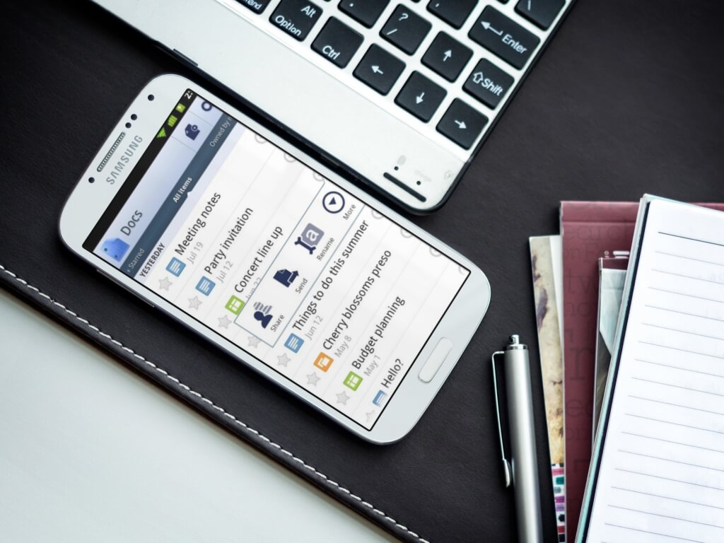
This Samsung Galaxy 4 mockup lays next to a laptop, a pen and several notebooks. This is clearly the desk of a busy person. Who? Your user, of course. We chose Google Docs for Android as the example, but image showcasing your productivity app in this beautiful stage. Take note that, to use this stage, the image you upload must be in portrait mode. The black, almost leathery texture that the phone lays on brings this photorealistic mockup to the next level, because it portrays the elegance of your users.
So Productive, So Casual
 Try it here. Source: Cloudprint
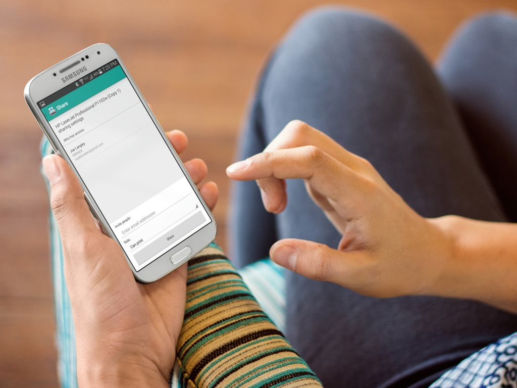
Maybe your goal is to show that, because your app works so well, your customer is so productive that he has lots of free time. On this Samsung Galaxy mockup, the person holding the phone sits on an interesting couch, with teal, white and black strips embroidered in the fabric. One of the most important qualities of a productivity app is precisely that: it gives you the time to both work and enjoy yourself. What better than working while on your couch?
Your Business on the Go
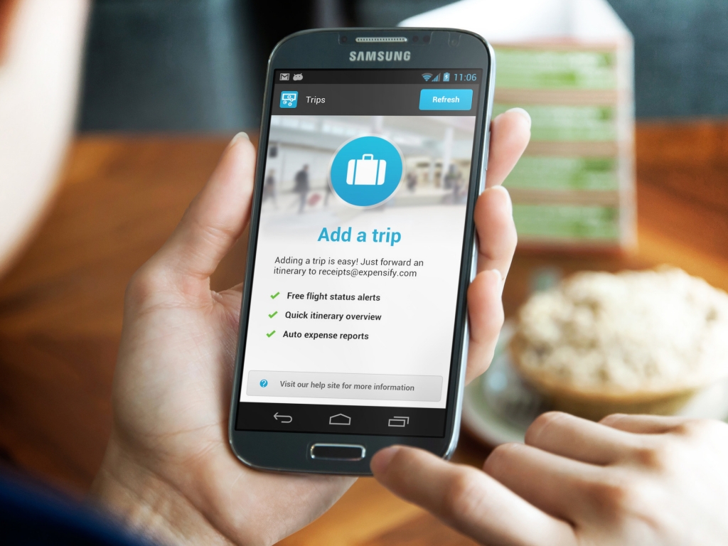 Try it here. Source: Expensify
If your productivity app is aimed more at very active people, always moving, talking and working, maybe you want to showcase them in the middle of lunch at a coffee shop. This Samsung Galaxy mockup does precisely that. In our example, the user is checking his expenses, but he could be scheduling meetings, organizing tasks, checking his agenda or any other feature that your productivity app has.
Elegant and Organized
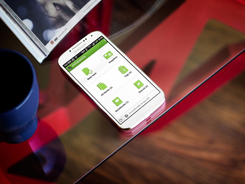
This white Samsung Galaxy mockup is meant to portray a more elegant audience. Your target could be C-level executives or fashionistas. It doesn’t matter. What’s important to note is that your productivity app would pop right out of this image, because the glass table, blue cup and abstract red-brown background make this a very interesting image to look at.
The Classic, at an Angle
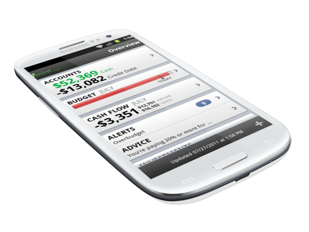
Finally, you can never go wrong with the most versatile Samsung Galaxy mockup of all. Over a transparent background floats a white Samsung Galaxy s3, at an angle. The phone has been perfectly retouched to showcase its modern features. This type of mockup is more useful when you have an app in development or you are putting the image on top of a great background. However, its simplicity also allows for a lot of freedom. Give it a try here.
If you’re creating an Android productivity app, you’re more than likely in need of a Samsung Galaxy mockup. Make sure to stop by at Placeit.net to check out all the other mockups available, so you can choose the best one for your app.
