Tips to Design an Effective M-Commerce UX for Your App

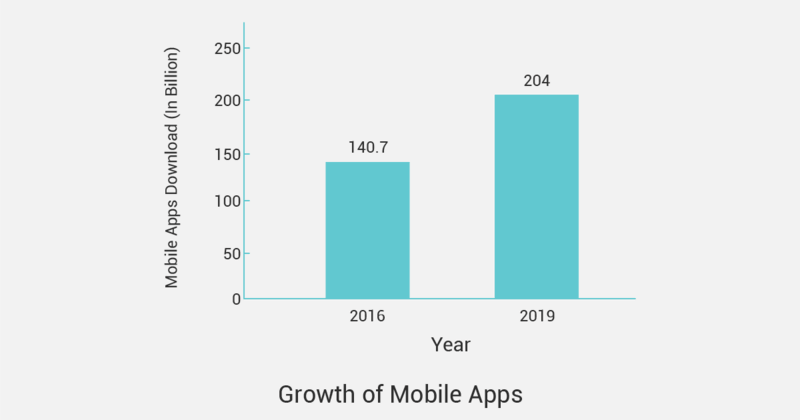
The mobile app usage in this era is skyrocketing! Did you know that 204 billion mobile apps were downloaded worldwide in 2019? At the same time, a user only uses 30 apps in a month? And rest just remains as a one-time download. Since it is clear that only the best mobile ecommerce solution survives in this competitive era, you need to work hard on designing your mobile app experience with the best m-commerce UX.

Source: Statista
- 140.7 billion mobile apps were downloaded in 2016
- 204 billion mobile apps were downloaded in 2019
- $462 billion is the global revenue from mobile apps in 2019
The better the user experience is you will have more possibilities to be among the top 30 mobile apps accessed by customers. Undoubtedly, the mobile app is no longer a luxury but a necessity for everyone. Today, most of the users are engaging with their mobile phones in almost every crucial moment of life. So, how do you define a killer mobile app with the best user experience?
If you really want your mobile app to shine in the online marketplace, it needs an exceptional design along with a well-thought product strategy. Here is your guide to take the user experience of your mobile app to the next level. Let’s get going and dive into the top design tips to ace the m-commerce game.

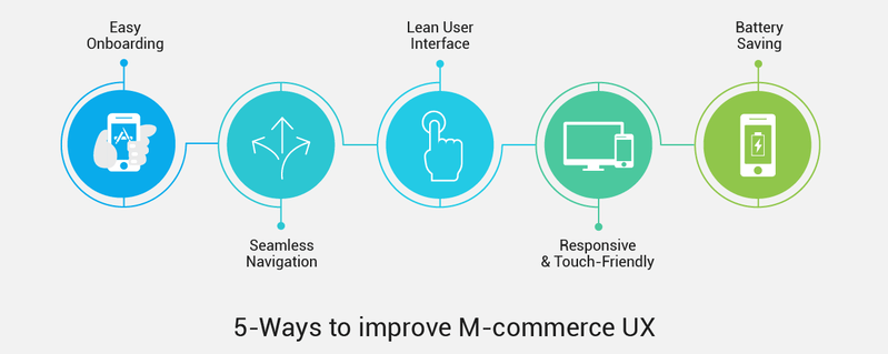
A Great Onboarding Experience
“The first impression is the last impression”. This is very true in the case of mobile apps because over 90% of the users use the downloaded app only once, and never return. And it becomes necessary to make a great first impression for users who download your app. For this purpose, you need to ask a few questions while designing an effective onboarding process in the mobile app. Ask specific questions like:
- Is there a requirement for an app tour?
- Should you provide an overview or introduction of all the features?
- What should be the best way to represent the app to the users?
Creating an onboarding experience always helps. If users will just keep looking at the mobile app dashboard and don’t get any directions, they will get confused about what to do. The user should be guided at each and every step for the best m-commerce experience so that they start using the app as soon as it is launched for the first time. You can use pinpoint arrows, tips, specific button designs to guide the user in real-time while building a value-oriented context of the mobile app.
Start thinking about mobile app usage for the end-user. Think what can be the greatest value for the users like, which features will help them start using the app right away? Consider those offerings while designing the onboarding process. It will increase the likelihood of creating the most successful mobile app onboarding experience for your users.
Seamless Navigation
The navigation of your mobile app should be self-explanatory and the user should not be bothered by finding the required options. This point is often overlooked by m-commerce developers because they try to impress their users with well-designed and intricate menus. You need not do that, just create a navigation that is familiar and obvious for the users and keep it consistent throughout the mobile app.
The primary focus should be to facilitate the user to reach their destination with minimum taps. And it is only possible when you arrange the information in a logical manner – thereby making the whole navigation experience intuitive and clean. For more details, provide a tab with useful links at the bottom. It will make the primary navigation flow simpler and easier for users.
Make It Responsive and Touch-Friendly
When you are designing a mobile app, the screen size of different mobiles should be the first thing in your mind. Understanding mobile screen sizes will help you develop the best mobile ecommerce solution. The most common mistake in this context is keeping the touch targets smaller. It leaves the users annoyed and they end up tapping on to nearby options.
So, a touch size should be easily tappable with a finger. The average size of the finger pad is between 10 to 14 mm and the size of the finger ranges between 8 to 10 mm. It means that a perfect touch target size should be 10 mm * 10 mm. Never ever give a hard time tapping the options to users and keep enough space between different elements of design to avoid overlapping.
And the last tip here is never to keep the button size identical but give them the significance they deserve. For example, a “Sign up” button should look different from the “Checkout” button.
Keep the User Interface Lean
When it is about the user interface, simpler is always better. Don’t try to overwhelm the users with endless design tricks, a lot of tabs and links as soon as they open your app. Instead, keep the design intuitive and minimal while making the user experience more meaningful. The primary purpose should be to fulfill the user requirements in one go.
It is easier to put up all the elements and options on the mobile app but it is difficult to keep the design minimalistic. You need to optimize and prioritize the options carefully and place every element strategically. Few important ways to make your m-commerce experience meaningful are:
- A well-thought design always works in your favor. Always think about your users first and then, make the next move in designing.
- Simplify the color scheme to enhance the overall user experience of your mobile app. Try to use multiple shades of a single color to keep the theme consistent.
- Ensure that there are no unnecessary elements and every design element should have a clear purpose to serve the user.
- Simple design does not mean less ever. But it means that the mobile app is a result of extensive research and deliberate thinking.
Don’t Drain the Mobile Battery
If your mobile app works great but drains the mobile battery, the users will be very less likely to open and use the app. Some major factors for extensive consumption of mobile batteries are screen color and brightness, activation of background services like the location. You can be selective with the background services and ask users to activate them only while using the app.
The heavy screen time problem can also be resolved with different modes. Just like, YouTube has rolled out “dark mode” to cut down battery usage. It is indicated that the app uses 43 percent less power than usual when used in this mode.
The Verdict
Good design is always the foremost requirement for a mobile app. Creating the first impression of using the app for a long time depends on the design. It sets the overall m-commerce experience of the app different from competitors and boosts the brand to gain better revenues. The mobile app revenues completely depend on the downloads and usage of the app by the users.
Hope these tips help you to understand the nitty-gritty of mobile apps and achieve an awesome user interface. If you are still worried about creating an interactive mobile experience for your business, consider opting for an efficient ecommerce solution that powers up the mobile experience of your users and business revenues too.
Isha Srivastava is an ecommerce expert with 3+years of experience. She writes extensively about the latest ecommerce trends and encourages people to take up new ways to make their online business a better one. With hands-on experience of handling m-ecommerce design and UX, she offers her take on improving the user experience for better mobile channel conversions. She currently works with StoreHippo- One of the leading SaaS-based ecommerce platform provider with comprehensive features for B2B+B2C online businesses.
Showcase Your Mobile Designs on Mockups!
Digital mockups are the best way to display your designs in a professional, but most importantly quick and easy way! Choose from our vast library of desktop, iPhone, and tablet mockups in different scenarios and with different models.
Make a Mobile Mockup