

There’s no better way to alienate your users more than to make them wait. And while your technological hands might be tied, your UX ones most certainly are not. We looked at what companies are doing to connect their users quickly and painlessly to the information that they want, to see what we could learn about improving perceived performance. Learn everything about with the following UX design tips:
1. Chrome’s Prerendering
Have you ever noticed how certain pages will load really quickly when you’re browsing the internet, for no obvious reason? Well, there is an obvious reason actually. It’s called prerendering and frankly, it’s pretty awesome. To take the example from Google themselves, let’s say you’re reading a blog. A lot of people will click ‘next post’. So said blog can tell Google ‘hey, get the next page ready!’ before you even click it. That way, when you do eventually get around to moving on, it’s already prerendered, and loads instantly. The same thing works to really quickly load pages you visit a lot based on your local history. Pages you visit a lot, like Facebook or Placeit, will load really fast.
What We Can Learn
While pretending seems like a tech advance to increase speed, it’s really not. The core idea can be replicated anywhere – know what your users want, and work to provide that before they ask for it. Which, actually moves us nicely along to our next tactic.
2. Work Ahead of the User
Instagram is just superb at doing this. They’re famous for their awesome user experience – but how do they actually do it?
They work in advance using what they call optimistic actions.
 Optimistic actions are just things that users will want to do, but it does them in advance.
One example is that whenever you pick a photo to share, as soon as you pick it, it uploads it. Now, as you go through thinking of something clever to write or organizing what hashtags to use, Instagram works to get it ready to share. When you’re finally all set to go, Instagram is already there.

Another optimistic action they use is the like button. The visual feedback to liking something isn’t tied to the data being uploaded to servers. Rather, it’s built into the UI of Instagram. What this means is that you can like something, no matter where you are and no matter what your coverage situation is – it’ll just be updated the next time you connect. But you still get the visual feedback! It’s a really simple way to tell a user ‘yes, we know what you’re trying to do and we’ll get on it as soon as we can’
What We Can Learn
In an article all about Instagram’s sneaky UX maneuvering, Mark Wilson summarized it best:
“There’s no reason a computer should ever be waiting for the user to hit “submit” to start the data upload process.”
People can probably guess what their users want. Help your programs make that leap as well.
3. Filler Content & Progressive Image Rendering
I combined these techniques because they spring from the same well–load something so that the user isn’t looking at a blank screen.
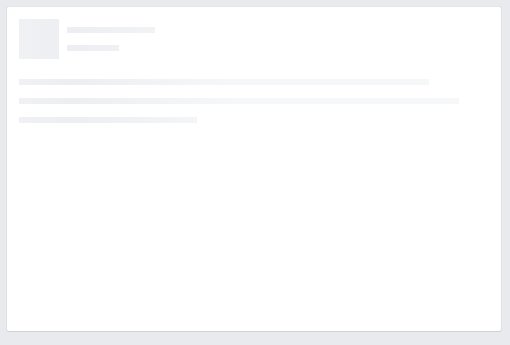
Filler content is when you load a shadow of what the final product will be. They’re a little bit like wireframes – a shell of what’s going to be there but isn’t there quite yet. Facebook tends to use filler content a lot with slower connections, and in that circumstance, it provides visual feedback to the user – yes, your content is on its way, it’s just taking a second to get there.
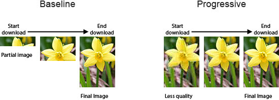
Progressive image rendering is something everyone has seen, even if you don’t know it. It’s when an image is loaded blurrily, and then becomes clearer as it finishes up. Like when you’re scrolling through Facebook pictures, and they’re all grainy and terrible for a second before they become crystal clear. (The alternative method is called the baseline, and it’s when an image loads in perfect quality, but only a little at a time. It’s insanely frustrating to watch.) This image from Six Revisions makes it really easy to understand.
Like filler content, progressive image rendering:
- Makes it clear something is happening
- Gives users a rough idea of what that something is going to be (Do I want to see a picture of a flower? Definitely! I’ll stick around for it to load properly.)
What We Can Learn
A blank screen is infuriating and doesn’t give the user any feedback whatsoever. Even if we can’t provide the complete experience, that’s no reason to leave people hanging. By giving a taste of the final product, or a shell or container that the final product is going to fill, reassures the user that they’re doing everything correctly, making the wait just that little bit more bearable.
4. Give the User Something To Do
It’s a little like Instagram with uploading pictures while you’re thinking of tags – if people have something to do sitting in front of them, they’re much less likely to be grumpy that they’re waiting. For example, YouTube had (I couldn’t get it to work so they may have gotten rid of it) an Easter egg built into their loader. Instead of just waiting for a video to load…

You could play snake instead!

Simple, easy, and super fun, it was a great way to stop people thinking ‘gee, I probably don’t need to see the cutest cat ever fall off a couch.’
What We Can Learn
It doesn’t have to be hard to engage users while they wait. It can be as easy as the simplest game ever made. It’s the same reason that people always read the worst magazines in a doctor’s office – they’re waiting for anways, might as well read Readers Digest from 1996. If you can give folks just a mackerel of entertainment, they’ll stick around while your back end does its thing.
5. Make Buttons Respond Super-Fast
It’s so simple it’s crazy. Here’s the situation. Buttons on apps or on websites have a slight delay built into them, about 300ms. And this is a great idea – it’s there so that the device knows that we meant to push the button, and weren’t just cleaning melted ice cream off our screen. However, from the graphic before, we know that 300ms is a long time for a user to perceive that they’re waiting (which they are, but it’s for their own good).
Image courtesy of Dribble
All you have to do is make the button look pressed as soon as it’s pressed. Some form of visual feedback is all it takes to let the user know before the 300ms wait that whatever they wanted to do has started, and it’s underway. THEN you can have the 300ms delay, to make sure that they wanted to do that. So simple, so effective.
Wrap Up
Perceived performance is incredibly important for user experience, maybe even more so than actual performance. These are just some of the tactics that designers and developers can use to keep the user in the loop as to what’s going on behind the scenes and keep them busy while your products work away in the background.

14 Comments
Šime Vidas
Regarding the 300ms tap delay, browser vendors have already recognized this UX issue and there are techniques for removing it (e.g using a meta viewport tag).
Spencer
You’re absolutely right – using programs like Tappy or FastClick are solutions as well – this was more a UX solution that would feel like it was going faster, rather than development solution to common UX qualms. But it’s good to know there’s more than one way to skin a cat.
Philip Tellis
There are accessibility issues with using these techniques, but then most developers are oblivious to all accessibility issues.
Ty Cahill
Philip, how about educating the developers who are oblivious to all those accessibility issues?
Philip Tellis
Blind users might soft tap on a link to find out what it refers to before hard tapping to follow the link (this is something made possible via screen reader software). Fast-click will bypass this and follow the link on the soft tap, which will disorient the user.
Users with motor difficulties might mis tap on a link just because their hands/fingers tend to move a lot while hovering over a page.
Instead, my recommendation would be, if you do want to reduce latency, then maybe do a dns prefetch and a tcp connect on tap start, and let the click do its job as usual. This could reduce up to 200ms latency, without surprising the user.
Spudley
Or you could use Pointer Events, and not have to worry about the 300ms delay at all.
Well, you *could* use Pointer Events, except that Apple seems to be getting prissy about implementing it. Sigh. Another useful API that I can’t use yet because of cross-browser support issues.
Graeme Fulton
“There’s no reason a computer should ever be waiting for the user to hit “submit” to start the data upload process.” – totally agree with this, especially when the server is slow and posting a form freezes the browser, just do it asynchronously
Rudy Man
I don’t. What if I select an embarrassing picture first, then change my mind and want to upload another? The first picture might be there forever waiting to be hacked, even if not visible because I didn’t press submit.
Graeme Fulton
Good point. To handle that situation, if the first upload is still in progress asynchronously, just cancel it and begin the second. Otherwise you can just overwrite the first image with the second. My original comment was in assumption that there was a submit button so you could confirm the picture was the right one before it becoming visible publicly. I guess it depends on the resources you have and experience you want to create.
Ty Cahill
Good point, Rudy! And what if you’re paying for the bandwidth being used to upload erroneous image selections? Definitely a good option to provide to users, but maybe not good to force it on everyone, all the time.
guillaume
This idea is really nice, but won’t it possibly download data the user don’t want to download? I mean that, if I got a 30mo data plan, but you load 1mo of stuff I don’t have yet seen (and maybe won’t), that would make me frustrated. I’m not a tech guy, so it might not work that way, correct my assumptions if I’m wrong!
Rebecca_2015
agreed!
Niclas Hellberg
Thanks for the great article. I think another great example of using Filler content is Pinterest. They are calculating the main color of an image and are taking this color as background color for a pin as long as the img is not fully loaded.
Michael
Great example of a sentence that has an entirely different meaning out of context: “If you can give folks just a smackrel of entertainment, they’ll stick around while your back end does its thing.”
I would consider revising it….