Differences Between Radical and Evolutionary Web Design
Which One Is Better and Why

Website design plays a large role in your conversion rate. 38% of people dislike engaging with a website if the design is unattractive.
If you face a sudden drop in conversion rate, getting low traffic, or having technical difficulties in your current design you must start thinking about redesigning your site.
For a start, you can replace your whole web design with a new one. It’s like changing your design from east to west and top to bottom. You left no trace of the previous design and adopting a fresh look and new features.
This designing strategy is called the traditional or radical redesign, aka revolutionary web design. Before you apply this method to your website, there are some advantages which may draw your attention. Such as-
- This design approach is long lasting and you don’t have to make frequent changes
- It will increase your conversion rate and brand value in the market
- A total website overhaul gives you a new look and up-to-date features
However, going for a radical design is like a penalty shoot-out in a soccer match. Either you scored or not, it ends the game anyway. After you radically redesigned, you can’t continuously A/B test your landing page, website copy, CTA button, header, logos, etc.
How would your new design impact your conversion rate? Without any A/B testing, it’s impossible to find out the answer.
So is there any different way? Yes, there is.
It’s an evolutionary web design strategy. ESR (Evolutionary site redesign) is all about staying with a particular design and continuously optimize every part of it.
Here we land to our debate. Which web design strategy is better to serve your purpose, and why? Don’t worry. I’m going to show you the best way with proper explanations.
What Is Radical or Traditional Web Design?
After running your business for years, you may think to upgrade the design of your website to make it more helpful and relevant.
You start visualizing a design that will reduce your maintenance effort, increase visual appeal, sells, and customer retention.
So you decide your website should leap into a completely new design.
A radical redesign changes every part of your website like your landing page, CTA button, site copy, the header, etc. Compared to your old version, you change all those elements or replace them entirely.
What happens when you make a radical change to your web design? Your online appearance takes a new shape, and you left it there. This design model doesn’t intend to go through an ongoing testing process.
Take a look at the top pros and cons of radical web design.
Pros:
- It’s concrete. After shifting to a new design, you need not worry about it.
- One-time budget.
- Get your website a new outlook.
- Get rid of all the technical difficulties from the older design.
Cons:
- You have to invest a considerable budget at a single time.
- You won’t be able to find how your new design is performing.
- A complete design overhaul takes years.
- Radical design backfires most of the time because if you face any new problem, you need to renew your investment.
- Despite spending a lot of time on a redesign, you’ll still be backdated. The world of web design is changing every day.
You spent money for a one-time switch, and that’s where you stop reshaping it for a specific period. Without testing, what assures your design won’t harm your traffic and conversion rate?
That’s why you must consider incremental or evolutionary web design.
What Is Evolutionary Web Design?
According to a notable conversion optimization specialist Chris Goward, ‘ESR is a structured, less risky, iterative design approach involves a process of testing with incremental improvements.’
Evolutionary web design is a continuous web designing process. This strategy follows these steps I’m mentioning below-
- You select a particular design for your business.
- After selecting your design, you’re bound to make it the face of your business. You keep improving every part. For example, A/B testing your landing page, website copy, header, call to actions, logos and so on.
- You never stop upgrading.
If you regularly check your site and try to improve your design, you will be able to learn how the changes help to increase your conversions.
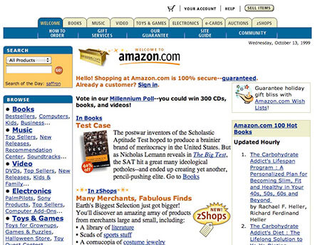
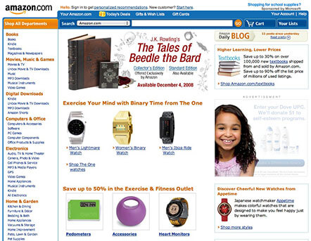
How does evolutionary site design work? Look at these different landing pages by Amazon:
Amazon in 2000:
Amazon in 2008:
Amazon in 2019:
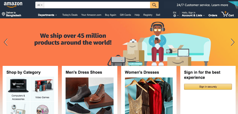
Just ask yourself, have you ever seen a drastic change in Amazon’s design?
Amazon has become a prime follower of the evolutionary site design strategy. They never change to a brand new design rather than improvise it regularly. People undoubtedly love it.
Now that you know about evolutionary site design let’s see what benefits come along with it.
What Are the Benefits of Evolutionary Site Design?
ESR helps you testing every potential element counts for your conversion rate, leads, and traffic.
Here you can see the difference ESR can make compared to Radical Web Design:
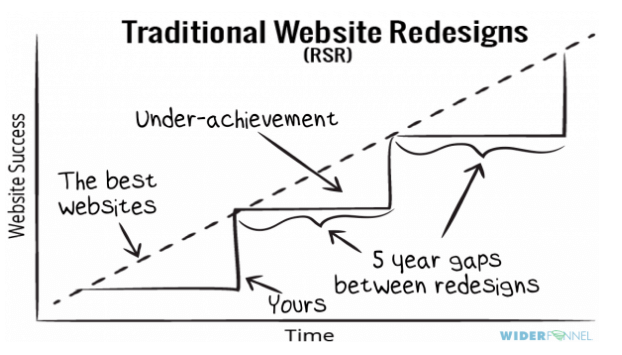
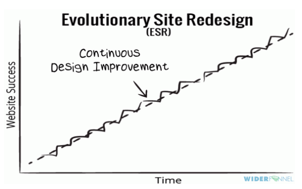
Whenever you adopt a complete design overhaul, it may consider as a drawback. Here you can see some necessary tests web designer underestimates in radical design-
- User experience
- Readability of copy
- Navigation
- Landing pages, etc.
It happens because they think a lot about ‘how the site looks’ rather than how the ‘site will perform.
On the contrary, the best websites always try to follow a continuous designing pattern. Most popular email marketing and e-commerce marketing tools also follow evolutionary design process as there are a lot of benefits.
- It’s faster than radical design: ESR is faster because you work individually on the different parts of your website each time. So a little change takes lesser time to generate a result. A radical redesign is different. The whole changing process takes years.
- You will get measurable and reliable results: Every time you make a change, you can split test those changes. A/B testing helps you get measurable results to understand the impact of your redesign. It will let you execute more accurate upgrading.
On the other hand, radical web redesign won’t get you any scientific results. If you feel you are losing sells or traffic for it, then you may take actions. Gut feelings aren’t a proven way to success. - A better user experience is assured: A radical design process takes time. It often interrupts the user experience. You can’t ignore the importance of consistent customer satisfaction with your web design.
Evolutionary site design is just the opposite. You can work behind a running website. It’s possible with ESR because you redesign part by part and your customer doesn’t even notice it at a glance. ESR chronically improve progressive customer experience. - Your website always keeps updating and stays ahead of competitors: If you never stop improving your web design, it will always be up-to-date. ESR assures any necessary changes at any time. So there is no chance to fall back. The radical design is a drawback considering this point. It takes longer time, getting old without any update, you can’t fix any current technical issues.
- You have a reasonable budget control: Budget is one of the essential parts of anything. While a radical redesign needs a fixed budget in a financial period, ESR demands a continuous money flow. Initially, it looks like a problem. But if you look closely, this isn’t a big deal while it ensures an ongoing and effective site optimization.
You can plan to spend money on your design throughout the year. It gives you control over any unexpected cost.
Why Radical Design Backfires: A Case Study
Do you remember digg.com incident? Back in 2010, they decided to change their website design radically. They completely changed their web appearance. Eventually, this website renovation resulted in a 26% traffic loss for Digg. Before this incident, they were one of the dominant social bookmarking sites.
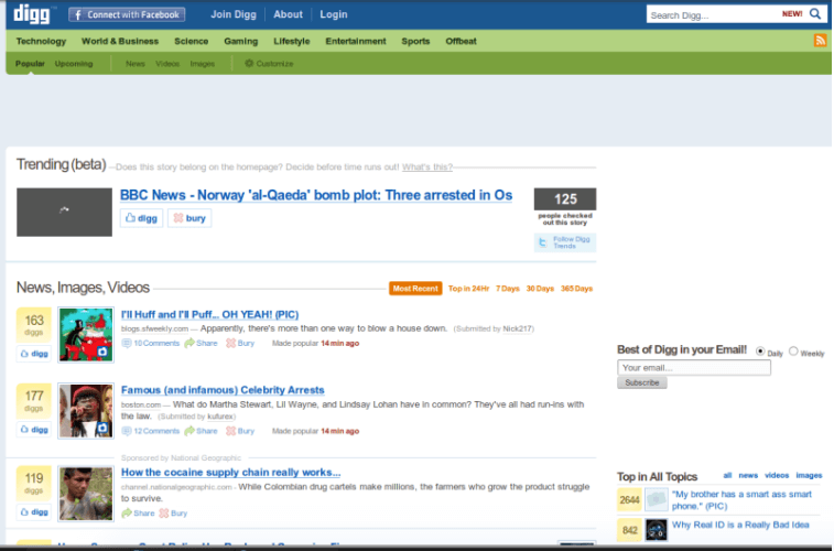
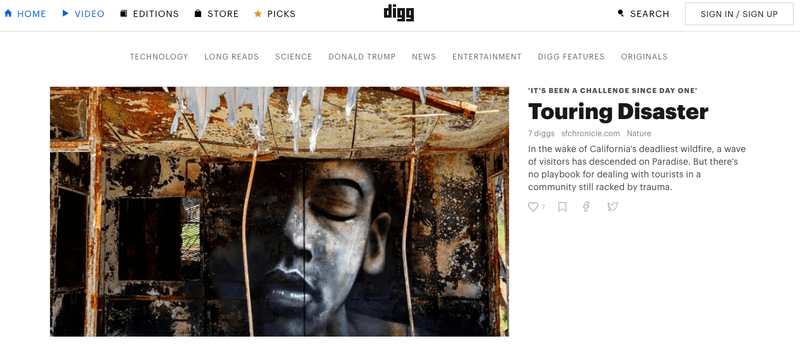
In 2010, Facebook and Twitter revolutionized social networking.
It’s understandable that as a leading social content platform, Digg thought they must concentrate more on social networking too. So they wanted their user to share contents with friends and follow what they are sharing.
Earlier, they had a centralized ‘link stock market‘. The opinions and voting of various user groups can dominate over individuals. Digg decided to redesign this process. They empowered individual voting options, which would let a single user see the content shared by their friends than the link voted by those user groups.
It sounded good and was a bold move for Digg. But when the dominant little groups had lost their dominance over a democratic approach, they lost interest. And most of the single Digg user didn’t have an influential friends network on Digg.
Top social media sites already had showered a lot of news to read or share. Why would anyone try to create a new social network in Digg?
You can see how Digg considerably lost their market share-
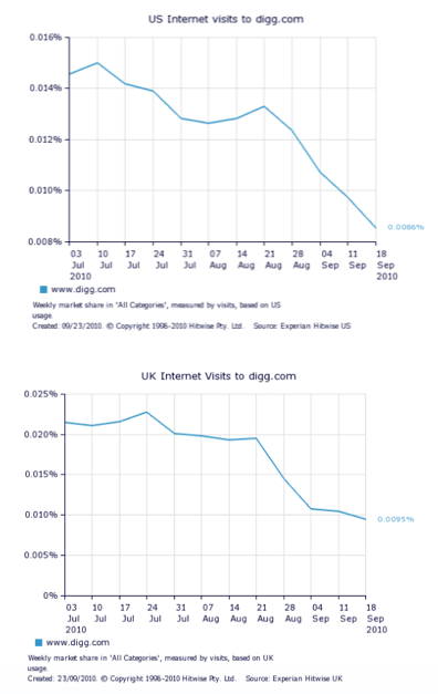
That’s how a radical move cost a huge let down for Dig.
What Situations Make You Fall for Radical Web Design?
Sometimes, it happens. You find yourself out of any options but radically reshape your website. Remember one thing – you should prioritize your customer before finalizing a design. Let’s check out the situations that make you consider a radical process.
- Your site has some technical issues. You can’t fix them unless changing it. For example, you have an eCommerce website. But your site doesn’t have the current eCommerce functionality.
- You want to change your brand or rebrand your business.
- The site looks old and backdated.
- Your boss thinks evolutionary web design costs are high.
- Your traffic is low.
- You (or your boss) want a shiny and new design.
Though, there are certain situations that make you think about radical design positively.
For example, you go on and on. You’re improving your web design very thoughtfully. But after five years, these changes failed to get better results. You may have reached the final point of your current design, and it doesn’t work. This situation is called Local Maxima.
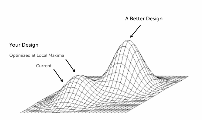
If you hit the limit of your current design and you can’t get more from it you should think about a radical web redesign.
Final Thoughts
You can choose radical web design only if you are facing dire situations like low traffic, low conversion rate, or you have reached the proximity of your current web design.
When it is better to follow an evolutionary redesign process?
- You have a long-term business plan
- You have more than 20000 monthly visitors, and you want to increase your sells and customer retention.
- Your customers are highly used in your current design.
- You have budget and patience.
- You have enough support, and scope to run continuous testing through every part of your company.
Now you are ready to make your decisions. I’ve discussed all the plus and minus of both web redesign strategy. Which one seems the most reliable? Don’t forget to share your thoughts with me.
Kaji Enamul Islam is a writer of eCommerce and digital business industries. Besides, his addiction to fiction, fact, movies, and books are possessive. Right now, he is working as a content marketing executive at OmniKick and Intent Marketer.
“Quickly found the perfect MacBook mockup on Placeit!”
Travis Johnson 5/5
Display Your Designs on the Best Mockups
Display your designs in a professional way using mockups. Context is key when displaying your designs. With Placeit you'll find many different types of devices to showcase your designs, from the latest iPhones and iPads to MacBooks and PCs, every mockup is created with your needs in mind!
Customize a Mockup Now!