
How to Make Old-School Web Design Look Good
Retro elements in the design are quite popular these days. But should it be a thing in web design? Can you use a 90s website template today — or it makes the site look too old school?
At Weblium, we created thousands of web designs, including the ones with retro design elements. Also, as a subsidiary of Template Monster, we own all their experience to analyze what works best. So, we created this short guide to help you understand what is a good old-school website design and what is not.
Why Is an Old-School Web Design Not Always Good for Your Site?
There’s a difference between using old school or antique style as a unique trait of your brand and simply having an old site that desperately needs a refresh. If you want to make your site look retro, we have a whole section about modern retro website design on our blog.
Truly old websites, apart from some unappealing visual components, also have largely skewed visual approaches, and scattered elements. A 90s website design will ward off a large number of your site visitors. Besides, it’s a question of trust. People are often not excited to purchase something from a website that seemed to be updated 20 years ago.
Some of the old-school website designs may also dent your SEO scores.
What 5 Old-School Design Elements Should You Avoid?
If you look at an old site, your eyes would most likely fall out from the barrage of mismatched blocks of text, images, acid colors, and other features hurt your brain. These elements are
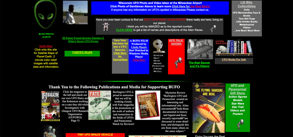
Sidebars
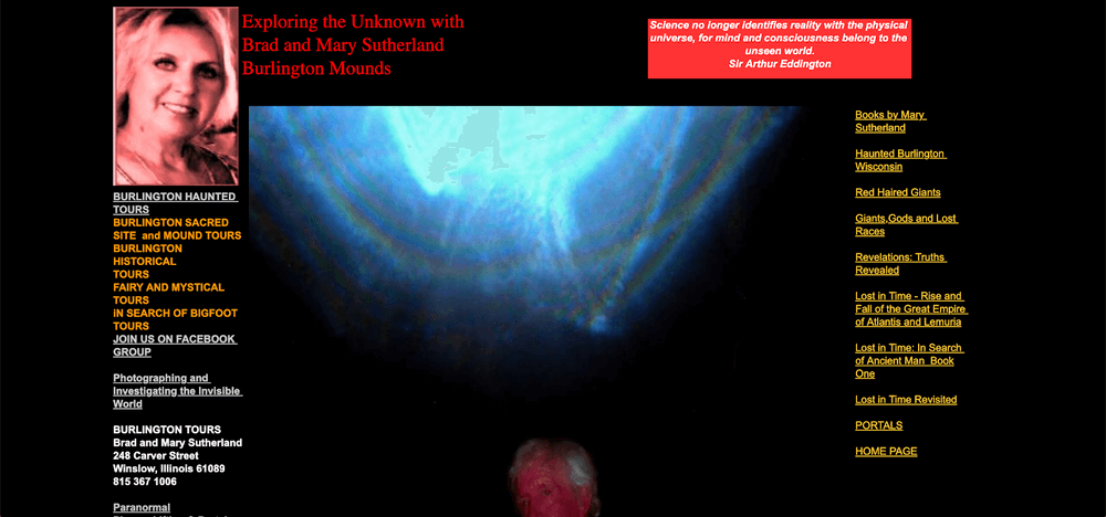
Sidebars were the junk boxes of most websites. They took anything that the website owner deemed fitting. However, instead of building the site, they were often the reason the sites looked ugly.
Often, if there was any important information on either of the two sidebars, it would simply be missed. After all, most people would not even glance at the contents of the sidebars.
In retrospect, sidebars were great when you had to pack all the information on your website on a single page. Thanks to the functionality available today, there’s no need for them anymore.
Flash Animation
Flash animation was meant to be the future of early 2000s web design. Adding a few animated features was a great idea until the small spindly animated GIFs actually made the websites a bore. This takes up important space and drags the users’ attention from the intended content.
Did You Know?
Flash animation code cannot be supported by most mobile devices. This means that websites using it are incompatible with smartphones.
As it stands now, Flash will not even be in use by 2020! Yes, it’s almost arcane and forgotten.
Alternative
Rather than clogging your website with flash animation, you can a smooth horizontal navigation design. And, you can always include a start button to play your animations or videos if need be.
iFrames
The word iFrame simply means “Inline Frame”. However, you should think of them as multiple frames within a single website page. On most occasions, web owners used iframes to embed videos and documents within their website pages while building a classic website design of the age.
Did You Know?
iFrames did work for some time. That’s why they have been around for 15 years. However, they came complete with the following cons:
- They made web design cumbersome and complicated.
- They complicated the usability of the websites.
- They also came with multiple security issues.
- SEO was a big problem for websites that use them.
Alternative
A perfect modern alternative to the iframes would be embedding the media straight into your website or playing around with plugins.
Separate Intro and Splash Pages
On old-school websites, splash pages were an aggravated form of greeting. Immediately after you clicked onto the website, some giant splash screen, with a picture, animation or just nothing at all meets you.
Splash screens are today’s version of “Click here to receive our newsletter” on some websites. Honestly, both don’t inspire any great sentiments.
Did You Know?
- Splash pages were meant to grasp the attention of the browser using shouting graphics. However, they almost always ended up aggravating the browser. More than 25% of web users immediately leave a page once they meet a splash screen.
- Though they are awesome at showing off your prowess at work, they are horrible at SEO. Some sites simply lost their rankings because they couldn’t do away with the splash and introductory screens.
Alternative
Rather than making the internet browsers angry by forcing them to click “skip” or answer redundant questions, designers build websites with no “enter page.” It makes browsing way easier.
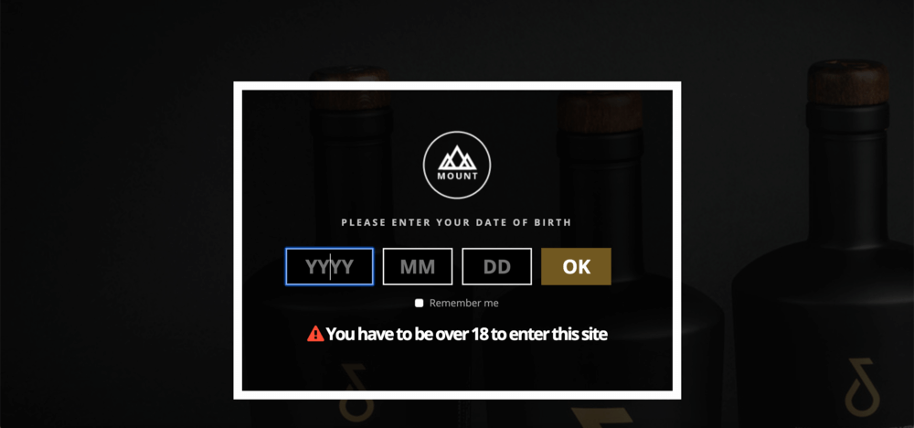
Counters
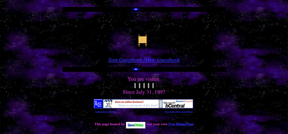
Counters were meant to show different statistics, like the number of visitors on a site or how many years you’ve been a user — and they are another trait of old-school websites. However, some counters will make you dizzy. They shout, glitter and confuse in equal measure. While they were famous in the 80s classical designs, no one really likes them anymore.
Did You Know?
Aside from wasting a lot of your website space, counters can also mess up your site rankings completely.
Numbers are cool, they are the perfect way to share your success. In fact, one of the best ways to sell your business is to show how long you have been doing it, and how many clients you have handled. But there are much better ways of doing that.
Alternative
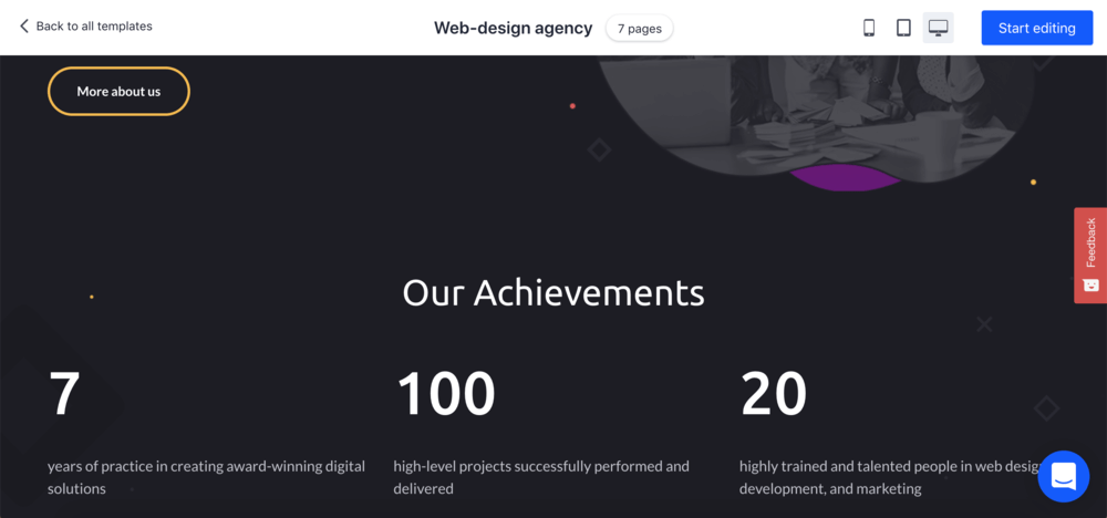
There are dozens of modern alternatives to counters. A great example would be placing an achievement’s section on your homepage.
Here’s an example made with AI website builder:
Wrap Up
An old-school website design should remain in the coffers. That’s a rather bold statement to make, but there are more progressive ways of using the webspace or making your site look retro and stay effective at the same time.
Aside from meddling with your site’s usability, they can also be a hurdle to achieving top SEO rankings. When designing a website, use modern trends and solutions. Minimalism is the trend of today.
Retro Web Design Can Look Modern
Creating a retro-modern web design isn't impossible, you just have to take into consideration some of the pointers above. When you're done, make sure to promote your web design work in the best way possible using digital mockups created by professionals, just for you!
Customize a Mockup Now!
1 Comment
iijnpfwqec
Muchas gracias. ?Como puedo iniciar sesion?