Awesome iMac Mockups for Your Advertising Campaigns
There are times when you need a great high-resolution mockup of your website. There is no better place for getting that done than on large iMac screens that show off every detail of your site. We’ve prepared 10 awesome iMac mockups for you that will give your website the best possible display.
1. iMac in a Dream Office
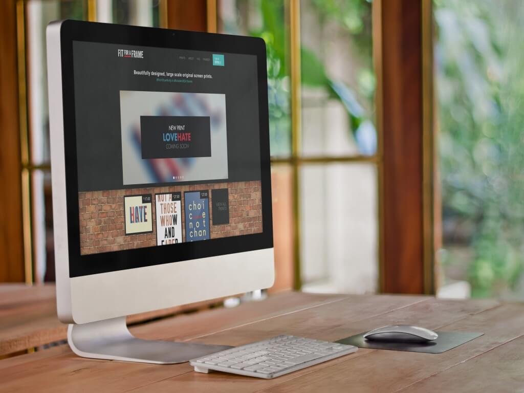
This is one of the most beautiful places to showcase your website mockup. The colors are vibrant, warm and work with just about any app design. The background has lush green scenery and the foreground features light brown wood. The color scheme creates a relaxing office atmosphere. The iMac is tilted slightly away from you, giving you a nice angled look at your product. There are no distracting elements to take the focus off your mockup.
2. Whistle While You Work

This is the perfect place for a beautiful responsive website. You can set your website on the large iMac display and on the iPhone 6. A woman smiles as she uses your site on the iPhone. She is happy and relaxed at work. There is beautiful greenery in the background behind the wooden office desk. Beside the keyboard, there is a small black notebook implying a slightly more creative workspace. This would also be a great place to show a website and an app that work together; perhaps something to help organize an office.
3. All Work and No Play…
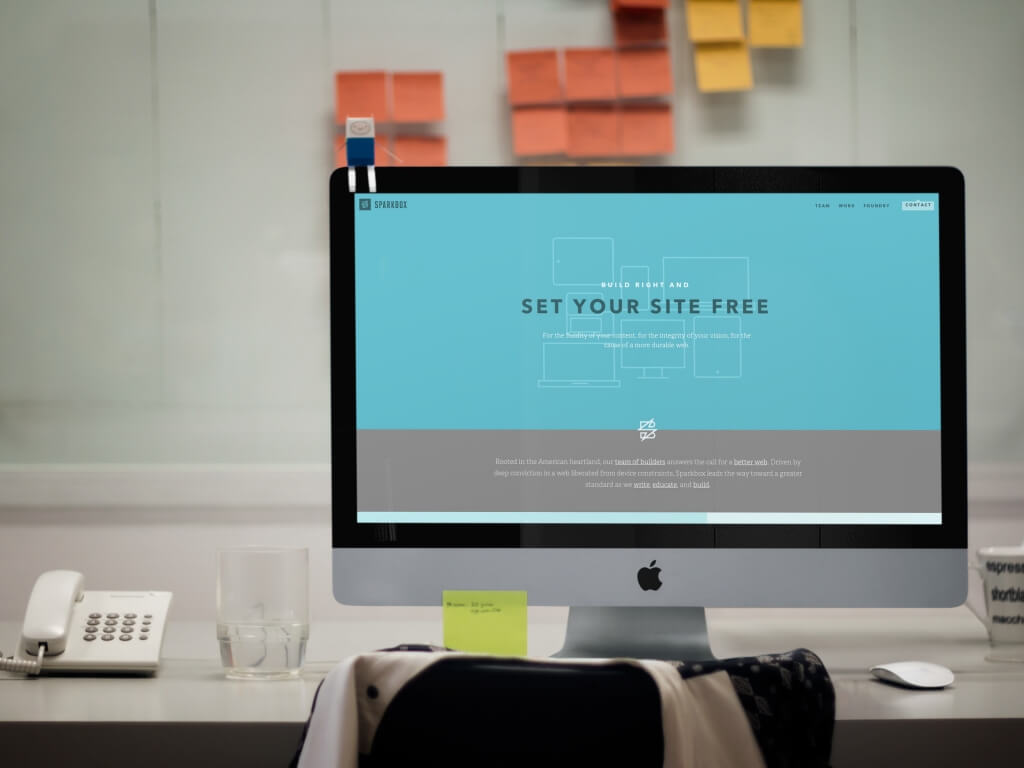
This is a great shot of an office with a slightly playful atmosphere. The iMac has an adorable paper figurine of Finn from Adventure Time sitting on the top left corner. A glass of water sits half empty beside the iMac. The chair even has a sweater hanging off the back. These personal touches make it seem like someone just got up from work for a break. Behind the desk is a board with organized post-it notes. You can use this for a product for busy office workers. A website with a playful or colorful design would really stand out in this shot.
4. Sleek
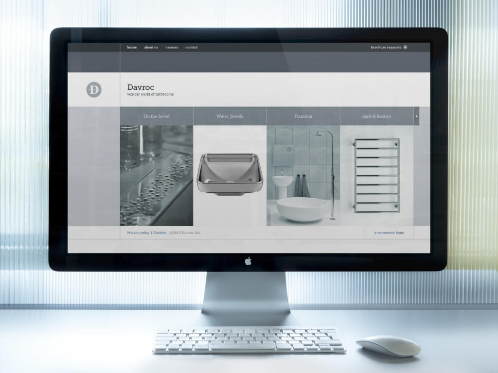
If you need a sleek, cool business look then this is the mockup for you. This set has an almost futuristic look. A bright white light comes in the top left, from behind a semi-opaque curtain. The color scheme is made up of white, grey, and cool light blue. The sterility of the space suggests a doctor’s office or dentist’s office. The iMac’s equally glossy look fits in to this setting perfectly. This is a great spot for a product directed towards medicine. It would also work well for any financial or accounting site with a clean design.
5. 2 for 1
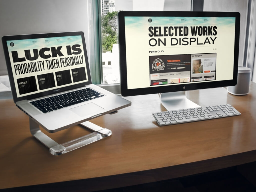
This is a superb shot for showing off 2 different sections of the same website. You can easily show off two different use cases or just your two favorite screenshots. The iMac mockup is set on a clean wooden desk with a half open window, so you can peek through and see the city on a cloudy day. This works well for both creative or business oriented products. The color scheme is neutral, so any website can easily stand out against it.
6. A Classic
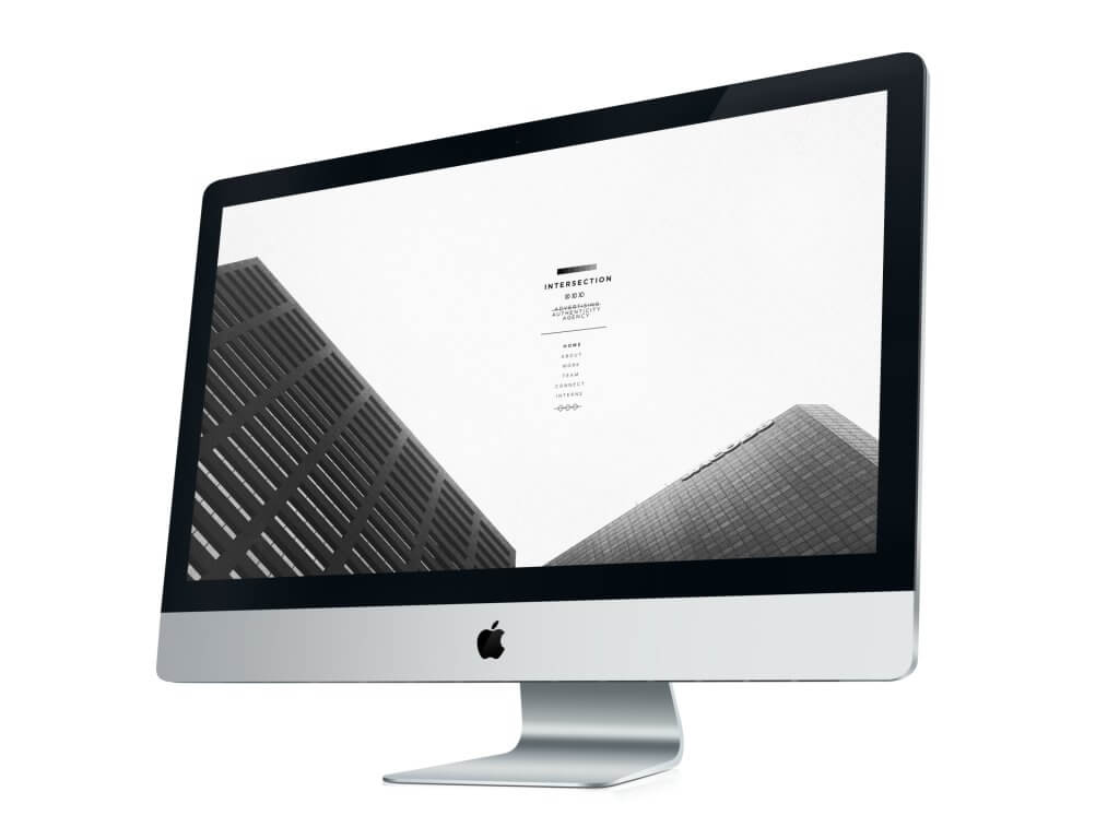
This is the classic Apple look of a polished device set against an immaculate white backdrop. The white background will give complete focus to your mockup. The screen will hold a large high-resolution image so you can show off every single detail of your website. The iMac is set at center stage at a slight angle, creating a dramatic and strong look that should be accompanied by a swelling symphony. You can make your website look bold and impressive with this mockup.
7. Stylish

This beautiful image features an iMac sitting on top of a vintage desk, next to a magazine and a cup of coffee at a creative office. The background is simple allowing potential viewers to center their attention on your app/website being displayed on the iMac’s screen. Consumers are going to love it! Use this great image to advertise your business and ideas and make an impact on the market right away.
9. Working Hard
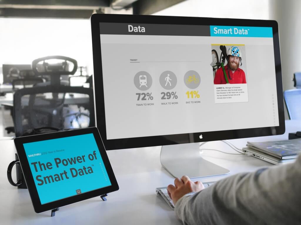
This is an ideal upscale work environment in which to show off your website. It is also quite neutral and can simulate any type of organization from a cool ad agency to a sleek law firm. You can display a great responsive website on the iPad set in a stand next to the iMac. This can also easily show 2 different use cases for your product. A man is featured sitting at the desk, hard at work on the iMac.
10. To the Point
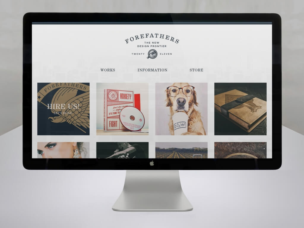
This polished set gives your product the full attention it deserves. The full frontal shot of the iMac lets you use all that space to your full advantage. The grey backdrop gives a neutral and polished look. While it can work with any kind of website, it is ideal for a site with polished design. A sleek music, design, or business website would work well.
Go ahead and try them out here!
Go ahead you will love these awesome iMac mockups.
