We have all seen the hamburger icon. As a matter of fact, most of us probably use it on a daily basis. It has become a staple in website and app design. I’m even looking at it now on the top right corner of Google Chrome.

Lately, there has been much debate about whether the use of the hamburger icon and side menus, in general, is really a good idea. Especially when it comes to UX design for a website. But more people have been wondering where it came from and how it got to be so widely used.
The Creator
 The hamburger icon was designed by Norm Cox for the Xerox Star, the world’s first graphical user interface. Norm Cox is the co-founder of Cox&Hall and has been an interaction/experience design consultant since 1982. He also happened to design the document icon for the same interface. Geoff Alday is the amazing software designer who went searching for the creator of the hamburger icon and managed to find this video.

From there he e-mailed mister Norm Cox, who was delighted to share the origin story for the hamburger icon. Here’s what he said:
Its graphic design was meant to be very “road sign” simple, functionally memorable, and mimic the look of the resulting displayed menu list. With so few pixels to work with, it had to be very distinct, yet simple. I think we only had 16×16 pixels to render the image. (or possibly 13×13… can’t remember exactly)
After the Xerox Star, however, the hamburger icon disappeared for some time.
The Resurrection
With the new, much smaller, interface that smartphones had, designers had to look for a way to make everything fit onto a 4-inch screen. It is unclear what app used it first but some of the first apps that people remember using the hamburger icon are:
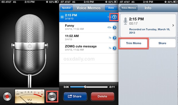
Voice Memos from iOS
This seems like it is the oldest occurrence (excluding Xerox) of the hamburger icon as a menu button. It came out June 17, 2009, and was available for the iPhone 3Gs. Clicking on it would bring up the list of recordings and options. Apple had already borrowed the mouse and the desktop from Xerox when it created the Macintosh, a small icon would not matter much.
Tweetie for iPad
Tweetie was the first app available for Twitter, created by Loren Brichter, who happened to be working at Apple at the time. This came out in 2008 and used the hamburger icon for lists. It seems like it is no coincidence that an Apple designer used this icon.
Facebook Makes It a Trend
Facebook seems to have also been a huge contributor in spreading the use of the hamburger icon for menus. It started out with this grid icon in 2008. It later added a row to the grid in 2009.
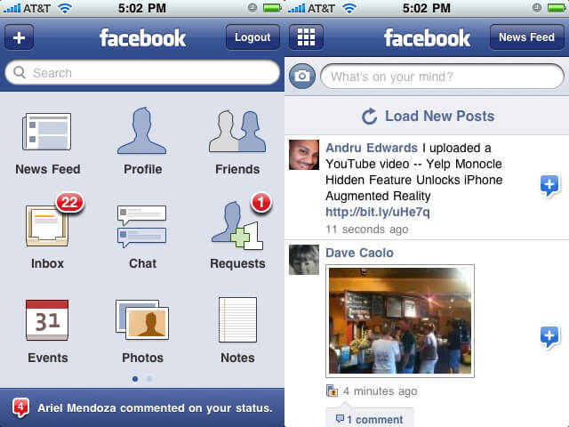
And lastly, in 2010 that grid became bars.
Facebook was already using the side menu and all they did was connect that grid. This seems to be one of the most remembered first sightings of the hamburger icon.
It looks like Apple was the biggest reason for the resurgence of the hamburger icon. They brought up the smartphone and the need for a compact display. They were already fans of Xerox’s ideas and they began using them on their interface. From there, huge social media apps took it over and everyone else followed along.
Currently, it is being used to represent side menus on websites and apps as well as lists. A few of the largest apps that use it are:
Reeder
Reeder uses the icon to get to your subscription lists.

Path
Path was also one of the first adopters of the hamburger icon and still uses it now to show navigation.

You can also find it on Twitters Bootstrap and Starbucks for navigation.
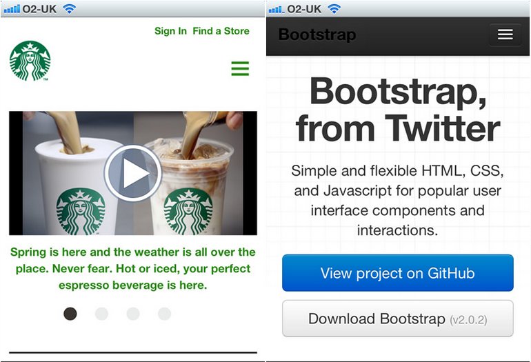
It has been popping up in the majority of apps and has become the industry standard to show additional options.
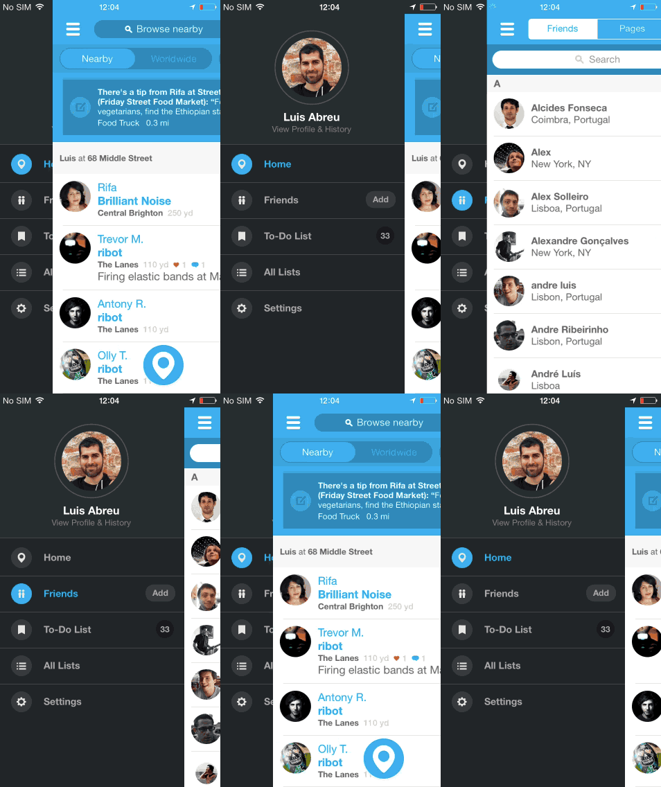
Websites recently began adopting it as well. The hidden menu works well for minimalist designs and has because extremely popular among designer websites.

And here is one from a construction companies website.

The Future
The hamburger icon has become a staple in both web and app design and it doesn’t seem like it will be going anywhere anytime soon. It has made its comeback and it seems to be here to stay. The hamburger icon has gotten quite a bit of heat from the UX/UI design community. Some people say it is a terrible thing that must be stopped now and be replaced simply with a menu or with a handy tab bar. Some hate and some love it.
Others have compiled lists of websites that use the hamburger icon for wonderful simple designs. So, is it really more of a matter of how and when it is used?

Where Did You First See the ☰ ?
Let us know in the comments below.

19 Comments
Rahul Arora
Nice roundup. I first saw the hamburger icon on some mobile design mockups. Didn’t know Norm Cox is the creator. His icon has almost made it to the app design standards.
Sheryl Winwood
Oh no till now I thought somebody else as its designer now cleared. thanx for letting me know of it Thanks a lot for sharing it
Maarten
The fact that a hamburger menu interrupts the user’s flow through a piece of software is the reason I try to work around using the hamburger menu. When the hamburger menu unfolds, by showing all kinds of “links” to other sections of an app, the user is put into a situation where it needs to scan all the options and CHOOSE which part of the app/content he wants to open.
You should’nt let users choose :p Create content-driven applications, bring the data forward and try to use other animations/transitions to hub/spoke a user from one place to another. That’s my opinion ^^
Kelly Jepsen
I can’t help but feel what you’re suggesting is actually an argument against using global navigation, as opposed to the hamburger icon itself. And that’s great advice for anyone living in an ideal world where there is no need to jump from one area of an application to another. For the rest of us, who have users who are constantly navigating to and from unrelated pages of an application, there’s often very little harm in looking into using global navigation (and the hamburger icon to instigate this interaction).
Charles Elwonger
Good points all around. Of course forcing a user to make a choice is often a sign of poor design… but in so many cases the choice is a core part of the purpose behind the application.
I do really like the “isolation” notion when I have to make a choice in an application. Especially on desktop, when there may already be a dozen things on a person’s screen — making each choice particularly clear and focused is a great boon. I definitely appreciate this.
On a case-by-case basis, it may sometimes be more convenient to always display the global nav should screen real-estate allow. But I tend to lean toward moment-to-moment simplicity, even if it costs an extra click.
Lucas Gallindo
Pure content-driven (no global navigation, no configs) is rare for a reason. It works well if you have a single-purpose app for niche users.
If the app has more than a few features or you don’t have fine control about who is using it (different types of users react differently to the same content), it’s not really feasible.
Kelly Jepsen
I would like to know when the icon started shifting from being a “list” icon, to a “menu” icon. Ultimately, a list and a menu are extremely similar, but it would be interesting to look at that transition closely (if at all possible).
Don
potato potaato
Chris
Considering that web designers have been using the unordered LIST element to display navigation links as a standard for years now would mean this shift isn’t something new.
Bauke
How deliciously ironic to use that animation with Luis Abreu’s avatar in a positive light, seeing that he is one of the people that wants to get rid of the Hamburger menu. 🙂
Hughett
There’s something to be said for its universal understand/appeal, which I think positions it as a good tool for better UX/XD. To me, that’s what’s most important with UI elements.
Gavin Engel
I think it looks more like an egg muffin sandwich.
Melissa
I’ve seen several articles discussing the origin and first uses of this icon, yet no one seems to ever include the contextual menu button on Android devices.
And I refuse to call it a hamburger – it makes me cringe when I hear UX professionals say this. Call it by the function it performs, just like you would any other UX component; slide out menu.
Nick Bewley
Simple applications absolutely should not hide functionality behind hamburger icons. However, as application complexity increases, so does the need to structure an information hierarchy in order to facilitate user flow through the design. A hamburger icon, a three dot (“more”) icon, sidebars, etc. are valuable tools to position certain elements down in the information hierarchy, while subsequently allowing more relevant options to shine in the hierarchy.
Ultimately, I agree that the hamburger icon is over- and mis-used, but disagree that it should be banished.
Leonardo Molina
The moment when I realized the hamburguer icon as a convention was when Firefox replaced their menu button with this icon
Jim S
As a video editor, I have seen the hamburger menu on the Avid Media Composer since 1996. It may have been there in earlier versions but that was the first year I started using the Avid system.
ftrain
It also shows up in DOS in the 80s or 90s. https://twitter.com/ftrain/status/724440969697984512
Scott Romack
I worked with Norm Briefly at Samsung. This is so cool that he invented the universal Icon for menu. I’m assuming the material design ‘…’ is a derivative of the ‘hamburger’. It looks more like a hotdog to me but it’s still delicious.
Daniel Chege
Thanks for sharing great insights on this blog, keep up the good work.