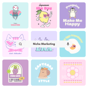
Niche Marketing Done Right: Top Guide for Entrepreneurs
Feel like your business gets lost in a crowded market? Here’s all you need to know about niche marketing and finding the right fit for you.

Feel like your business gets lost in a crowded market? Here’s all you need to know about niche marketing and finding the right fit for you.
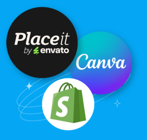
In this guide, we’ll walk you through how to use Placeit & how to combine these three tools to create beautiful, on-brand product visuals!
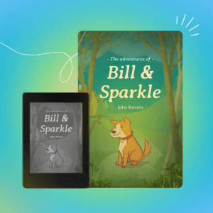
Stuff Your Kindle Day is the perfect event to boost your book’s visibility! Learn how to join & grab top Placeit book templates to stand out.

Protect original creations & stay clear of intellectual property violations. We’ll review the Etsy copyright infringement for 2025.

Global trade policies are changing with upcoming China tariffs in 2025, but what does this mean for your POD business?
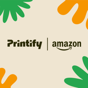
The super combo for any POD seller is here with the Printify Amazon Integration! Image what you can achieve with these two and Placeit!

Selling on Amazon can provide a great income with a relatively low upfront investment, so let’s learn how to make money on Amazon.

Make your shop a perfect match this Valentine’s Day! Discover best tips and strategies in this Valentine’s Day Etsy guide to grow your sales!

Stitch your success with print-on-demand embroidery in 2025! Discover embroidery ideas, tips, companies and how to boost your POD sales.

Get the insight you need to help your brand succeed! Sign up for our monthly newsletter and stay up to date on our latest blog posts - it's free!
Send me the latest in...
We're hard at work preparing our next newsletter.
See you soon!