

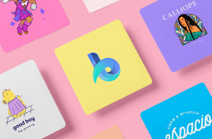
Are you a content creator, an influencer, a business owner, a POD seller, or just selling products or services? Then and in any case, you’ll definitely need to create a logo to assertively communicate your values and identity. Surely, you already know that there are different types of logos but how do you choose the right one among a great variety? No worries, we’re here to give you a hand! To find out which type of logo suits you best, we have designed a quick quiz to help you narrow down your options. Plus, we’ll give more details and recommendations about each one, so, ready to get started?
Quiz: What Types of Logos Are Best for You?
Take the quiz and discover the ideal logo style for you to design in just a few clicks!
Learn More About the Types of Logos
- Why Are Logos Important for Your Business?
- Name-Based Logos
- Image-Based Logos
- How to Make a Logo With Placeit?
- Types of Logos: Last Words
- FAQ Types of Logos
Why Are Logos Important for Your Business?
You may already have your business up and running and think that you may not need a logo, but the reality is that you do. A logo is one of the pillars of your brand identity because it’ll put a visual image in the minds of your target audience to differentiate you from competitors that offer similar products or services to yours.
Besides, one of the main advantages is that it helps you be recognized and makes you unforgettable to people interested in acquiring your products/services/content. Think about this, in a day, we are exposed to hundreds of stimuli that bombard us, but if you have a great business logo, it will give your brand an image that represents what you do and what you want to communicate, and in that way, it’ll help your brand be more easily fixed in people’s minds. They may not always remember your brand’s name, but an image may be all you need to keep them coming back to you.
Additionally, if you’re still not completely convinced, think that all your favorite brands have a logo, so incorporating a logo makes your business look professional and reliable. A logo shows that you’re putting a lot of effort into making things happen and your brand is not just a hobby but something that will give you benefits in the short and long term.
![]()

Name-Based Logos
As the name suggests, these types of logos focus mainly on the name and are practically made up of pure text. They’re usually brand names, abbreviations, initials, or some letters combined with numbers. Likewise, they don’t have any images, but they can have small shapes so as to not look so flat. Finally, it should be clarified that typographies, colors, spaces, and sizes play a fundamental role so that these types of logos can be differentiated in a visual universe of brands.
![]()
1. Wordmarks (Logotypes)

Ideal for
New businesses, businesses with short or one or two-word names.
Highlights
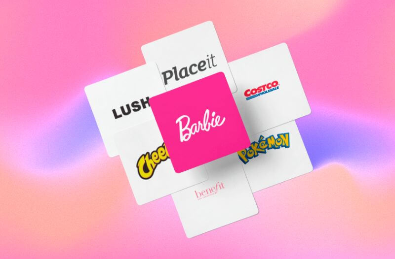
- These types of logos are also known as logotypes. Their main feature is that they’re only composed of letters and nothing else.
- The adjectives that best describe these types of logos are: timeless, versatile, and adaptable.
Recommendations
![]()
- Generally, the most common typefaces used in wordmark logos are serif styles, but each font has a different meaning. For example, Serif gives an elegant, traditional, formal presence. In contrast, Sans Serif shows a modern, renewed and versatile illusion.
![]()
- For this type of logo, it’s advisable to use a range of 1 or 2 colors, although there are no written rules. For instance, Google and Toys”R”Us defied them by incorporating 4+ colors into their logos.
- It’s totally valid to incorporate shapes and minor elements in the letters to achieve a differentiating effect, but remember, less is more.
- Likewise, and following basic design principles, it’s acceptable to enlarge or shrink certain areas for these logos to emphasize certain elements more than others.
- Additionally, we must ensure that wordmark logos are entirely legible and adaptable to any size. This is easy to achieve due to their text-based designs.
- To conclude, the fact that it’s a minimalist logo doesn’t mean it’s easy to design. In fact, it requires paying a lot of special attention to details and thinking very cleverly about how to stand out from the competition.
![]()
Examples
Placeit, Costco, Pokemon, Benefit, Cheetos, Lush, and Barbie.
![]()
2. Letterform
Ideal for
Companies that want to see their initials/first letters in the logo.
Highlights
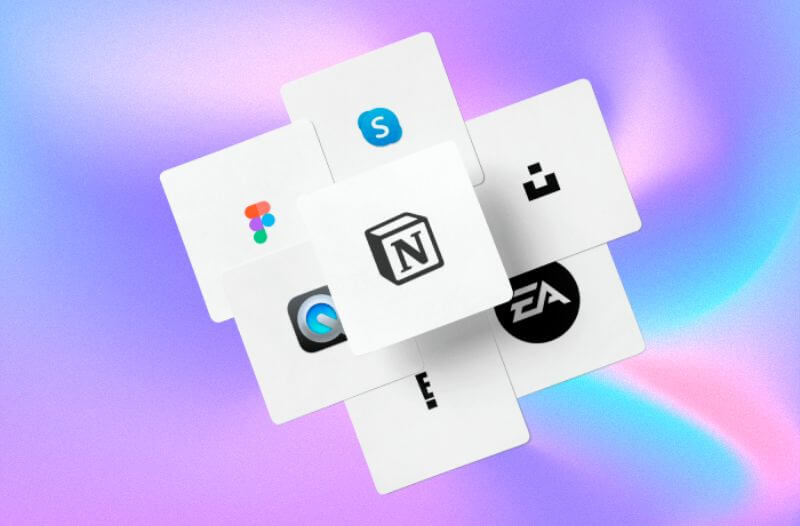
- They’re very short and are also based on letters, but the main difference is that these types of logos are only made up of a single letter—for example, the E entertainment logo.
- This kind of logo isn’t usually the official logo for a brand but a variant of the primary one. It’s usually used by the top leading companies in any industry or by those that are well-positioned since they’re easily recognizable.
Recommendations
- One of their advantages is that since they only consist of one letter, they’re highly scalable and can be present in almost any offline or online media, from website icons and pens to large banners and web pages.
- Moreover, one of their main features is that they shouldn’t have many details but rather different shapes to give a different twist to the selected font.
- Although these types of logos give the appearance of being minimalist, it’s not true at all. In fact, many of these logos include different creative elements to make them stand out from the crowd and be memorable.
- The typography implemented must be fully legible to be easily identifiable.
Examples
Skype, Unsplash, EA Sports, E entertainment, QuickTime Player, Figma, and Notion.
![]()
3. Lettermark (Monogram)
Ideal for
- New businesses,
- Brands with very long names that wish to abbreviate it,
- Companies and founders that wish to include their initials (either first or last name).
- It’s also perfect for businesses in international markets, as it does not require a long name or may be misunderstood due to cultural differences.
Highlights
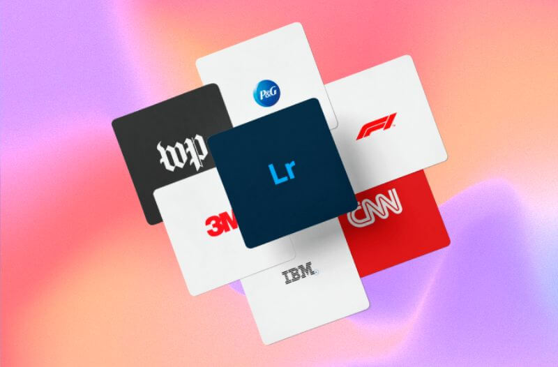
- These types of logos usually have 1 to 3 letters in the logo. For the same reason, they are easy to read and even remember.
- They give the impression of having a hidden meaning since, at first sight, you cannot know much if you only have the initials.
- It is a logo that is not complicated and is generally modern. In fact, they are often used by many technology companies as well as luxury, fashion, and design companies.
Recommendations
- Again, as with letter-based logos, it’s recommended to choose details, shapes, colors, sizes, spaces, and typographies that make it stand out so that it isn’t forgotten.
- Sometimes, depending on the material on which the logo is printed, the company’s full name can be added in smaller letters—for instance, Cartoon Network.
![]()
- To conclude, monogram logos aren’t only limited to letters; you can also include numbers like 3M.
Examples
Procter & Gamble, Formula One, CNN, IBM, 3M, the Washington Post, and Adobe Lightroom.
Looking for design inspiration? Check out our logo ideas guide! It’s packed with design tips regarding graphic style, colors, and fonts and over 30 ideas sorted into 9 styles to perfectly match your vision
Image-Based Logos
In this category, we have added the remaining six types of logos. It’s worth mentioning that not all of them are 100% images, but all include at least a small image. On the other hand, we can say that there can be a little more creative freedom when designing these types of logos since they can be based on real elements or even create something completely new and unique and even complement it with some text.
4. Abstract
Ideal for
- Brands with a presence in several countries,
- Businesses with diverse product lines,
- Companies looking to go beyond the traditional.
Highlights
- These types of logos are based on images but have a differentiator: the graphics aren’t natural/real objects but rather invented or metaphorical. In fact, many elements of abstract logos are usually handmade. This allows the creation of something original and ingenious.
- Versatile, entertaining, adventurous, and memorable are just some adjectives that best describe this type of logo.
Recommendations
- Think about your values and the message you want to communicate. In the end, the quote “a picture is worth a thousand words” totally applies to this design process. You must be careful that your logo isn’t too confusing or simply difficult to understand.
- When you create it, consider that the image must be the main thing or what stands out the most in your logo. You can emphasize what you think is the most relevant or what will transmit the essence of your brand.
- Finally, being an abstract logo, there aren’t impediments or rules. You can use geometric shapes, straight or irregular lines, or figures without any shape. However, it’s essential to investigate in detail what each one means to hit the nail on the head. For example, according to neuromarketing, the human brain is more attracted to organic, natural shapes such as curves instead of straight lines.
Examples
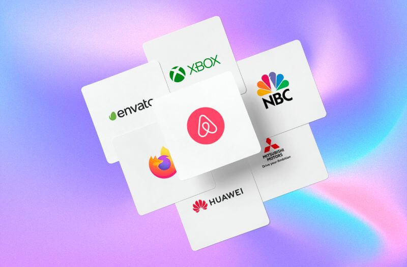
XBOX, NBC, Mitsubishi motors, Huawei, Firefox, Envato, and Airbnb.
5. Combination Mark
Ideal for
- Any type of business,
- New companies.
Highlights
This is one of the most common types of logos since, as its name suggests, they’re made up of both text and images. This means they’re easier to build according to your brand identity and values.
Recommendations
- These logos are easy to design because developing them allows so much freedom. For example, graphics can be an emblem, a mascot, a real or imaginary object, or a symbol. Additionally, texts can be long, small, have initials, or even carry a slogan.
- The name can be below or above the main image, in the middle, or on the right.
- When looking at the future, these logos make rebranding easier because their elements can be adapted or removed.
- Also, the fact that they contain both elements helps them easily be remembered by their image or name. Still, both aspects complement each other and can lead to a more lasting mental fixation.
- Finally, using only 1 to 2 words is advisable to avoid oversaturation. And for the color scheme, one can choose to use complementary or contrasting color ranges to give it more visual strength.
Examples
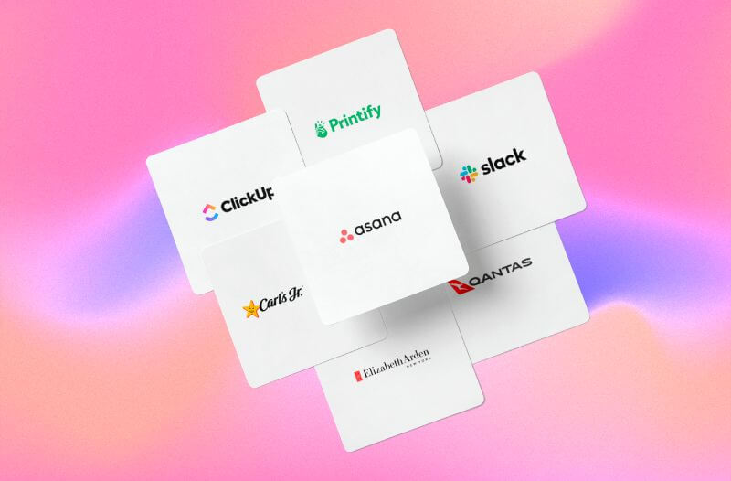
Printify, Slack, Qantas, Elizabeth Arden, Carls Jr., Click Up and Asana.
6. Dynamic
Ideal for
Businesses that are in rapidly changing industries, such as entertainment and creative industries.
Highlights
- These types of logos are easily recognizable because they can be adapted to any context or circumstance. Like at the height of the COVID pandemic, some famous logos adjusted their style to send a message that it was better to keep a safe distance, but in a fun and creative way.
For instance, Audi and Volkswagen were some of the famous logos that showed their dynamism during the pandemic:

- On the other hand, while dynamic logos are highly adaptable and versatile, this doesn’t mean they are a complete rebrand. Only certain elements in the design change, but at the end of the day, it still maintains the same essence that, no matter its form, must remain recognizable.
Recommendations
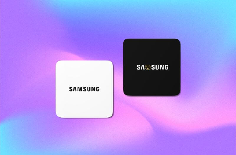
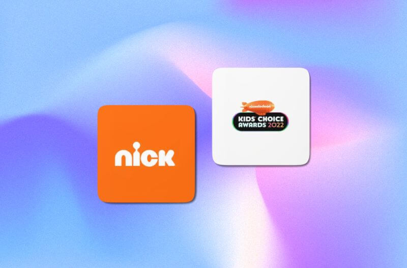
- For these types of logos, variations are usually simple or small. Generally, what changes are the shapes, the orientation of certain elements, and the colors, although the typography is almost always respected. For example, Nickelodeon used to keep its typography and color palette but only changed the shape. Therefore, we suggest maintaining a balance; try to keep 1 or 2 parts (from the original logo) to feature in this new version.
- Additionally, and speaking of dynamism, you can choose to add movement to your logo. Doing this will undoubtedly make your logo stand out from the crowd and give it an innovative touch.
- On the other hand, it’s worth mentioning that these logos are usually temporary, as they transform according to the context, seasons, events, or temporalities. And clearly, the original logo is still kept. It isn’t discarded, and instead, different options are created.
- Finally, dynamic logos are a great success because they show that they are constantly updated and attentive to environmental changes.
![]()
Examples
Nickelodeon, Samsung, Volkswagen, Audi, MTV, AOL, FedEx and Mercado Libre.
7. Emblem
Ideal for
Schools, government offices, sports clubs, non-profit organizations, automobile businesses, family businesses, and businesses with years of experience.
Highlights
- Also known as “badge logos,” they’re easily identifiable because they have shields, symbols, and insignias, which are usually accompanied by bold or elongated/large typefaces. Additionally, these types of logos stand out for having many details -which always symbolize something important- inside of them. Although it isn’t a rule, it’s a common feature of many emblem logos.
- Likewise, it’s worth mentioning that having an emblem makes the logo become more traditionalist and familiar, with history and values, and is well established while also reflecting certain power, prestige, and respect for its years of experience behind it.
Recommendations
- As we mentioned, these types of logos have tiny details or elements within themselves, so it can be difficult to scale them to smaller sizes because they lose quality. Because of this, we recommend including high-quality graphic elements, not oversaturating the design, and even having an alternative version of the logo for printing the logo on smaller surfaces such as on a pen or stickers.
- On the other hand, something we can rescue is that, as they are characterized by being broad, you can add a slogan or phrase underneath that represents your organization’s values.
- Also, try adding some of the most distinctive elements these types of logos contain, such as frames, traditional geometric shapes, 2 to 3 colors that are complementary or contrasting, and features found in nature or even animals (that go inside the main structure).
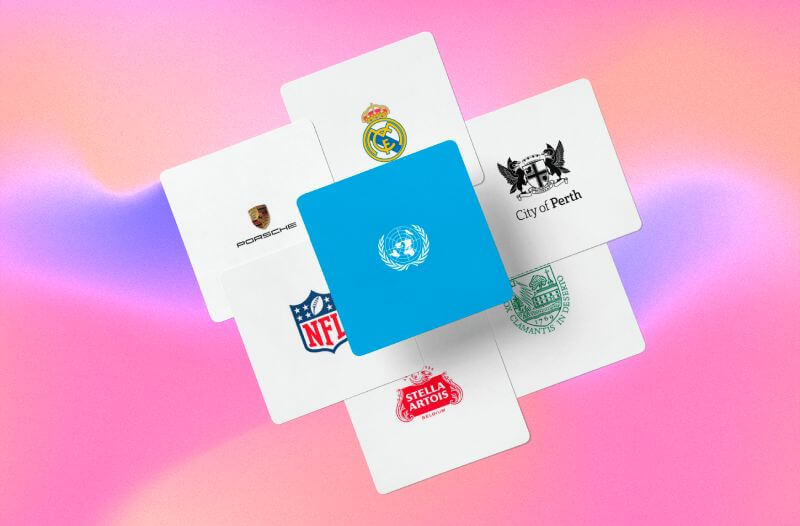
Examples
Real Madrid, City of Perth, Dartmouth University, Stella Artois, NFL, Porsche, and United Nations.
8. Mascot
Ideal for
- Brands that target families or children’s audiences.
- Companies that want to convey a fun, warm, friendly, and family-friendly message.
Highlights
- These logos can be easily recognized because they have a real, fictitious, or mythological character, object, or animal, but in an illustrated form to officially represent a business.
- Also, a mascot logo tends to be easily related to or recognizable.
- The most common business lines that use these types of logos are those related to food, clothing, technology, marketing, and manufacturing companies.
- Lastly, mascot logos are extremely helpful in humanizing brands, giving them a more friendly touch that undoubtedly helps to establish a deep emotional connection with their target.
Recommendations
- As we have mentioned, these types of logos are ideal to speak for a brand in a playful, creative, reliable, and cool way. Therefore, the illustrations should reflect a similar message. At the end of the day, these mascots will be the brand ambassadors.
- When designing, please consider that your illustrations can be flat, freehand, or even 3D.
- Typography and colors are essential to give it a look that syncs with the character’s design. Consequently, your choices should align with a friendly, caricatured version.
- Keeping with the best tips, try to add a smile or friendly gestures to your character for a trustworthy and warm look. You’ll find that many famous mascot logos have this quirk in them. Think, for example, of the Quaker and KFC characters. Or even the Kool-Aid man, the Duracell bunny, or the friendly Michelin man.
- Additionally, when designing this type of logo, try to keep a balanced proportion between the brand name and the image. They can be the same size, or you can emphasize the title or picture a little more.
- Finally, it’s advisable to have a logo variant since it may be challenging to capture on very small surfaces due to its graphic elements.
![]()
Examples
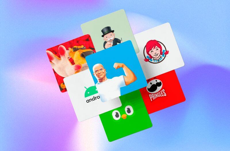
Mr. Monopoly, Wendy’s, Pringles, Duolingo, Android, Chester from Cheetos, and Mr. Clean.
9. Pictorial Mark (Brandmark)
Ideal for
Large companies or companies that are well positioned/established in the market.
Highlights
- These types of logos are 100% image-based, and unlike other visual emblems, the images must be from the real world. That is their primary differentiator.
- Pictorial logos are used mainly by large technology giants or market leaders in any industry.
Recommendations
- This type of logo is the opposite of wordmarks, so they have no text, only a graphic- usually an icon or a symbol.
- It isn’t advisable to use a brandmark for new businesses. Since it’s made up only of a visual component, it would be difficult for a single image to represent your business and what it does. In fact, this is more like an adaptation that many famous brands have made to simplify their logo.
- Finally, suppose you decide to create a pictorial logo or have it as an alternative. In that case, we suggest you think and analyze the graphic object carefully, think long term, and ask yourself if its meaning will prevail, if it represents a similar meaning in different languages or cultures and if the characteristics of the chosen object really represent what your brand wants to communicate through a single image.
Examples
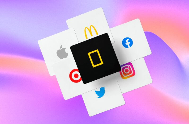
McDonald’s, Facebook, Instagram, Twitter, Target, Apple, and Nat Geo Travel.
How to Make a Logo With Placeit?
Now that you know the existing types of logos, it’s your turn to create a great logo that suits your style and core values. What better way to do this than with the Logo Maker from Placeit by Envato? Here we explain through a quick step-by-step video how to design your logo from scratch.
![]()

Types of Logos: Last Words
Before ending this post, we want to share a few recommendations that apply to all nine types of logos. Let’s review them swiftly to make the most of this process!
![]()
Colors
First, before choosing the color schemes for your logo, you should dive into color psychology to check if each meaning aligns well with the message you want to convey. It’s key to ensure that the tones selected fit, mainly with the typeface, because they’re usually the components that stand out the most in a logo. For example, an elegant typeface wouldn’t look very good with a color like orange, which often denotes that something is cheap. Instead, it could be a color that makes more sense, such as gold, which is associated with luxury. Notice the difference?
Typefaces
When it comes to text-based logos, this element is key to differentiating yourself from your competitors. There are thousands of different fonts, so, as with the colors, you should narrow down your options to keep your focus on your essence and core values. Don’t forget to play with the sizes, shapes, and spaces to give your logo a distinct touch. So, don’t be shy, and encourage yourself to make something creative and outstanding!
Scalability
When it comes to details, please pay attention to them and think about how your logo would look on different materials, whether online or offline. Ask yourself, is it scalable? Does it look good printed on a business card and keep the same quality when it’s on a billboard? All those questions are essential to know what type of logo suits you best.
![]()
& How to Use Your Logo Like a Pro
Variations
You don’t necessarily have to keep only one version of your logo. Like many brands, it’s possible to have a different one that might be more valuable according to certain situations or materials. Therefore, it’s okay to have different interpretations of your logo! For example, Harvard has an emblem logo that might not be suited for printing on everything. Because of this, they use simple letters or letterforms like the Harvard H or just the university name when it comes to placing their logo on small merchandise items.
And that’s a wrap! Please let us know which of all these types of logos you would choose to represent your business. ![]()
FAQ Types of Logos


