So you want to create your own logo design, well you’ve definitely come to the right place! We will tell you absolutely everything you need to create a stunning logo design that is professional-looking, functional, and ready to be used!
In this guide, we will tell you everything you need to know to design your own brand’s logo! Define your brand’s style, create a logo with every essential aspect of a great design, and finally, how to make a logo with the best tools.
What You’ll Find
- First, a Bit of Logo Design 101
- What’s the Difference Between Brand & Logos?
- Types of Logos You Can Try
- Logo Color Palette
- What’s the Best Logo Size?
- The Golden Ratio in Design
- Get Inspired
- Learn from the Most Famous Logos in the World
- So, What Makes a Great Logo Design?
- Characteristics of a Bad Logo Design
- How to Make a Logo Design
- How to Make a Logo with Placeit
- Logo Redesign
- Free Logo Design
- What’s Your Business?
- Animated Logos
- About Placeit’s Logo Maker
- What’s Next? Get Your Logo on the Next Level: Branding
- FAQ
Whether you’re a business owner with a brand that has been around for some time or you are building a business from the ground up, designing your logo is simply an essential step. It is the most valuable asset of your brand!
Your logo represents everything your business is, so it’s worth taking the time to get it right! Let’s avoid bad first impressions with poorly made logos.
First, a Bit of Logo Design 101

Have you stopped to think why some brands’ values are over the top? When someone asks you to think of a brand, any kind of brand, which ones do you think of?
Crazy right? How some brands stick to their audience’s mind while others just fade in a few seconds. We figured out what a good logo needs and we made an incredibly simple tool for you to use.
Why Do I Need a Logo?
Your logo will represent your business; it will be the first impression your customers get from your brand. It’s super important that you don’t mix a logo with a brand. These are very different elements of a business:
What’s the Difference Between Brand & Logos?
It’s important that you understand the difference between your logo and your brand. Brands are continuously evolving; however, you should always have a great starting point, and that is your logo! Having a solid logo will always make rebranding your business easier in the future.
What is Logo?
A logo is a graphic image that represents your service or product. It can have text, symbols, or both. A logo is an essential part of a well-constructed brand.
What is a Brand?
A brand is an idea your customer has about your service/product and this idea is built from the concept you’ve created and promoted, the graphics you use, the people related to your brand (think employees/brand ambassadors). Basically, the experience your market, users, or clients have when interacting with your brand.
It’s important that you define your brand’s identity before creating a logo design. What’s your brand’s personality? What makes it special compared to other brands? Which are the words you wish your brand is described with?
How to Create Your Brand’s Name
When thinking about your brand’s title, you should always consider these:
- The meaning of words in different countries
- Communication tone, consider your word choice may set a personality for your logo.
- Research registered names and trademarks, you can’t use a registered name!
On top of trademarking your brand’s name, it’s important that you trademark your logo. It goes without saying that creating a logo that is memorable and representative of your brand can take some time to get perfect. Because of this, it’s important to protect your logo so that no one else can use it.
As mentioned above, before you even start using a logo, run a trademark search. Doing so will confirm that your logo is original and isn’t infringing on anyone’s trademark. You don’t want to be told after printing all your packaging or branding materials that you have to change your logo because it’s already trademarked, or, even worse, get sued by the owner of the trademark.
This will also be super important when you start the process to trademark your logo. If your design or one similar to it is already in use, your application will be rejected and you’ll be sent back to square one.
To learn more specifics about what a trademark is, what types of trademarks exist, and how to trademark your logo, check out our guide on trademarking a logo.
Types of Logos You Can Try
Logotype
![]()

This is made only by text or fonts like monogram logos which are great if your name is too long. On the contrary, wordtypes logos display your whole brand’s name.
Pro Tip: If you want to dive deep into fonts logos you should definitely follow this link to our How to Choose the Best Font for Your Logo.
Imagotype
![]()
We usually see font and a graphic element. These are also known as pictorial marks, iconographic images that represent your brand. You can use abstract icons, minimalist, or a more complex graphic design.
Remember that a logo is not the same as an icon. You can find their main differences here Logo vs. Icon.
Isologo
![]()
This is a symbol & text together, a combination mark. Emblem Isologos have both their graphic elements and font integrated together in a way that you can’t separate them from each other.
Isotype
Just an image, no need for text. This has been accomplished within time by Apple and Nike. It takes a whole team to achieve it since it’s a lot of work.
![]()
🔥 Find out what types of logos work best for your business through this quick quiz!
Logo Color Palette
Paying attention to your color palette can help you build a design that truly reflects your brand’s style. The psychology behind each color will help you evoke emotions in your design.
Red
This must be the most emotional color expressing contrary emotions. It can represent love or anger, it’s passion, it can also represent dynamism, and since it’s very high visibility color, it’s universally used to prevent dangerous situations. It is also courage, strength, and power. This is a very popular color used in Fast Food brands.
Orange
This color, like red, is also encouraging and has that happy touch yellow gives. This makes it exciting, warm, fun, and creative. This color stimulates and communicates fun. It also expresses freedom. It’s normally used in food and creative environments, like entertainment or sports.
Yellow
If you wanna talk about freshness and youth, this is definitely your color. Most people perceive confidence and success from it. Positivity and happiness are part of it as well. If you want to energize or affect moods, this color is perfect.
Pink
The passion from red and purity from white brings you pink, meaning love and femininity. Tenderness and nurturing are also associated with this color. It’s normally used in fashion, beauty, or services and products for women.
Blue
This color reminds us of serenity and peace. If you want to build loyalty and trust, you may consider using this color. Lighter shades of blue also help you make your brand seem more relaxed. Technology, health, finances, accounting brands normally use this color.
Green
This color is about growth and health. Brands that use this color usually are health-oriented or want to connect with people that have eco-friendly and health-conscious lifestyles. Nonprofits, real-estate, environmental, and banking businesses will turn to this color.
Violet
A spiritual color that brings red’s power and blue’s calmness. It inspires reflection and self-awareness. Royalty, quality & luxury are associated with this color, and it’s normally used to inspire wisdom. Religious or humanitarian brands often use this color.
Brown
Stability, a solid foundation, and reliability that makes you think of safety and confidence. This color creates warmth, and it’s often used in the agriculture, construction, or transportation industries.
Black
The absence of color. It represents power, elegance, control, and sometimes intimidation. It can be perceived as sophisticated, sexy, and secretive. This color is must combined with others in all industries.
Read more on color psychology for logo design and brands on our Color Psychology Marketing post.
And finally, if you aren’t sure about what are the best colors for your logo, you definitely need to read our post to find some inspiration. Take a look at the Logo Color Schemes: A Complete Guide on All You Need to Know
Choose the Right Fonts for Your Logo
The font you use also has a lot of meaning to your logo design. If you want to get deeper into the right elements for logo design, please go ahead and visit our Guide on Creating Custom Logos with the Right Elements.
What’s the Best Logo Size?
The best size for your logo will depend on what you’re planning to use it for. Ideally, you will be able to use your logo for something as small as a favicon and as large as a billboard, so you can see how the ideal logo size can change depending on its use. With that said, here are the recommended logo sizes for some common use cases.
Ideal Logo Size for Web
Using your logo for the web can mean different things since the term web is so broad. The most common things you will need to adapt your logo for include:
- Company Website: When you look at a company’s website you’ll notice that their logo is present on every page. Usually, the logo will appear on the top left-hand side of a website and will be incorporated into the menu or navigation. If you’re using a website template, this will usually have logo size guidelines for you to follow. If not, then 250 x 150px will be a safe size to start with.
![]()

- Favicon: A favicon is a tiny icon that you see on all the tabs you have open in your browser. This is usually a variation of a logo that is reduced to just the icon. Because of this, it’s best to avoid using text in your favicon because it will be unreadable. The ideal size for this is 16 x 16px.

- Email Signature: Using an email signature that includes your brand’s logo is a great idea, especially if you’re communicating with people outside of your organization. It gives your emails authority and legitimacy, so definitely have one set up. It’s best to stick with a logo that is 320px in width and max 100px in height so that you’re sure it’ll display properly on desktop and mobile devices.
![]()

The Best Logo Size for Social Media
If you’re planning to set up social media accounts for your brand, it’s great practice to use your logo for your profile picture. Stick to a PNG file and these size recommendations:
Profile Picture
Display Shape: Circular
Size: 320 x 320px
Profile Picture
Display Shape: Circular
Size: 170 х 170px
Cover Photo
Size: 851 x 315px, max 100KB
Profile Picture
Display Shape: Circular
Size: 400 x 400px, max 2MB
Cover/Header Photo
Size: 1500 х 500px
- YouTube
Profile Picture
Display Shape: Circular
Size: 800 x 800px, max 4MB
Banner
Size: 2048 x 1152px (16:9 aspect ratio), max 6MB
👉 You can find the logo size recommendations for even more social media platforms in our logo size guide.
Logo Sizes for Print Items
Finally, if you plan to use your logo for print items, the recommended size can vary quite a bit. There isn’t one size that will work across the board, so work with your designer and print shop to get it just right. To help you get it right, here are some recommendations:
- T-Shirts
Maximum print area: 14 x 15 inches
Center chest: 6 x 5 inches – 10 x 8 inches
Chest pocket (doesn’t have to be on an actual pocket): 2.5 x 2.5 inches – 5 x 5 inches
Sleeve: 1 x 1 inch – 4 x 4 inches
- Mugs
For 11 oz. mugs, the print area is 8.5 x 3 inches. The final size will depend on the look you want, so you can always size up or down.
- Round Buttons/Pins
Band and art buttons: These can be anywhere from 1.25 inches to 1.5 inches.
Campaign buttons: These are usually on the bigger side and measure 2.25 inches.
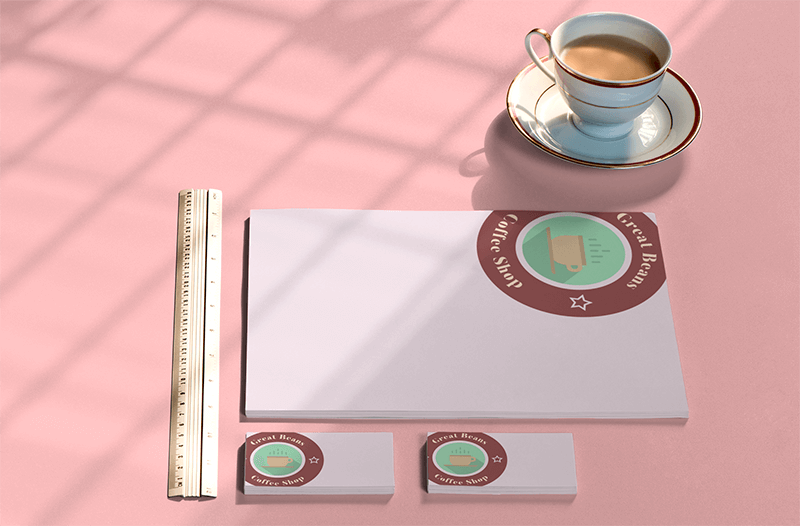
- Business Cards
Standard business cards in the United States measure 3.5 x 2 inches, and in the UK and most of Europe, they measure 3.3 x 2.1 inches. Your logo size will depend on the design you use, but should be smaller than the whole business card area.
The Importance of Logo Variations
![]()

When you create your logo design, it’s important that you don’t only have a single design. Since your logo will be used in a variety of spaces, it’s common practice to have a number of logo variations. Some of the most common variations include:
- Combination mark: This is usually what your original logo design will be. It’s a combination of words and symbols.
- Wordmark: This will be your logo design stripped down to just the text.
- Letterform: A letterform is just a single letter that comes from your logo that is still identifiable with your brand. An example is how Netflix can use a single N in their brand’s typography and you still know what brand it is.
- Symbol/brandmark: As its name states, this is simply a symbol or icon that is identifiable with your brand. The Nike swoosh is an example of this.
- Black and White: You will need a black and white version of your logo in some cases, so keep this in mind when designing it. You want to be sure all the elements translate well even without color.
- Horizontal, vertical, and square: These last three are combined into one because they simply take your logo design and change the orientation. A horizontal logo may look best on one product but a small product may not have the space for it, so a square version will be needed.
The Golden Ratio in Design
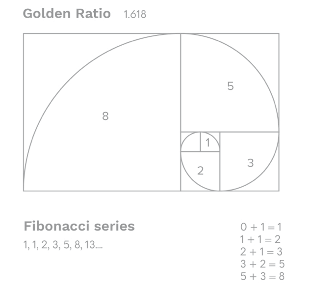

If you don’t know yet what is the Golden Ratio, please take a quick minute to check it out. If you do, then these are the tips we suggest you keep in mind when creating your logo design.
1. Golden Ratio in Typography & Hierarchy
After you choose your texts A, B, and C according to hierarchy, you then multiply whatever the size of your font is by, yes you guessed it, 1.618. Keeping this proportion on your fonts will help you get a balanced logo. You should do exactly the same with your inline font spaces.
2. Consider Golden Ratio Spiral & Focal Point
Setting your logo design over a Golden Ratio sketch will help you place your elements on the right focal points.
3. Set Your Dimensions to 1:1.618
Whichever your elements’ sizes are in px, you should simply multiply by the ratio to get the best proportion.
4. Height & Width of Your Logo Proportion
The golden rectangle will help you position your elements. Keep this in mind whenever you need to resize your logo design, the same rule applies.
By trusting the Golden Ratio on the previous designing practices, you will ensure the results will be simple, clean, and beautiful.
Get Inspired
Now that you have a better insight on the best practices for logo creations, is important that you take your time to get inspired! Brainstorm ideas on the logo design you are looking for.
You can create a mood board to collect ideas, style, tone, and more elements of your logo design.
Checking out the competition is also a great practice when getting inspired. What is your competitor’s style? And at last, choose your design style. These are only a few of the logo styles you can turn your design to:
💡 You can also create a seasonal logo variation for your design to set the tone for your brand every time there is an important retail season coming up! Easter, Christmas, Halloween, and so on!
Learn from the Most Famous Logos in the World
As you look for inspiration, don’t forget to stop and look at the logos you interact with daily. You may not even notice how many logos you come into contact with on a daily basis, but some of the logos you see multiple times a day may be some of the most famous logos ever, and with good reason. It makes sense to take note of what makes them so successful so that you can try and apply some of these principles to your own logo design.
World’s Most Famous Logos By Type
Wordmark or Logotype
A wordmark is a logo that consists of just the company’s name. Famous wordmarks often use a custom typeface created specifically for the brand.
![]()
![]()

Lettermark or Monogram Logo
A lettermark or monogram is a typography-based logo made up of the brand’s abbreviated name or its initials.
![]()
![]()
Letterform Logo
Letterform logos are even shorter than a monogram and only feature a single letter. Brands will often have an established wordmark and then adapt that into a letterform.
![]()
![]()
Emblem Logo
An emblem uses a combination of text and images and has a more traditional feel since they are similar to crests.
Emblems are popular options for sports teams, schools, and more traditional brands.
![]()
![]()
Pictorial Mark Logo or Brandmark Logo
A pictorial mark is just a symbol or graphic without any text. The graphic used in the logo has to be a real item.
![]()
Abstract Logo Design
Like a pictorial mark, an abstract logo is made up of a graphic or icon. The difference is that an abstract logo’s graphic is a custom graphic made for the brand. It won’t feature a real-world item but rather a graphic unique to the brand.
![]()
![]()
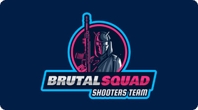
Mascot Logo
A mascot logo features an illustrated character that can be based on a real or made-up person, animal, or any other type of character.
![]()
![]()
Combination Mark Logo
A combination mark is made up of a combination of a graphic and text. The text can be a whole word, a monogram, or even a single letter, but it has to be combined with a graphic to create this type of logo.
What Do The Most Famous Logos Have in Common?
- Simplicity: Simplicity is key when designing a logo. Keep your design to the point to ensure it is impactful and memorable. A simple logo will also be easier to reproduce in small and large sizes, as well as in color and black and white, which is important for branding.
- Memorable: An effective logo is one that is memorable and easily recognizable. Simple design, unique typography, or a bold color palette can be enough to ensure your logo stands out. Keep in mind that most brands use logo variations, and all of these should be able to stand on their own while still being memorable and recognizable.
- Smart: Tiny details will get lost in a logo and can even make it look cluttered. Think smart when designing your logo and look for opportunities to use things like simple shapes, bold color combos, and use negative space to get creative. If your logo is clever, it’ll impress your audience and stick with them. Just look at the FedEx logo and look for the arrow in the negative space. This sort of detail sticks with people.
So, What Makes a Great Logo Design?
A great logo is a logo that accomplishes its main functions and is professional:
- It represents well your brand and makes you stand out from the crowd. This means you’ve chosen a unique and distinctive design.
- It is also memorable and recognizable by your target audience!
- It works in any size, whether it’s a tiny profile image on social media or a big print logo on a street banner. Simply ask yourself how easy it is to read what your logo is at first sight.
- And at last, it is a timeless logo. Remembered along the way you will be able to make minor redesigns to your logo but overall its essence should be relevant. This is why we don’t recommend you make a logo basing your creative decision too much on current trends.
Characteristics of a Bad Logo Design
Ok, so we have discussed what to do when designing a logo, let’s talk about what not to do.
Avoid Outdated Visuals
An outdated logo can disappoint your target before they give your brand a chance. You can fix an outdated logo by performing a logo revamp.
Mismatched Colors
Your colors should represent your brand’s image, you don’t want to send the wrong message. Also, badly matched colors can result in an unpleasant experience on your design. Pay attention to color saturation and irrelevant colors.
Over-Complicated Design
Usually, when discussing logos, less is more, too much detail may end up being self-defeating. Also remember a logo should look amazing on any size, if you add too much detail it might look wrong on a small size, or lack of responsiveness.
Too Simple or Generic
A simple logo might be too easy to forget. Try to inject some uniqueness into your design.
Poor Typography Choices
Your font style and text placement are focal points to your logo. Avoid using inappropriate fonts, too many fonts, and pay attention to kerning which refers to the spacing between letters.
Relies Too Heavily on Trends
We mentioned this one before, but again, it is very important.
Doesn’t Appeal to Target Audience
Always consider who your target audience is and appeal to their own styles and interests with your design.
Lacks Visual Unity
Finally, every element you’ve chosen for your logo design should come together in harmony. All elements are properly weighted, and in symmetry or asymmetry if that is what you are going for!
Learn more on this subject in our 10 Distinctive Characteristics of a Bad Logo Design post.
How to Make a Logo Design
There are two main roads to creating your own logo design:
1. Hire A Designer

When choosing to hire a designer you should expect lots of questions about your project or business in order to understand what you are looking for. They must apply a brief, these are questions about what you want to communicate and what your business is about.
The designer will present you with at least 2 proposals to choose from. Sometimes asking for further proposals may cost you extra. In the end, you will receive a Vector File with your original design and with which you can make further edits if needed.
2. Do It Yourself

If you want to create your own logo, you can either try a design software or a logo maker. If you don’t have design skills an online tool will be your best friend. You can make as many customizations as you need price-free. You will get a PNG high-resolution logo as well ad an editable PFD file which you can easily vectorize in case of future edits.
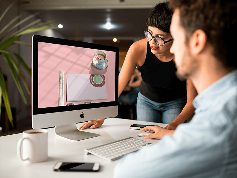
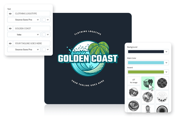
How to Make a Logo with Placeit
- Select “Logos” from the main menu. You can filter your logo options by choosing an industry or style right away or make this filtering further ahead.
- Type in the text box your business name
- Our logo experience will show you right away hundreds of templates with your business name!
- Choose a template that bests go with your style.
- Once on the editing screen, you can fully customize this template. Select fonts, colors, choose the main graphic, and background.
- Once you are completely satisfied with your logo design, click on the “download” button. You will shortly receive a PNG and an editable PDF file. Now share it right away!

Logo Redesign
Deciding to rebrand your business or updating your logo should have some purpose behind it. Below are some examples of why businesses decide to update their brand or spruce up their visual identity.
Your Logo No Longer Reflects Your Brand
As a small business grows, this can cause its target audience to change or expand. The logo they started off with may no longer reflect their brand and will need an upgrade.
Your Products or Services Have Changed
If you’re changing the products and services your business offers or if you’re adjusting your pricing, now is a good time to rebrand.
You Don’t Stand Out Among the Competition
If you were the first in your market but now the market is saturated with similar businesses, your logo may no longer stand out. A new logo can help you refresh your brand and stand out again.
Your Brand Needs an Update
Maybe your logo looked great when you first started your business 20 years ago but now it looks a bit dated. Updating your visual identity is part of growing, so a new logo isn’t a bad idea.
You Need a More Cohesive Brand
Establishing a cohesive brand will be easier if you have a brand style guide. If your business lacks one, take the opportunity to design a new and more solid visual identity for your business.
You can implement two different re-branding strategies:
Partial Rebranding
Partial rebranding is a great strategy for brands that have been in the business for years and are recognized for their positive qualities. Since you don’t want to lose these positive associations, minor changes to your business logo may be all that’s needed to update your image.
Complete Rebranding
Changing your company’s image completely is a large step that requires some serious planning. This goes beyond just updating your brand’s color palette or logo design and can include things like changing the company’s name and a complete overhaul of your social media pages and website.
Interested in re-branding? Read more on our Rebrand Your Business with this Logo Maker post.
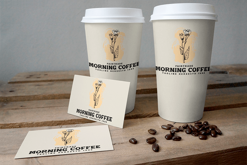
Free Logo Design
![]()

Loving this? Great news! You can use Placeit’s logo maker to design your logo completely free! That’s right, Placeit intuitive and smart logo-making experience brings you endless customizations to design your logo and download without spending a cent! Try out thousands of high-quality logo templates to design your own today!
Disclaimer: our free logo selection changes throughout time so we would advise if you see anything you like that you use it and download it right away!
What’s Your Business?
Architecture & Design, Gaming, Food & Events, Clothing & Beauty, Healthcare, Shops, Lifestyle & Fitness, Services, Finance & Legal, Music & Podcasts, Education & Arts, Sports Logos
Animated Logos

You can go further and beyond with your logo by creating an animated logo! You will get an MP4 file to share and ready to use in your video intros, social media clips, gaming channels, and more!
About Placeit’s Logo Maker
You can go further and beyond with your logo by creating an animated logo! You will get an MP4 file to share and ready to use in your video intros, social media clips, gaming channels, and more!
Placeit’s Logo Maker
- Super easy to make and edit. You preview as you design
- The results are professional and look great
- Designing a logo only takes a couple of minutes
- You don’t need to hire a designer, Placeit’s designers have done all the hard work for you
- You don’t have to learn how to use complicated software like Illustrator or Photoshop
- You don’t have to spend a fortune!
Alternatives
- Other logo makers are as complicated to use as Photoshop
- Too easy to make something ugly
- Hiring a personal designer can be very expensive and time-consuming
- Making a simple change can take days with a designer
Design a logo you are proud of! Placeit has thousands of templates fit for all business industries and our library grows every day! You will never get tired of our templates!
Learn more on how to start a brand logo with Placeit. Even if it’s a moving company logo or an industrial one! We’ve got you covered.
What’s Next? Get Your Logo on the Next Level: Branding

You can create all kinds of branding assets with your new logo as well as use it to brand your online presence all over the internet! You can add your logo on new mixtape covers, business card designs, flyers, social media posts, brand merch, brochures, and all kinds of branded materials!
FAQ
I love Placeit.net every time there is something I want to make I know where to go for logos and animated texts and lots more they have been a useful tool for me for 2 years now @ AnimeBoy