Web Design Trends 2025
Redefine Your Digital Presence
22 Web Design Trends to Watch This Year:
With 2024 just about to leave the stage, we are getting ready to update our pages with the hottest web design trends coming next year and you should too!
Every year, we see new design trends come up in the design industry. Some of these trends help to inform and inspire designers to build more engaging websites for customers and businesses, others – for personal projects.
Certain aspects of web design trends will always remain crucial, such as user-friendly navigation, data security, and swift loading times. But let’s dive right into it:
Table of Contents
Introduction to Web Design Trends
Trends typically help designers innovate new ways to design websites to be more usable and to have better chances of converting modern and fresh customers while finding new ways to bring them into the future goals of the business.
The web design field has a mutual relationship with technology, and for business to grow and stand out, designers must research and incorporate the latest web design trends to make their products fresh and modern.
One thing’s sure though, UX and usability always remain the primary consideration for any business that wants to remain user centered and customer focused.
⚠️ New Placeit product alert: Hero Banners!
Why Is Web Design Important?
 It helps your business to stand out
Good website design gives you an excellent opportunity to get ahead of the competitors by providing exceptional user experience. Many modern brands still underestimate the value of design so it’s your chance to stand out by not only providing great service but also high-quality web design.
😉 It gives users a sense of trust
Your website should be designed in such a way that shows potential customers that you are an expert in your field. Produce quality content to show expertise, add testimonials on your homepage and use trust badges to demonstrate users they are in the right hands. Good design should not only be pretty but also user-friendly enough for customers to trust you. It signifies that you’re a true professional that cares about delivering them exceptional experiences.
 It contributes to a better UX (user experience)
User experience involves every interaction a user has with your business and product. Great web design based on data gathered from user research can help you enhance these experiences, make them more smooth and customer-oriented.
User research helps you learn about user behaviors in order to make sure that you design your website for an actual customer, with their needs in mind. Thus, using a UX research tool during the web design process will help discover where customers struggle on your website and use the insights gotten from the test to improve its UX.
🤑 Web design also increases conversions
Investing in your digital presence as a business should be top priority in today’s world. This gives you a lead over other competitors and also establishes your brand as a go-to expert in your industry. Your website should be designed from top to bottom to give the impression that you can solve the problem that potential customers came to you with.
A strong digital presence also helps you to increase your business visibility, improve customer satisfaction and experience, gain more sales and increase conversions. Attractive UI design, smooth navigation and just overall good UX will keep customers coming at all times.
💡 It makes easier the navigation on your site
If your website is challenging to navigate, or has a poor structure and layout, it will be difficult for users to find information and will lead to drop offs. Make sure your website is optimized for actual users and is intuitive enough to keep them on your page. You can do so by designing the information architecture of your website to suit the mental model of your user.
It is not enough for users to just know where they are in your website, they should also know how to navigate to where they want to get to in order to perform any specific task. When your website navigation is intuitive enough, users tend to get less frustrated with finding their way around but are more inclined to visit your website because of the pleasant experience that they may now associate with it.
With new web design trends springing up every year, we decided to put together a list of 10 web design trends that will likely be popular in the design industry.
Feel free to make this list your own for inspiration: 👇🏼
1. Color Design Trends
Designers are moving toward soothing and nurturing color palettes, carefully selecting shades that minimize visual fatigue. Embracing multi-tonal color schemes are on the rise, combining sophistication with a sense of warmth. Consider this year’s color when thinking about your web design.
Gradients are gaining popularity among creatives as a go-to source of inspiration for modern website designs. As we look ahead to 2025, gradients are poised to feature even more prominently in web design.
From cluttercore vibes to experimental typography, it’s all about pushing the limits! Asymmetrical layouts, extreme imbalance, overlapping elements, clashing colors.
The anti-design trend for 2025 is all about flipping the script—ditching the rules in favor of bold, chaotic creativity. While it’s not for everyone, this rebellious style is making waves and dominating social media.
In a world flooded with AI’s polished perfection, designers are embracing raw, imperfect, and handmade aesthetics that feel authentic and personal.
Running the same lane, brutalism is back! Pushing against years of overly polished, cookie-cutter designs.
A clean, striking aesthetic where raw honesty meets design sophistication. With contrasting colors and bold elements stealing the spotlight, brutalism commands attention in a way that feels both deliberate and refreshing.
3. Typography Takes Center Stage in 2025
Bold, expressive typefaces are stealing the spotlight and defining brand voices like never before. Also, Serif fonts are making a major comeback, bringing warmth and character to headlines and CTAs.
Maximalist typography is another power move—think oversized, layered text that demands to be noticed. Designers are also having fun with high-contrast font pairings, mixing serif and sans-serif styles, and crafting playful, custom typefaces brimming with personality.
10. Experimental Navigation
Think of unique layouts, immersive scrolling, 3D transitions, and spatial interfaces that break free from traditional dropdowns. These bold designs turn navigation into an experience, perfect for creative portfolios and sites that aim to leave a lasting impression.
Also, Parallax scrolling is taking storytelling to the next level, revealing more of the site as you scroll, like flipping through a digital narrative. Pair this with background videos that play only when users scroll or animations that appear like magic, and you’ve got a site that surprises, captivates, and keeps visitors engaged longer.

5. Sustainable Web Design - Green is the New Gold
Sustainability is taking center stage in web development, blending eco-consciousness with performance. From streamlined code and optimized media to eco-friendly hosting, sustainable web design slashes the internet’s carbon footprint while delivering lightning-fast user experiences.
Think of reduced data transfer through optimized images and videos. One effective practice is to compress images, ensuring they maintain quality while reducing file size. Responsive designs that adapt seamlessly to any device, and energy-efficient coding practices that work smarter, not harder. Bonus? These green practices not only help the planet but also create sleek, efficient websites that users can’t get enough of. Sustainability isn’t just a trend—it’s the future of web design.
6. Big Blocks, Big Contrast
Block-based layouts infused with vibrant color contrasts with the ability to blend eye-catching visuals with seamless functionality.
Contrasting color blocks not only grab attention but also guide users effortlessly, creating natural navigation points. Smart use of color psychology and spatial design. Each block becomes a self-contained micro-environment, all working together to tell a cohesive brand story. It’s a winning formula for creative platforms, SaaS brands, and anyone appealing to design-savvy audiences.

7. Purposeful Movement
Craft purposeful animations and selective 3D elements that enhance rather than overwhelm. This thoughtful shift improves performance, minimizes cognitive load, and creates a user experience that feels polished and intentional. Motion isn’t just decoration—it’s a tool for meaningful interactions and storytelling.
Scrolling Animations
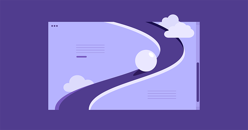
Turn every scroll into an engaging journey. From elements that fade in and out to text that moves, rotates, or changes color, these effects captivate users and encourage deeper exploration.
8. Micro-Interactions: Small Moves, Big Impact
On a website, micro-interactions are the subtle animations that provide instant feedback to users. You’ve probably seen the classic link color change when you hover over it, but in 2025, we’re taking it up a notch.
Micro-interactions aren’t just fun—they enhance the user experience, adding playfulness and flair to your site.
E-commerce sites, especially in fashion and retail, are using sophisticated micro animations to not only make browsing more engaging but also to dynamically showcase products.
Micro animations are a perfect way to guide users through your website, subtly highlighting important sections and directing attention where it’s needed most.
9. Interactive 3D Models & Content
3D models don’t just look cool—they offer an immersive, lifelike experience. Product animations let users inspect every angle as if they were holding the item in their hands, boosting confidence and enhancing the online shopping journey. This can even lead to higher conversion rates.
11. Emphasize Negative Space
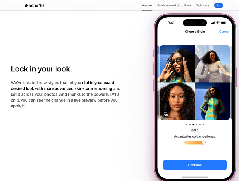
Designing with negative space is all about striking the perfect balance between content and empty areas, creating a sleek, uncluttered layout that lets your design breathe. By focusing on simplicity and minimalism, you give text, images, and buttons room to stand out without overwhelming the user.
Margins, padding, and line spacing create natural separation between sections, while thoughtful typography guides the eye, establishing a clear visual hierarchy. The result? A cleaner, more intuitive experience, Apple is a prime example of mastering this technique.
Negative space lets users’ eyes rest and take in the design without distraction. The modern design trend isn’t just about minimalism—it’s about using space thoughtfully to guide the user and create a calming, engaging experience.
13. Gamified Design
Add game-like elements such as points, rewards, and challenges, encouraging users to stick around longer and engage more. Think interactive sections that not only entertain but also provide value, while subtly gathering information about your visitors.
Interactive marketing elements include: Quizzes and assessments, Polls and surveys, Calculators, Contests.
14. Nostalgic Twist On Modern Design
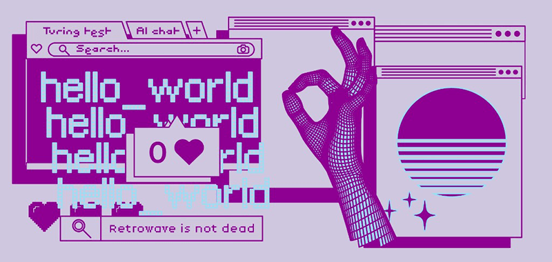
This web design trend brings back classic digital vibes, like pixelated text, simple color schemes, and basic geometric shapes. When mixed with contemporary layouts, it creates a cool fusion of old-school charm and modern flair, tapping into nostalgia while staying fresh.
It’s a great way to grab attention with a minimalist yet unforgettable design—perfect for brands looking to evoke a retro feel with a modern edge. Think bold, blocky fonts, vintage-inspired icons, and monochrome color schemes to nail this trend.
15. Smart Video
It’s all about using video thoughtfully, with clear purpose and meaning. Gone are the days of simply embedding random YouTube clips. One high-quality, well-crafted video is far more impactful than a bunch of scattered, low-effort ones.
Focus on creating videos that answer common questions from your prospects and clients. This not only makes your website a valuable resource but also positions your brand as an authority in your field.
16. Scrollytelling
When visitors power scroll through your site, they often zoom past key info and bounce. That’s where scrollytelling comes in—it’s the technique that stops them in their tracks and pulls them in. Instead of the usual intro paragraph, scrollytelling breaks up the narrative and spreads it across the page, creating a seamless story as users scroll down.
The magic lies in crafting an engaging journey—think less “product brochure,” more “product adventure.” Ensure smooth transitions and make it mobile-friendly. For an immersive experience, add cool effects like parallax scrolling or zoom-ins.”
Your story could be about: the inspiration behind your business, the process or ingredients, the impact your business makes, etc.
17. Text-Only Hero Images
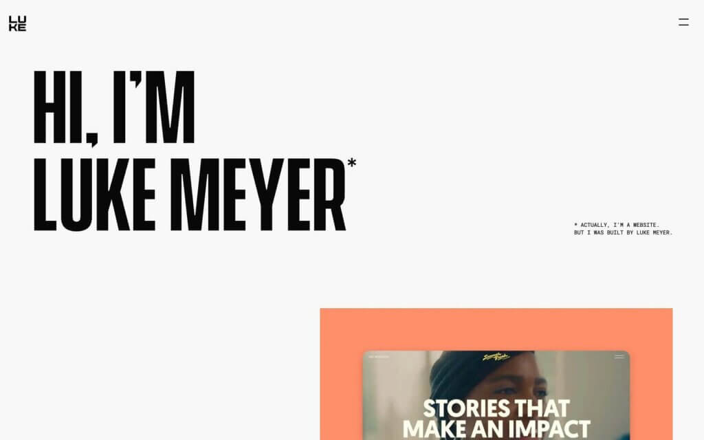
Just like newspapers place their most attention-grabbing headlines above the fold to drive sales, websites rely on their hero section—the top of the page—to make a lasting first impression.
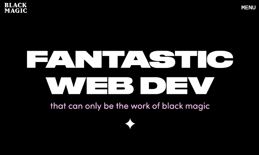
Replacing imagery with striking, unique fonts is a modern way to cut through the noise and grab users’ attention in seconds. With web users scrolling past countless pages daily, eye-catching typography in the hero section could be the game-changer that hooks your audience instantly.
18. Custom Illustrations Take the Spotlight
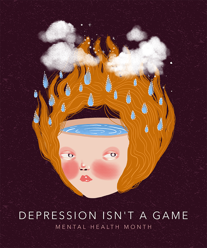
Stock graphics are stepping aside as custom illustrations steal the show in 2025. Swapping out photography for unique illustrations is becoming a go-to web design trend—and for good reason.
Illustrated visuals not only add a fresh, creative edge to your site but also come with a practical bonus: smaller file sizes and faster load times. With Google doubling down on page speed through its Core Web Vitals metrics, designers are turning to illustrations as a stylish and performance-friendly solution.
It’s a win-win: better user experiences and visuals that truly stand out!
19. Say Hi to Virtual Reality/ Immersive Reality In E-commerce
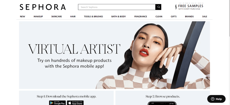
VR is becoming a cornerstone of online shopping experiences. From Nike’s virtual shoe try-ons to Sephora’s game-changing makeup testing tools, major brands are leading the charge in making shopping more interactive. Even home improvement giants like Home Depot and Lowe’s are empowering customers to design entire rooms with immersive VR tools.
These features aren’t just fun—they’re practical. Virtual try-ons, product demos, and room visualizers help shoppers make confident decisions from the comfort of their own homes. The big leap in 2025? VR/AR tools are now more accessible, seamless, and optimized, making them an essential part of modern web design.
20. Dark Mode

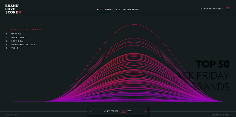
Dark mode isn’t just a trend—it’s a win-win for both practicality and aesthetics. On the functional side, it helps reduce eye strain, a big deal as screen time keeps climbing. On the style side, dark mode instantly gives your website a sleek, ultra-modern vibe, letting other design elements pop against its shadowy backdrop.
Ever since Apple popularized dark mode a few years ago, brands have followed suit, rolling out low-light versions of their websites and apps. Whether you call it dark mode, night shift, or low-light UI, this design choice offers a low-contrast option that’s easy on the eyes—especially in dim environments. Cool, modern, and user-friendly—it’s here to stay.
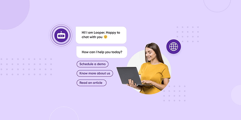
22. Chatbots Are Becoming Your Digital Besties
So, Which Web Design Trend Are You Most Excited About?
The design approach of delivering different web designs while keeping accessibility, seamless navigation and usability in mind that engages with users in a unique yet meaningful way will continue to be the most relevant design trend. This is already spread across as UI and UX design emphasizes and focuses on this. There’s still a huge potential in personalization of web design in such a way that connects to the user and enhances user engagement.
