


More people than ever are using the internet, and your website is often a customer’s first point of contact with you. To attract and keep customers, you must offer a top-quality user experience. That’s where the concept of inclusive web design comes in. This guide delves into the ideas behind inclusive web design and how you can build upon these ideas to improve overall usability.
All You Need to Know About This Topic
- What Is Inclusive Web Design?
- What Are the Principles of Inclusive Design?
- What Is an Example of Inclusive Design?
- To Conclude
What Is Inclusive Web Design?
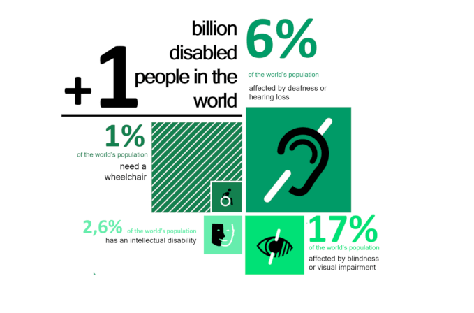
Inclusive web design is the practice of making a site that anyone can use. The range of people visiting your site may have disabilities or a broader unfamiliarity with the internet. These can prevent them from performing certain tasks on your website, which, if you work in e-commerce website development, has obvious drawbacks.
Practically speaking, visitors might have problems with a site’s visuals or audio content. They may be unable to interact appropriately with an interface that requires them to speak. They might struggle to interact with specific elements on a website, such as buttons or links. An issue that mobile usability testing can mitigate. They may also struggle to understand how to move around a site or feel uncomfortable with divulging personal details.

Inclusive web design recognizes and works to mitigate these issues on a website. By doing so, you’ll ensure a wider array of people can use your site properly without compromising the experience for non-disabled users along the way.
🔥 You might like: The Power of Web Design for Your Startup
What Are the Principles of Inclusive Design?
A great way to consider accessibility is to work directly with the people facing significant issues, such as disabilities. For example, think about conducting interviews with people you think are likely to use your website and factor their feedback into your broader design choices.
A disability charity may be a helpful point of contact at this early stage. Factoring the inclusion process into your QA test plan is also recommended.
In addition to this idea, you can consider a few broad, inclusive design principles. These move beyond specific user categories, although they remain helpful when designing or redesigning a website.
1. Flexibility
Since we now access the internet on various devices, designers and developers are accustomed to altering a website for different contexts. Consider expanding this concept to accommodate people with disabilities, and embrace the idea your website will do different things for different people.
You might want to approach this idea as a series of questions: asking who will use your site, where and when they will access it, and so on. Even if these answers aren’t always obvious, asking the questions is still worthwhile.
2. Accessibility
A good website isn’t a puzzle that needs to be solved. People visiting your site should understand how it works and where they are within it. If you’re thinking of adding a new feature to a website, consider whether it increases a site’s value or its complexity. You can also use split testing to try out a few different potential site changes.

It would help if you also remembered that people like to absorb information differently. For example, some people like to read it, while others prefer video. At least considering different information delivery methods is a solid strategy here.
Similarly, it should always be clear what’s happening on a site. Clear messages that say when things are going right (or wrong) help people stay on course during their time with your site and encourage repeat visits.
3. Accommodation
While you probably want to fill pages with content, having too much can be overwhelming and counterintuitive. Conversely, having too little can lead to your users feeling confused. Try to strike a balance with how much appears on each web page; this reduces friction when people come to use them.
Try to apply your design practices consistently across an entire site, too. This ensures that anyone who interacts with your site will be pleasantly surprised. Understanding user behavior via tools like heatmaps can help you decide what to prioritize during site overhauls.
What Is an Example of Inclusive Design?
With these ideas in mind, it’s time to look at some concrete ways you can make a site work more effectively. Keep in mind that everyone’s approach to inclusive design is different: we can’t ask ‘what is stack overflow‘ and get a definitive answer to every question. However, these measures are a good starting point.
1. Large buttons
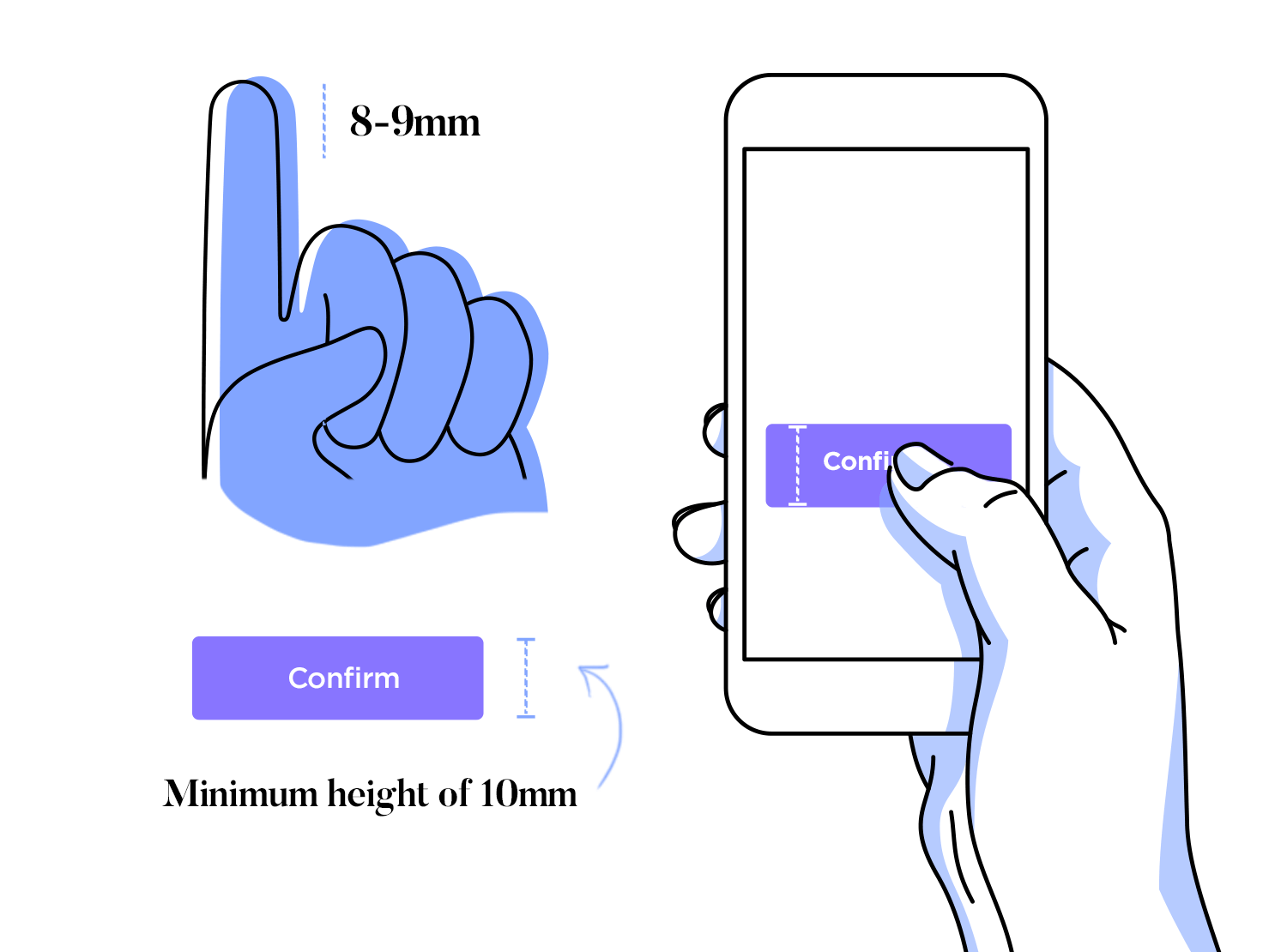

A great starting point for inclusive design is a clean, easy-to-understand layout. This idea manifests in a few different ways, but clickable elements are some of the most important.
Anything that a user needs to tap or click should be at least 48×48 pixels wide. This means that visitors can interact with your site more easily if they have impaired vision or impaired motor function.
If there are multiple clickable elements on a page, ensure they aren’t too close. Otherwise, this could cause someone to click on something they don’t want to, which is clearly undesirable.
You can also make buttons work better by limiting their numbers. Don’t have too many on any one web page; focus on what’s essential. Services like Global App Testing can help you spot these issues more efficiently.
2. Good Color Choices
Color is a crucial part of a brand, although it’s easy to make poor color choices. We also need to consider using color in our broader site design.
Good websites ensure a minimum level of contrast between color values (referring to their relative light and dark rather than their hue). A good rule for contrasting color values is 3:1. This should work effectively for clickable objects, visuals, and other website elements.
Even if you nail a site’s color contrast, you might have a color-blind visitor for whom contrast isn’t particularly helpful. As such, consider other ways of drawing attention to a particular page element, like bolding or underlining text.
3. Thoughtful Language

Through ideas like contextual communication, businesses are thinking carefully about how they talk to customers. It’s important to be similarly careful with the language you use on websites more generally, especially since written content remains very popular.
On a basic level, try to avoid complex industry jargon; consider if there’s a simpler word with similar meaning. Explain any abbreviations you use, and limit sentence length when you can. If you use headings, make sure they accurately reflect the content underneath them.
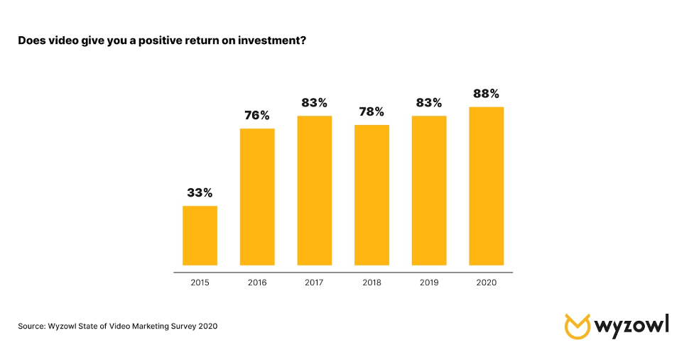
You also need to think about how text physically appears. Aim for a font size of at least 16px, use clear fonts, and strive for high contrast against the background. Make links easy to spot (by underlining them, for example) and ensure that spacing in and around content blocks is big enough. Don’t forget to add captions for video content as well.
4. Inclusive Elements
This idea applies to many parts of your website, although visuals are particularly vulnerable. If you need to represent a person, or group of people, on your website, are you making negative assumptions about them? CCaaS cloud services can help you get answers to these questions more quickly than ever.
It’s often a good idea to produce a more abstract figure or work representing several ethnicities, gender identities, and disabilities on a site. You may even want to avoid identifying specific groups altogether in your visuals, especially if things like gender and race are irrelevant to a subject.

BE more inclusive on your site by avoiding questions on ethnicity or gendered language; this action can lead to more engagement. The more steps in a form or a checkout process, the less likely your users will complete it. While you’re unlikely to ask about gender or ethnicity in, say, an e-commerce site, the principle of simple, minimalistic information gathering still applies more broadly.
To Conclude
Surely, before reading this guide, you were already familiar with – and may even have adopted – some of the concepts and principles of inclusive web design. However, it is helpful to think of the concept as an evolving process rather than a one-time task.
On the other hand, flexibility and accessibility require a focus on more specific elements such as buttons, text appearance, and even color choices. Also, consider how you represent people on your site and whether you need detailed information from your users or not. Making this a common practice ensures that both your site and your business have a stronger foundation.
Author’s Bio:


Emily Rollwitz – Content Marketing Executive, Global App Testing
Emily Rollwitz is a Content Marketing Executive at Global App Testing, a remote and on-demand app testing company helping top app teams deliver high-quality software anywhere in the world. She has five years of experience as a marketer, spearheading lead generation campaigns and events that propel top-notch brand performance. Handling marketing of various brands, Emily has also developed a great pulse in creating fresh and engaging content. She’s written for great websites like Airdroid and Shift4Shop. You can find her on LinkedIn.