


In this article, we are going to talk about how to track customer behavior on your website, innovations of UX website analysis, and all the reasons to use a heatmap for tracking user behavior to achieve the best website design.
What You’ll Find:
- What is User Behavior?
- How Does UX Design Impact the Promotion of an Online Store or Website?
- What is User Behavior Analytics with Heatmap Tools?
- Why Website Clicks Something You Need to Track
- User Behavior through the Website Clicks & Scroll Analysis
- Visual Presentation of User Behavior On a Live Website Example
All examples related to user behavior in the article are based on the unique statistics on more than 40 million clicks collected with Plerdy heatmap.
Thinking about the moment you’ve bought something, you are more likely to recall your feelings rather than the product. Any interaction with an online store or website is recorded in your emotional memory and is part of your behavior on the website.
What is User Behavior?
Today, the web provides tons of products and services we can order without leaving our homes. For example, if you google ‘order a pizza’, the search will show you over 1.1 billion offers. The same relates to many other categories of products.

This leads to a question: Have you ever realized that your website’s user experience may provoke negative emotions and behaviors that could make up to 99% of potential buyers leave? Here are some stats that should convince you to check your website for any UX issues and to do some tracking of your analytics:
-
- 79% of customers admit they will look for another website if the current one doesn’t meet their expectations.
- 96% of smartphone users have come across websites that don’t have mobile versions or aren’t adapted for mobile display.
- 52% of users state that a negative mobile experience makes them less likely to interact with your company.
- 63% of users browse products or services on several types of devices (smartphones, tablets, laptops, PC, etc).
There is a lot of similar data on user behavior that proves the importance of tracking user experience (UX) for digital marketing and online customers. So let’s discuss everything you need to know about UX analytics.
How Does UX Design Impact the Promotion of an Online Store or Website?
Peter Morville, the president of a consulting firm providing information architecture and findability services, identifies the following factors that affect website UX and behavior:

In other words, a website with a good UX must be:
- Useful
Website content should fully meet the needs of customers and evoke positive behavior.
- Usable
Ease-of-use remains an essential component of user experience and provides good user behavior.
- Desirable
All images, brand, and design elements should be eye-catching and provoke positive emotions and behavior.
- Accessible
All website elements and content must be accessible to people with disabilities.
- Credible
Everything you publish on the website should be reliable and accurate to make users trust you. This improves their behavior on the website.
- Findable
Content must be well-structured and have clear navigation.
If all these 6 factors that ensure a decent website UX and behavior are met, website visitors will enjoy using your resource and show good behavior. So it is worth tracking these factors.
Yet not only the mentioned statistics and analytics results prove that UX plays a major role. Recently, Google has published a 108-page online book – UX playbook. It’s full of tested tips on how to increase sales with UX. The review is based on A/B tests of a broad range of research, analytics, and articles. Having studied several thousands of retail websites, Google Analytics has found out that there are certain universal UX elements.


The book includes a checklist that helps to analyze and improve the UX of a mobile website in 6 key fields:
- Home/landing page.
- Menu and navigation.
- Search.
- Category/product.
- Conversion.
- Form optimization.
A quality website UX not only improves a customer’s behavior on your site, but it also improves your search ranking. Note that mobile website usability is one of the 200 most important ranking factors. The new Google Mobile-First Indexing approach also pays a lot of attention to website UX.
✨ Don’t miss out: The Ultimate Guide to Inclusive Web Design + Tips on How to Do It
What is User Behavior Analytics with Heatmap Tools?
The majority of online stores use similar analytics for tracking user behavior. They do this, because of a subjective belief that all existing web resources have already been tested and are quite convenient for potential customers. In reality, each site or online store has a unique target audience, which may behave differently than yours.
That’s why, to understand how your potential customers behave on your online store, you need to use a click heatmap.
The data collected with this analytics map will allow you to learn more about the preferences and behavior of users. You will also see any obstacles or flaws that prevent customers from completing the purchase.
Such research and tracking methods can help increase the conversion of an online store and a better user experience.
User Behavior Tracking with Heatmap Analytics Tools

These tracking tool collects data and segments it by the type of device used to view a website and the behavior of users on it.
An additional advantage of these, is the capability to track behavioral interactions with all dynamic website elements (pop-ups, menus, etc). Again, everything happens in real-time.

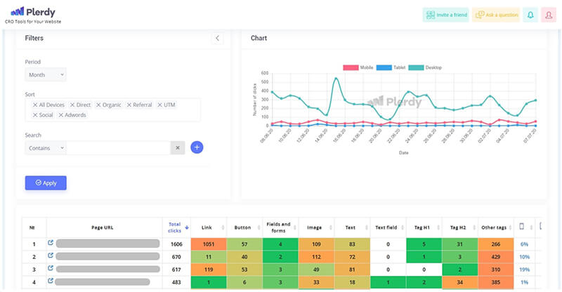
These heat maps processing website tracking data, not only detect the place where clicks happen but also record their sequence. The analytics tool divides a page into 5 parts on a percentage basis and tracks the number of clicks in each of them. It also tracks the scroll depth which is also a very important aspect of the behavior of users. You can use this data on user behavior to define the most suitable spots (the areas with maximum clicks) for placing important information.
Let’s talk more about the numbers and results we obtained by tracking and researching the user experience and behavior on the pages of various web resources.
User Behavior Analysis Based on Heatmap Data
User behavior differs and depends on the subject of a website, the traffic source, and the intentions of a website visitor. For a more precise user behavior analysis, we have collected around 100 million clicks from various sources. These interactions were made on websites with unlike subjects and functions.
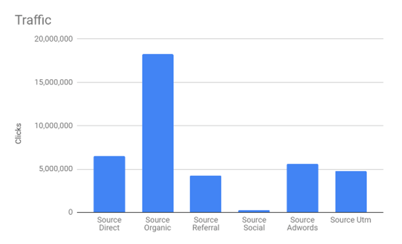

Here is a graph of total clicks grouped by traffic source. We relied on this analytics data in our following studies of the user behavior.
Segmentation of Total Clicks by Device Type
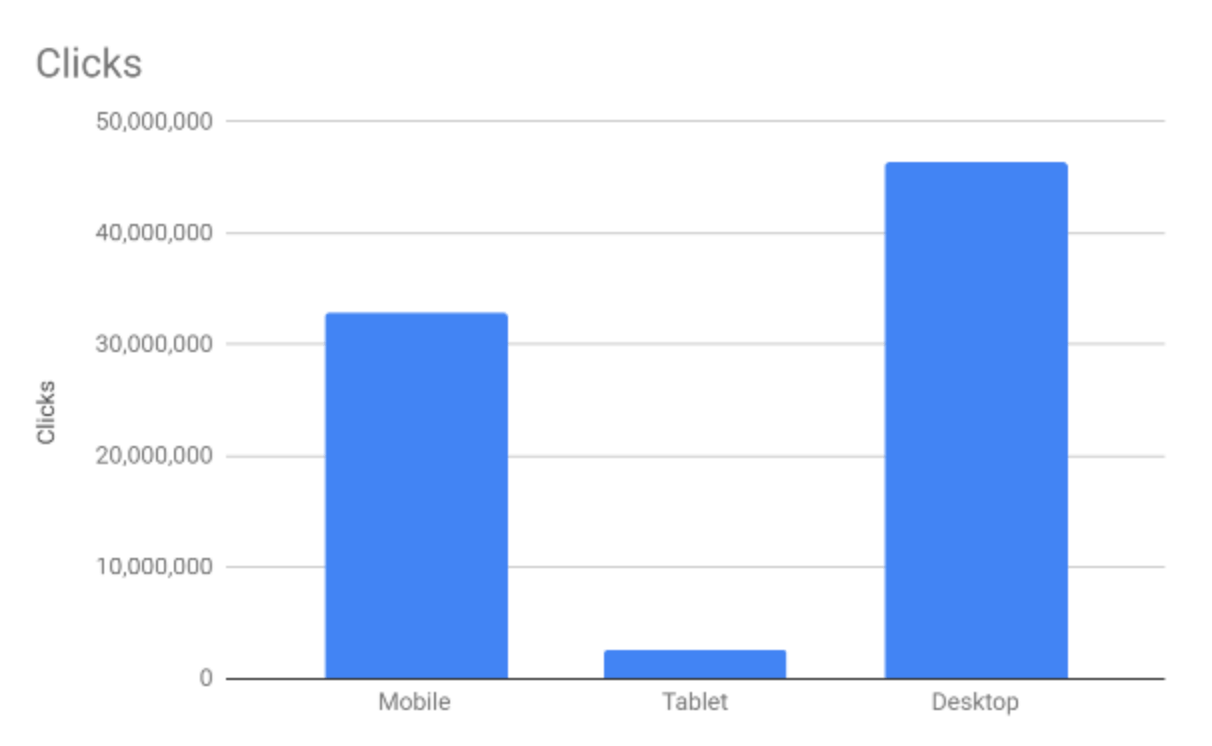

As you can see from the graph, the largest number of clicks was made on PCs. The number of mobile clicks is significantly lower, and the least clicks are attributed to tablet users.
Everyone knows that mobile traffic is steadily growing year by year and this also influences user behavior. This raises a logical question: Why are most clicks still made on desktops?
The answer is simple. When users visit a website from a mobile device, they click only for a specific purpose (to go to another page, select a button, or an active link). The rest of the time they scroll. When users browse from a PC, they often hover over the text with a mouse, highlight elements, copy them, or make so-called empty clicks (clicks outside the website elements). Targeted clicks comprise only a part of total interactions and their behavior.
Analysis of Mouse Hovers Before Clicking
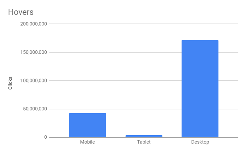

The graph clearly shows that the users of a desktop website version hover elements before clicking them (stop for at least 2 seconds) much more often. This means that they carefully read the content or hesitate.
Once you know the general behavioral patterns (clicks based on different traffic sources and devices), you can predict the actions and behavior of your website visitors and help them use your website more efficiently.
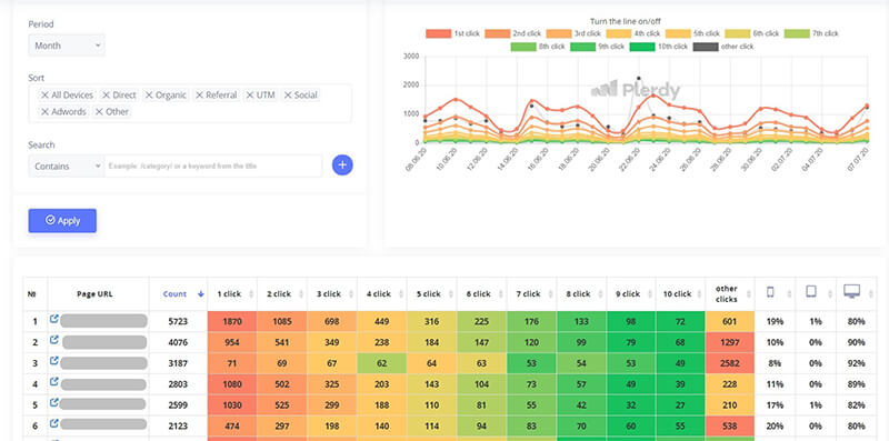
For a more detailed tracking, analysis, and prediction of user behavior, I’ve also prepared a graph showing the distribution of clicks between the parts of a page.
Distribution of Clicks Depending on the Scroll Depth and Device Type
The graph below shows how the number of clicks depends on the device type and the part of a page:
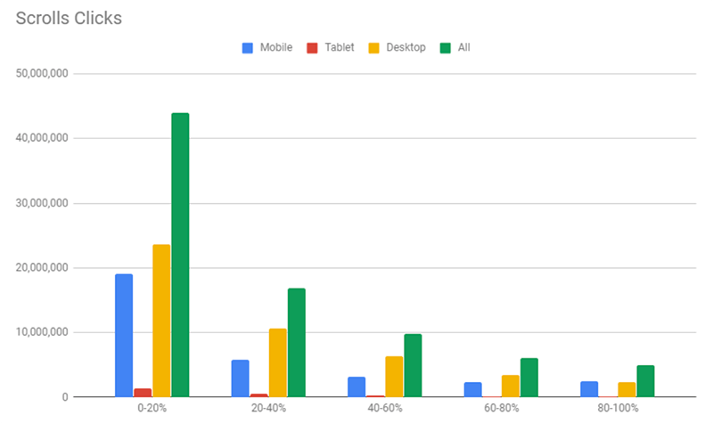

As you can see, users made the most clicks on the first parts of the page (0-20%). Even if you add up the clicks from other parts, it’s still less.
The graph also shows a significant decline in clicks starting even from the second part of the page (20-40%). This means that you need to plan the structure of your content. The information that is the most critical to users should always be placed in the first part as it is very important for forming positive behavior.
Of course, not all pages are identical. They may have different sizes and designs. Nevertheless, this graph conveys one main idea – if you want to keep customers, place calls-to-action at the top of pages.
Distribution of Click Sequences Depending on the Part of a Page
Whereas the previous graph shows where to place the main information, the next one helps to understand how users navigate web pages and what they do the most often.
Click sequences are intentionally segmented by device type. This is necessary to see a clearer overall picture of the user behavior.
Distribution of Click Sequences on PCs
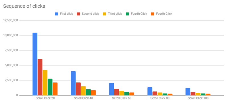

The graph shows that most users made their first click somewhere at the top of the page (0-20%). Besides, the number of first clicks sharply declines on the second (20-40%) and the following portions of pages.
Such a distribution also shows that the number of first clicks on different page sections is always higher than the second, third, etc. clicks.
What conclusions can we draw from this graph?
After their first click, many users leave the page to go to another one or close the website at all. A significantly smaller number of users continue browsing the page and interacting with the website.
Distribution of Click Sequences on Smartphones
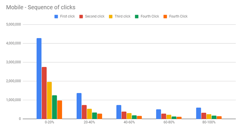

The situation is similar among mobile device users. Yet in this case, the difference between the number of clicks made on the first (0-20%) and second (20-40%) parts of the page is more significant.
This means that any mobile website version should include all the necessary information at the top. Users are very unlikely to scroll down in search of more details.
Distribution of Click Sequences on Tablets
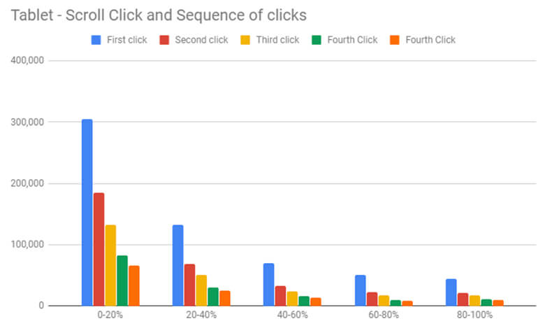

Such a comparison is essential to optimize a website for different types of devices and provide positive user behavior. Whereas, for example, your desktop version can contain a lot of information at the top of the page, a mobile version has limited space. Make sure to take this into account while designing your mobile website for improving user behavior.
Distribution of Scroll Depth Depending on the Part of a Page
The below graph shows how deep users scroll pages without making clicks.
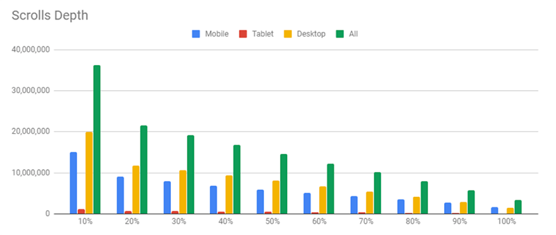

Based on the indicators, we can detect a gradual decline in the scroll depth that starts at a specific point of the page. With every portion of the page, the number of users reduces. The lower we go, the fewer visitors keep scrolling. Since the majority of clicks are made on the first part of the page, this graph also shows a decline starting from the second part.
Why Website Clicks Something You Need to Track
To make sure potential customers feel comfortable on your website, you need to know what they do first right after landing on the page. So this is worth tracking.
Find out what clicks they make, what sections they visit, and at what stage of the sales funnel they leave your website. The number of clicks on different website elements can answer the following questions:
- What do users like on your website and what prevents them from making a purchase?
- Why does one website page have a higher conversion rate than another?
- Why does your website have a high bounce rate (or does a separate page have a high exit rate)?
- Does your website include any elements that look clickable when they aren’t?
- Is the content good? How can you increase its scroll depth?
- Where are the most favorable spots to place internal URLs and interesting offers?
- Are the pop-ups shown on the specific page suitable and effective? (If most users close the pop-up, you should try to remove it, and see how they will behave without it).
- Are your calls to action and other elements effective?
Only when you have this information, you will be able to reduce the number of dissatisfied customers, increase positive user behavior, and win new customers.
User Behavior through the Website Clicks & Scroll Analysis
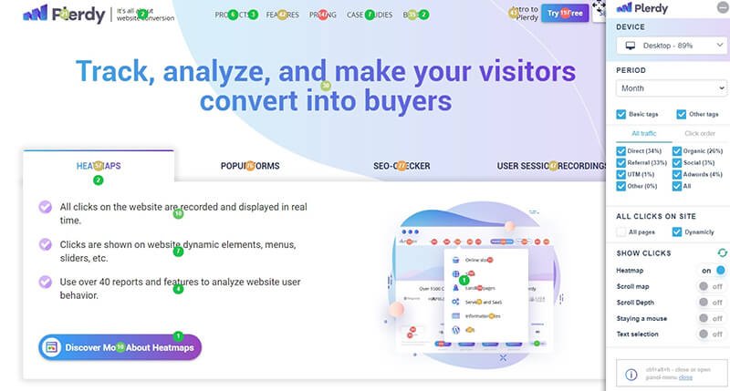

You can view the data slice of Plerdy’s click and scroll heatmaps immediately after the tracking script is installed. Just press Ctrl-Alt-H to open the sidebar of the analytics tool for tracking the user behavior. The statistics are displayed on each page separately. The tracking information is shown in real-time on a live website, instead of screenshots used by many similar analytics tools like Hotjar and others. This allows you to track dynamic elements and avoid switching between the pages and the main dashboard.
The dashboard contains all the collected analytics data grouped by specific parameters of user behavior. It’s very handy to see any deviations in website performance that influence the behavior of customers.
Visual Presentation of User Behavior On a Live Website Example
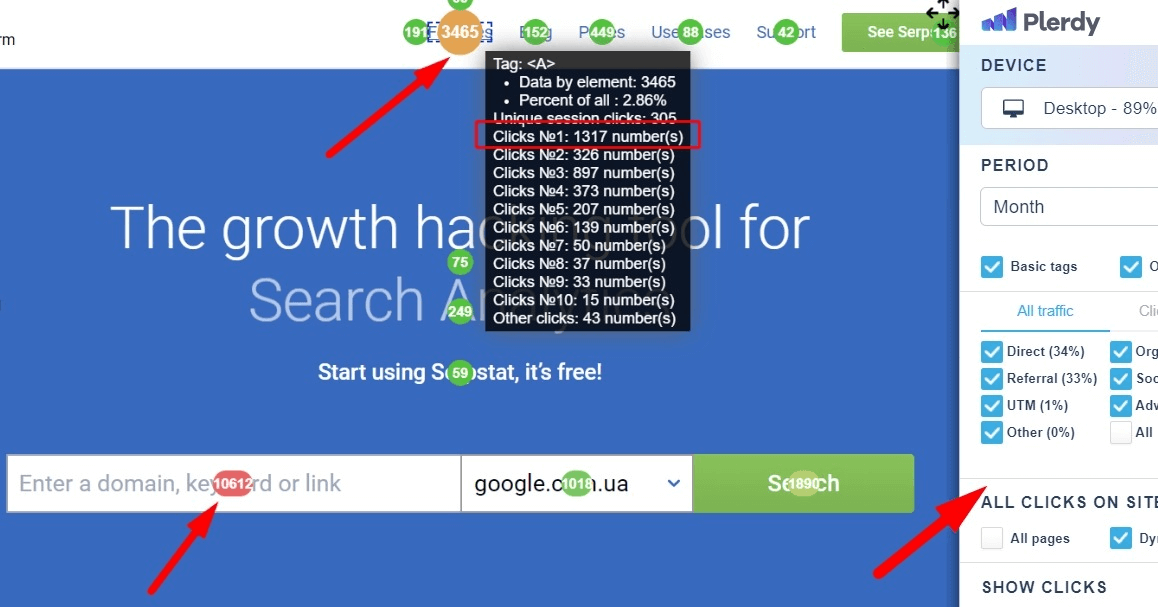

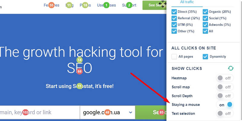
Heatmaps tracking tool used to analyze the behavior of website visitors to find out which features buttons (that forwards to the corresponding section) have the highest CTRs. The most popular element is the field where users can enter the URL or domain of the website they want to analyze. According to the tracking data, this field was clicked 10612 times compared to the Search button with only 1890 clicks.
Thus, we can assume that other users just clicked Enter, and waited for the results or left the website at all.
If the owners of the website ignored this behavioral pattern, they would have lost tons of users. Fortunately, by clicking Enter, visitors can run the link analysis. The only problem is that the analysis is quite slow, which can nudge people into leaving the page.
Apart from the total number of clicks made on the element, you can also view which elements/blocks users click first. This allows you to understand what attracts visitors’ attention right after they land on the page and how does this influences their behavior.
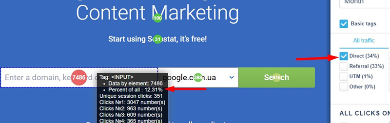

A separate analysis of the search bar’s CRT solely for direct traffic shows that this element has 12.3% of total direct traffic clicks (direct traffic comprises 47%). This means that although the search bar is accentuated on this page, users also click other elements that distract their attention and this affects their behavior.
If you want to know where your website visitors click first and how this determines their behavior, analytics heatmaps can be very useful. They don’t only filter first clicks by traffic source, but also by click sequences.
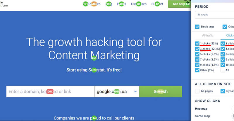

For example, this way you can find out where visitors that came from organic traffic clicked first and their behavior.
Let’s get back to the previous graphs of click sequences in different parts of the page for further analysis of the customer behavior.
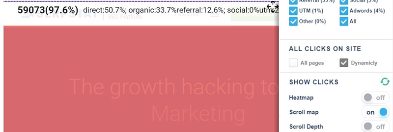

After viewing this screenshot, we can once again conclude that 97.6% of all clicks are made on the first screen. Thus, the other 4 portions of the page are less effective and rarely clicked.
The analysis of mouse hovers shows that users interact with the element very fast. It takes visitors less than 2 seconds to click, even though most of them browse the website on PCs.

The situation with the scroll depth is similar. The homepage of Serpstat’s website comprises eight 1920×1080px scroll screens. According to the collected data, only 5% of users viewed the second screen or, in other words, scrolled so the behavior on the second screen was not so productive.
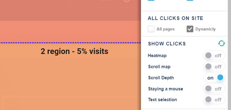

The scroll depth analytics data again proves that practically no one checks the lower part of the website, so the behavior there is almost absent. There is almost no use in placing any additional elements there.
Last Words
So this is the research I carried out together with Plerdy’s team. Hope it will help you with your website UX analysis and understanding of user behavior.


