


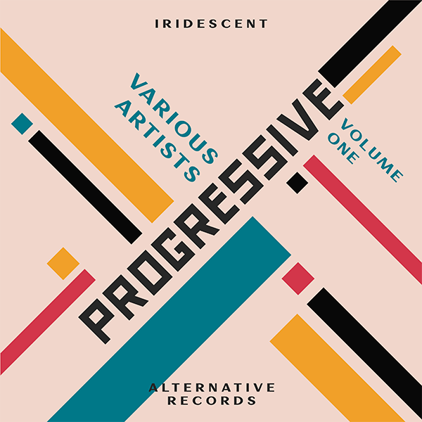
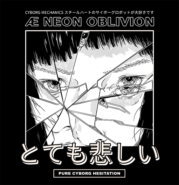
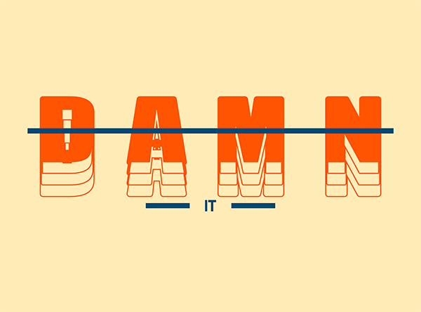
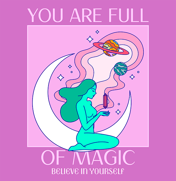
Design is all about aesthetics and what constitutes a good or a bad design can be very subjective. In the end, beauty is in the eye of the beholder. Graphic design principles help designers create attractive, effective, and harmonious compositions.
Ever looked at a design and not know where to look at? Whether it is a piece of advertisement, a moodboard, a website design, or create your own logo, videos, banners, and other content pieces, visual design principles and elements are essential to it. Graphic design plays a critical role in building a brand. You only get one opportunity to impress your viewer. Learn the basic graphic design principles in order to create something beautiful and stunning!
Here’s What You’ll Find:
What are the Principles of Design?
Depending on your source, you find a different number of principles. We’ve gathered the following list of graphic design elements and principles based on our own experience when working on our own creations. Let’s dive right into it!
1. Balance
Every element in a design has its own weight. When you balance your elements you can create harmony in your design. Balance also gives design stability and structure. There are two main types of design balance:
Symmetrical Balance

Equal weight on either side of an imaginary central line. Create a sense of calmness. The human eye is often attracted to symmetry.
Asymmetrical Balance
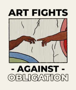

The asymmetrical balance occurs when in the same image, there are two graphic elements that are different – in terms of visual weight – but together they manage to be harmonious and make the image appear balanced. For example, a very famous piece that includes this asymmetrical balance is Michelangelo’s Creation of Adam in the Sistine Chapel. Note: Randomness can also be very visually appealing. But in the end, the asymmetrical balance still maintains an equilibrium.
2. Contrast
Contrast helps emphasize the main elements of your design with high contrasts. This effect makes your design as they call it to “pop”. Use high contrasting colors: light vs. dark, modern vs. old, and so on.


🔥 Want to upgrade your design game? Give your content a spin with our brand-new Image Background Remover!
3. Rhythm
Like music, this principle suggests and conveys movement. It uses repetitive elements in the design, such as lines, shapes, patterns, and colors. Please notice that rhythm allows for spaces between these elements, and in design, these blank spaces are called intervals.


4. Proximity
This principle refers to the fact that similar elements should be together. The closer they’re to each other, the more they are related.
5. White Space
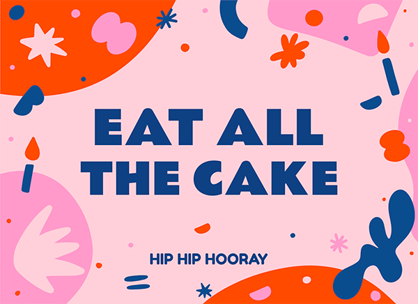
Negative space or white space takes into account all the spaces between elements that are not being used. So if you’re wondering where you can use it, opt for logos, it’ll give your design simplicity and will help to emphasize certain elements. Lastly, this design graphic principle works amazing when you have to create an outline of information in order to understand what is it you want to emphasize.
![]()
6. Repetition
Repetition helps to tie together tons of different elements. It gives your design a great sense of brand. Finally, the repetition doesn’t have to be exactly the same. For example, you can include two different typefaces to avoid making the design look too simple or ordinary.
7. Unity
This refers to how different designs work together as a whole with a clear relationship with each other. This one is also a biggy when working on a brand’s designs.

8. Movement
Brings life to your elements, you can use blurs, lines, waves, and other motion effects.
Transparency
Helps element interaction and movement.
9. Composition
This is the general arrangement of your elements. Your composition has to follow the main purpose of your design, give it a hierarchy.
Hierarchy
Clearly states the order of your elements. For example, using titles against subtitles, and body. It can be achieved through several methods like bigger elements, bolder fonts, framing, and so on.
Give extra weight to those elements that are most important. Think about high-ranking elements.
Alignment
It is the ordered connection between elements that looks pleasing to the eye. Alignment creates a more unified design.
Proportion
The size of each element in relation to each other. This too helps create a sense of hierarchy. This is the visual weight of each element.
Grid
Help align all your elements in an orderly manner.
10. Variety
As its name suggests, variety means different elements and contrasts in the same artwork. Talk about colors, shapes, typographies, and images that will keep the viewer’s attention. In this way, simple and monotonous designs are avoided. Although, you should be careful not to overload your design to not tire the eye.

11. Emphasis
This graphic design principle tells us that, at the moment of designing, we must focus on the element that we want to stand out the most; in this case, the one that immediately will catch the viewer’s attention. Overall, this element is a title. However, it can be a shape, an object, or an area considered more critical. Whatever the chosen part is, graphic designers tend to enlarge the element or add some white space around to give the impression that it’s the main thing and thus maintain the main focus and then look at the secondary objects, which clearly have less importance.


12. Typography
Just like with your design’s colors, you also have to choose a font palette. Fonts can give your design a whole style and look, so choose wisely.
✨✏ To learn more about this topic, continue reading: ‘Font Pairing Made Easy: A Guide for Non-Designers.’ In it, you’ll find helpful tips and visual examples to master this subject.

Bonus: Elements of Design
Now that we have seen the 12 principles of design, you are probably wondering, what are the elements of design? Here we share 5 briefly so that you can create a harmonious and balanced composition:
Line
A line in your design gives a visual direction to the eye. It creates an illusion through which the eye travels your design, in other words, it sets the movement of your design.

Color
Color throughout your design shows your overall design mood. Consider color psychology theory to use the right palette for your design. It also helps you communicate subconscious messages through your work.

Texture
In your designs creates a sense of touch to all elements and gives depth to the design.
Depth
Gives a 3D dimension to your 2D objects. This works well with textures and shadows.
![]()
Value
In this case, the value is nothing more than clarity and obscurity. That is, when we have a color, we know that it has different shades and gradients, going from lighter to darker. These tones help the composition to look with more or less mass, contrast, and volume.
Shape
Shapes are enclosed lines that will never be open.
The most popular and the ones we all know are the geometric ones, although there are also the organic (irregular contour, curves predominate) and the abstract ones. Therefore, it’s essential to inform ourselves before using them since each one represents something different. For example, according to several studies, our brain tends to be more inclined to organic shapes than geometric ones.
![]()
Last Words
Creating mind-blowing designs it’s easier when you can relate to the principles of graphic design. It’s way harder trying to go freestyle over your whole design.
Additionally, setting a few basics can help you create something that is really appealing to the eye. Aim to understand these elements in graphic design in order to create even better designs each time. Make sure your designs truly support your message in a creative way.
So there you go! Start creating amazing assets. Have any questions or comments? Leave a line for us!