

Top 5 Most Confusing Icons You’ve Probably Seen
We see a lot of icons every day. From any experience in the app store to pressing play on your Walkman, we interact with them all the time. But a lot of icons that are deeply engrained in our lives don’t actually make any sense. We looked at the top 5 most confusing icons and tried to trace their origins back to where they came from, so you can avoid making mistakes when designing and releasing your app or when working on a website’s UX design.
The Share Icon
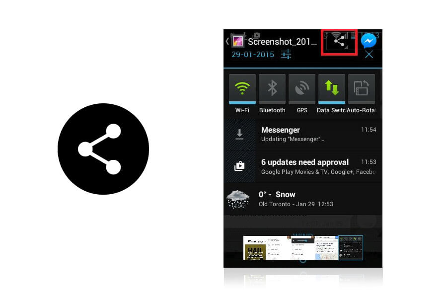
If you don’t know what I’m talking about, it’s that little icon that you see on phones and websites to share content. Here’s what it looks like in context.
So what does this confusing icon even mean, and why does it look like a tree diagram?
The share icon was developed by Alex King in December 2006 and released under Creative Commons Attribution 2.5. It was purchased by ShareThis in 2007.

Co.Design hazarded a guess that it’s the idea of taking one idea and spreading it to at least two others. Personally, it reminds me of a pay-it-forward type vibe. Congruous with these ideas, the ShareThis usage guidelines say that the icon should not be used to share to a single channel or service.


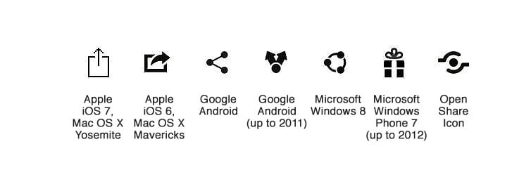
The thing about the share icon is that this particular take on it isn’t bad – it’s just that the share iconography world is so divided. Apple, Microsoft, Android, and Open Share all have different share icons. Not different takes on the same idea, but dramatically different icons, from dramatically different concepts. The Open Share icon, for example, is meant to be one hand passing an object to another; Apple’s is the idea of a tray and information going out/up into the world.

Personally, I don’t see one icon emerging as the clear leader in the fight, and with each one being as viable as the next in terms of what they mean, I think we’re going to be stuck with them for a while.
Play Icon Button
It’s everywhere, but what does it actually mean? At this point, it’s a great icon – instantly recognizable, only ever means one thing, and as an added bonus, can be reimagined to fit into whatever design trend you want (flat, for example).
![]()
Where Play Came From
The short answer is no one really knows. Gizmodo says that it’s from the 1960s when audiovisual was still reel-to-reel. The idea back then was that the triangle actually was an arrow, indicating which way the reel went, but this is pretty much just speculation. The reason the play button is so overwhelmingly successful is large because of just how globalized the consumer electronics industry is. So everyone knows what it means, and what it does.
While there might have been a logical grounding once (like how the Gmail logo is a letter) that time is long past. It’s an abstraction, an idea which everyone agrees ‘yep, this means play’.
This agreement over abstract meaning is so absolutely that it’s actually spawned abstract icons in its own right.
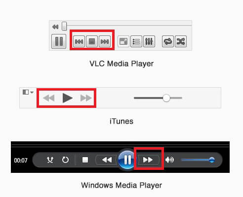
The fast forward icon and the rewind icon. If one triangle means ‘go’ then two must mean ‘go faster!’ and if a right-pointing triangle means to go forward, a left-pointing trial must me go back. It’s so simple, but the fast forward /rewind buttons are entirely abstract imaginings contingent on the play button, which is entirely abstract! Whew. My head is starting to spin.

Bluetooth
Of all the symbols here, Bluetooth definitely has the best story.
![]()
In the 10th century, the Danish king Harald Blåtand (Harold Bluetooth, in English) had an enthusiasm for blueberries, and his tooth was always stained blue (hence the name). He also united a whole lot of Scandinavia, the same way Bluetooth today allows “connectivity and collaboration between disparate products and industries.” It’s a little heavy-handed, but that’s the story of the Bluetooth name.
Where the Icon Came From
With that in mind, the logo is actually the old rune for H and B (for Harold Bluetooth).
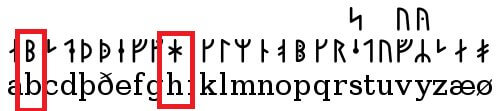
It’s actually just convenient that the old runes combined look a bit like a B, but it’s very convenient for quickly grasping what this confusing icon stands for. Plus, because Bluetooth is patented technology maintained by the Bluetooth SIG, the use of the icon (which is really just their logo) is a little bit more restricted, which means there’s not the same division of icons meaning the same thing.

The downside of Bluetooth is that it doesn’t give any indication that it’s a piece of technology that will allow quick and easy sharing among devices.
So you have to be in the know to get any benefit out of the Bluetooth icon.
USB
USBs – useful, ubiquitous, cheap. Everyone has at least a few flash drives floating around, not to mention all the chargers, connectors, printer cables, external hard drives, and other miscellaneous techs that seem to rely on those three little letters.
![]()
Where the Icon Came From
You know the one. It’s embossed into the side of your computer and at the end of all your cables.
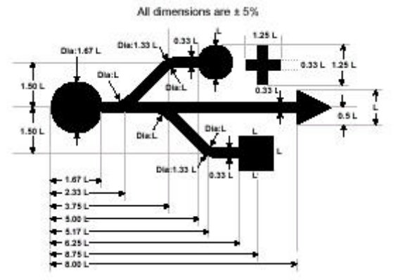
The idea of the icon came from Neptune’s Trident Dreizack. The trident symbolized power, and the USB symbolizes the ‘power’ or a single connector for multiple devices. The different shapes at the ends – the square, the circle, and the triangle, drive the point home that it’s universal.
However, as an icon, it’s not that useful. Sure, it might be recognizable, but there’s no way to know from the icon what it does without pretty substantial previous knowledge. Maybe it will be the next ‘play’ button, an abstract notion that becomes entirely normalized on a global scale, but until that happens it’s just not great iconography.

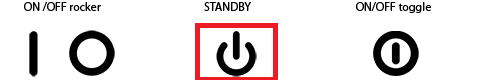
Power Button
The power button rivals the play button for ubiquity, mostly because it’s differentiated so much. For example, to turn a Prius on, it’s the power symbol that you press. To turn on an electric kettle, the same button. Turn on a PC or a Mac, same button.
It is truly the global icon for power.
Where It Came From
Jessica Patterson at Design.org provides a great summary of what’s actually going on. The two elements of the icon represent on and off. The line represents 1 or a | represents a fully powered state in a binary system.
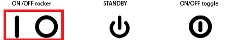
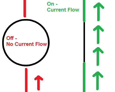
The O means that nothing is happening. This is all via the International Electrotechnical Commission (IEC), which sets international standards on stuff like this. Way back in the day, when things were turning on and off for the first time, this made a lot of sense – there was a switch, one end had a line, the other a circle. Easy to understand. They actually come from the world of electrical current, nicely articulated by this image


So there is (or was) a clear basis for the icons. But what isn’t quite so useful is when both icons are on the same button. There are actually two icons in play here, one which just sleeps a device and one for fully turning it on and off. But I didn’t know there was a difference. Plus, the difference is really small.
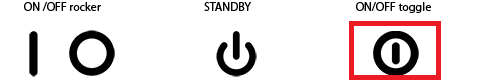
I don’t think the difference is well enough understood or even relevant to justify two different icons today. My laptop, for example, has the sleep variation. But whenever it’s misbehaving and needs to be shut down, what button do I push? The sleep one! So there are obviously some consistency problems. Plus, for a lot of buttons, there’s no visual cue if it’s on or off, although, with new devices, there tend to be lights to indicate that sort of thing. However, if you’re looking for the best laptop for graphic design, it’s crucial to consider not only the button icons but also the hardware and performance aspects to ensure a smooth and efficient design workflow.
All in all, the power button was a good idea when it started and was great for the target audience (engineers). But now, it’s widespread enough to be everywhere but not ingrained in out icon lexicon to the same degree that the play button is. But it’ll get there, especially if they streamline the half-closed and fully closed icon into one.
TL;DR
Even the most misunderstood and confusing icons have origin stories. We traced the share, play, Bluetooth, USB, and power icons back to their roots to better understand how these now-common icons came to be, and whether or not they actually make any sense today.
“Can’t mention this enough: For web/UI designers, Placeit is a great online tool!”
Six Revisions 5/5