How Subtle Changes Can Increase Your CTR
Everyone wants more clicks. More taps. More users saying, ‘Yes, I’m into whatever it is that you’re giving me.’ We wanted to look at a few ways that actually make users want to click more; this is where UX design comes in!
What You’ll Find:
It’s pretty well plastered all over the web: when you’re getting users to click, a subtle change can go a long way. We looked at what exactly those subtle changes might be and the effect they might have on your conversions.
Fonts
Fonts can have a crazy enormous effect. For example, in 2009, Tropicana rebranded in a big way, and a huge part of that was redoing their font. Remember that the Tropicana font is also their logo.
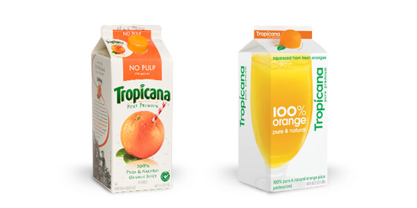
Image via Vital Design
Fonts are also one of the most stable things that you can rely on when you’re getting people to click.
Generally, a bold, sans serif font with high contrast is going to do great.
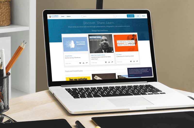
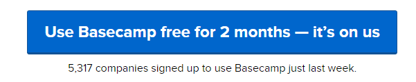
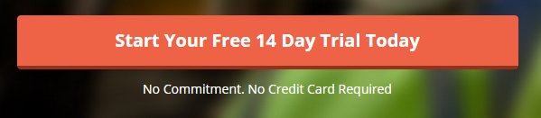
Why? It’s the easiest to read. Examples of this are all over the internet. Basecamp, BaseCRM, Evernote, mHelpDesk – all these companies have the same looking CTAs – high contrast, bold sans serif font. It’s easy to see, it’s easy to read. That’s why companies tend to use it over serif fonts. (Same goes for posters – you can read them from ages away). Also, sans serif is easier to read on a computer, which is why you want to use it when you want the reader to click – they need to know what you’re saying before anything else.
Drop Shadows + 3D effects
It’s amazing how drop shadows and making something 3D can get people to click on it. It’s really the one major drawback of flat design. (Currently. The other is that, eventually, it’s going to be crazy-dated.) When things are really flat, they look great, but they’re not so easy to know what’s clickable and what isn’t. Jakob Nielsen discussed this when he evaluated Windows 8 in 2012.
Because people click more when things actually look like buttons, rounded edges or a drop shadow make it really easy to know what’s clickable and what isn’t.
(pro tip: these are called kiosk-style buttons).
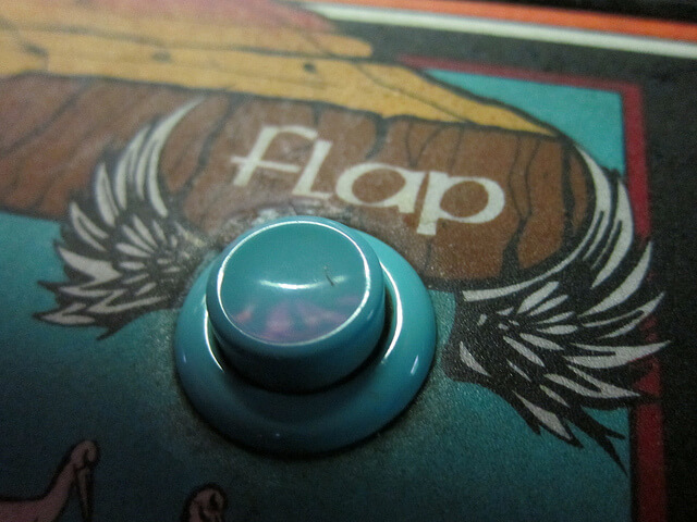 This actually presents an interesting problem. Kiosk-style buttons were originally used in arcades and other places back in the day. So when we went digital, that norm carried over. That makes sense, but at some point, they become beveled 3D buttons for the sake of being beveled 3D buttons, not because anyone actually remembers where they came from. It’s like the floppy disk save icon – the skeuomorphic root eventually becomes arbitrary, and it’s no longer skeuomorphic.
All this to say that people are more comfortable clicking kiosk-style buttons right now, but we might see a steady move away if a flat design can hang in there for a few more years.
Movement
A lot of people lump movement in with making something that’s clickable 3D, but I think it’s important enough to warrant a category on its own, first from a UX perspective and second because of what it means for flat design.
From a UX perspective
Users need feedback for their actions. It’s the number 1 way to help users understand where they are and what to do.
The first job of making something clickable is telling users that it can be clicked.
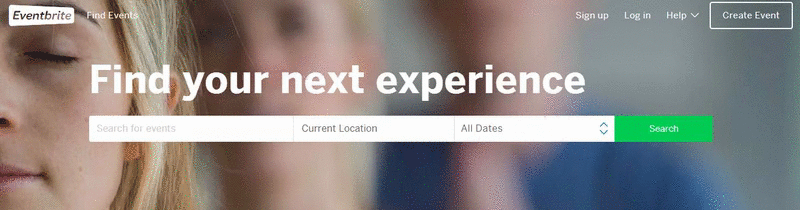
When it comes to buttons, for example, just the slightest gradient change can do wonders. For example, the Eventbrite homepage uses slight gradient changes on its icons to show that they’re clickable and reinforce where the user is:
Another great example is eTecc/Interactive’s website homepage. They actually use a fill to let the user know that something’s clickable.
It’s such an easy way to figure out how to inform users what’s clickable and what isn’t. And as things get flatter and flatter, this visual feedback is increasingly important. Oddly, this is something Apple could improve at. Check out the Apple.ca homepage.
It looks like the links at the top are clickable, which they are, and there’s a small gradient change to reaffirm that knowledge for the user. We can also assume that the view gallery option is clickable as well, and again there’s a color change to reinforce that.
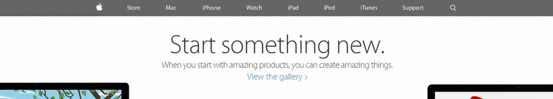
But the problem is that the entire screen is actually clickable! It’s extremely unintuitive to the user, and as someone who happens to click a lot, it took me a while to figure out why the page kept changing. It’s not at all an intuitive UI.
From a flat perspective
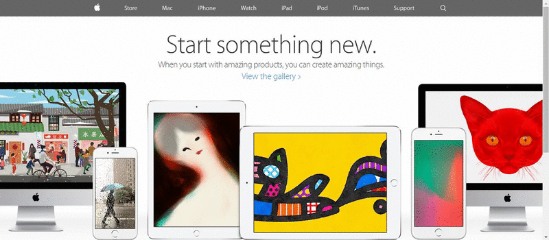
 So while Apple hasn’t nailed it 100% of the time, they’re pretty close. And movement lets designers build the flat interfaces that they want while still letting users know what’s clickable and what isn’t. Notice how all the examples were exceptionally flat designs? Full disclosure I planned that. It illustrates that a flat design can work for a button as long as there’s feedback.
Here’s an example of a flat(ish) design without feedback – while it’s clear to me that it’s a button, without feedback, it does feel a little bit like my computer isn’t working.
Contrast + Color
Sadly, there’s not a particular RGB code that guarantees people to click. But there are some excellent rules to follow that will help you out. If you want users to click on something, you want it to stand out. That means you need it to contrast dramatically with whatever else is around it, even if it means breaking from a brand’s color palette.
For example, David Hamill recommends using color for hyperlinks that aren’t used for anything else. On his site, each link is done in pink. It’s easy as a user to know what’s a link and what isn’t. Combined with a change when you hover over it, it’s really obvious to the user when you can click on something.
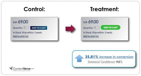
This sort of issue of color and contrast most often comes up with calls to action (CTA) and buttons, and a small change in color can make a huge change in profits. For example, Vibethink wrote about CTAs and buttons and reported that changing the color and shape of a button increased conversions (read: clicks) by 35%. They felt that the increased contrast made it easier for users to click.
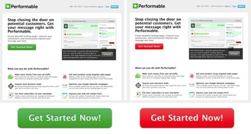
But they changed two things, so it’s not absolutely scientific. Hubspot 2011 published the results of some A/B testing on red and green buttons and found that the red button outperformed the green one by 21%.
So color and contrast can play a huge role in getting users to click on stuff.
Wrap Up
The devil’s in the details. As designers, developers, UXers, and marketers, whenever we make something clickable, we’re asking the user to do something. Click here. Submit application. Contact us. Buy now. Whatever it is, it’s something they have that we need. So why not simplify that? The best way to help your users click (and thus probably help you) is to make it easy to click. By making buttons fit expectations with kiosk-style design, by making fonts easy to read on a screen (even if they’re small), and by providing feedback on buttons and clickable content, you make your users’ lives easier.
That’s it, really. When you’re making something clickable, make your users’ lives easier at the same time.
Enjoyed this post? You might also want to read our Understand Your Users to Improve Your Website UX Design post or our Great Products Every UX Designer Should Own!
